Thumbnail Widget
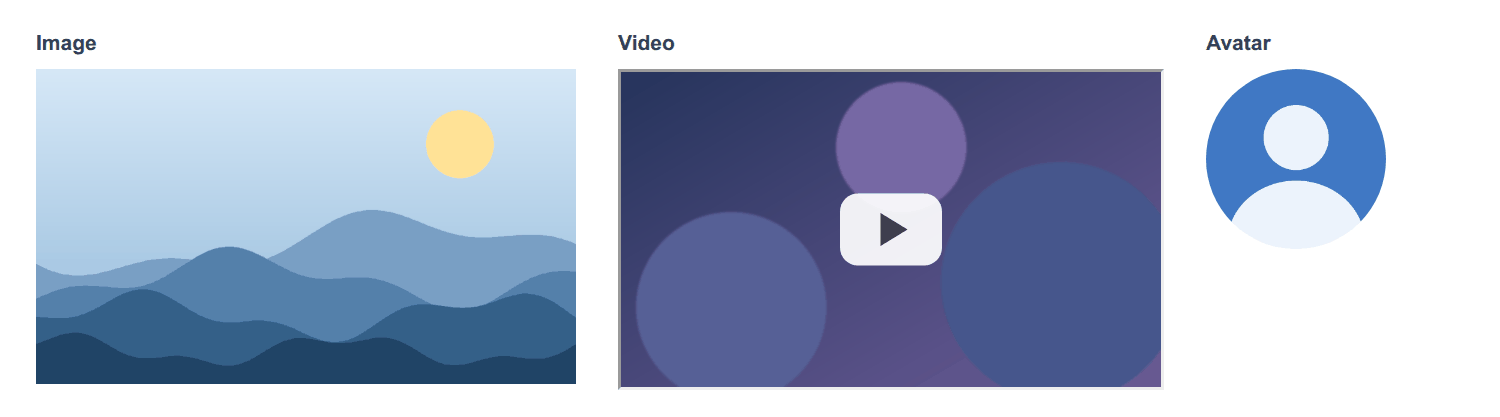
The Thumbnail widget shows one media on a page from a link: an image, a video in a frame, or a round avatar. It only displays content: it holds no value and users cannot change it.
The Image widget is a banner: a background image that you upload, with a title and a description on top of it. Use the Thumbnail widget to show a picture on its own, a video or a portrait.
Adding the WidgetDirect link to Adding the Widget
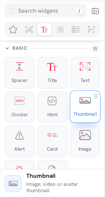
The widget is in the Basic group of the widget palette. You can also find it by typing thumbnail, video or avatar in Search widgets.
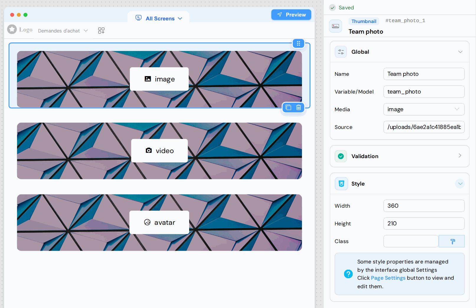
On the canvas, the widget is a placeholder labelled with its media type (image, video or avatar). The media itself appears only in the Preview and on the published page.
Global CardDirect link to Global Card
| Option | Description |
|---|---|
| Name | The name of the widget in the builder. |
| Variable/Model | The name of the widget in the page. No value is stored under this name. |
| Media | image (default), video or avatar. The other options of the card depend on this choice. |
| Source | The link to the media (see Source). |
| Size | Avatar only (see Avatar). |
| Height (px), Width (px) | Video only (see Video). |
SourceDirect link to Source
The widget has no upload button: Source holds a link, which can be:
- a path on your server, such as
/uploads/<file id>/name/photo.png: upload the file to Files, then copy its link with the copy icon; - a full URL starting with
https://.
A private file can be seen by signed-in users only: on a page open to everyone, use a public file (see Access Control and File URLs).
Source is a fixed link. A {{photo}} expression is not replaced by the value of the variable, so the media does not load, and the ${...} syntax of the PDF Reader can prevent the widget from being displayed. To show an image that depends on the data of the page, use an Html widget:
<img :src="models.photo" style="width: 200px" />
Media TypesDirect link to Media Types
ImageDirect link to Image
The image fills the area of the widget without being deformed: what goes beyond the area is cropped. Set the size in the Style card:
| Option | Value | Default | If empty |
|---|---|---|---|
| Width | A number of pixels, without a unit | 720 | The image takes the full width of its column (0 does the same) |
| Height | A number of pixels, without a unit | 420 | The height follows the proportions of the image |
A value with a unit, such as 50% or 300px, is ignored and gives the same result as an empty field. To let the image follow the width of its column on every screen, leave Width empty.
If the image cannot be loaded (no source, wrong link), the widget shows a grey area with the text FAILED, at the size set in Width and Height. If Height is empty, the area is only a thin strip (about 19 pixels high).
VideoDirect link to Video
Source opens in a frame (iframe) inside the page, so it must link to a page that accepts being embedded. For YouTube, use the embed link, https://www.youtube.com/embed/<video id>: a https://www.youtube.com/watch?v=... link is refused by YouTube inside a frame. The frame allows full screen and autoplay; the embedded page decides whether it uses them.
Set the size of the frame in the Style card, with Width and Height (default 720 × 420 pixels). They hold the same values as Width (px) and Height (px) in the Global card, whose fields are narrow.
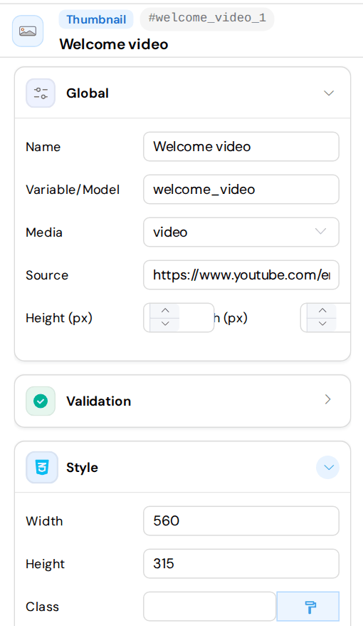
Use numbers of pixels, without a unit. An empty field or a value with a unit is ignored and the browser uses its default frame size. The frame keeps its size on every screen: check the result on small screens.
AvatarDirect link to Avatar
The avatar is a circle, and the picture is cropped to fill it. Size sets its diameter in pixels (default 150; an empty field gives 100). The Width and Height of the Style card have no effect on an avatar.
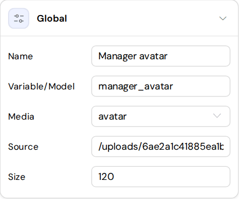
Size must be a plain number. A value such as 120px or large prevents the avatar from being displayed.
If the picture cannot be loaded, the avatar is a plain grey circle.
Validation CardDirect link to Validation Card
Available and Visible work as on the other widgets, and Visible can hold a condition such as {{status}} === 'Approved' (see Validation Rules). Required and Disable are shown in the card but have no effect on this widget.
Style CardDirect link to Style Card
- Width and Height: see Image and Video.
- Class: CSS classes. The button next to the field opens the dynamic classes. The classes apply to the image or the avatar itself, and to the block around the frame for a video.
The ID shown at the top of the panel, next to the type of the widget (for example #team_photo_1), is the ID of the block around the media. Use it in your stylesheet. The widget has no alignment option, so this is how you centre an avatar, or remove the border that browsers draw around a frame:
#manager_avatar_1 { text-align: center; }
#welcome_video_1 iframe { border: 0; }
When your account applies its design to the applications, the image and the video frame take the rounded corners of the design.