Date Widget
The Date widget provides a comprehensive date and time selection interface with multiple display formats and configuration options. It supports single dates, date ranges, time selection, and various validation rules.
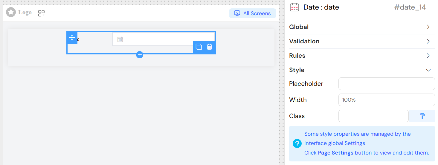
Widget Overview
The Date widget is built on Element UI's date picker component and offers flexible date/time input capabilities with extensive customization options including format specification, validation rules, and dynamic behavior.
Configuration Options
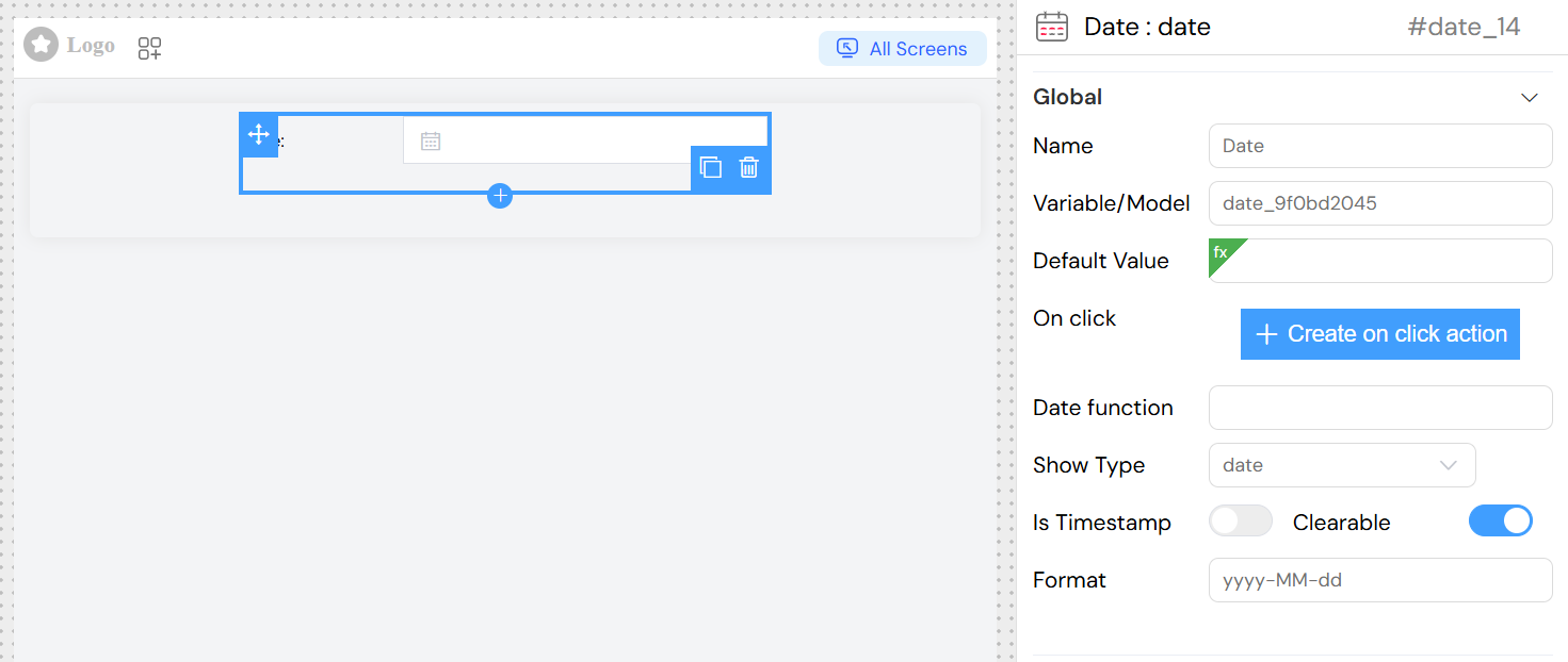
Global Settings
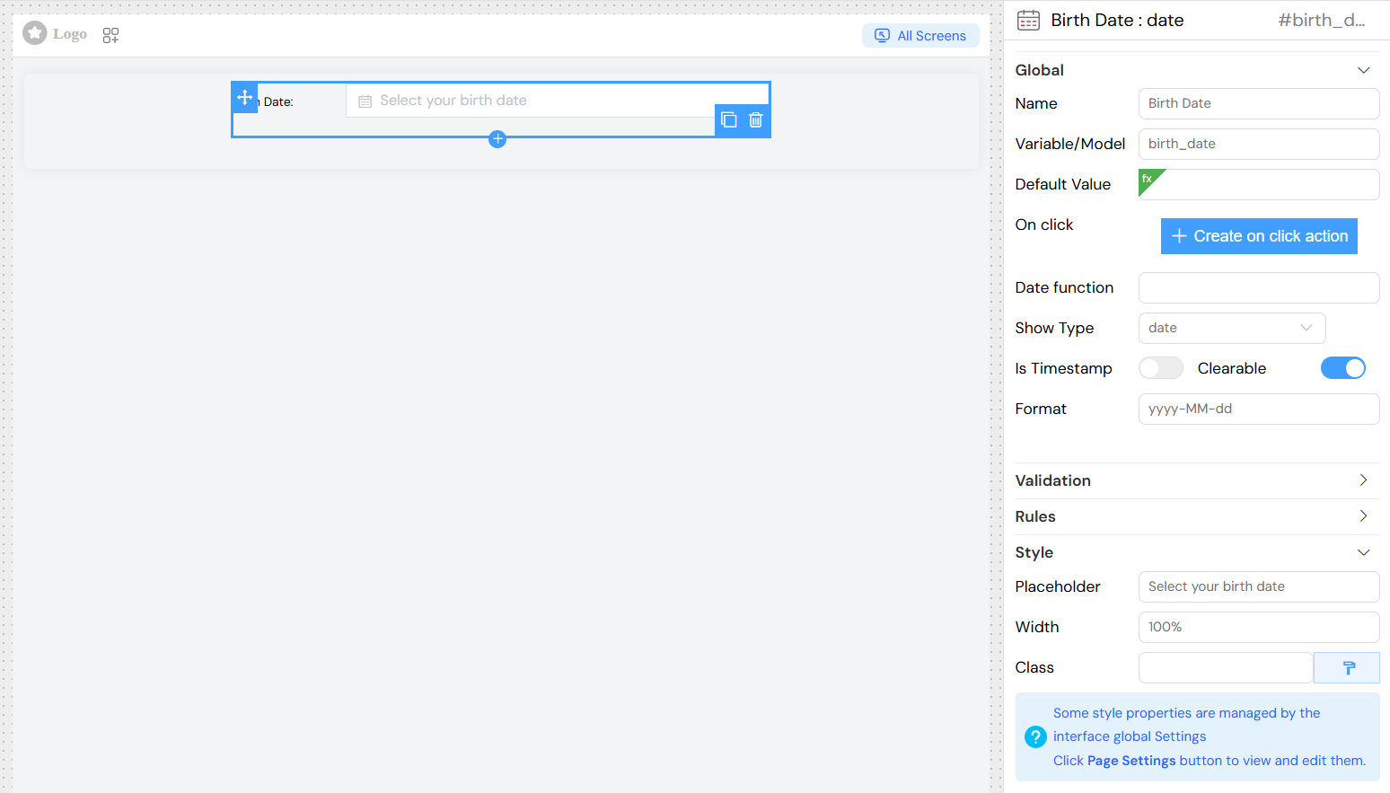
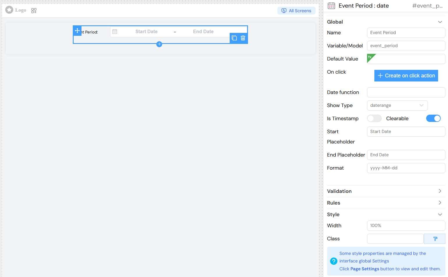
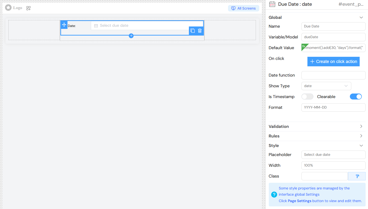
Name
- Field: Name
- Description: Display label for the date widget
- Type: Text input
- Required: Yes
Variable/Model
- Field: Variable/Model
- Description: The data model property that will store the selected date value
- Type: Text input
- Required: Yes
- Note: Must be a unique identifier within the form scope
Default Value
- Field: Default Value
- Description: Initial value for the date widget
- Type: Dynamic input with autocomplete suggestions
- Supports:
- Static dates:
2023-12-25 - Dynamic expressions:
{{currentDate}},${today} - Relative dates:
{{moment().add(7, 'days')}}
- Static dates:
Date Function
- Field: Date function
- Description: Custom JavaScript function to control date picker behavior
- Type: Text input
- Usage: Define custom date restrictions or calculations
- Example:
return { disabledDate: (time) => time.getTime() < Date.now() }
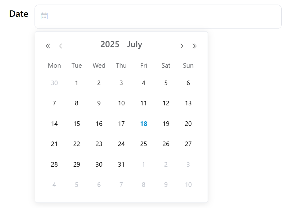
Show Type
- Field: Show Type
- Description: Determines the date picker display format and selection mode
- Type: Dropdown selection
- Options:
year- Year selection onlymonth- Month selection onlydate- Single date selectiondates- Multiple date selectiondatetime- Date and time selectiondatetimerange- Date and time range selectiondaterange- Date range selection
- Default:
date
Is Timestamp
- Field: Is Timestamp
- Description: When enabled, returns timestamp value instead of formatted date string
- Type: Toggle switch
- Default:
false
Clearable
- Field: Clearable
- Description: Allows users to clear the selected date
- Type: Toggle switch
- Default:
true
Format
- Field: Format
- Description: Date/time display format using moment.js format strings
- Type: Text input
- Examples:
YYYY-MM-DD- 2023-12-25DD/MM/YYYY- 25/12/2023YYYY-MM-DD HH:mm:ss- 2023-12-25 14:30:00MMM DD, YYYY- Dec 25, 2023
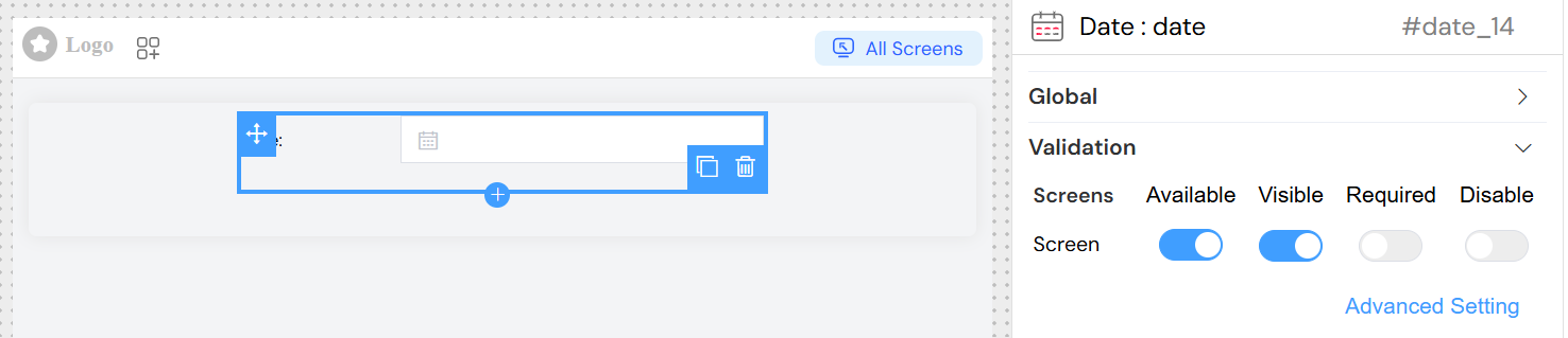
Validation
Screen-Based Validation
Configure widget behavior across different screens (mobile, tablet, desktop):
Available
- Controls whether the widget is available on specific screen types
- Type: Toggle switch per screen
Visible
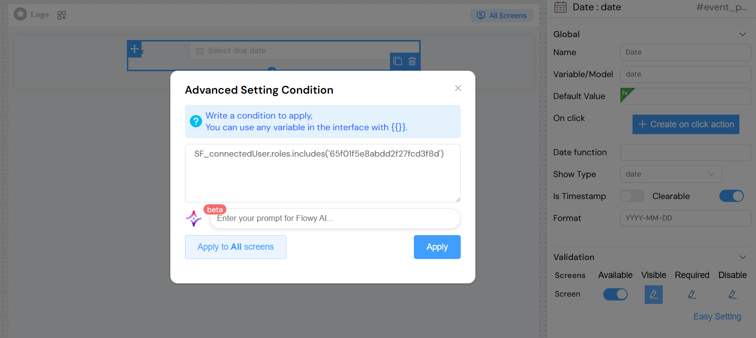
- Controls widget visibility on specific screen types
- Type: Toggle switch or advanced expression
- Advanced: Use JavaScript expressions like
{{user.role === 'admin'}}
Required
- Makes the field mandatory on specific screen types
- Type: Toggle switch or advanced expression
- Validation: Triggers form validation if empty
Disable
- Disables user interaction on specific screen types
- Type: Toggle switch or advanced expression
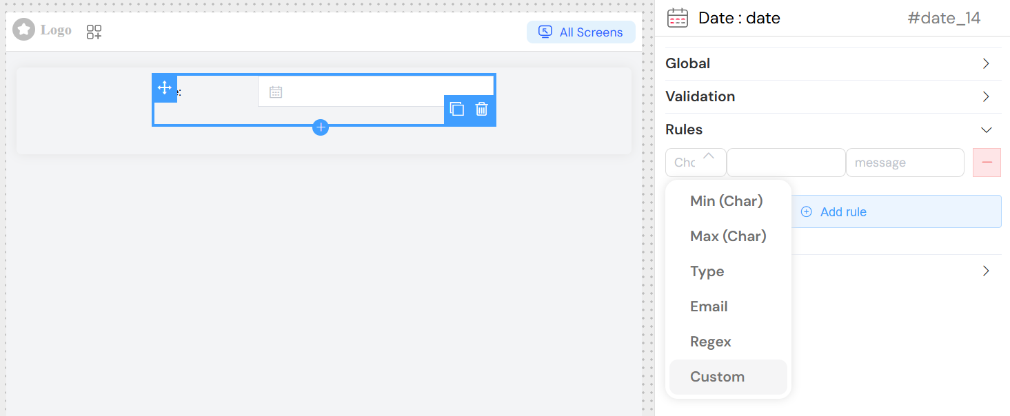
Validation Rules
Custom Rules
- Purpose: Define specific validation criteria
- Configuration:
- Rule Type: Select from predefined rule types
- Value: Rule parameter (if applicable)
- Message: Custom error message
- Examples:
- Minimum date validation
- Maximum date validation
- Custom date range validation
Actions
On Click
- Field: On click
- Description: JavaScript code executed when date selection changes
- Type: Code editor or action builder
- Context Variables:
SF_input.value- Selected date valueSF_input.SF_currentIndex- Current loop index (if in a loop)
- Example:
console.log('Date selected:', SF_input.value)
](/img/04_ressources/project/web-interface/widgets/dateActions.png)
Style Configuration
Placeholder
- Field: Placeholder
- Description: Placeholder text displayed when no date is selected
- Type: Text input
- Example: "Select a date"
Width
- Field: Width
- Description: Widget width specification
- Type: Text input
- Examples:
100%,300px,50rem
Class Names
- Field: Class
- Description: Custom CSS classes for styling
- Type: Text input with dynamic class support
- Examples:
custom-date-picker,highlighted-field
Dynamic Classes
- Purpose: Apply conditional CSS classes based on data
- Configuration: Use the paint brush button for advanced class configuration
- Example: Apply different styles based on selected date validity
Usage Examples
Basic Date Selection
Date Range Selection
Dynamic Default Values
Advanced Features
Conditional Visibility
Configure the widget to show/hide based on other form values:
Best Practices
- Format Consistency: Use consistent date formats across your application
- Validation: Always validate date inputs, especially for business-critical dates
- User Experience: Provide clear placeholders and labels
- Accessibility: Ensure proper labeling for screen readers
- Mobile Optimization: Consider different date picker behaviors for mobile devices
- Default Values: Use sensible defaults to improve user experience
- Range Validation: For date ranges, ensure start date is before end date
Troubleshooting
Common Issues
Date not saving correctly
- Check the format configuration matches your backend expectations
- Verify the model name is unique and properly defined
Validation not working
- Ensure required rules are properly configured
- Check that validation messages are defined
Date picker not appearing
- Verify the widget is set to visible on the current screen type
- Check for CSS conflicts that might hide the picker
Format display issues
- Confirm the format string follows moment.js conventions
- Test format strings with sample dates
Debug Tips
- Use browser developer tools to inspect the generated HTML
- Check console for JavaScript errors
- Verify data model values in Vue DevTools
- Test different screen sizes and orientations