Web Modeler
1. Introduction to the Web Modeler
The Softyflow Web Modeler is a powerful, user-friendly tool for designing and building modern user interfaces for your applications. It features an intuitive drag-and-drop editor that empowers developers of all levels from no-code citizen developers to seasoned software engineers to create rich, responsive, and highly functional web pages. With extensive configuration options, a vast library of UI components, and an integrated script editor for advanced customizations, the Web Modeler is your all-in-one solution for UI development.
2. Configuring Your Web Interface
After creating a web interface, the Page Settings tab is your central hub for configuration. Here, you can define everything from basic information to layout, styling, and navigation.
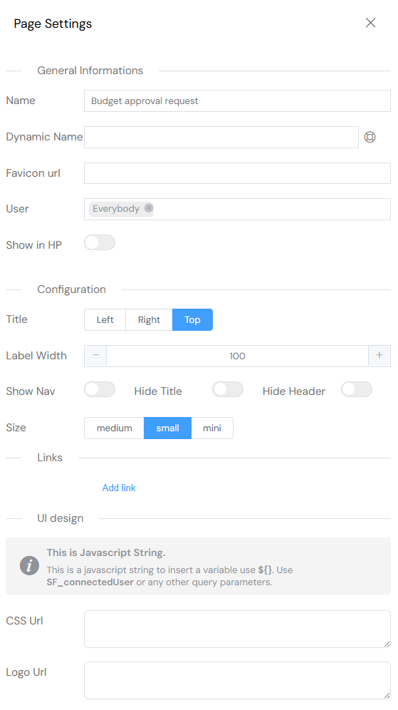
2.1. General Information
- Name: Assign a clear and descriptive name for the page. This name will be displayed in the browser tab and throughout the application's navigation.
- Favicon URL: Set a custom favicon for your page. The favicon is the small icon shown in the browser tab, bookmarks bar, and other browsing contexts. You can use any valid image URL.
- User Access: Control who can view and interact with this interface. You can grant access to specific users or entire groups.
- Show in Home Page: Toggle whether this interface should appear as a card on the application's main home page for quick access.
2.2. Layout & Style
- Title Position: Determine the default alignment for all component titles on the page. Options include Left, Right, or Top.
- Label Width: Specify a fixed width for component labels to ensure a consistent and clean layout.
- Show Sidebar: Enable or disable the sidebar navigation. The sidebar automatically populates with links to the sections you create on your page, but only visible sections will be included.
- Element Size: Adjust the default size of UI elements like buttons and inputs. Choose from Medium, Small, or Mini to control the density of your interface.
2.3. Navigation & Structure
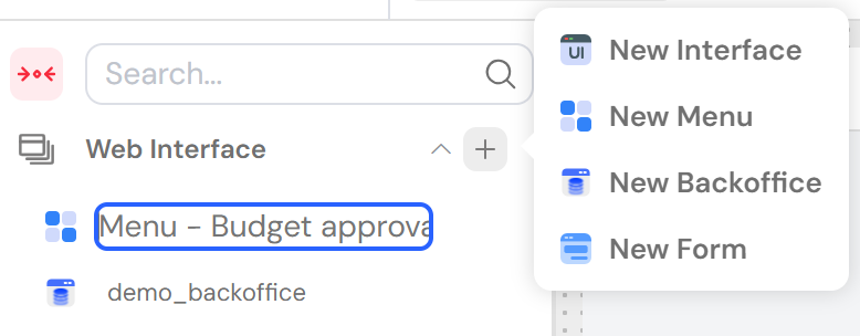
- Menu Bar: Select a pre-defined navigation bar (NavBar) to be displayed at the top of your page.
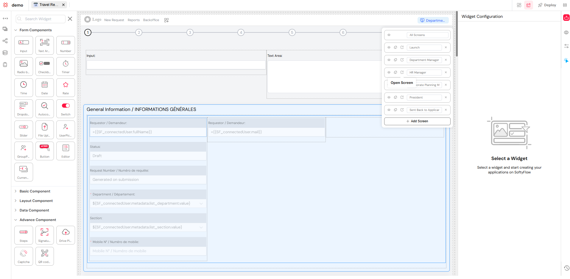
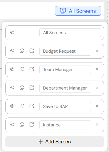
- Screens: Attach multiple screens to a single web interface. This powerful feature allows you to group related views or steps in a process, improving performance and organization by reducing the number of individual interfaces you need to manage.
- Links: (This section appears to be empty in the original content. I'll leave it as-is but it could be expanded in the future to describe linking to other pages or resources.)
- Links:
3. Building with Widgets
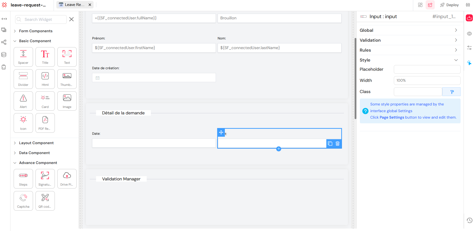
The Web Modeler includes a comprehensive library of ready-to-use components, or "widgets," that you can drag and drop onto your canvas to build your page layout and functionality. Each widget is configurable on three levels:
- Global Configuration: Settings common to all widgets, such as their identifiers.
- Custom Configuration: Settings specific to the type of widget (e.g., setting the options for a Dropdown).
- Validation & Rules: Settings that control a widget's behavior on a specific screen (e.g., making it visible or required).
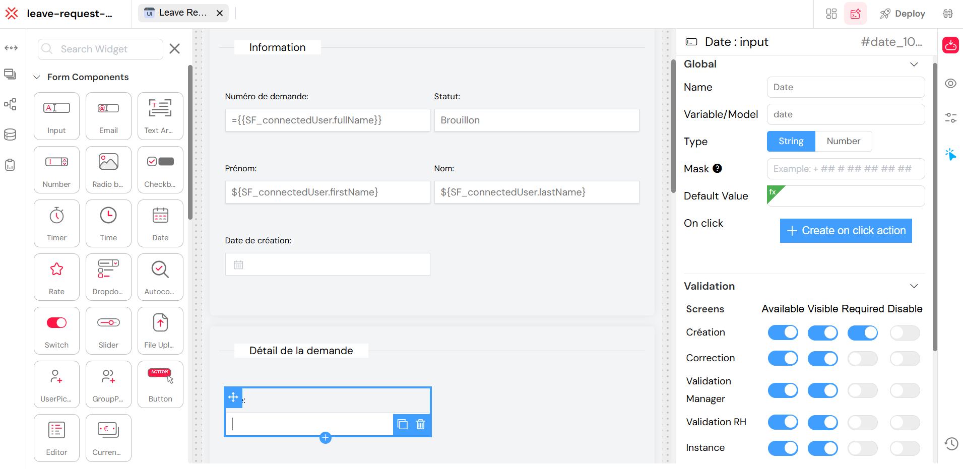
3.1. Global Configuration
Every widget shares a common set of identifying properties that are crucial for data binding and referencing them in scripts or actions.
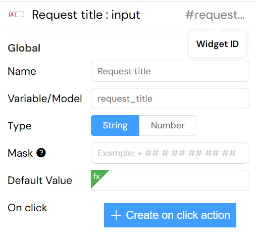
- Name: The display name or label for the widget. This is often shown to the end-user (e.g., as the title of an Input field or a Divider).
- Model: The variable name that holds the widget's data. This is the key you will use to access the widget's value in scripts and actions.
- ID: A unique identifier for the widget instance on the page. This ID is essential for targeting the component with CSS or JavaScript.
Every component should have a distinct model, unless you intentionally want two components to share the same data model. In most cases, the model should be unique.
3.2. Available Widgets
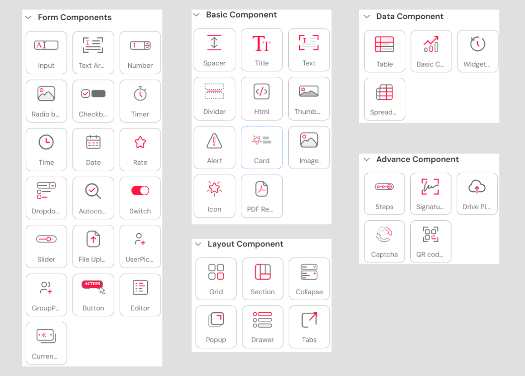
Softyflow provides a rich variety of pre-built widgets, organized into four main categories, to cover all your UI needs.
| Components | Type | Components | Type |
|---|---|---|---|
| Timer | Basic components | Title | Basic components |
| Text | Basic components | Thumbnail | Basic components |
| Divider | Basic components | Card | Advance components |
| HTML | Basic components | Image | Advance components |
| Input | Basic components | File Upload | Advance components |
| Text Area | Basic components | GroupPicker | Advance components |
| Number | Basic components | Table | Advance components |
| Radio Button | Basic components | Steps | Advance components |
| Checkbox | Basic components | UserPicker | Advance components |
| Time | Basic components | Widget History | Advance components |
| Date | Basic components | Grid | Layout |
| Dropdown | Basic components | Section | Layout |
| Autocomplete | Basic components | PopUp | Layout |
| Switch | Basic components | Drawer | Layout |
| Slider | Basic components | Tabs | Layout |
| Button | Basic components | QR code scanner | Layout |
| Rate | Basic components | Basic Charts | Chart Components |
4. Managing Page Views with Screens
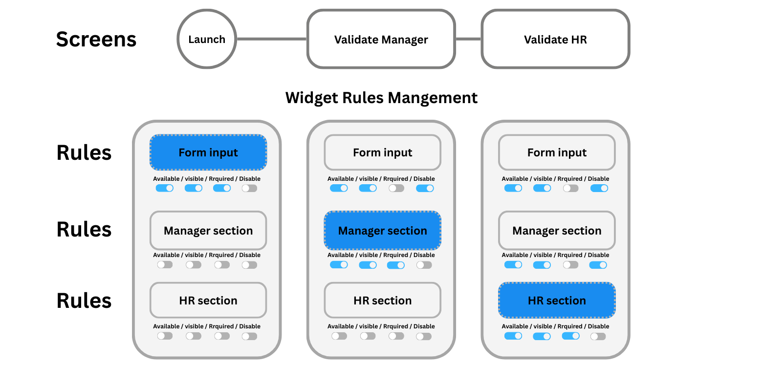
The "Screens" feature is a powerful tool for creating multi-step wizards, complex forms, or simply organizing content within a single web interface. By defining multiple screens, you can display different sets of widgets to the user without needing to create separate pages.
4.1. Creating and Linking Screens
From the Page Settings panel, you can easily create and manage all the screens associated with your web interface.
4.2. Per-Screen Widget Behavior
Softyflow provides granular control over how each widget behaves on a per-screen basis. This allows you to tailor the user experience for each step or view in your interface.
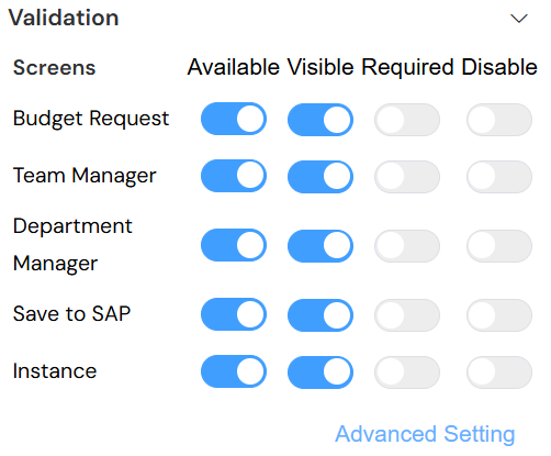
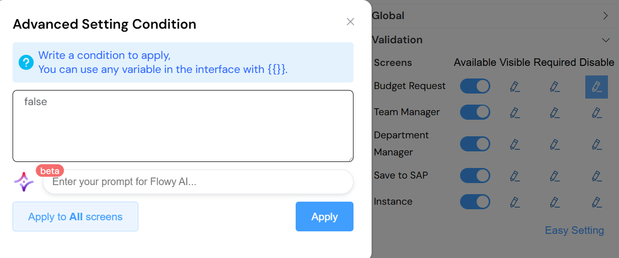
You can define the following rules for any widget on any screen:
- Available: Determines if the widget is loaded and part of the page's data model for that screen. If not available, it effectively doesn't exist.
- Visible: Controls the widget's visibility. An available widget can be hidden from the user but still be accessed and manipulated by scripts.
- Required: Marks an input widget as mandatory for form submissions on that particular screen.
- Disable: Disables user interaction with the widget, making it read-only. The widget is visible but cannot be edited.
5. Crafting User Navigation
Effective navigation is key to a great user experience. The Web Modeler provides a dedicated tool for creating and managing navigation bars (NavBars) to guide users through your application.
5.1. Creating a Nav Bar
A NavBar is the primary navigation element for your application, typically displayed at the top of the page. You can create and design NavBars directly within the Web Modeler.
5.2. Arranging Navigation Elements
Once you have created a NavBar, you can populate it with navigation elements. Each element can be a direct link to a web interface or a dropdown menu containing a list of links.
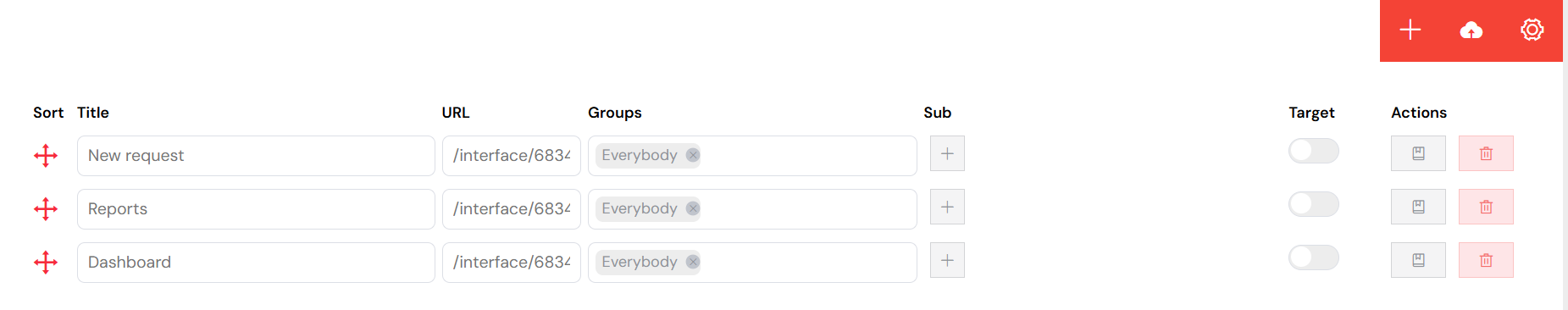
You also have fine-grained control over visibility. You can choose to show or hide each navigation element based on the current user or their group, ensuring that users only see the navigation options relevant to them.
6. Automating Logic with Actions
Actions allow you to bring your interface to life by executing logic in response to user interactions or page events. You can attach one or more actions to any UI component.
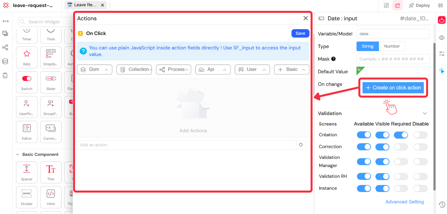
Softyflow allows you to attach actions to your UI components. These actions can be triggered in several ways:
On Mounted: The action runs as soon as the interface is loaded.
Watch: The action runs whenever a specific component's value is changed, clicked, or otherwise updated.
On Click: The action runs when a user clicks the component (typically a button).
Computed: The action functions like a computed property, dynamically calculating a return value based on other data.
You can attach multiple actions to a single component to create complex, chained behaviors.
7. Advanced Customization with Scripting
For ultimate control and flexibility, the Web Modeler provides a powerful script editor. This allows you to write custom JavaScript code to implement complex logic, manipulate components, and integrate with external services.
Softyflow's frontend is built on VueJS 2. This means you can leverage the power and familiarity of the Vue ecosystem directly within your scripts. You have access to the same lifecycle hooks (like created, mounted, and updated) and can write functions to control your interface's behavior with precision.
Mounted() (DOM Insertion)
Mounted hook is the most used lifecycle hook, called after the DOM has been rendered : allows you access to the component immediately after first render.Most frequently used to run page initializing DOM manipulation.
important: do not use mounted to fetch data, the propre hook is Created().
Mounted () : it will execut after rendering the component.
Read More