Alert Widget
The Alert widget displays informational, warning, success, or error messages to users in your application interface. This widget is based on Element UI's alert component and provides various customization options.
Overview
The Alert widget is a versatile notification component that can be used to:
- Display system messages and notifications
- Show validation feedback
- Communicate important information to users
- Provide contextual alerts based on user actions
Configuration Properties
Basic Configuration
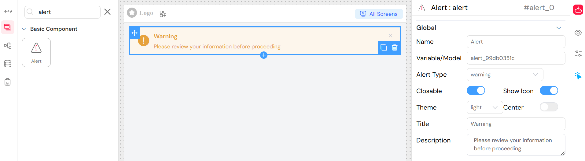
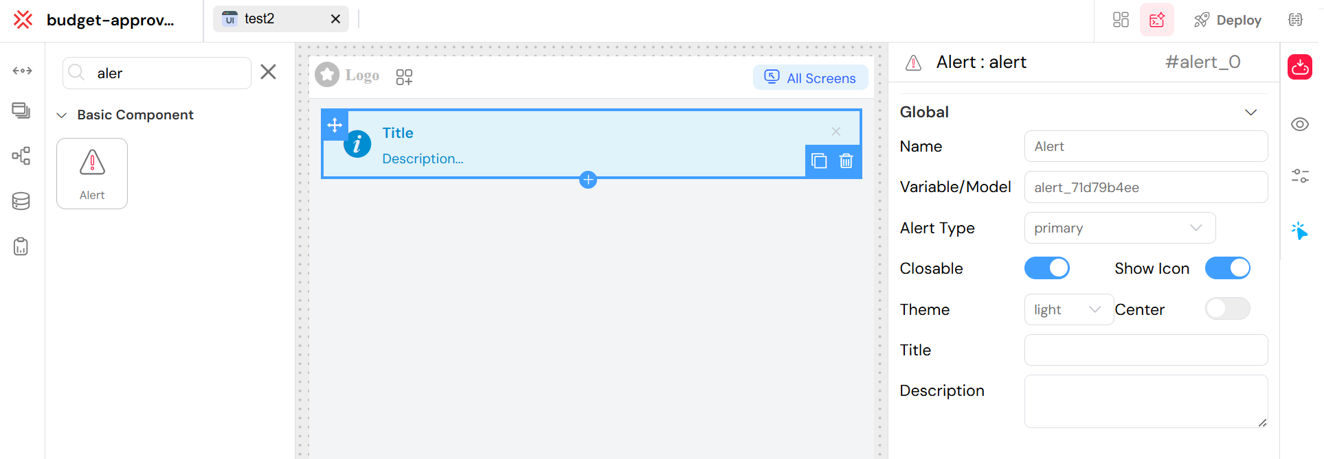
Alert Type
- Field:
type - Type: Dropdown selection
- Options:
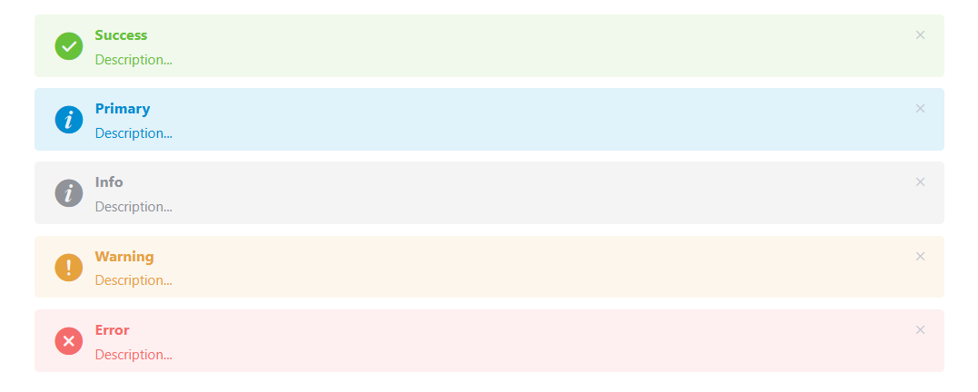
primary- Blue themed alert (default)success- Green themed alert for positive feedbackinfo- Blue themed alert for informational messageswarning- Orange/yellow themed alert for warningserror- Red themed alert for errors and critical messages
- Description: Determines the visual appearance and semantic meaning of the alert
Title
- Field:
title - Type: Text input
- Required: Optional
- Description: The main heading text displayed at the top of the alert
- Note: Supports translation using the
SF_translatefilter
Description
- Field:
description - Type: Textarea
- Required: Optional
- Description: The main content/message body of the alert. Supports HTML content
- Default: "Description..." (placeholder)
Display Options
Closable
- Field:
closable - Type: Switch (boolean)
- Default:
false - Description: When enabled, displays a close button allowing users to dismiss the alert
Show Icon
- Field:
showIcon - Type: Switch (boolean)
- Default:
false - Description: When enabled, displays a contextual icon based on the alert type (info, success, warning, error)
Center
- Field:
center - Type: Switch (boolean)
- Default:
false - Description: Centers the alert content horizontally
Theme/Effect
- Field:
effect - Type: Dropdown selection
- Options:
light- Light theme with subtle backgrounddark- Dark theme with bold background
- Default:
light - Description: Controls the visual intensity and background styling of the alert
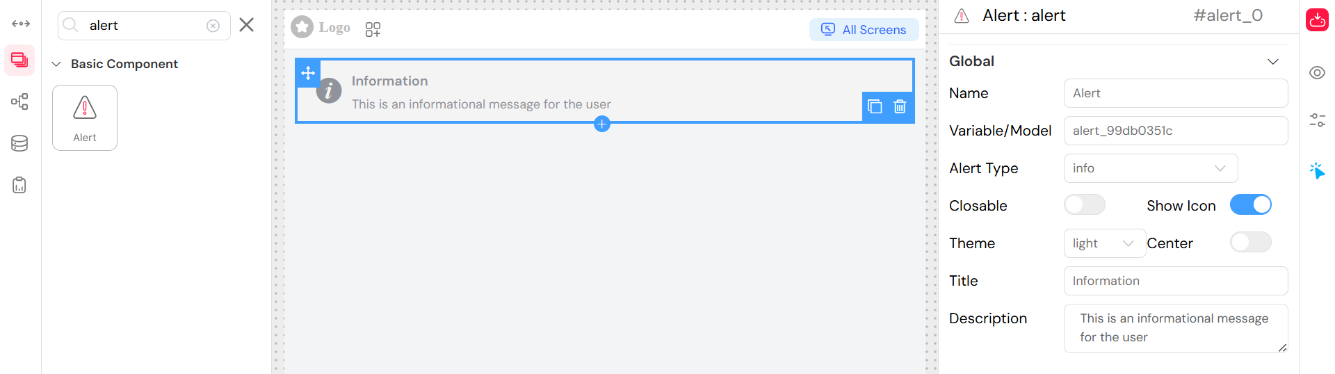
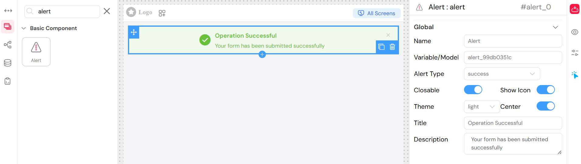
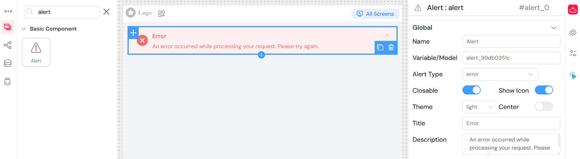
Configuration Interface
When configuring the Alert widget in the low-code platform, you'll find these options in the Global section of the widget configuration panel:
Step-by-Step Configuration
Select Alert Type
- Choose from the dropdown: Primary, Success, Info, Warning, or Error
- This determines the color scheme and default icon
Set Display Options
- Toggle Closable to allow users to dismiss the alert
- Toggle Show Icon to display contextual icons
- Toggle Center to center-align the content
- Select Theme (Light/Dark) for visual intensity
Add Content
- Enter a Title for the alert header
- Add Description text for the main message body
Usage Examples
Basic Information Alert
Success Notification
Error Alert
Warning Alert
Styling and Themes
Primary Theme
When using type: "primary", the alert automatically applies the primary-theme-alert CSS class for custom styling integration with your application's theme.
Visual Customization
- Light Effect: Subtle background with standard text
- Dark Effect: Bold background with high contrast text
- Icons: Automatically selected based on alert type when
showIconis enabled - Centering: Content alignment can be controlled with the
centeroption
Events and Interactions
While not explicitly configured in the interface, the Alert widget supports the following events at the component level:
- onClose: Triggered when the alert is dismissed (if closable)
- onShow: Triggered when the alert is displayed
Best Practices
When to Use Each Type
- Info: General information, tips, or neutral notifications
- Success: Successful operations, confirmations, positive feedback
- Warning: Cautions, non-critical issues, important notices
- Error: Failures, critical issues, validation errors
- Primary: Brand-specific alerts or custom themed messages
Accessibility Considerations
- Use clear, concise titles and descriptions
- Ensure color is not the only way to convey meaning (use icons)
- Test with screen readers when using complex HTML in descriptions
- Consider auto-dismissal timing for closable alerts
Design Guidelines
- Keep messages brief and actionable
- Use consistent alert types across your application
- Consider the visual hierarchy when placing alerts
- Use closable alerts for non-critical information
- Reserve non-closable alerts for critical system messages
Integration with Other Widgets
The Alert widget can be effectively combined with:
- Forms: For validation feedback and submission confirmations
- Buttons: To display action results
- Data Tables: For operation status messages
- Modals/Popups: For contextual notifications within dialogs
Technical Implementation
The Alert widget is implemented using:
- Frontend: Element UI (
el-alertcomponent) - Template Engine: EJS for server-side rendering
- Styling: CSS classes with theme support
- Localization: Built-in translation support via
SF_translate
This widget seamlessly integrates with the platform's form validation, state management, and theming systems.