Title Widget
Overview
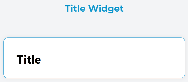
The Title widget is a versatile text heading component that allows you to create structured headings (H1-H6) within your interface. It provides flexible configuration options for styling, alignment, and dynamic content rendering.
Configuration
Global Settings
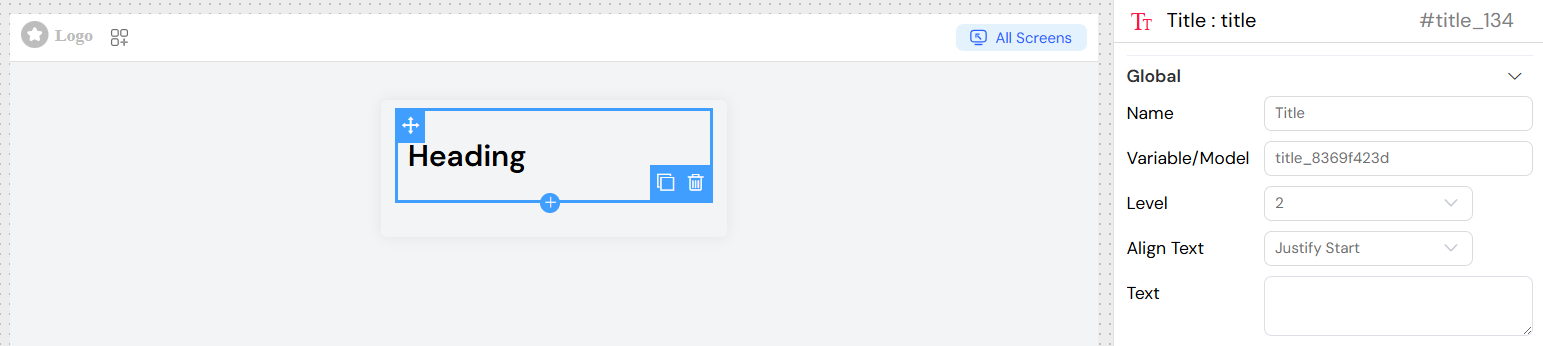
Name
- Field: Name input
- Description: Sets the internal name/identifier for the widget
- Usage: Used for referencing the widget in scripts and actions
Variable/Model
- Field: Variable/Model input
- Description: Links the widget to a data model or variable
- Usage: Enables dynamic content binding and data synchronization
- Format: Use dot notation for nested properties (e.g.,
user.name)
Title-Specific Configuration
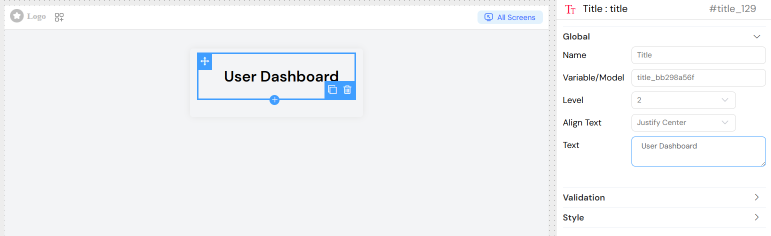
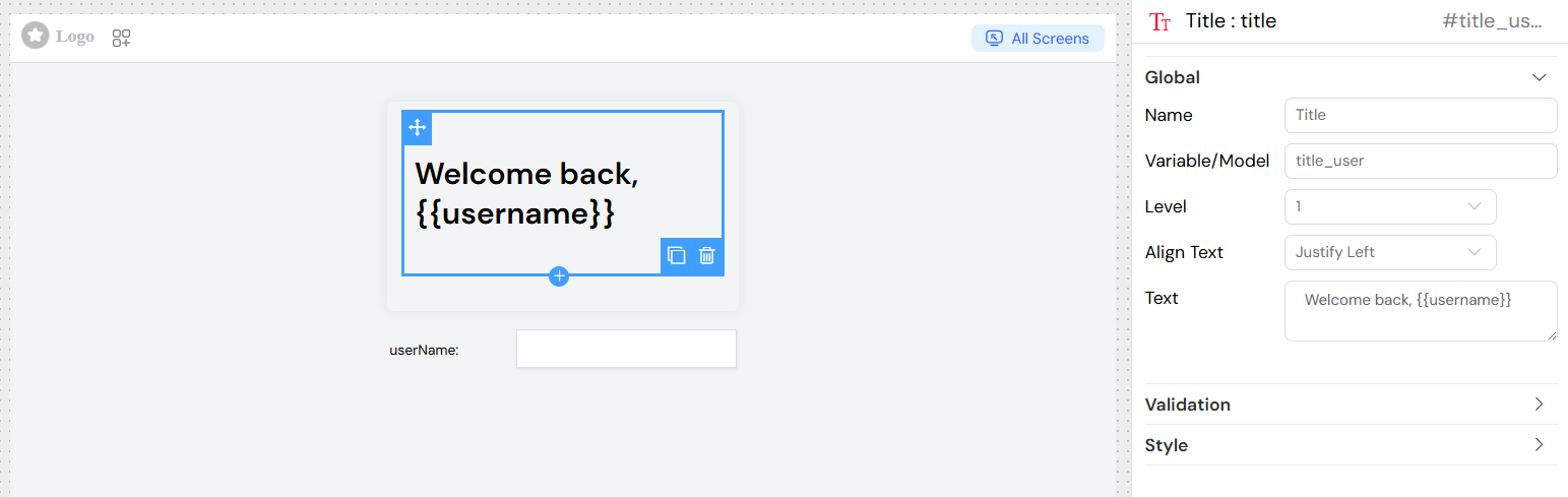
Level
- Field: Level dropdown
- Options: 1, 2, 3, 4, 5, 6
- Description: Determines the HTML heading level (H1, H2, H3, H4, H5, H6)
- Default: H1
- Usage:
- H1: Main page titles
- H2: Section headers
- H3-H6: Subsection headers
Text Alignment
- Field: Align Text dropdown
- Options:
- Center: Centers the text horizontally
- End: Aligns text to the end (right in LTR languages)
- Justify: Justifies text with even spacing
- Left: Aligns text to the left
- Right: Aligns text to the right
- Start: Aligns text to the start (left in LTR languages)
- Default: Left
Text Content
- Field: Text textarea
- Description: The actual content that will be displayed
- Features:
- Supports plain text
- Supports dynamic variables using
{{variable_name}}syntax - Multi-line text support
- HTML entities are automatically escaped
Dynamic Content
Models Binding
The title widget supports dynamic content through models interpolation:

Style Configuration
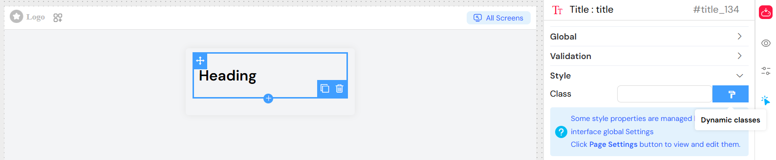
Class Names
- Field: Class input
- Description: Adds custom CSS classes to the title element
- Usage: Apply custom styling or framework classes
- Example:
custom-title primary-color
Dynamic Classes
- Field: Dynamic classes button
- Description: Configure conditional CSS classes based on data or conditions
- Usage: Classes that change based on application state
Validation and Visibility
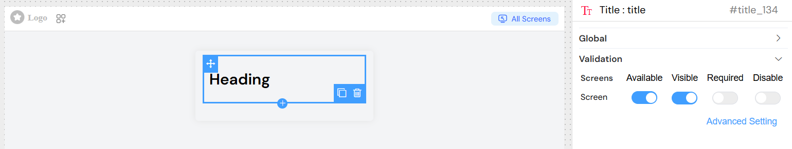
Screen-Based Configuration
The title widget supports different configurations for different screens/contexts:
- Available: Controls whether the widget exists in the interface
- Visible: Controls whether the widget is visible to users
- Required: Not applicable for title widgets (display-only component)
- Disable: Not applicable for title widgets (non-interactive component)
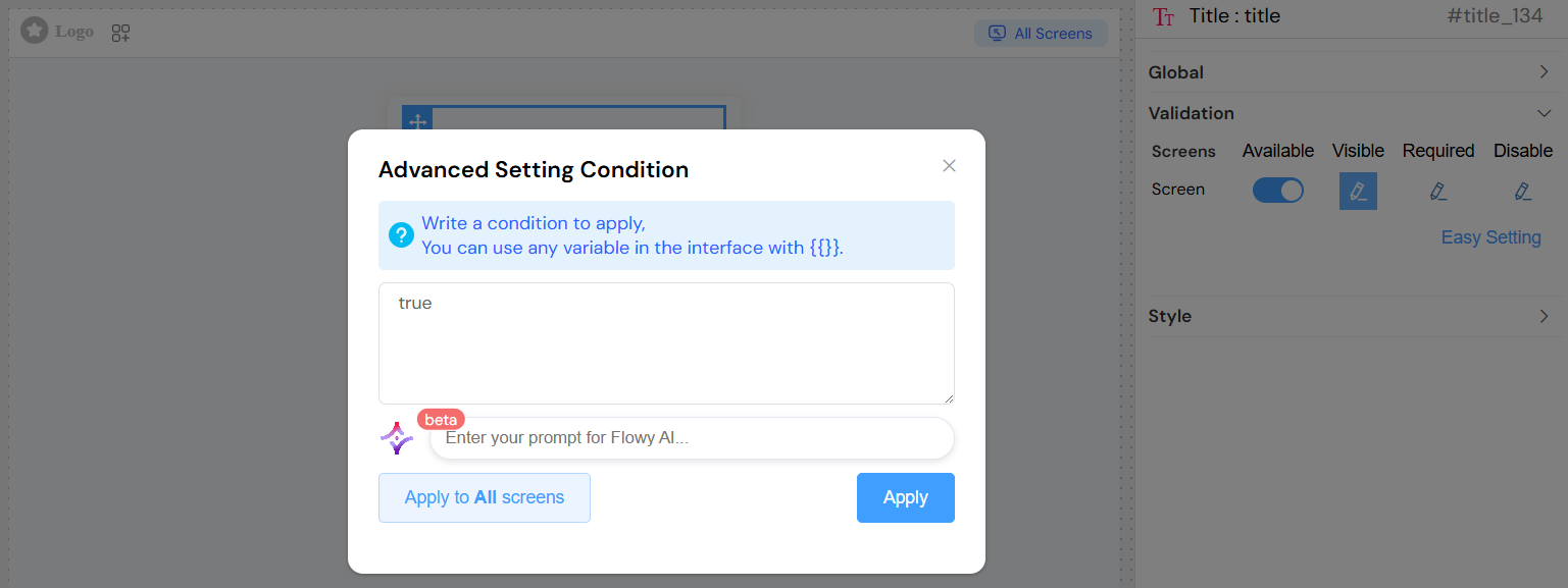
Advanced Visibility Conditions
Use JavaScript expressions for complex visibility logic:
Best Practices
Semantic Heading Structure
- Use H1 for main page titles (only one per page)
- Use H2-H6 for hierarchical content structure
- Maintain logical heading order (don't skip levels)
Content Guidelines
- Keep titles concise and descriptive
- Use sentence case rather than ALL CAPS
- Ensure titles are meaningful and accessible
Responsive Design
- Test title appearance across different screen sizes
- Consider text length for mobile displays
- Use appropriate heading levels for content hierarchy
Examples
Static Title
Dynamic Title
Troubleshooting
Common Issues
Title not displaying
- Check visibility conditions
- Verify variable bindings are correct
- Ensure the widget is marked as "Available"
Dynamic content not updating
- Verify variable names match exactly
- Check data model connectivity
- Ensure proper variable syntax
{{variableName}}
Styling issues
- Verify CSS class names are correct
- Check for conflicting styles
- Test on different screen sizes
Debug Tips
- Use browser developer tools to inspect generated HTML
- Check console for JavaScript errors
- Verify data binding in Vue DevTools