Form Widget
The Form widget is a powerful container component that allows you to create structured forms with multiple input fields, validation rules, and advanced layout options. It serves as a parent container for other form elements and provides comprehensive form management capabilities.
Overview
The Form widget creates a structured form layout using a grid system. It can contain various input components, handle validation, and manage form submission. The widget supports different screen configurations, conditional visibility, and advanced validation rules.
Configuration Options
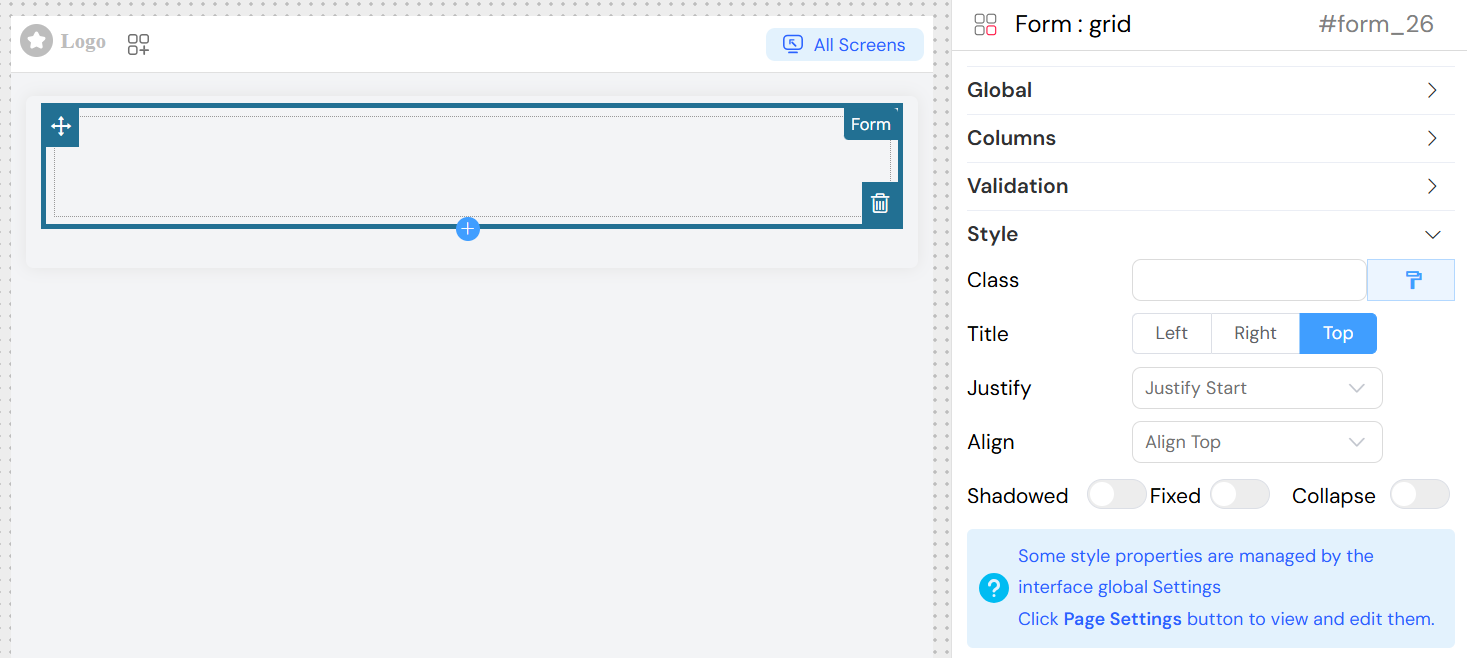
Global Settings
Basic Configuration
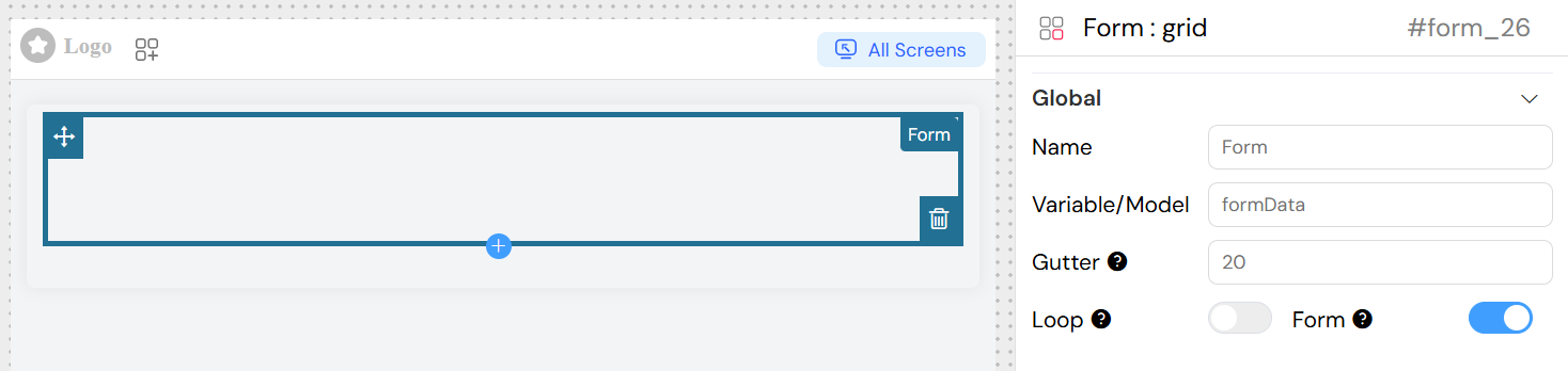
- Name: Display name for the form widget
- Variable/Model: The data model that will store the form values (e.g.,
userForm,contactData) - Form: Create a separate form instance from the main page form
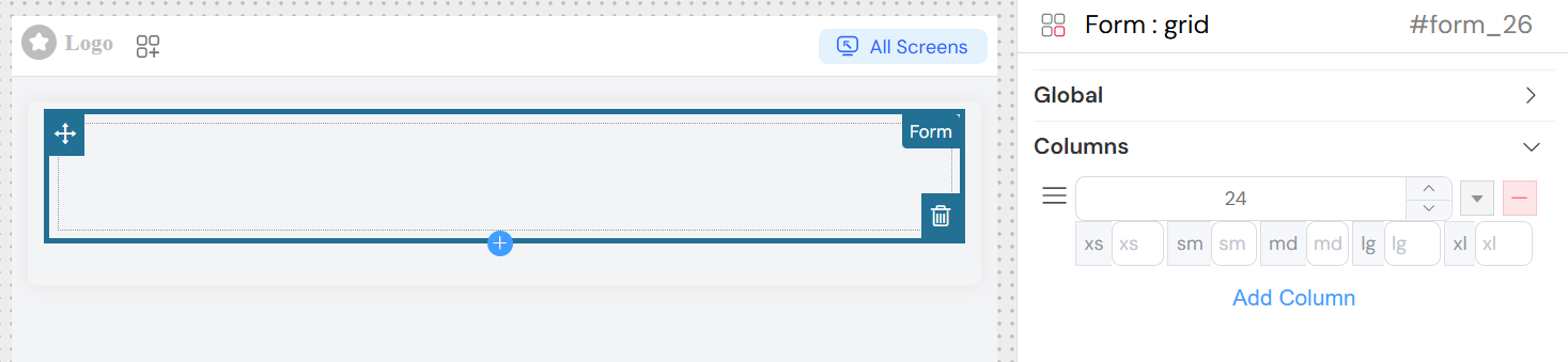
Form Columns Structure
The form uses a column-based layout system where you can:
Add Columns: Create new columns with specific span widths
Configure Responsive Breakpoints:
xs: Extra small screenssm: Small screensmd: Medium screenslg: Large screensxl: Extra large screens
Drag and Drop: Reorder columns using the drag handles
Remove Columns: Delete unnecessary columns
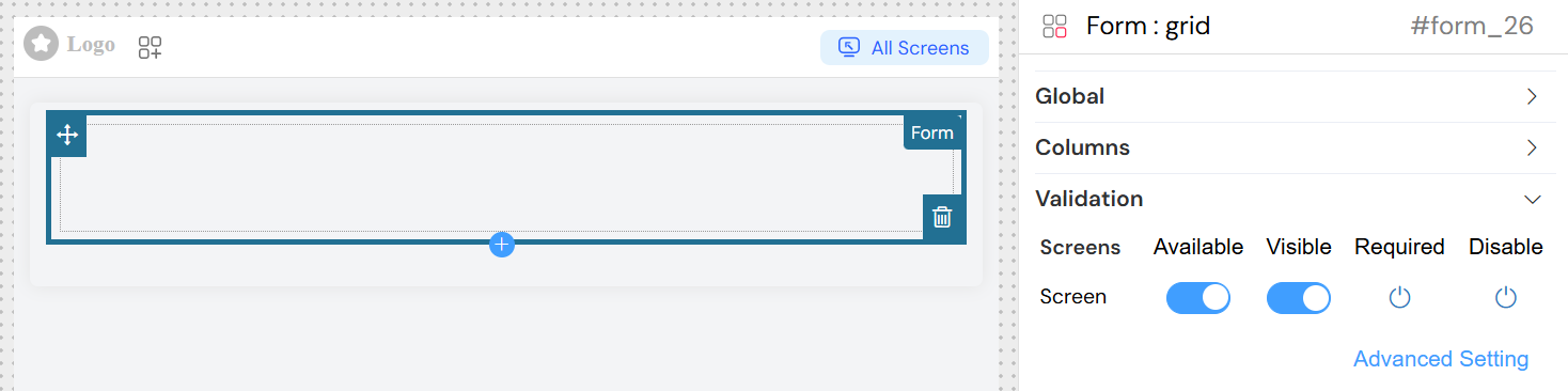
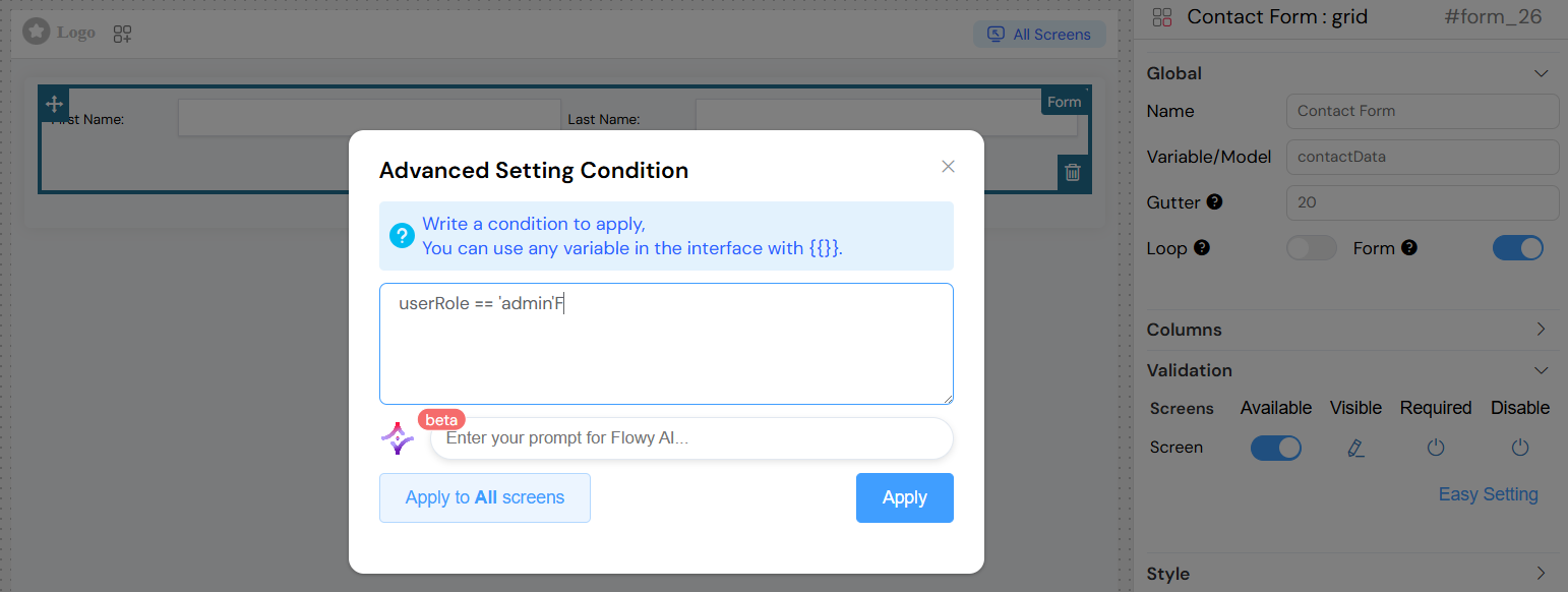
Validation Configuration
The form widget supports comprehensive validation across different screens (views/pages).
Screen-Based Validation
For each screen in your application, you can configure:
- Available: Whether the form is available on this screen
- Visible: Control form visibility with boolean or conditional expressions
- Required: Make form fields required on specific screens
- Disable: Disable the entire form on certain screens
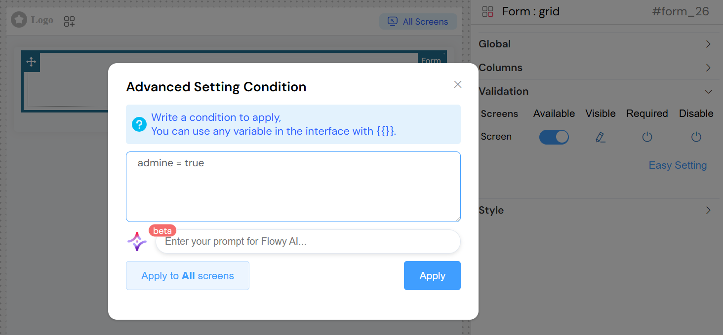
Advanced Validation
- Conditional Expressions: Use dynamic expressions for visibility and validation
- Reference other form fields:
{{fieldName}} - Use comparison operators:
{{age}} > 18 - Complex conditions:
{{userType}} === 'admin' && {{status}} === 'active'
- Reference other form fields:
Style Configuration
layout Configuration
Label Position: Choose how labels are positioned relative to inputs
left: Labels appear to the left of inputsright: Labels appear to the right of inputstop: Labels appear above inputs
Justify: Horizontal alignment of form elements
start: Align to the startend: Align to the endcenter: Center alignmentspace-around: Distribute with space aroundspace-between: Distribute with space between
Align: Vertical alignment of form elements
top: Align to topmiddle: Center verticallybottom: Align to bottom
Shadowed: Add shadow effect to the form
Fixed: Make the form position fixed
Collapse: Enable collapsible form sections
Basic Styling
- Width: Set form width (pixels, percentages, or CSS units)
- Height: Set form height
- Class Names: Add custom CSS classes for styling
- Dynamic Classes: Apply classes based on conditions
Layout Options
- Layout Mode:
Block: Form takes full widthInline: Form elements display inline
- Border: Enable/disable form border
Usage Examples
Basic Contact Form
Conditional Form
Best Practices
Form Design
- Logical Grouping: Group related fields in the same column
- Responsive Design: Configure appropriate breakpoints for different screen sizes
- Clear Labels: Use descriptive labels for form fields
- Validation Feedback: Provide clear error messages
Performance
- Efficient Models: Use specific model names to avoid data conflicts
- Conditional Loading: Use visibility conditions to load forms only when needed
- Minimal Nesting: Avoid excessive nesting of form components
User Experience
- Progressive Disclosure: Use collapse feature for complex forms
- Visual Hierarchy: Use spacing and alignment to guide user attention
- Feedback: Provide immediate validation feedback
- Accessibility: Ensure proper label associations and keyboard navigation
Data Management
- Consistent Naming: Use consistent naming conventions for models
- Validation Strategy: Implement both client-side and server-side validation
- Error Handling: Plan for graceful error handling and recovery
Technical Implementation
Component Structure
The form widget generates a Vue.js component that:
- Manages form state and validation
- Handles nested component communication
- Provides data binding capabilities
- Supports dynamic form generation
Integration Points
- Parent Components: Can be embedded in pages, popups, or other containers
- Child Components: Contains and manages various input widgets
- Data Layer: Integrates with the application's data management system
- Validation System: Connects to the platform's validation framework
This documentation provides a comprehensive guide to configuring and using the Form widget effectively in your application interface.