Button Widget
The Button widget creates interactive clickable buttons that can trigger various actions within your interface. This widget provides extensive customization options for appearance, behavior, and functionality.
Overview
The Button widget is a versatile UI component that allows users to trigger actions, submit forms, navigate between pages, or execute custom functions. It supports multiple visual styles, sizes, icons, and positioning options.
Basic Configuration
Global Settings
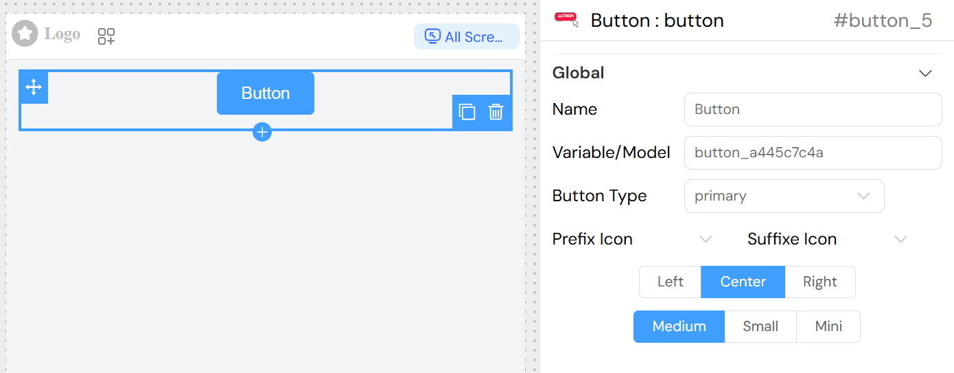
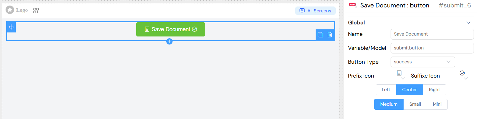
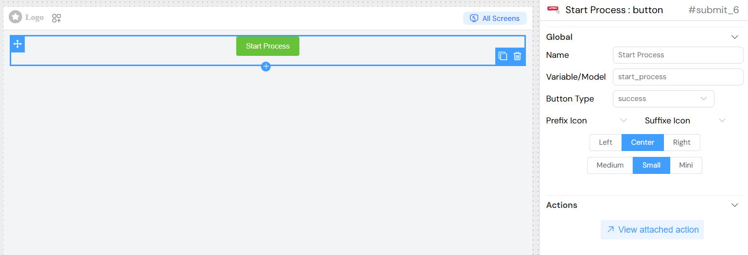
Name
- Field: Name
- Description: Display name for the button
- Type: Text input
- Usage: This text appears on the button and can be translated
Variable/Model
- Field: Variable/Model
- Description: The data model or variable name associated with this button
- Type: Text input
- Usage: Used for data binding and referencing the button in scripts
Button Properties
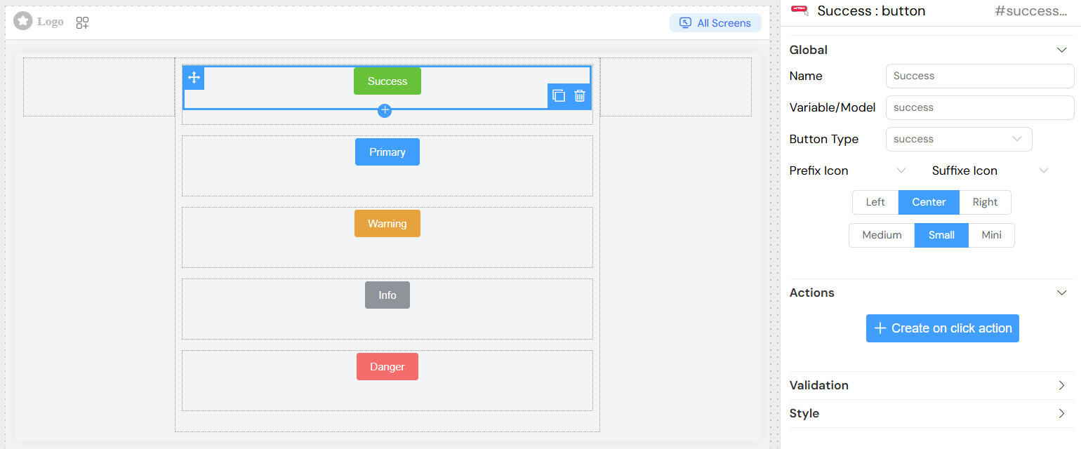
Button Type
- Field: Button Type
- Options:
primary- Primary action button (typically blue)success- Success/confirmation button (typically green)info- Informational button (typically light blue)warning- Warning button (typically orange/yellow)danger- Destructive action button (typically red)
- Default:
primary
Size Options
- Field: Size
- Options:
medium- Standard size buttonsmall- Smaller buttonmini- Minimal size button
- Default:
medium
Alignment
- Field: Float
- Options:
left- Align button to the leftcenter- Center the buttonright- Align button to the right
- Default:
left
Icon Configuration
Prefix Icon
- Field: Prefix Icon
- Description: Icon displayed before the button text
- Type: Icon selector
- Usage: Choose from available icon library
Suffix Icon
- Field: Suffix Icon
- Description: Icon displayed after the button text
- Type: Icon selector
- Usage: Choose from available icon library
Actions Configuration
On Click Action
The button supports comprehensive action configuration through a dedicated action editor:
- Script Execution: Execute custom JavaScript code
- Form Submission: Submit parent form data
- Navigation: Navigate to other pages or URLs
- API Calls: Make HTTP requests to external services
- Variable Updates: Modify interface variables
- Function Calls: Trigger predefined functions
Action Properties
- SF_input: Access to input context and current data
- SF_currentIndex: Current index in loop contexts
- Loading State: Automatic loading indicator during action execution
- Error Handling: Built-in error management
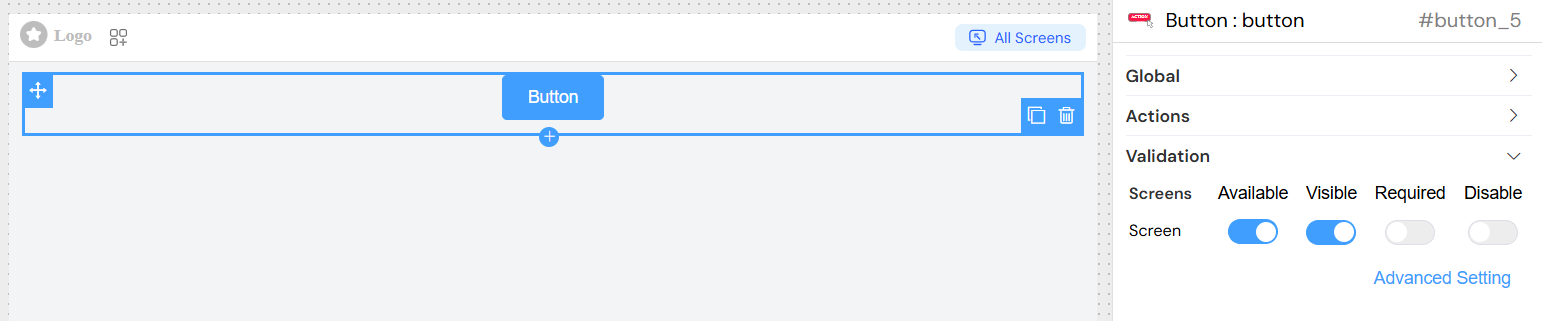
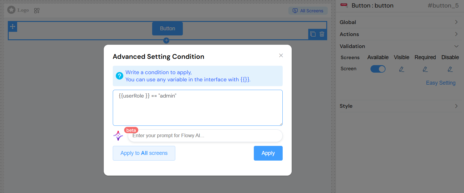
Validation and Visibility
Screen-Based Validation
Configure button behavior across different screens/contexts:
Available
- Description: Controls if the button exists in the interface
- Type: Boolean or conditional expression
- Default:
true
Visible
- Description: Controls button visibility
- Type: Boolean or conditional expression
- Options:
- Simple toggle (true/false)
- Advanced conditional expression using variables
Required
- Description: Validation requirement (if part of form)
- Type: Boolean or conditional expression
- Context: Only applicable when button is part of form validation
Disabled
- Description: Controls if button is interactive
- Type: Boolean or conditional expression
- Effect: Button appears grayed out and non-clickable when disabled
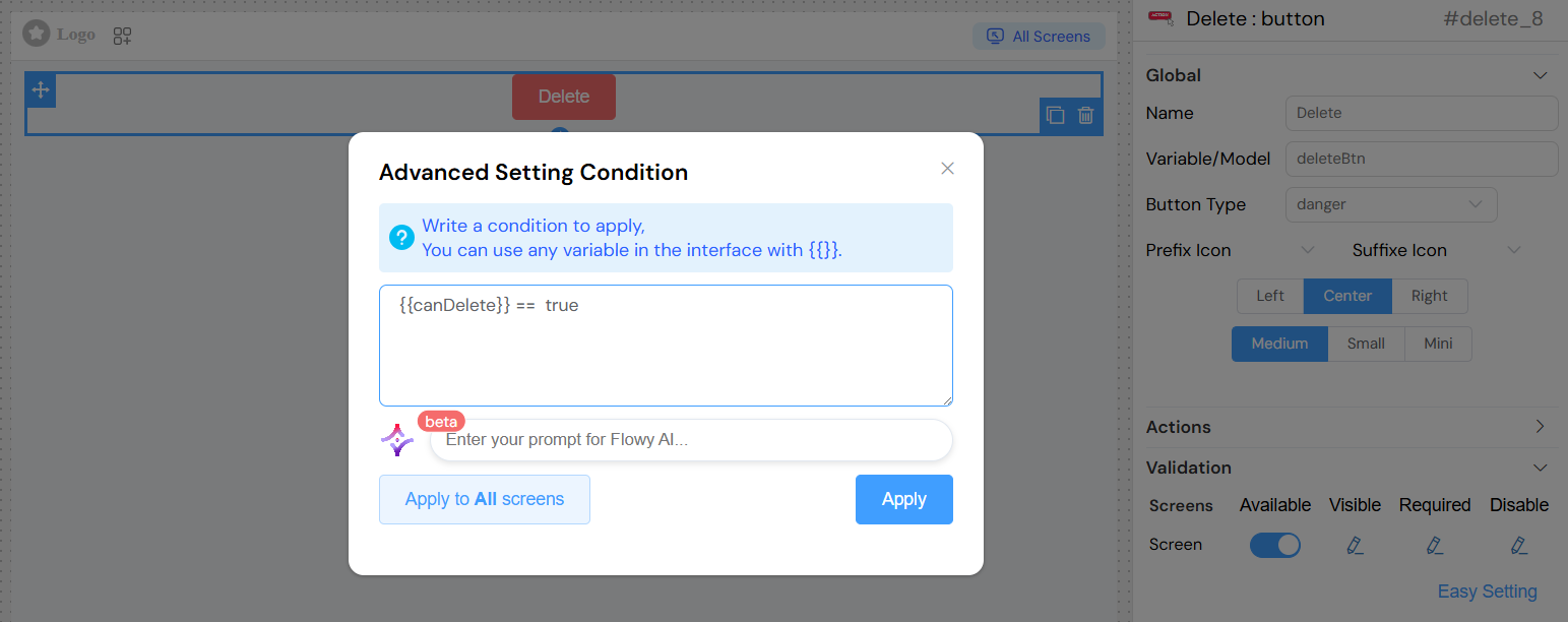
Advanced Conditional Logic
Use conditional expressions with interface variables:
Styling and Appearance
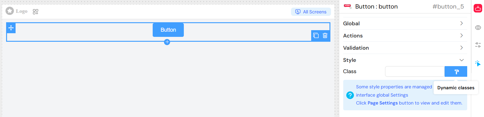
CSS Classes
- Field: Class
- Description: Custom CSS classes for styling
- Type: Text input (comma-separated)
- Usage: Apply custom styles or framework classes
Dynamic Classes
Advanced styling based on conditions:
- Dynamic Class Configuration: Apply classes conditionally
- State-Based Styling: Different styles for different states
- Responsive Classes: Classes that adapt to screen size
Layout Options
- Block vs Inline: Control button layout behavior
- Width: Custom width settings
- Height: Custom height settings
Usage Examples
Basic Button
Button with Icons
Action Button with Start Process
Conditional Button
Events
onClick
- Trigger: When button is clicked
- Context: Provides access to current data and form state
- Parameters:
SF_input: Input context objectSF_currentIndex: Current loop index (if applicable)
Loading States
- Automatic Loading: Button shows loading spinner during async operations
- Disabled During Loading: Button becomes non-interactive during action execution
Best Practices
Action Design
- Clear Labels: Use descriptive button text
- Appropriate Types: Match button type to action severity
- Loading Feedback: Ensure async actions show loading states
- Error Handling: Implement proper error management
Visual Design
- Consistent Sizing: Use consistent sizes within form groups
- Logical Positioning: Place primary actions prominently
- Icon Usage: Use icons to enhance, not replace, clear text
- Color Coding: Follow standard color conventions
Accessibility
- Keyboard Navigation: Ensure buttons are keyboard accessible
- Screen Reader Support: Use meaningful button names
- Focus Management: Proper focus handling in forms
- Contrast: Ensure sufficient color contrast
Form Integration
- Validation Context: Consider button role in form validation
- Submit Behavior: Configure appropriate form submission
- Field Dependencies: Set up proper field relationships
Advanced Features
Form Integration
- Submit Forms: Automatically submit parent forms
- Validation Triggers: Trigger form validation
- Field Dependencies: React to other form field changes
Loop Context
- Loop Integration: Special handling within data loops
- Index Access: Access to current loop iteration
- Dynamic Properties: Properties that change per loop item
Custom Styling
- Theme Integration: Integrates with interface theme settings
- Responsive Design: Adapts to different screen sizes
- Custom CSS: Support for custom styling
Troubleshooting
Common Issues
- Button Not Responding: Check if disabled or validation conditions
- Actions Not Executing: Verify action configuration and permissions
- Styling Issues: Check CSS class conflicts
- Loading States: Ensure async actions are properly handled
Debugging
- Browser Console: Check for JavaScript errors
- Network Tab: Monitor API calls during button actions
- State Inspection: Verify variable states and conditions