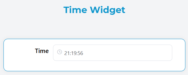
Time Widget
The Time widget allows users to select and input time values with a user-friendly time picker interface. It supports both single time selection and time range selection with extensive customization options.
Overview
The Time widget provides an intuitive way for users to select time values in your forms. It features a clean interface with optional arrow controls, customizable formatting, and support for time ranges. The widget includes built-in validation and can be easily integrated into forms with other components.
Configuration Options
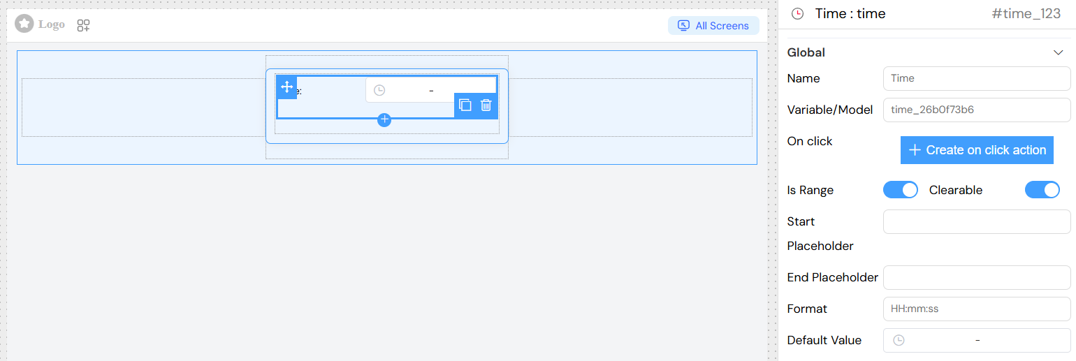
Global Settings
Basic Configuration
- Name: Display name for the widget field
- Variable/Model: The data model property where the selected time will be stored
- Default Value: Pre-selected time value when the widget loads
Time Type Settings
- Is Range: Enable to allow selection of time ranges (start time and end time)
- When enabled, users can select both a start and end time
- When disabled, only a single time can be selected
Format and Display
- Format: Time display format (e.g., "HH:mm", "HH:mm:ss")
HH:mm- 24-hour format with hours and minutesHH:mm:ss- 24-hour format with hours, minutes, and secondshh:mm A- 12-hour format with AM/PM
- Arrow Control: Enable arrow controls for easier time selection
- Clearable: Allow users to clear the selected time
Placeholder Configuration
- Placeholder: Text shown when no time is selected (for single time selection)
- Start Placeholder: Text shown for the start time field (when Is Range is enabled)
- End Placeholder: Text shown for the end time field (when Is Range is enabled)
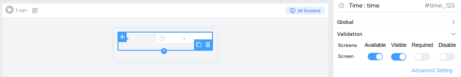
Validation
Screen-based Validation
Configure different validation rules for different application screens:
- Available: Control if the widget appears on specific screens
- Visible: Control the visibility of the widget based on conditions
- Required: Make the time selection mandatory
- Disabled: Disable the widget to prevent user interaction
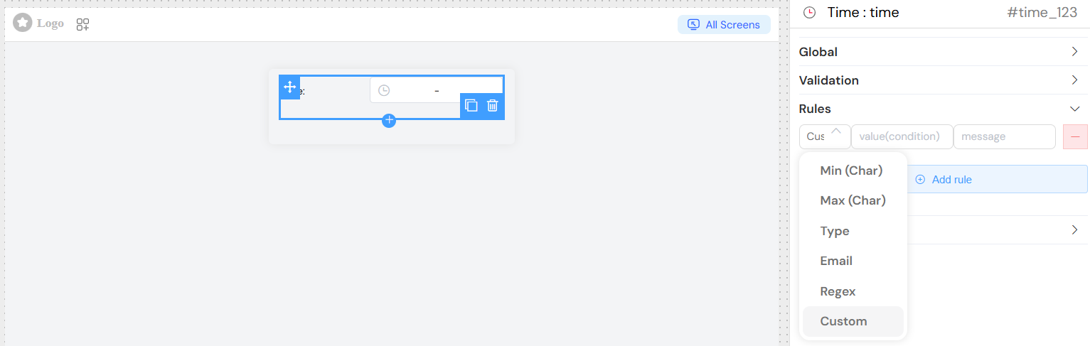
Validation Rules
Add custom validation rules:
- Custom Rules: Define specific validation logic with custom error messages
- Built-in Validation: Automatic validation for required fields
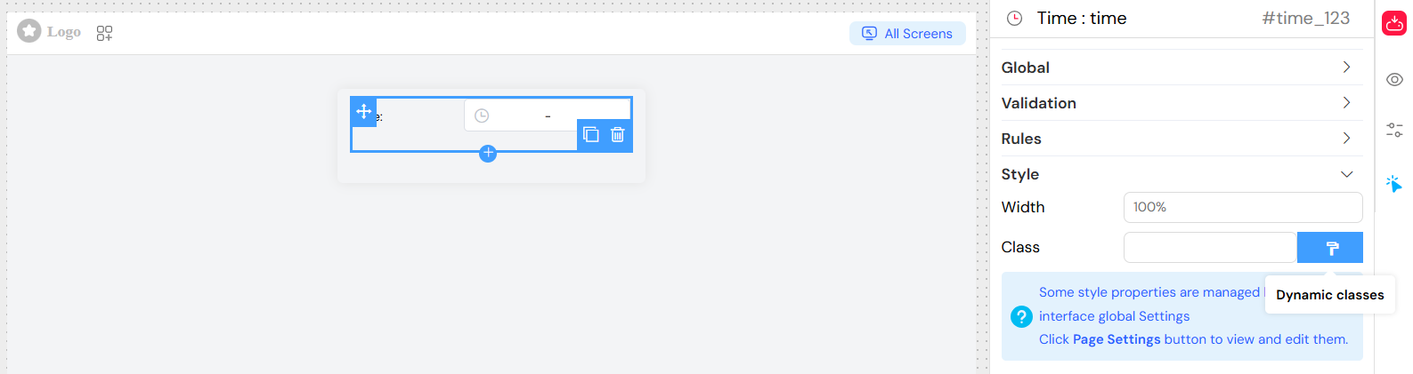
Style Configuration
Layout Options
- Width: Set the widget width (e.g., "100%", "300px")
- Class Names: Add custom CSS classes for styling
- Dynamic Classes: Apply conditional CSS classes based on form state
Responsive Design
- The widget automatically adapts to different screen sizes
- Supports responsive width settings
Actions
- Triggered when the user selects or changes a time value
- Access the selected time value in your action handlers
- Use for real-time form validation or dependent field updates
- Configure custom actions when users interact with the widget
- Integrate with form workflows and business logic
](/img/04_ressources/project/web-interface/widgets/timeActions.png)
Time Formats
Common Format Options
- HH:mm - 24-hour format (e.g., 14:30)
- HH:mm:ss - 24-hour format with seconds (e.g., 14:30:45)
- hh:mm A - 12-hour format with AM/PM (e.g., 2:30 PM)
- hh:mm:ss A - 12-hour format with seconds and AM/PM
Custom Formats
You can define custom time formats based on your application requirements. The widget supports standard time formatting patterns.
Data Handling
Single Time Value
When isRange is false, the widget returns a single time string in the specified format.
Time Range Value
When isRange is true, the widget returns an array with two elements:
[0]- Start time[1]- End time
Default Values
- Single Time: Provide a time string in the specified format
- Time Range: Provide an array with start and end times
Best Practices
Time Format Selection
- Use 24-hour format (HH:mm) for international applications
- Use 12-hour format (hh:mm A) for region-specific applications
- Include seconds only when precision is required
User Experience
- Provide clear placeholder text indicating expected format
- Use arrow controls for easier time selection
- Enable clearable option for optional time fields
Validation
- Set appropriate validation rules for business requirements
- Provide clear error messages for validation failures
- Consider time zone implications for your application
Performance
- Use default values strategically to improve user experience
- Consider the impact of real-time validation on performance
- Optimize change event handlers for complex forms
Troubleshooting
Common Issues
- Format Mismatch: Ensure default values match the specified format
- Range Validation: When using ranges, validate that end time is after start time
- Time Zone: Consider time zone handling in your application logic
Debugging
- Check browser console for validation errors
- Verify that the model property is correctly bound
- Ensure placeholder text is properly configured for range selections