Input Widget
Overview
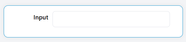
The Input widget is a versatile form component that allows users to enter and edit text, numbers, and other data types. It provides comprehensive validation, formatting, and styling options to create robust form interfaces.
Basic Configuration
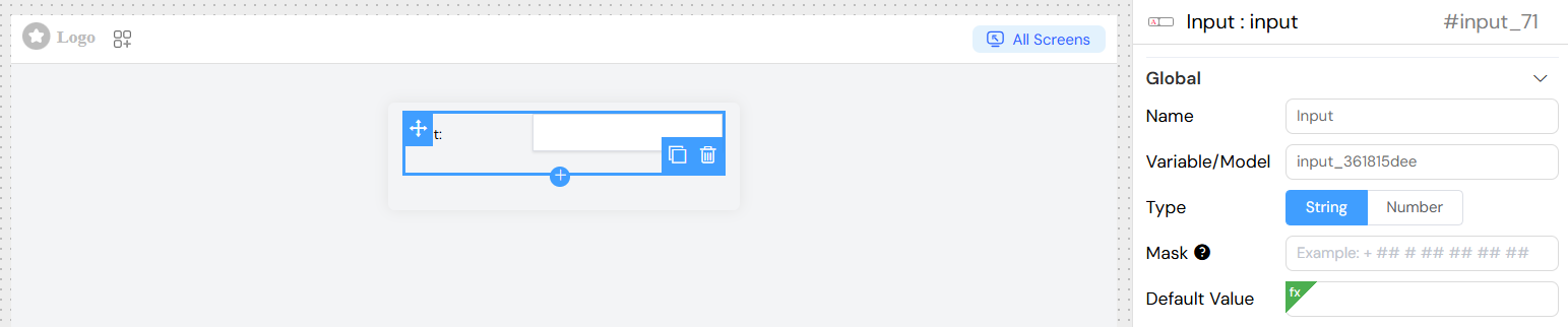
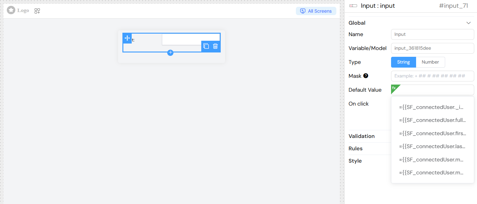
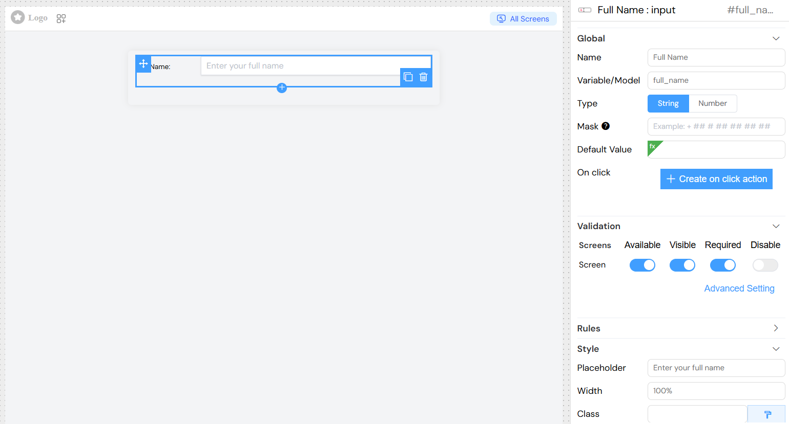
Global Settings
| Field | Description | Required |
|---|---|---|
| Name | Display label for the input field | Yes |
| Variable/Model | Variable name to bind the input value | Yes |
| Default Value | Initial value when the component loads | No |
Data Types
The input widget supports two primary data types:
String Type
- Use Case: Text input, formatted strings, masked inputs
- Features:
- Input masking for formatted entries
- Text validation rules
- Custom placeholder text
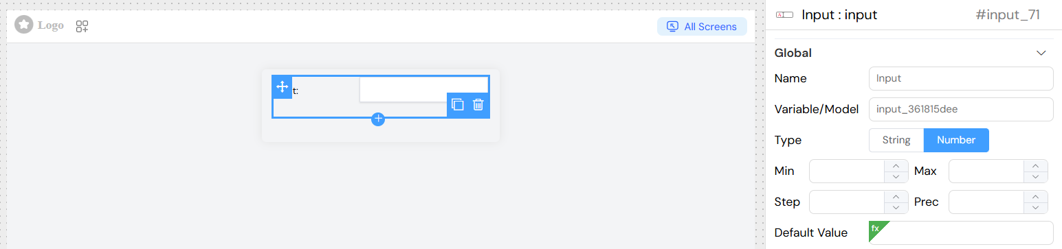
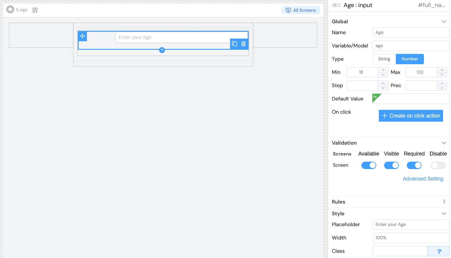
Number Type
- Use Case: Numeric input with validation
- Features:
- Min/Max value constraints
- Step increment control
- Precision settings for decimal places
Data Type Configuration
String Configuration
Input Masking
Use masks to format user input automatically:
| Mask Character | Pattern | Description |
|---|---|---|
# | /\d/ | Numeric digit |
X | /[0-9a-zA-Z]/ | Alphanumeric character |
S | /[a-zA-Z]/ | Alphabetic character |
A | /[a-zA-Z]/ | Uppercase alphabetic |
a | /[a-zA-Z]/ | Lowercase alphabetic |
! | Escape character | Literal character |
Example Masks:
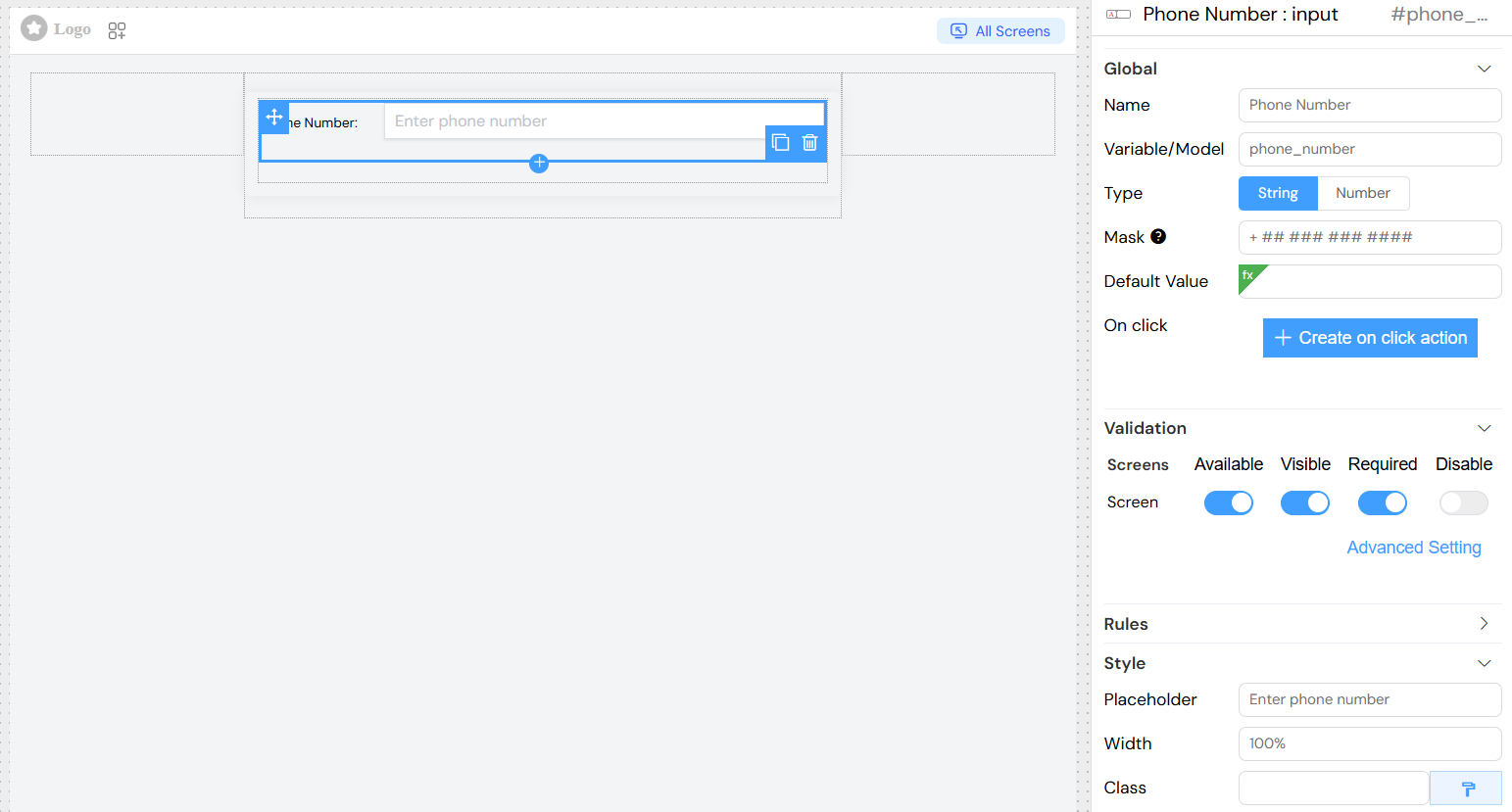
- Phone Number:
+ ## # ## ## ## ## - Credit Card:
#### #### #### #### - Date:
##/##/####
Number Configuration
| Setting | Description | Default |
|---|---|---|
| Min | Minimum allowed value | None |
| Max | Maximum allowed value | None |
| Step | Increment/decrement step | 1 |
| Precision | Decimal places | None |
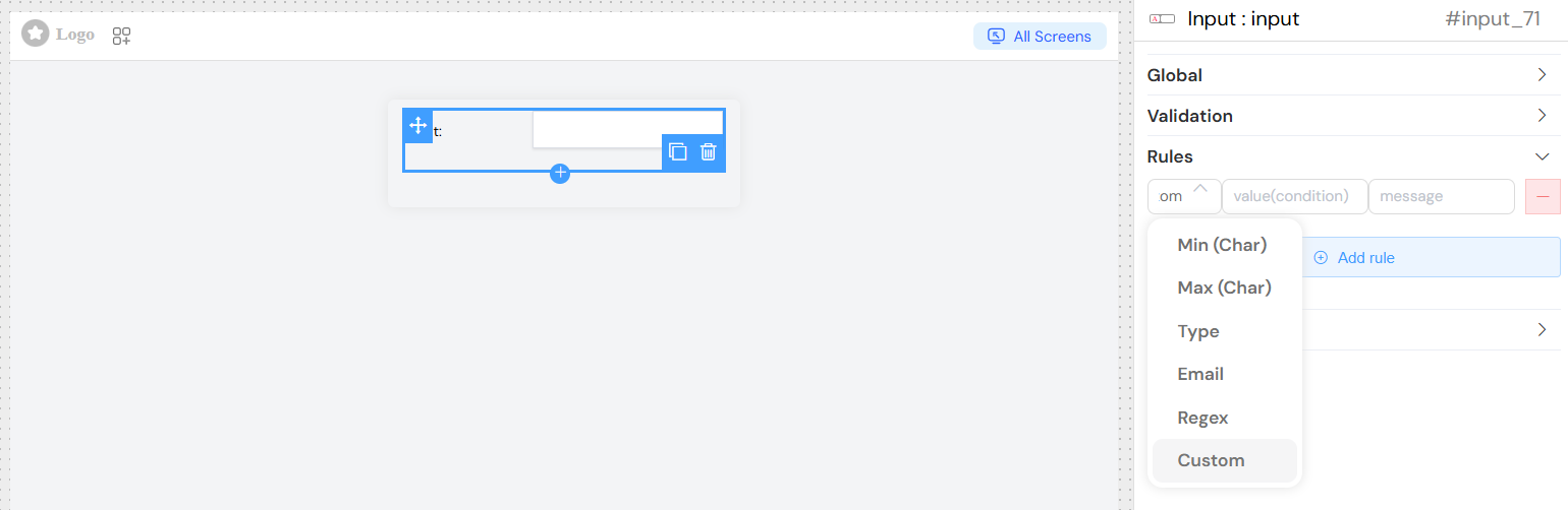
Validation and Rules
Custom Validation Rules
Add custom validation rules with:
- Rule Type: Select from predefined validation patterns
- Value: Validation parameter (e.g., minimum length)
- Message: Custom error message to display
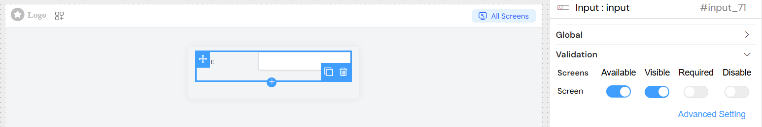
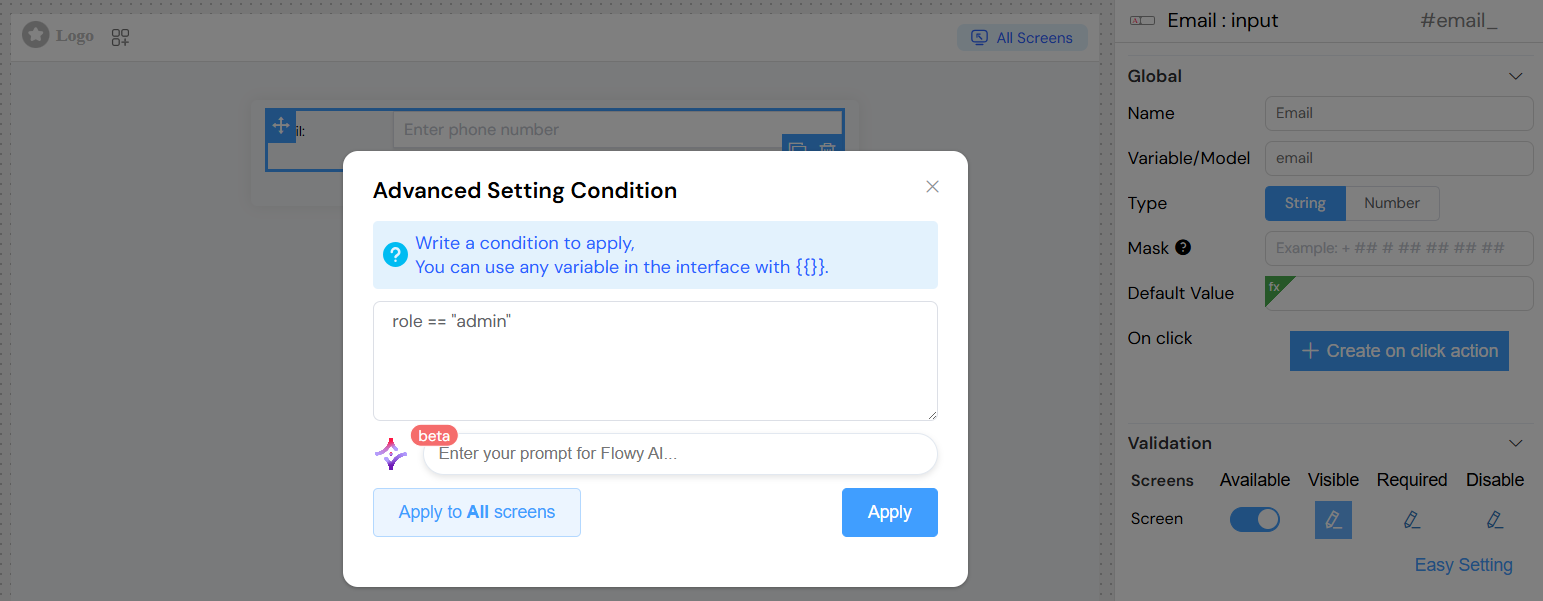
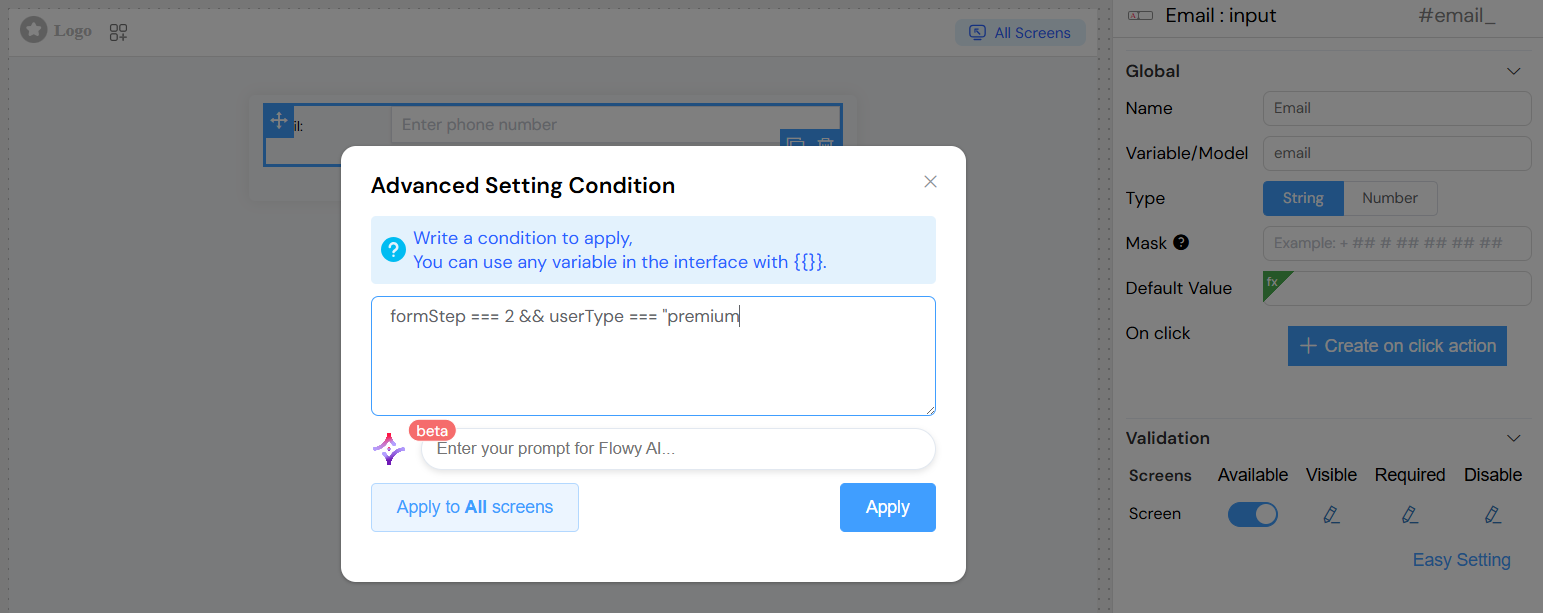
Screen-based Validation
Configure different validation behaviors for different screens:
| Property | Description |
|---|---|
| Available | Whether the widget appears on this screen |
| Visible | Whether the widget is visible (can use conditions) |
| Required | Whether the field is mandatory |
| Disabled | Whether the field is read-only |
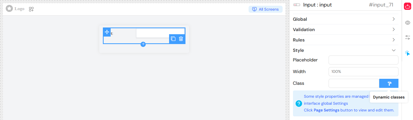
Styling Options
Basic Styling
| Property | Description | Example |
|---|---|---|
| Placeholder | Hint text displayed when empty | "Enter your name" |
| Width | Component width | "100%", "200px" |
| Class Names | CSS classes for custom styling | "custom-input, large" |
Dynamic Classes
Configure classes that change based on conditions:
- Use the dynamic classes editor
- Reference form variables and data
- Apply conditional styling
Advanced Features
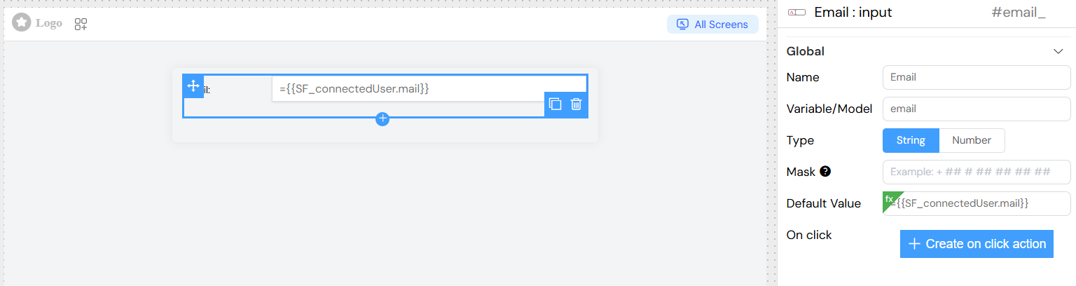
Dynamic Default Values
Set default values that can reference other form data:
Event Handling
onChange Event
Triggered when the input value changes:
- Access the new value via event parameter
- Automatically enforces min/max constraints for numbers
- Can trigger custom actions and functions
Working with Actions and SF_input
Attaching Actions to onChange Event
You can attach custom actions to the input widget's onChange event to respond to value changes in real-time. This is useful for:
- Updating other fields based on the input value
- Triggering calculations or validations
- Fetching related data from the backoffice
- Implementing cascading field updates
How to Attach an Action
- Navigate to the Global section in the widget configuration
- Find the On Change event Button
- You can attach actions to the widget
- The system will execute your code whenever the input value changes
Accessing Values with SF_input
When working with onChange events, you have access to the SF_input object that contains information about the value change:
SF_input Structure for Input Widget
{
  value: /* The value after the change */,
  SF_currentIndex:  /*  The index of the loop where the change has been done, This is only available for Inputs inside a loop */
}
Best Practices for Actions
- Keep Actions Lightweight: Avoid heavy computations in onChange events
- Debounce API Calls: If fetching data, consider debouncing to avoid excessive requests
- Handle Errors: Always include error handling in your action code
- Validate Input: Check if values exist before using them
- Use Clear Variable Names: Make your code readable for future maintenance
Currency Support
Special handling for currency inputs:
- Automatic formatting based on locale
- Currency symbol display
- Decimal precision control
Integration Features
Form Integration
When used within a form:
- Automatic form validation
- Submit/reset handling
- Parent form state management
Loop Integration
When used in loops:
- Access to loop index via
SF_currentIndex - Independent validation per loop item
- Dynamic field naming
Action Integration
Configure onClick actions:
- Custom JavaScript functions
- API calls and data operations
- Navigation and UI interactions
Usage Examples
Basic Text Input
Phone Number with Mask
Numeric Input with Constraints
Dynamic Default Value
Conditional Visibility
Simple Conditions
Complex Conditions
Best Practices
Field Naming
- Use descriptive variable names
- Follow consistent naming conventions
- Avoid spaces and special characters in variable names
Validation
- Provide clear error messages
- Use appropriate data types
- Set reasonable min/max constraints
User Experience
- Use meaningful placeholders
- Group related fields logically
- Provide immediate feedback on validation
Performance
- Avoid complex default value expressions
- Use efficient validation rules
- Minimize unnecessary re-renders
Troubleshooting
Common Issues
Validation Not Working
- Check required field configuration
- Verify custom validation rules syntax
- Ensure proper screen validation setup
Mask Not Applied
- Verify mask syntax using supported characters
- Ensure string data type is selected
- Check for conflicting CSS styles
Default Values Not Loading
- Verify variable references exist
- Check expression syntax
- Ensure referenced data is available
Styling Issues
- Verify CSS class names
- Check width/height values
- Ensure proper CSS specificity
Debug Tips
- Use browser developer tools to inspect generated HTML
- Check console for JavaScript errors
- Verify form data binding in Vue DevTools
- Test validation rules independently
Browser Compatibility
The input widget is compatible with:
- Chrome 60+
- Firefox 55+
- Safari 12+
- Edge 79+
Related Components
- Textarea Widget: For multi-line text input
- Select Widget: For dropdown selections
- Date Widget: For date/time input
- Currency Widget: For specialized currency handling