Image Widget
The Image widget is a versatile hero section component designed to create eye-catching banner areas with background images, titles, and descriptions. It's perfect for creating prominent call-to-action sections, featured content areas, or page headers.
Overview
The Image widget displays a large rectangular container with:
- A background image that covers the entire area
- Overlay text content (title and description)
- Customizable dimensions and alignment
- Responsive design capabilities
- Full styling control
Configuration Options
Global Settings
Basic Properties
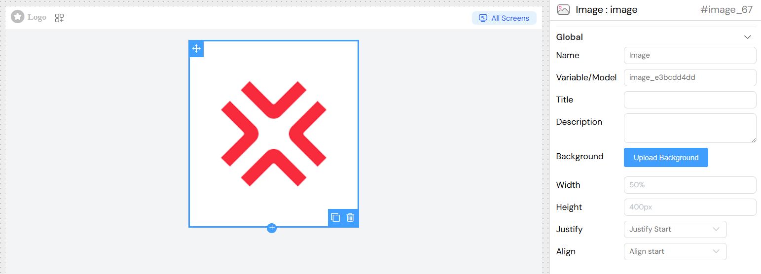
- Name: A descriptive name for your image widget
- Variable/Model: The data model variable name that will store any related data
Content Configuration
Title
- Field Type: Text input
- Description: The main heading text displayed prominently on the image
- Usage: Enter the primary message or call-to-action text
- Translation: Supports internationalization through translation keys
Description
- Field Type: Textarea
- Description: Secondary text that appears below the title
- Usage: Provide additional context, details, or supporting information
- Translation: Supports internationalization through translation keys
Background Image
- Field Type: File upload
- Description: The background image that covers the entire image area
- Requirements:
- Image formats: JPG, PNG, GIF, WebP
- Recommended resolution: High resolution for crisp display
- The image will be automatically scaled to cover the full container
- Upload Process: Use the "Upload Background" button to select and upload your image
Layout & Dimensions
Width
- Field Type: Text input
- Default: 100%
- Description: Controls the horizontal size of the image
- Accepted Values:
- Percentage values (e.g., "100%", "75%")
- Pixel values (e.g., "800px")
- CSS units (em, rem, vw)
- Example: "50%" for half-width container
Height
- Field Type: Text input
- Default: 400px
- Description: Controls the vertical size of the image
- Accepted Values:
- Pixel values (e.g., "400px", "600px")
- Viewport units (e.g., "50vh")
- Other CSS units
- Example: "400px" for a 400-pixel tall image
Justify (Horizontal Alignment)
- Field Type: Dropdown selection
- Description: Controls horizontal positioning of content within the image
- Options:
- Start: Aligns content to the left edge
- Center: Centers content horizontally (default for most designs)
- End: Aligns content to the right edge
Align (Vertical Alignment)
- Field Type: Dropdown selection
- Description: Controls vertical positioning of content within the image
- Options:
- Start: Aligns content to the top
- Center: Centers content vertically (recommended for balanced design)
- End: Aligns content to the bottom
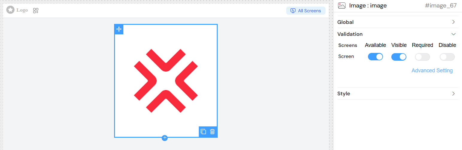
Validation & Visibility
Screen-Based Validation
Configure different behaviors across multiple screen types:
- Available: Whether the widget appears on specific screens
- Visible: Controls visibility with support for conditional logic
- Required: Makes the widget mandatory (if applicable)
- Disable: Prevents interaction (if applicable)
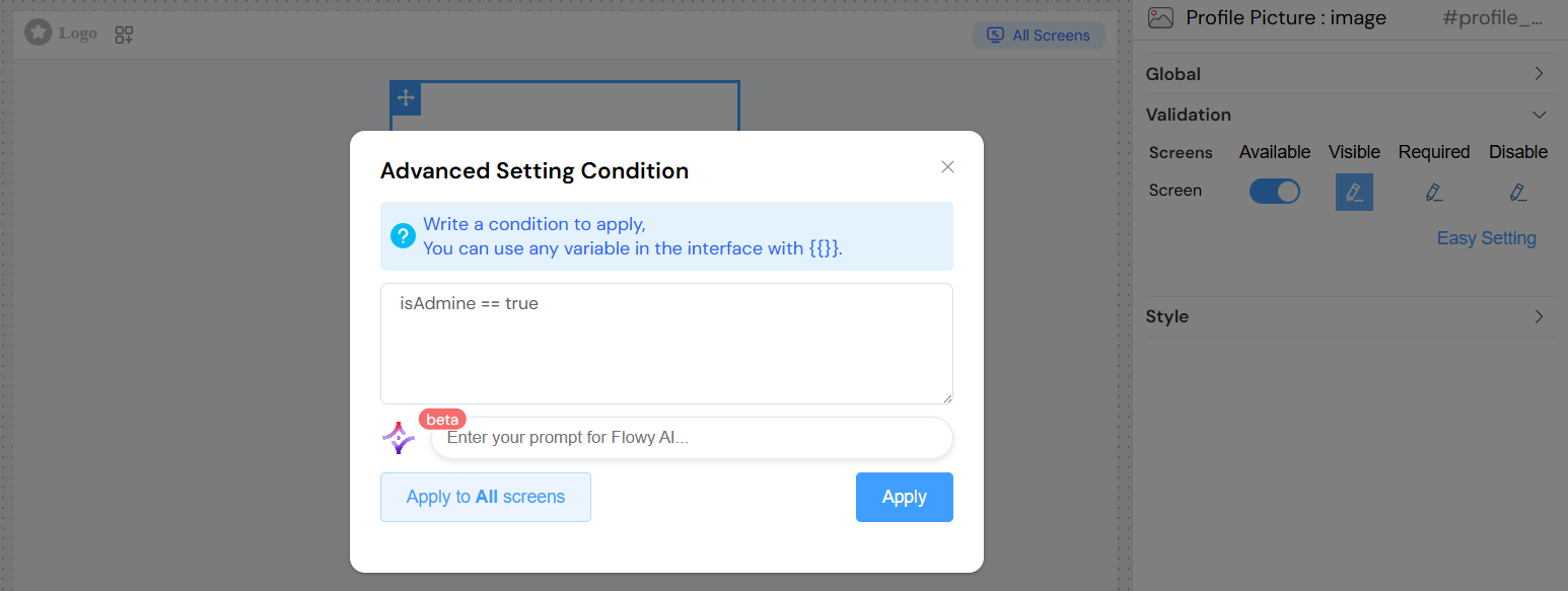
Advanced Visibility Conditions
- Use JavaScript expressions for dynamic visibility
- Access other form variables using
{{variableName}}syntax - Create complex conditional logic based on user input or application state
Style Configuration
CSS Classes
- Static Classes: Add custom CSS class names for styling
- Dynamic Classes: Use JavaScript expressions to conditionally apply classes
- Class Names: Space-separated list of CSS classes
Custom Styling
- The widget inherits global interface styling
- Additional styling can be applied through custom CSS classes
- Responsive behavior can be controlled through CSS media queries
Usage Examples
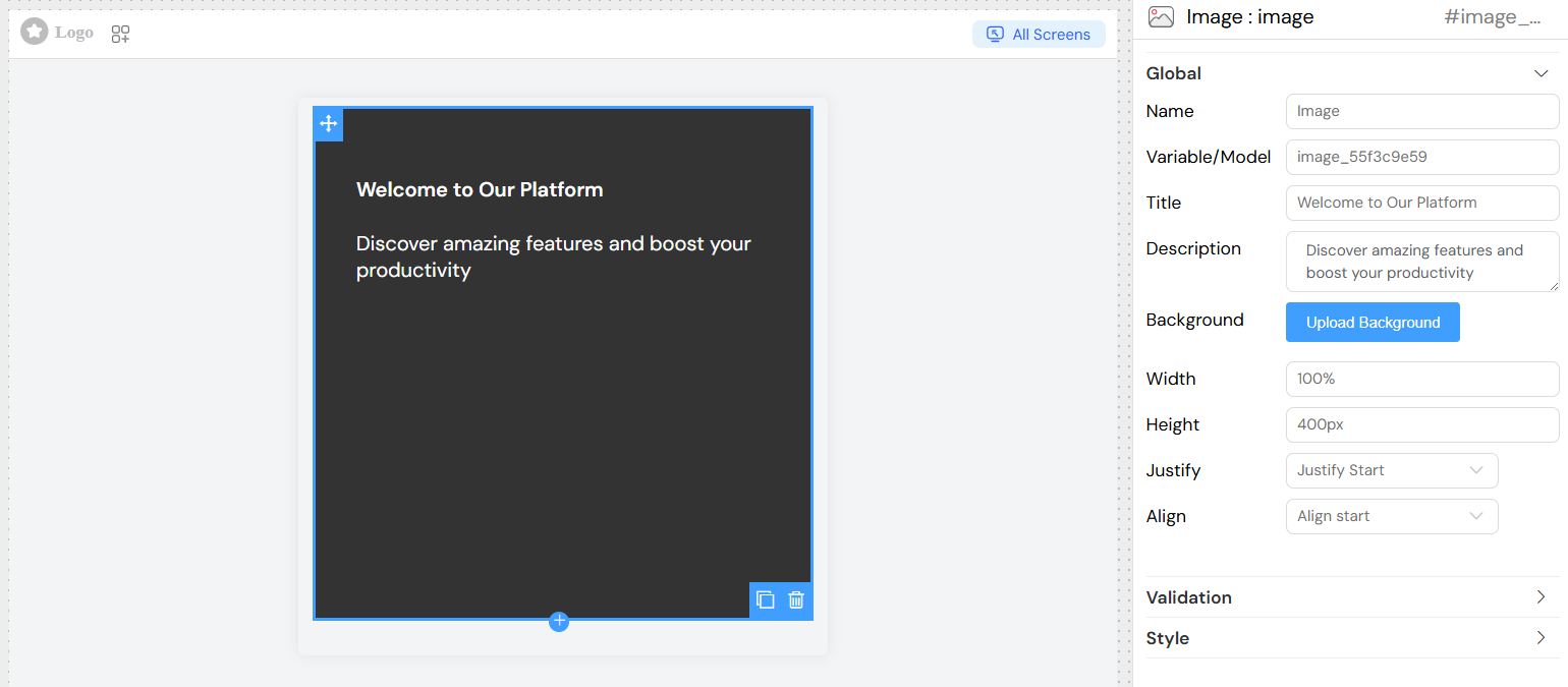
Basic Hero Section
Title: "Welcome to Our Platform"
Description: "Discover amazing features and boost your productivity"
Width: "100%"
Height: "500px"
Justify: "center"
Align: "center"
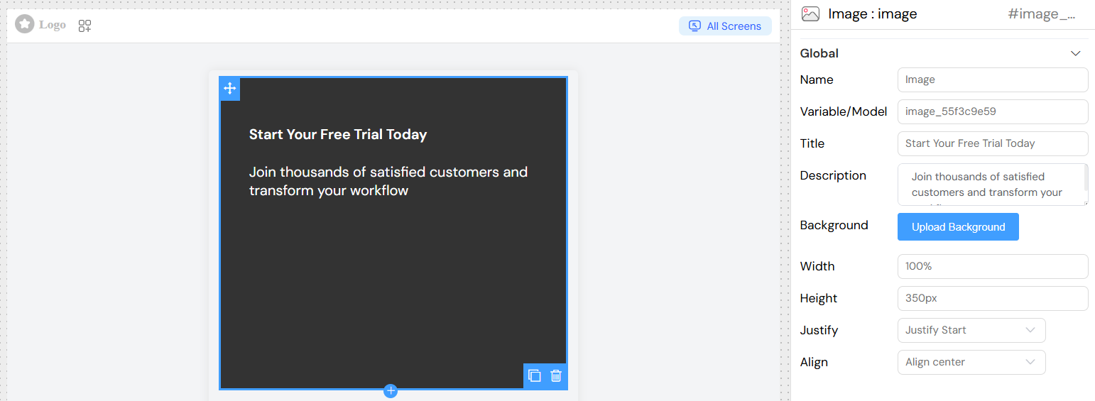
Call-to-Action Banner
Title: "Start Your Free Trial Today"
Description: "Join thousands of satisfied customers and transform your workflow"
Width: "100%"
Height: "350px"
Justify: "start"
Align: "center"
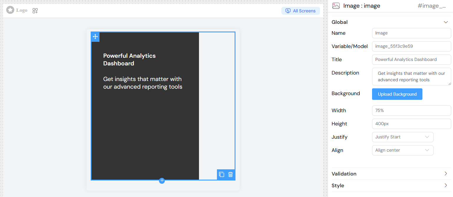
Feature Highlight
Title: "Powerful Analytics Dashboard"
Description: "Get insights that matter with our advanced reporting tools"
Width: "75%"
Height: "400px"
Justify: "center"
Align: "end"
Best Practices
Content Guidelines
- Title: Keep titles concise and impactful (5-8 words typically work best)
- Description: Limit descriptions to 1-2 sentences for optimal readability
- Contrast: Ensure text remains readable against your background image
Image Selection
- Quality: Use high-resolution images (at least 1920px wide for full-width images)
- Subject: Choose images that don't compete with text for attention
- Format: Optimize images for web (use appropriate compression)
- Fallback: Consider how the component looks without an image during loading
Responsive Design
- Height: Use relative units (vh, %) for better mobile responsiveness
- Width: Consider how your image adapts to different screen sizes
- Text: Ensure text remains readable on mobile devices
Performance Considerations
- Image Size: Optimize background images to balance quality and load time
- Loading: Consider lazy loading for images below the fold
- Caching: Utilize proper caching strategies for background images
Integration Tips
Variable Binding
- Connect the image to data models when content needs to be dynamic
- Use the Variable/Model field to bind to data sources
- Access dynamic content through the model system
Conditional Display
- Use validation rules to show/hide images based on user roles
- Implement screen-specific visibility for different device types
- Create dynamic content based on user preferences or application state
Accessibility
- Ensure sufficient color contrast between text and background
- Provide alternative text context through proper heading structure
- Consider users with motion sensitivity when using animated backgrounds
Technical Notes
Generated Structure
The image renders as a responsive container with:
- Positioned background image with cover scaling
- Overlay content container with configurable alignment
- Translation-ready text elements
- CSS class support for custom styling
Browser Compatibility
- Modern browser support for CSS flexbox and positioning
- Background image cover support across all major browsers
- Responsive behavior through CSS media queries
Performance Impact
- Minimal JavaScript overhead
- CSS-based styling and positioning
- Efficient image rendering through browser optimization