Section Widget
OverviewDirect link to Overview
The Section widget is a framed block with a title bar that groups other widgets. The user folds it and opens it again by clicking the title bar. Its tile is in the Most used and Layout groups of the palette.
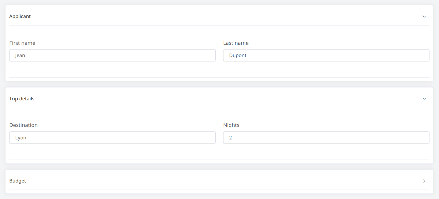
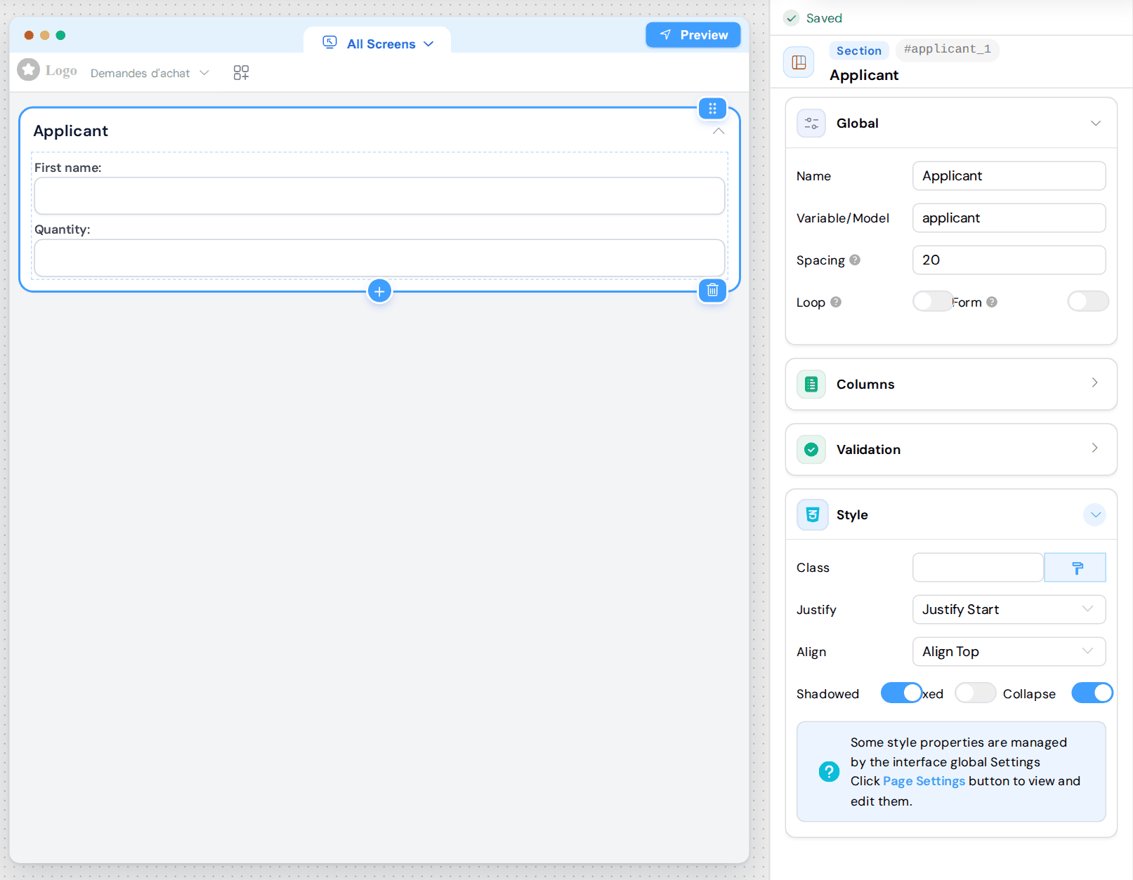
A section is a Grid with the Shadowed and Collapse options on, one column and a Spacing of 20. The header of the configuration panel shows the Section badge. A Grid on which you turn Collapse on works the same way, but keeps its Grid badge.
ConfigurationDirect link to Configuration
Global card:
- Name: text of the title bar. It goes through the translations of the page.
- Variable/Model: identifier of the section. It holds no data unless Form or Loop is on (see Fields in a Section).
- Spacing: space between the columns, in pixels.
- Loop: repeats the block (see Loop). This turns Collapse off: the block loses its title bar.
- Form: makes the block a separate form (see Form).
Columns card: the columns of the block, as for a Grid (see Column Configuration).
Validation card: the rules of each screen. For a section, the last column is Collapse instead of Disable (see Grid, Section, Form, Tabs, Drawer and Popup).
Style card: Class, Justify, Align and Fixed, as for a Grid (see Layout and Styling), and:
- Shadowed: frame and shadow around the block, except with Loop on. With Side navigation on, the sidebar lists a section only if it is placed directly on the page, with Shadowed on and Fixed off.
- Collapse: title bar and folding. Turned off, the block is a plain Grid without a title bar.
Folding a SectionDirect link to Folding a Section
- A section is open when the page opens. A click on the title bar folds it, another click opens it again.
- Each section folds on its own: opening one does not close the others.
- To show a section folded when the page opens on a screen, turn on the Collapse switch of this screen in the Validation card. The user can still open it.
- Folding only hides the block: its fields are not disabled and keep their values. With Form on, the fields of a folded block are disabled until it is opened again, and keep their values.
Fields in a SectionDirect link to Fields in a Section
The fields of a section are stored at the level of the page, under their own Variable/Model: {{first_name}}, not {{applicant.first_name}}.
With Form on, they are stored under the Variable/Model of the block: {{applicant.first_name}}. With Loop on, each row is an item of the list {{applicant}}.
A Required field is still checked when its section is folded, or hidden by a Visible rule. The form is refused, and the message under the field cannot be seen until the section is open. Leave the section open on this screen, or give the Required rule of the field a condition (see the Rules Manager).
Exception: with Form on, a section hidden by a Visible rule does not block the validation of the Main Form (see validateForm).