Card Widget
The Card widget shows an image, a title and a text in a framed block. A click on the card can run actions, which makes it a good entry point on a dashboard or a home page. You find it in the Basic group of the widget palette.
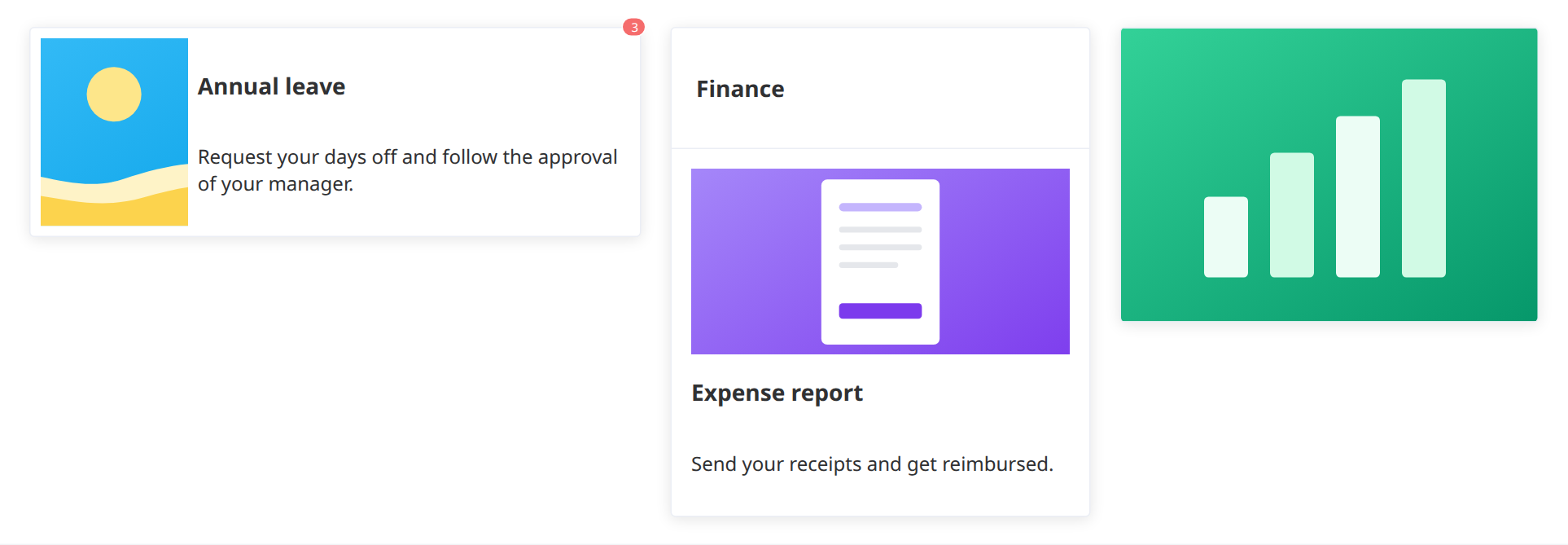
ConfigurationDirect link to Configuration
Select the card on the canvas to open its configuration panel.
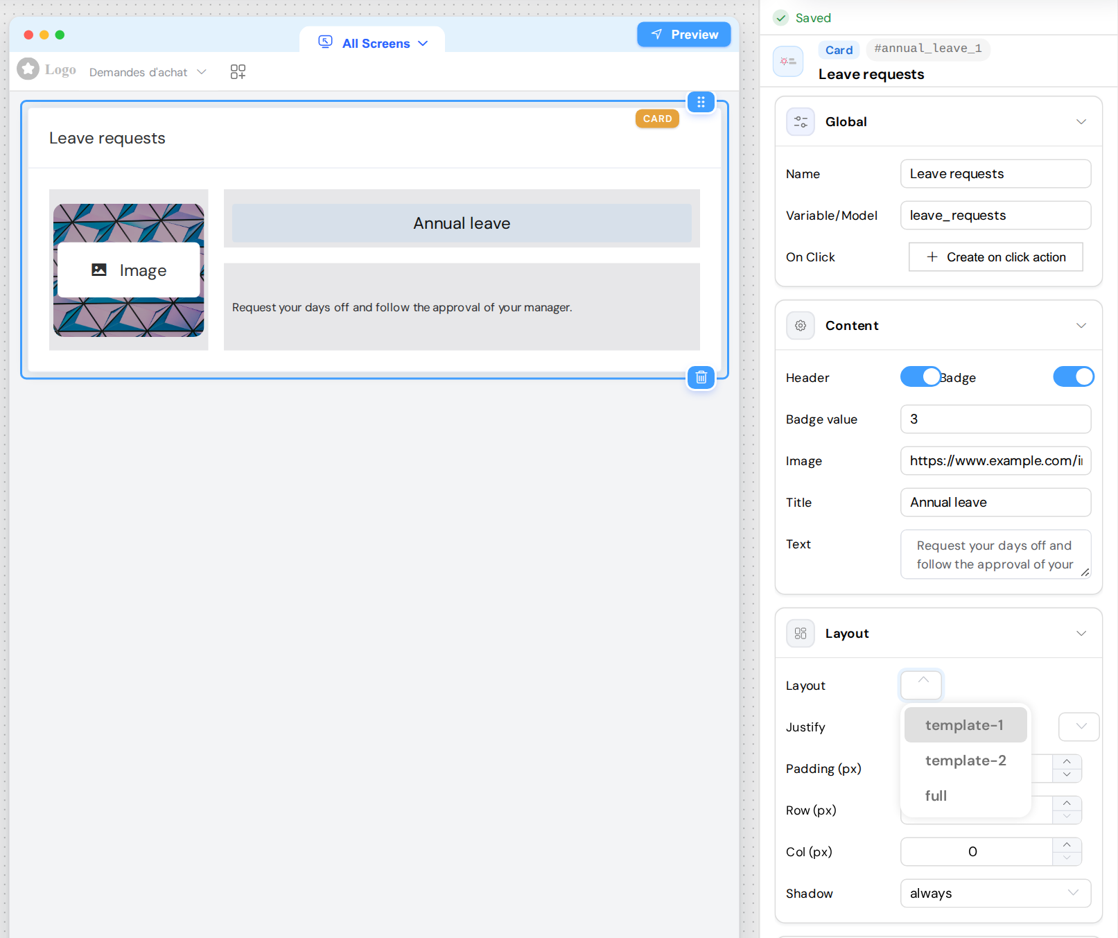
The canvas is an outline of the card: it always shows a placeholder instead of the image, it does not show the badge, and it shows the placeholder texts "Heading" and "Typography" while Title and Text are empty. An empty title or text shows nothing on the published page. Use View interface in the right rail to see the real card.
GlobalDirect link to Global
| Field | Description |
|---|---|
| Name | Name of the widget. It is also the text of the header when Header is on |
| Variable/Model | Identifies the widget. A card holds no value |
| On Click | The actions run by a click on the card. See Running Actions on Click |
ContentDirect link to Content
| Field | Description |
|---|---|
| Header | Adds a band at the top of the card, with the Name of the widget |
| Badge | Shows a small badge on the top right corner of the card |
| Badge value | Text of the badge. The field appears when Badge is on |
| Image | Address of the image: https://... or a path on the server such as /uploads/.... The image fills its area, so it can be cropped |
| Title | Title of the card |
| Text | Text of the card |
These fields are fixed texts: a {{variable}} is not replaced and HTML is displayed as typed. To show a value of the page, use a Text or an Html widget.
The header, the title and the text are translated by the dictionary of the page. See Multi-Language.
LayoutDirect link to Layout
| Field | Description |
|---|---|
| Layout | template-1: the image on the left, on a quarter of the width, then the title and the text. template-2: the image on top, then the title, then the text. full: a single element fills the card |
| Use Element | With full only: the element to show, image, title or text. The Content section then hides the fields of the other two |
| Justify | Horizontal placement: Justify Start, Justify End, Justify Center, Justify Space Around or Justify Space Between |
| Align | Vertical placement: Align Top, Align Middle or Align Bottom |
| Padding (px) | Space between the edge of the card and its content |
| Row (px), Col (px) | No effect on the published page |
| Shadow | always, hover (only while the pointer is over the card) or never |
The effect of Justify and Align depends on the layout:
full: both place the title or the text in the card, Align only with a Height. An image fills the card, so they have no effect on it.template-1: Justify places the title and the text in their column. With a Height, a title and a text, Align moves only the text, in the space under the title.template-2: without an image and with a Height, Align moves the title, or the text if there is no title. With both, the text stays at the bottom. Justify has no visible effect.
ValidationDirect link to Validation
| Property | Description |
|---|---|
| Available | Whether the card exists on this screen. It is only shown in the All Screens view |
| Visible | No effect on a card (see below) |
| Required, Disable | No effect: a card holds no value |
The Visible switch, a condition set with Advanced Setting, and the show and hide actions do not change a card: it stays on the page. To show or hide a card, place it in a Grid or a Section and set Visible on that container. To remove it from a screen, select All Screens at the top of the canvas and turn off Available on that screen (see Validation Rules).
On a page that still runs on the old version of the engine (the panel shows This interface is running on an old version of Softyflow), Visible does hide the card, until you click Upgrade.
StyleDirect link to Style
| Field | Description |
|---|---|
| Height | Height of the content of the card, in pixels: a number without a unit, for example 170. The header comes on top of it |
| Class | Static CSS classes, for example kpi-card |
| Dynamic classes (the brush button next to Class) | A JSON object where each key is a class name and each value a condition with the variables of the interface in {{ }}. The class is added to the card while its condition is true, for example { "is-late": {{days}} > 10 } |
With Height empty, the card takes the height of its content. The exception is a template-1 card placed directly on the page or in a Tabs: it stretches to the height of the content of the page. Set a Height, or place the card in a Grid.
Running Actions on ClickDirect link to Running Actions on Click
- In the Global section, click Create on click action. The Code page of the interface opens in a new tab of the project, on the On Click actions, with a function named after the id of the card (
<id>_action, for exampleannual_leave_1_action) whose Trigger component is the card. - Add your actions to this function and save.
- Back in the builder, the button is now called View attached action and takes you to this function.
If the Code page was not open yet, it can open on On Mounted, without creating the function: go back to the builder and click the button again.
At runtime:
- A click anywhere on the card, except on its badge, runs the actions, including a click on a widget placed in one of its slots.
- The pointer does not change over the card. To show a hand, add a class with
cursor: pointer. SF_inputonly holdsSF_currentIndex, the index of the row when the card is in a loop.
On an older page, a card whose On Click already holds the name of a function keeps a text field: a click calls the function of that name.
Slots for Other WidgetsDirect link to Slots for Other Widgets
A card has three slots for other widgets, numbered 1 to 3. Since 8.6, the Title, Text and Html widgets placed in a slot appear on the published page, under the content of the card, slot after slot (they were ignored before). They follow their own Available and Visible rules.
The builder cannot fill these slots: a widget cannot be dropped on a card, and neither the canvas nor the panel shows what a slot holds. Flowy fills them. Add the card in the builder, because Flowy does not create cards, then ask Flowy to place a widget in it (in its scripts, ui.putInCard(widget, cardId, slot)). Ask Flowy again to change or remove this widget.