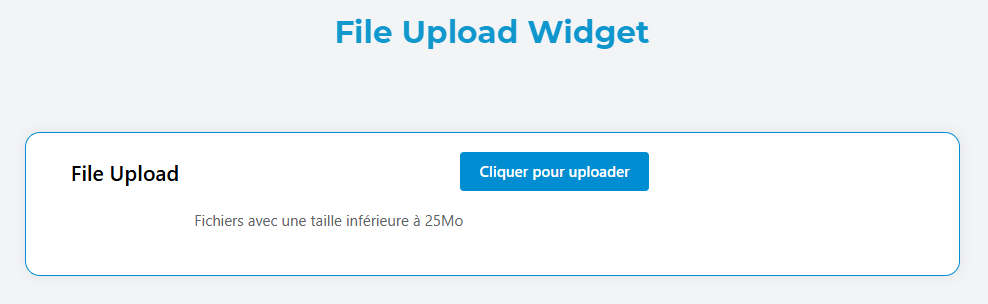
File Upload Widget
The File Upload widget allows users to upload one or multiple files to your application with advanced configuration options for file validation, storage, and user experience.
Overview
The File Upload widget provides a robust file upload interface with support for:
- Multiple file uploads
- File type validation
- File size limitations
- Drag and drop functionality
- Cloud storage integration (AWS S3)
- Custom styling and validation
Basic Configuration
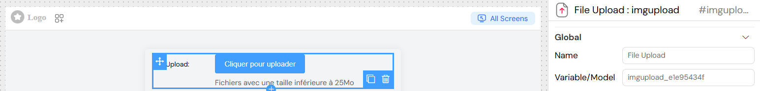
Global Settings
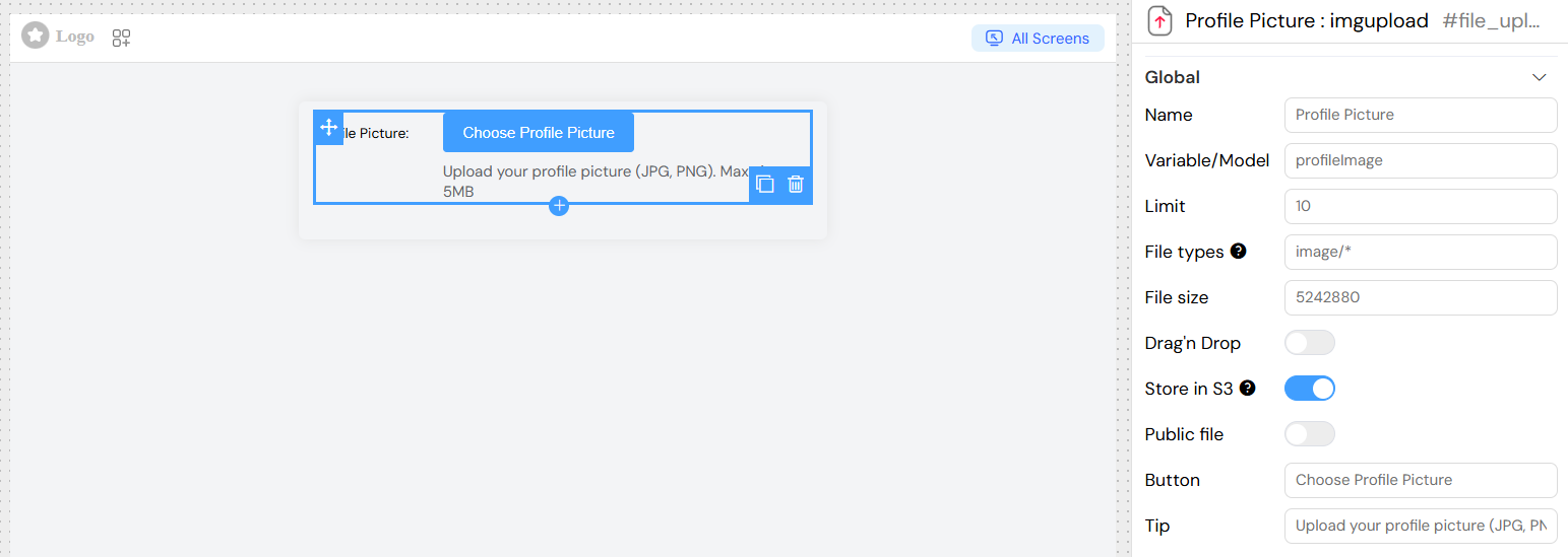
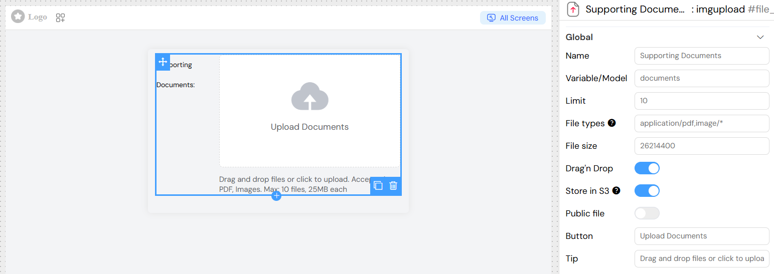
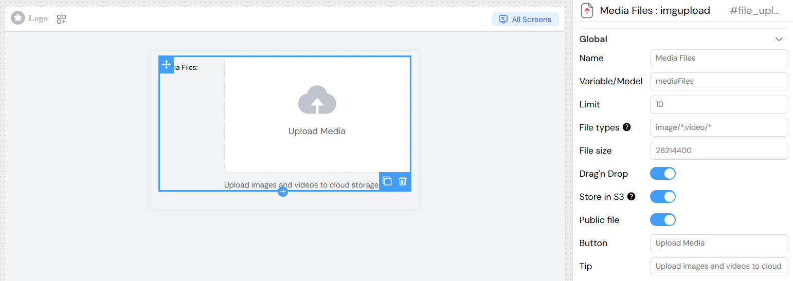
Name
- Field: Name
- Description: Display name for the widget
- Type: Text input
- Required: Yes
Variable/Model
- Field: Variable/Model
- Description: The data model property that will store the uploaded files array
- Type: Text input
- Required: Yes
- Example:
uploadedFiles
Upload Configuration
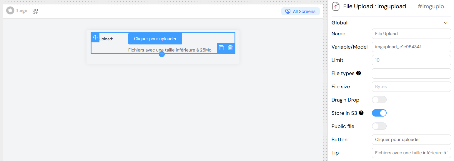
File Limit
- Field: Limit
- Description: Maximum number of files that can be uploaded
- Type: Number input
- Default: No limit
- Example:
5(allows up to 5 files)
File Types
- Field: File types
- Description: Acceptable file MIME types
- Type: Text input
- Format: Comma-separated MIME types
- Examples:
image/*(all image types)image/jpeg,image/png,image/gif(specific image types)application/pdf(PDF files only)image/*,application/pdf(images and PDFs)
- Reference: MDN MIME Types
File Size
- Field: File size
- Description: Maximum file size allowed per file
- Type: Number input
- Unit: Bytes
- Example:
26214400(25MB in bytes) - Note: Server limit is 25MB by default
Upload Interface
Drag and Drop
- Field: Drag'n Drop
- Description: Enable drag and drop file upload interface
- Type: Toggle switch
- Default: Disabled
- When Enabled: Shows a drop zone with upload icon
- When Disabled: Shows a button for file selection
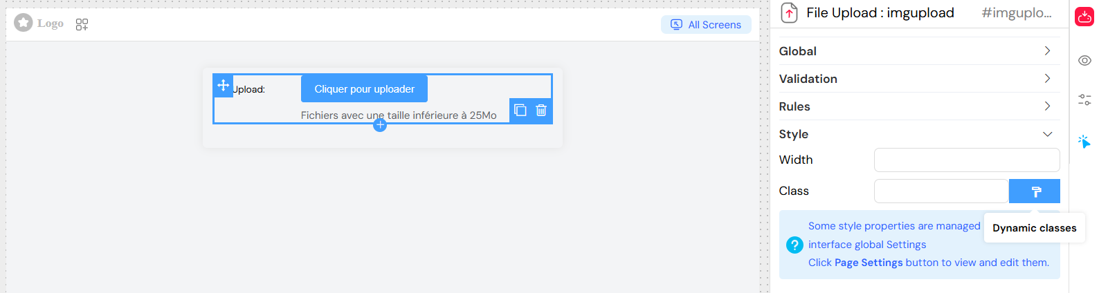
Button Text
- Field: Button
- Description: Text displayed on the upload button
- Type: Text input
- Default: "Choose Files"
- Example: "Upload Images"
Tip Text
- Field: Tip
- Description: Helper text displayed below the upload area
- Type: Text input
- Example: "Supported formats: JPG, PNG, PDF. Max size: 25MB"
AWS S3 Storage
- Field: Store in S3
- Description: Store uploaded files in AWS S3 bucket instead of local storage
- Type: Toggle switch
- Default: Disabled
- Requirements: S3 bucket must be configured in your account
- Note: This will be the default option in future releases
Public File Access
- Field: Public file
- Description: Make uploaded files publicly accessible
- Type: Toggle switch
- Default: Disabled
- Effect: Files can be accessed without authentication
Validation and Rules
Built-in Validation
The widget automatically validates:
- File type against accepted MIME types
- File size against maximum size limit
- Number of files against the limit
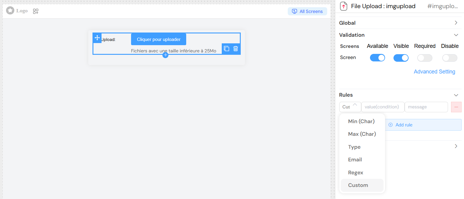
Custom Validation Rules
You can add custom validation rules in the Rules section:
- Required: Make the field mandatory
- Custom Rules: Add JavaScript validation functions
Screen-based Validation
Configure widget behavior per screen in the Validation section:
- Available: Show/hide widget on specific screens
- Visible: Control visibility with conditions
- Required: Make field required on specific screens
- Disable: Disable widget on specific screens
Styling and Layout
Basic Styling
- Width: Set widget width (CSS units)
- Class: Add custom CSS classes
- Dynamic Classes: Set classes based on conditions
Layout Options
- Layout: Choose between block or inline display
- Border: Enable/disable border around widget
Events and Actions
On Click Event
- Field: On click
- Description: JavaScript function executed when files are uploaded/removed
- Context: Access uploaded files via the model variable
- Available Variables:
SF_input: Object containing file informationSF_currentIndex: Index in loop contexts
](/img/04_ressources/project/web-interface/widgets/fileuploadActions.png)
Usage Examples
Basic File Upload
Document Upload with Multiple Files
S3 Storage Configuration
Advanced Configuration
Conditional Visibility
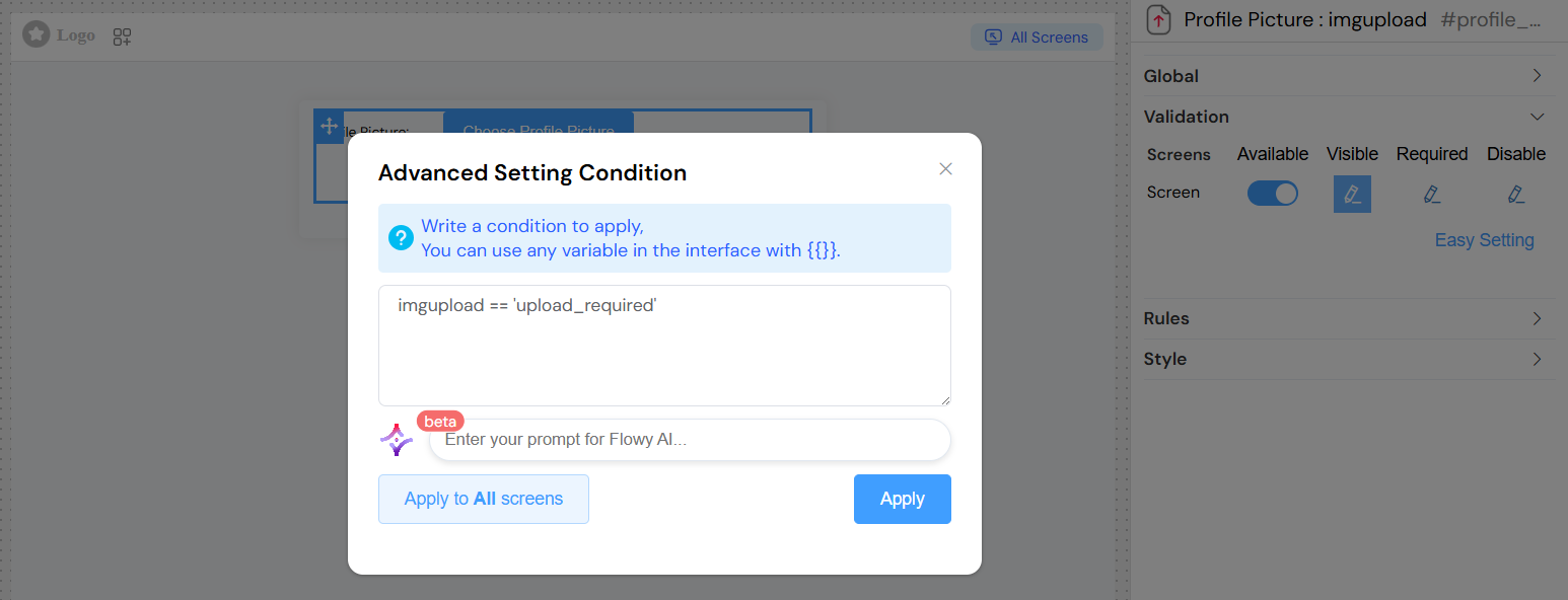
Set the widget to show/hide based on other form values:
Error Handling
Common Error Scenarios
- File Type Not Accepted: "Type file not acceptable!"
- File Too Large: "File size can not exceed [maxSize] Bytes!"
- Too Many Files: "Limit is [limit][files](/docs/ressources/global/files) !!"
- Server Error: "La taille du fichier à télécharger dépasse la limite de 25Mo."
Best Practices
- File Limits: Set reasonable file limits based on your server capacity
- User Feedback: Always provide clear tip text about accepted formats and sizes
- Validation: Use both client-side and server-side validation
- Storage: Consider using S3 for better performance and scalability
- Security: Be cautious with public file settings
- UX: Use drag and drop for better user experience
- Error Messages: Provide clear, actionable error messages