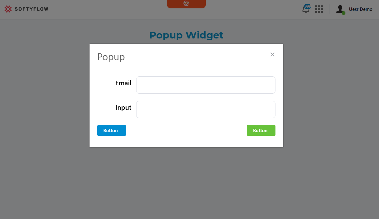
Popup Widget
The Popup widget creates a modal dialog that displays content over the main interface. It's built using Element UI's dialog component and provides extensive customization options for content display, validation rules, and user interactions.
Basic Configuration
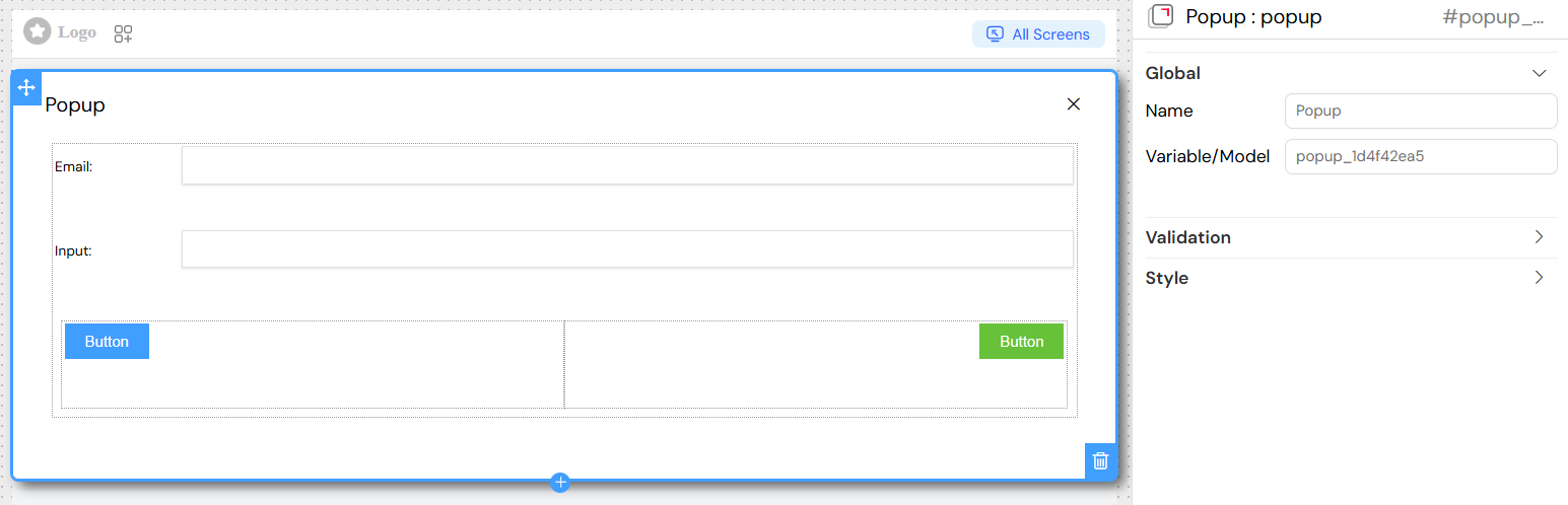
Global Settings
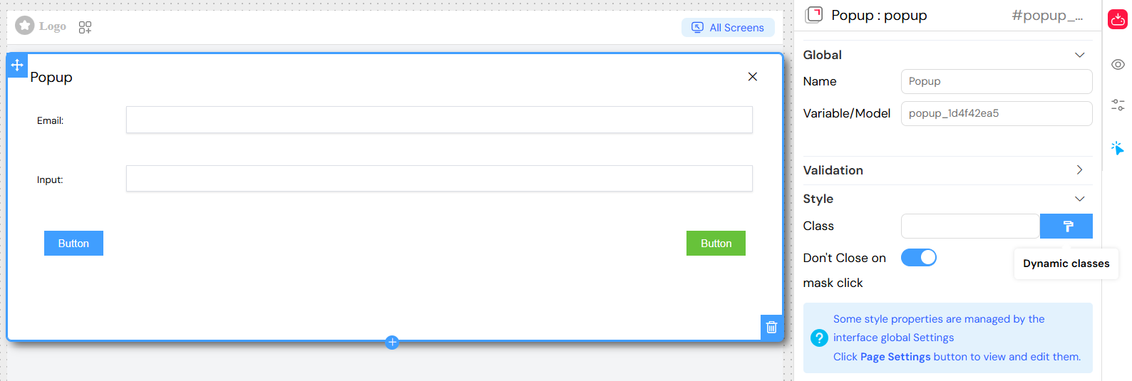
Name
- The display name for the popup widget
- Used for identification and reference within the interface
Variable/Model
- Defines the data model binding for the popup
- Controls the popup's visibility state and data context
- Format:
variableNameormodel.property
Content Management
Dialog Properties
Title
- Sets the header text displayed at the top of the popup
- Supports translation using the
SF_translatefilter - Can include dynamic content using variable interpolation
Content Structure
- Popups contain a grid layout system (el-row/el-col)
- Can include any combination of widgets: forms, tables, buttons, text, etc.
- Widgets are rendered based on their individual validation rules
Nested Widget Support
The popup acts as a container for other widgets:
- Grid layouts for structured content organization
- Form elements (inputs, selects, checkboxes, etc.)
- Display widgets (text, titles, images, tables)
- Interactive widgets (buttons, drawers, other popups)
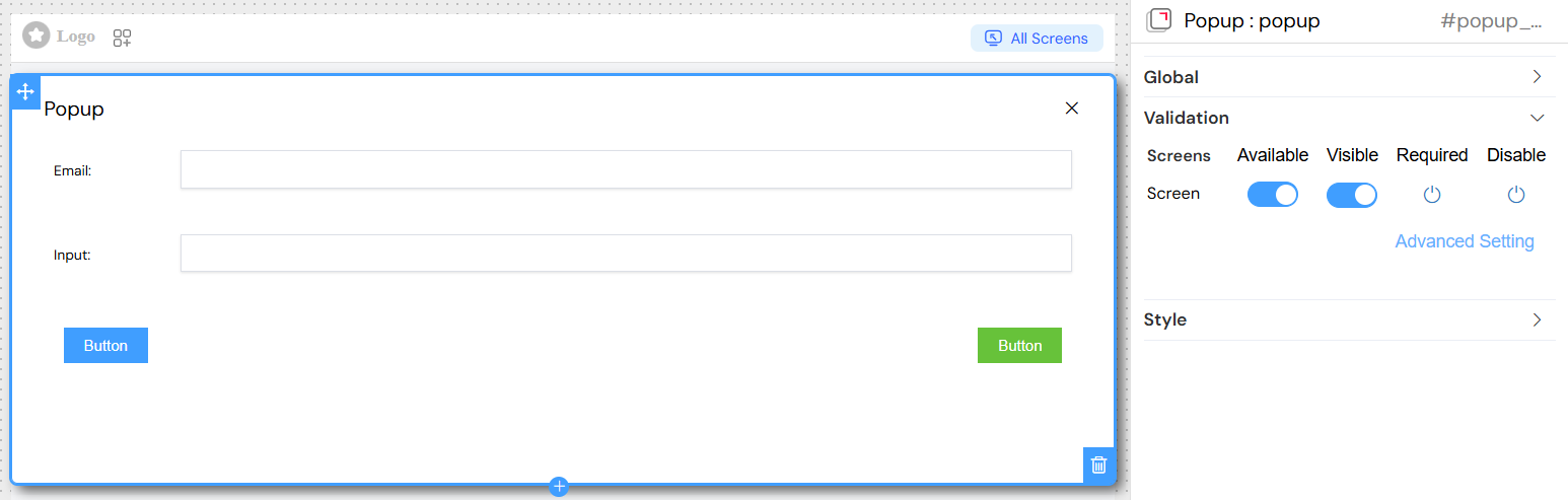
Visibility and Validation
Screen-Based Validation
Configure different behaviors across multiple screens/contexts:
Available
- Controls whether the popup is available in specific screens
- Boolean value:
trueorfalse
Visible
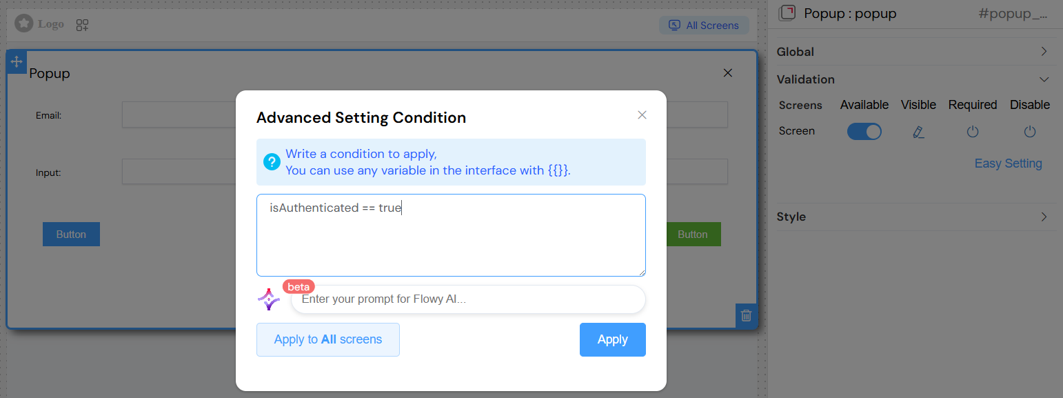
- Controls popup visibility with advanced condition support
- Options:
- Simple boolean:
trueorfalse - Dynamic conditions using variables:
{{variableName}} - Complex expressions:
{{user.role}} === 'admin' && {{status}} === 'active'
- Simple boolean:
Required
- Defines if popup interaction is mandatory
- Inherits validation rules for contained form elements
Disable
- Controls whether the popup can be opened/interacted with
- Supports conditional logic similar to visibility
Advanced Visibility Conditions
Variable References
- Use
{{variableName}}for dynamic conditions - Access nested properties:
{{user.profile.role}} - Support for comparison operators:
===,!==,>,<,>=,<=
Complex Conditions
Styling and Layout
Basic Styling
Class Names
- Static CSS classes:
custom-popup large-modal - Dynamic classes using conditions:
Size and Positioning
- Width: Set popup width (pixels, percentages, or CSS units)
- Height: Define popup height constraints
- The popup automatically centers on screen
Behavior Settings
Close on External Click
- Don't Close on mask click: Prevents closing when clicking outside
- Default:
false(allows closing by clicking backdrop) - Set to
trueto require explicit close action
Modal Behavior
- Blocks interaction with background content
- Provides overlay/backdrop effect
- Keyboard navigation support (ESC to close)
Event Handling
Popup Events
On Close
- Triggered when popup is closed (any method)
- Can execute custom JavaScript functions
- Access to popup data context
Visibility Changes
- Automatic event firing on show/hide
- Integration with parent component lifecycle
Widget Events
Nested widgets maintain their individual event handlers:
- Button clicks
- Form submissions
- Data changes
- Validation events
Best Practices
Performance Optimization
- Use specific visibility conditions to avoid unnecessary renders
- Implement proper data cleanup on close
- Minimize nested widget complexity
User Experience
- Provide clear close mechanisms (buttons, ESC key)
- Use appropriate sizes for content
- Implement loading states for async operations
Accessibility
- Ensure keyboard navigation works properly
- Provide appropriate ARIA labels
- Maintain focus management
Data Integrity
- Validate form data before closing
- Handle unsaved changes appropriately
- Provide confirmation for destructive actions
Integration Patterns
With Tables
- Row action popups for details/editing
- Bulk operation confirmations
- Filter/search interfaces
With Forms
- Multi-step wizards
- Detailed input sections
- File upload interfaces
With Navigation
- Context menus
- Help systems
- Settings panels
The Popup widget provides a powerful foundation for creating rich, interactive modal experiences while maintaining clean separation between content and presentation logic.