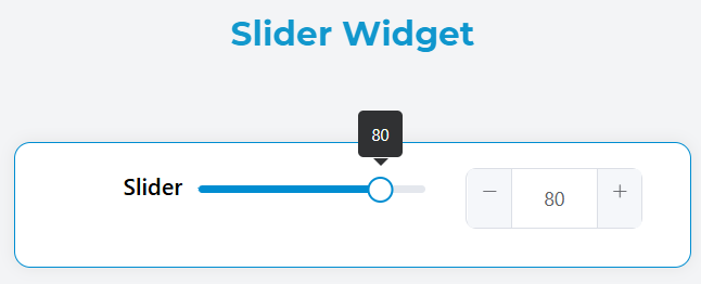
Slider Widget
The Slider widget provides an interactive range input control that allows users to select numeric values by dragging a handle along a track. This widget is built using Element UI's slider component and offers extensive customization options.
Overview
The slider widget enables users to:
- Select single values within a defined range
- Select ranges between two values (when range mode is enabled)
- Input values directly through an optional input field
- Apply validation rules and conditional visibility
Basic Configuration
Global Settings
Name
- Field: Widget display name
- Purpose: Sets the label text that appears above the slider
- Example: "Volume Level", "Price Range", "Temperature"
Variable/Model
- Field: Data binding variable name
- Purpose: Defines the model property that stores the slider value
- Format: Use camelCase naming (e.g.,
priceRange,volumeLevel) - Note: This value will be accessible in your application logic
Show Input
- Type: Boolean toggle
- Default:
false - Purpose: Displays an input field alongside the slider for direct value entry
- Use Case: When users need precise value input

Advanced Configuration
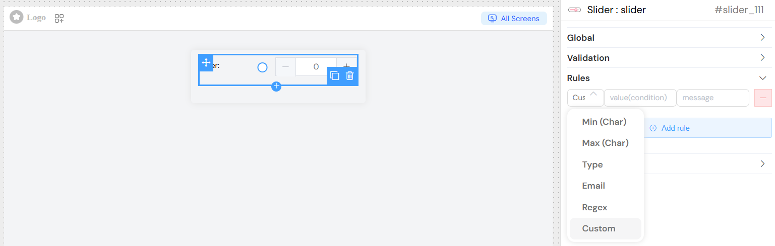
Validation Rules
Configure validation to ensure data integrity:
Required Field
- Make the slider mandatory for form submission
- Configure per screen/device type
- Set custom error messages
Custom Validation Rules
- Minimum Value Rule: Ensure value meets minimum requirements
- Maximum Value Rule: Prevent values exceeding limits
- Range Validation: For range sliders, validate that start < end
- Custom Logic: JavaScript expressions for complex validation
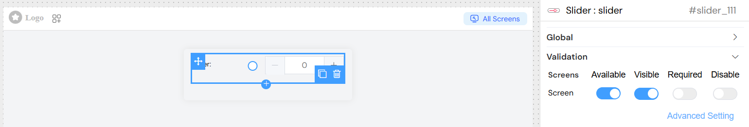
Screen-Based Configuration
Configure different behaviors across device types:
Visibility Controls
- Desktop: Full slider with input field
- Tablet: Slider only, no input field
- Mobile: Compact slider with touch-friendly controls
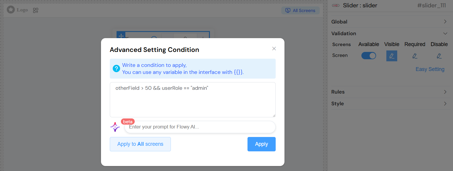
Conditional Logic
- Show/hide based on other form values
- Dynamic enabling/disabling
- Required field status per screen
Advanced Conditions Use JavaScript expressions for complex logic:
Styling and Layout
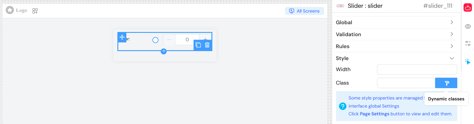
CSS Classes
- Static Classes: Add predefined styling classes
- Dynamic Classes: Apply classes based on conditions
- Custom Styling: Override default appearance
Layout Options
- Width: Control slider width with CSS units
- Alignment: Position within container
- Spacing: Margin and padding adjustments
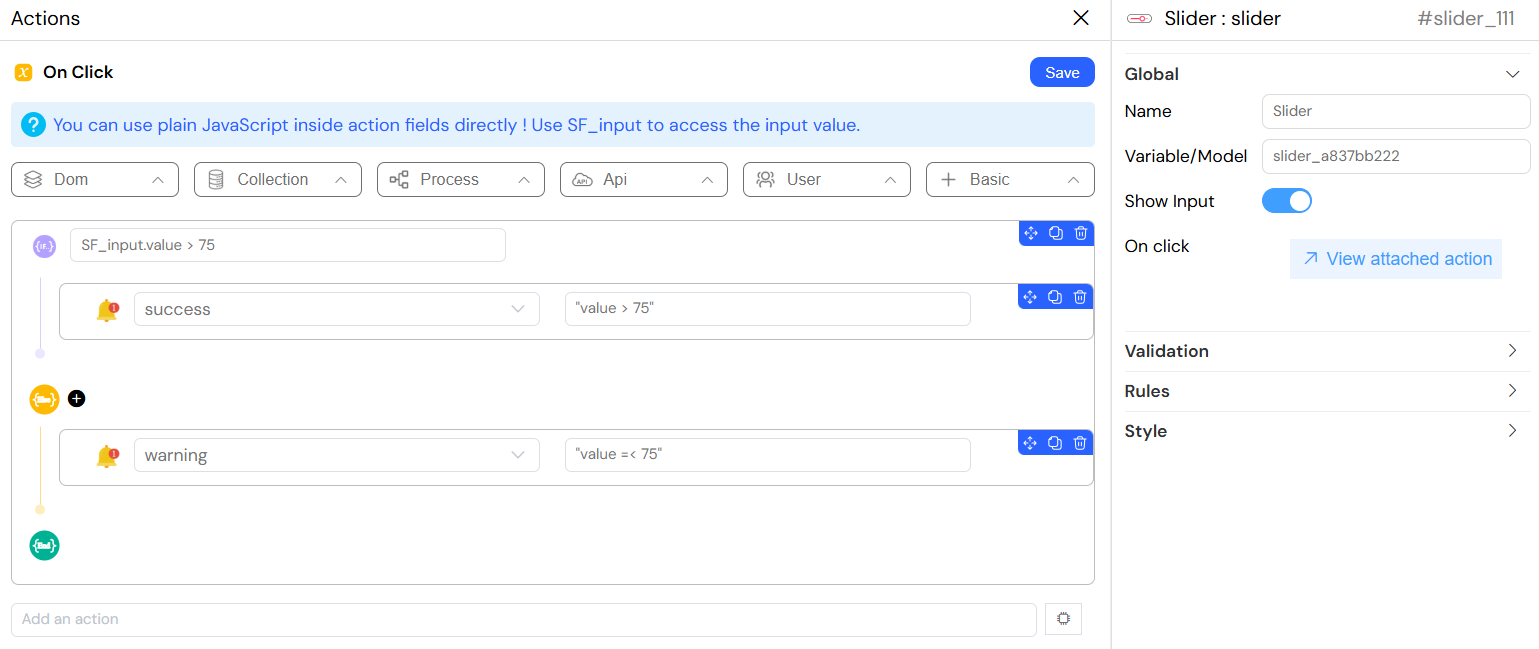
Event Handling
Change Events
On Change Action Configure actions that trigger when slider value changes:
Basic Actions
- Update other form fields
- Trigger calculations
- Call external functions
- Navigate to different screens
Event Data Access
SF_input.value: Current slider valueSF_input.SF_currentIndex: Loop index (when in repeating sections)SF_input.SF_data: Complete form data context
Example Actions
Best Practices
User Experience
- Clear Labeling: Use descriptive names and helpful placeholders
- Appropriate Ranges: Set logical min/max values for your use case
- Reasonable Steps: Choose step values that match user expectations
- Visual Feedback: Use validation messages and visual cues
- Mobile Friendly: Test touch interactions on mobile devices
Performance
- Debounced Actions: Avoid triggering actions on every small change
- Efficient Validation: Keep validation rules simple and fast
- Minimal Re-renders: Structure change handlers efficiently
Accessibility
- Keyboard Navigation: Ensure slider works with keyboard controls
- Screen Readers: Provide meaningful labels and descriptions
- Color Contrast: Ensure slider is visible to all users
- Focus Indicators: Clear visual focus states
Common Use Cases
Single Value Sliders
- Volume Controls: Audio/video volume adjustment
- Progress Indicators: Completion percentage
- Rating Systems: Satisfaction scores (1-10)
- Quantity Selectors: Product quantities
- Percentage Inputs: Discount rates, completion rates
Range Sliders
- Price Filters: E-commerce price ranges
- Date Ranges: Timeline selections
- Size Filters: Dimension ranges
- Performance Metrics: Min/max thresholds
- Resource Allocation: Budget distributions
Interactive Dashboards
- Filter Controls: Adjust data visualization ranges
- Parameter Tuning: Real-time algorithm adjustments
- Simulation Controls: Adjust simulation parameters
- Threshold Settings: Alert and notification thresholds
Troubleshooting
Common Issues
Slider Not Responding
- Check if widget is disabled via validation rules
- Verify min/max values are properly set
- Ensure step value is not zero or negative
Validation Errors
- Review validation rule syntax
- Check data types (number vs string)
- Verify required field configuration
Styling Issues
- Inspect CSS class conflicts
- Check width settings and container constraints
- Verify responsive behavior across devices
Performance Problems
- Optimize change event handlers
- Review complex validation logic
- Check for memory leaks in custom actions
Debug Tips
- Console Logging: Add console.log to change handlers
- Model Inspection: Check form model values in browser dev tools
- Network Monitoring: Watch for excessive API calls on value changes
- Validation Testing: Test edge cases and boundary values
This slider widget provides a powerful and flexible interface component that can adapt to various use cases while maintaining excellent user experience and performance.