Divider Widget
Overview
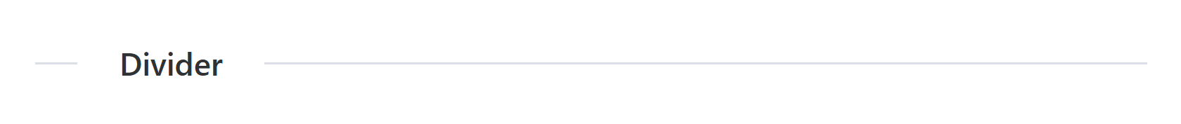
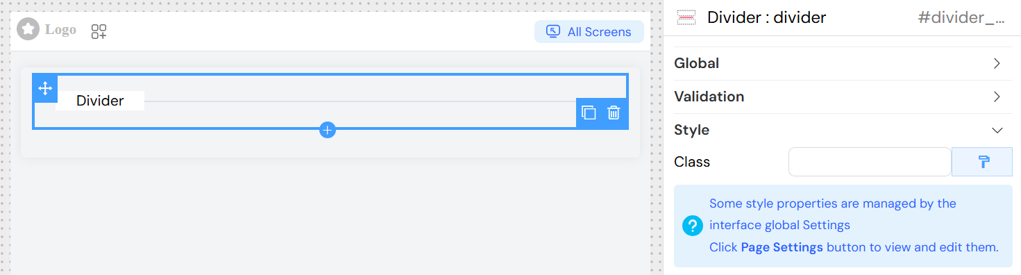
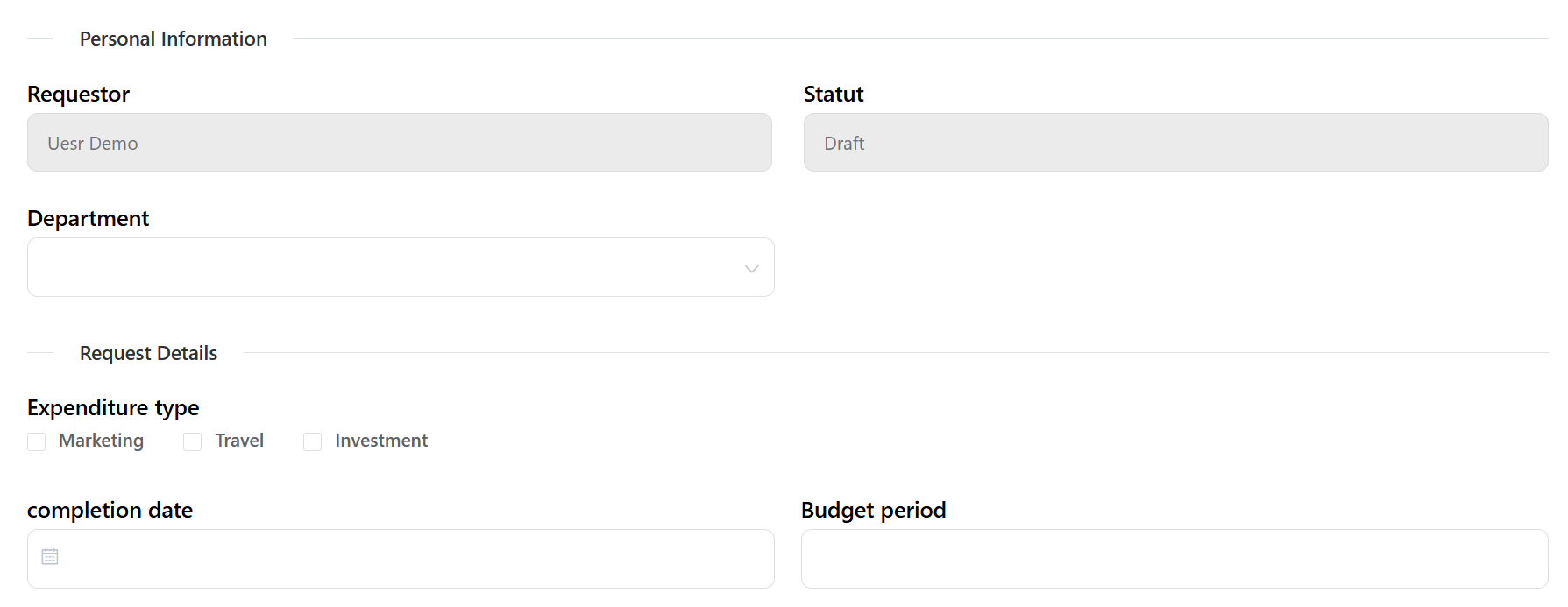
The divider widget is a visual separator component that helps organize and structure your interface by creating clear divisions between different sections of content. It renders as a horizontal line with optional text label that can be positioned and styled according to your needs.
Global Settings
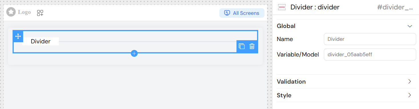
Widget Name
- Field: Name
- Description: The display text that will appear on the divider
- Usage: Enter the text you want to display on the divider line
- Example: "Personal Information", "Contact Details", "Settings"
Variable/Model
- Field: Variable/Model
- Description: Optional variable name for programmatic access to the widget
- Usage: Define a unique identifier if you need to reference this divider in scripts or validation rules
- Example:
section_divider,contact_separator
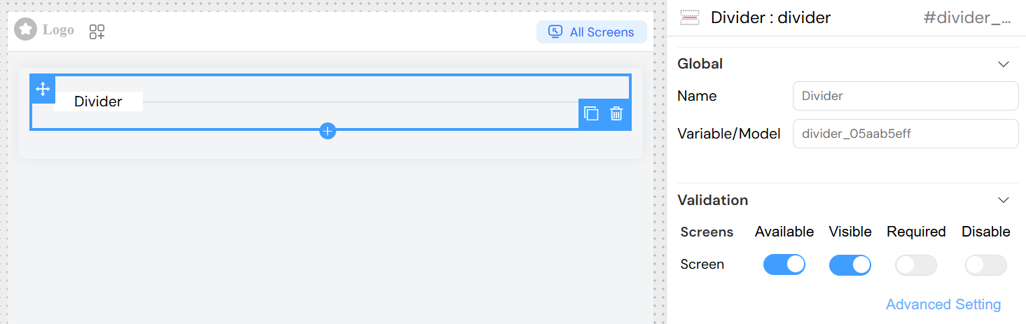
Validation and Visibility
The divider widget supports screen-based validation rules that control when and how the widget appears across different interface screens.
Screen Configuration
Available
- Description: Controls whether the widget exists on specific screens
- Options: Toggle on/off for each screen
- Use Case: Show dividers only on certain forms or views
Visible
- Description: Controls the visibility of the widget
- Options:
- Simple Mode: Toggle on/off
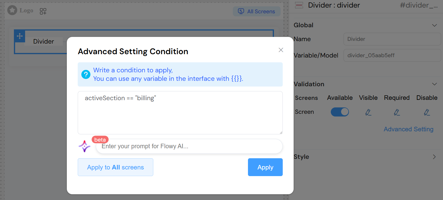
- Advanced Mode: JavaScript condition
- Advanced Examples:
{{user.hasPermission('view_advanced')}}- Show only for users with specific permissions{{formData.section === 'extended'}}- Show based on form state{{models.showDetails}}- Show based on variable value
Required
- Description: Not typically applicable to dividers (visual elements)
- Usage: Generally left disabled for divider widgets
Disable
- Description: Controls whether the divider appears disabled/grayed out
- Usage: Rarely used for dividers but available for special styling needs
Advanced Visibility Conditions
When using advanced settings, you can write JavaScript expressions using:
- Variables: Access any interface variable using
{{variableName}} - Form Data: Reference form fields and their values
- User Context: Access user information and permissions
- Global State: Reference application-wide variables
Example Conditions:
Styling and Appearance
Content Position
- Default: Left-aligned
- Description: The divider text is positioned to the left of the line by default
- Customization: Can be modified through CSS classes
CSS Classes
- Field: Class
- Description: Add custom CSS classes to style the divider appearance
- Usage:
- Enter class names separated by spaces
- Use existing theme classes or custom CSS
- Examples:
primary-divider- Apply primary theme stylingbold-text large-spacing- Multiple classes for bold text and extra spacingcenter-divider- Custom class to center the text
Dynamic Classes
- Feature: Dynamic class assignment based on conditions
- Access: Click the paint brush icon next to the Class field
- Usage: Write JavaScript expressions that return class names based on data or state
- Example:
{{user.role === 'admin' ? 'admin-divider' : 'user-divider'}}
Implementation Details
Widget Structure
The divider widget generates an Element UI divider component with the following characteristics:
- Element Type:
el-divider - Content Position: Left-aligned by default
- Text Content: Automatically translated using the interface translation system
- Conditional Rendering: Respects visibility settings
- CSS Integration: Supports both static and dynamic class assignment
Translation Support
- The divider text is automatically processed through the translation system
- Use translation keys in the widget name for multi-language support
- The system will automatically translate the text based on the current language setting
Responsive Behavior
- The divider adapts to container width automatically
- Text positioning and styling respond to CSS breakpoints
- Mobile-friendly by default with proper Element UI responsive design
Best Practices
Naming Convention
- Use descriptive names that clearly indicate the section being divided
- Consider using translation keys for multi-language interfaces
- Keep names concise but meaningful
Visual Hierarchy
- Use dividers sparingly to maintain clean design
- Consider using different styling for different levels of separation
- Ensure sufficient spacing around dividers for visual clarity
Accessibility
- Divider text provides semantic meaning for screen readers
- Use meaningful section names to improve navigation for assistive technologies
- Ensure color contrast meets accessibility standards when applying custom styles
Performance Considerations
- Dividers have minimal performance impact
- Complex visibility conditions should be optimized for performance
- Avoid deeply nested condition expressions when possible
Common Use Cases
Form Section Separation
Troubleshooting
Divider Not Appearing
- Check visibility conditions in validation settings
- Verify the widget is marked as "Available" for the current screen
- Ensure container has sufficient width to display the divider
Text Not Displaying
- Verify the widget name is properly set
- Check for translation issues if using translation keys
- Ensure CSS classes aren't hiding the text content
Styling Issues
- Verify CSS class names are correct and available
- Check for CSS conflicts with other styles
- Ensure dynamic class expressions return valid class names
Visibility Conditions Not Working
- Validate JavaScript syntax in advanced visibility conditions
- Ensure referenced variables exist and are accessible
- Test conditions in browser console for debugging