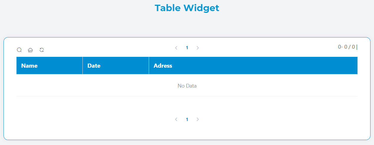
Table Widget
The Table widget provides a powerful and flexible data display component for your applications. It supports various data sources, interactive features, sorting, filtering, pagination, and export capabilities.
Overview
The Table widget allows you to display tabular data with rich formatting options, interactive controls, and responsive design. It can connect to different data sources including collections, reports, external databases, and variables.
Basic Configuration
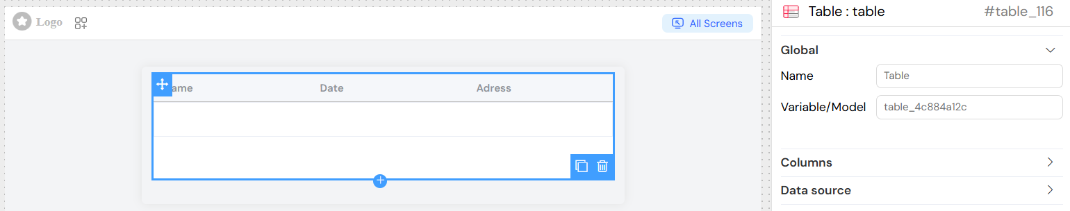
Global Settings
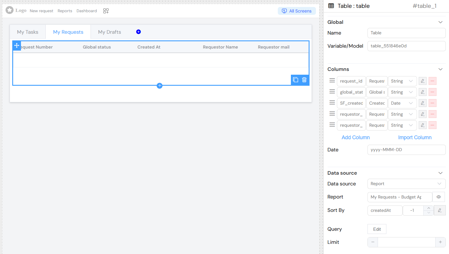
Name
- Field:
Name - Purpose: Sets the display name for the widget
- Usage: Used for identification in the widget list and management
Variable/Model
- Field:
Variable/Model - Purpose: Defines the data model that stores the table data
- Usage: Specify the variable name that will hold the table's data array
- Example:
tableData,users,products
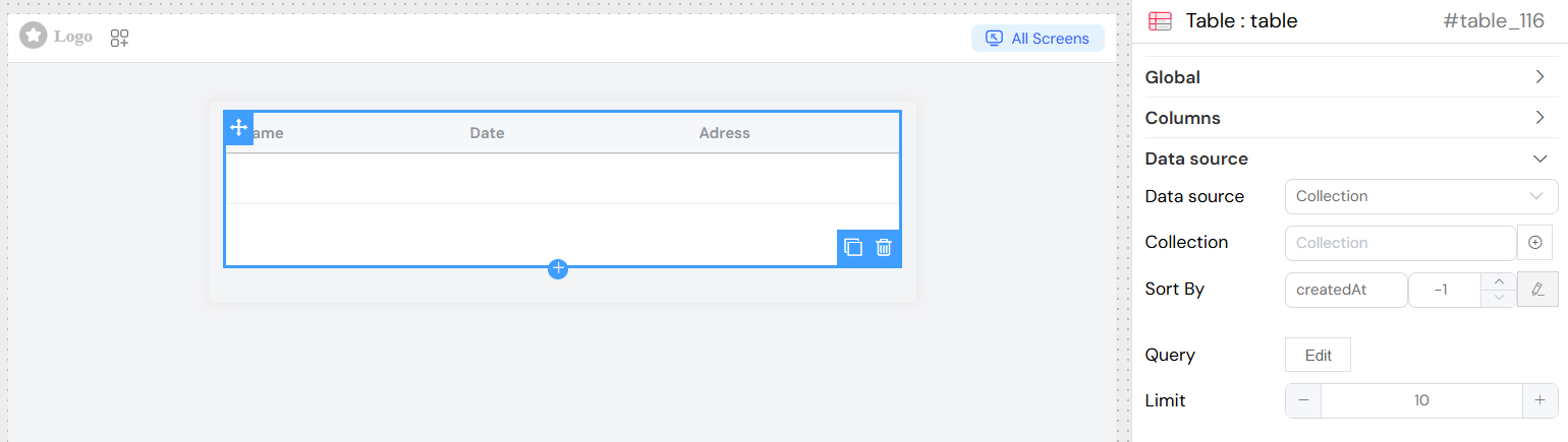
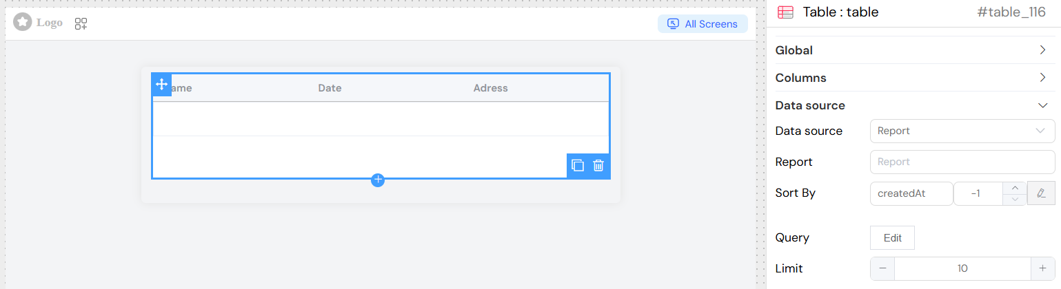
Data Source Configuration
Data Source Types
Collection
- Option: Collection
- Description: Connect to a database collection
- Configuration:
- Select from available collections in your project
- Direct access to collection data with automatic querying
Report
- Option: Report
- Description: Display data from predefined reports
- Configuration:
- Choose from existing reports
- Inherits report structure and calculations
EDS (External Database Source)
- Option: EDS
- Description: Connect to external databases
- Configuration:
- Select configured database connections
- Supports SQL, LDAP, Google Sheets
- Custom query capabilities
](/img/04_ressources/project/web-interface/widgets/tableDataEDS.png)
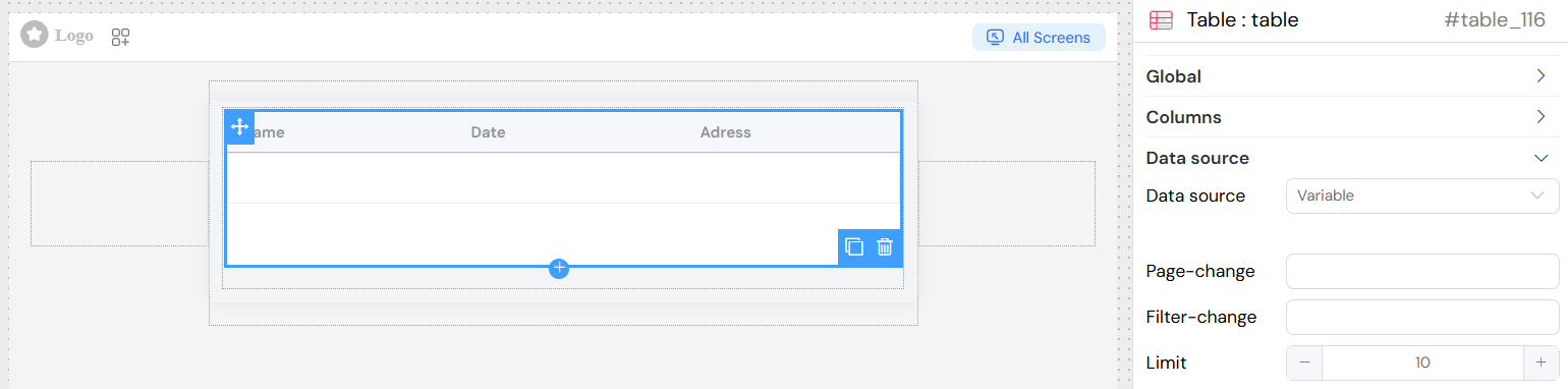
Variable
- Option: Variable
- Description: Use data from application variables
- Configuration:
- Bind to existing data models
- Manual data management
- Custom event handling
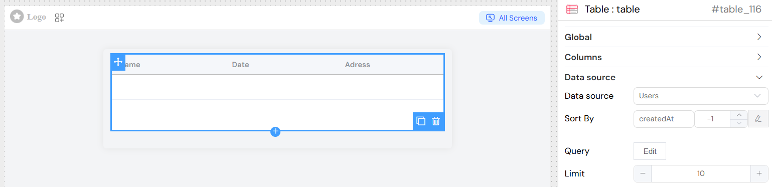
Users
- Option: Users
- Description: Display user management data
- Configuration:
- Access to user directory
- Built-in user properties
Query Configuration
Standard Query
- Purpose: Define data filtering and selection criteria
- Format: JavaScript expressions with model variables
- Syntax: Use
{{variableName}}for dynamic values - Example:
{ status: "active", category: {{selectedCategory}} }
Aggregation Query
- Purpose: Perform data aggregation operations
- Features:
- Group by operations
- Count, sum, average calculations
- Complex data transformations
- Toggle: Enable "Is Aggregation" option
Sort Configuration
- Sort By: Field name for default sorting
- Direction:
1for ascending order-1for descending order
- Sort Object: Advanced sorting with multiple fields
Limit
- Purpose: Set maximum number of records per page
- Default: 10 records
- Range: Any positive integer
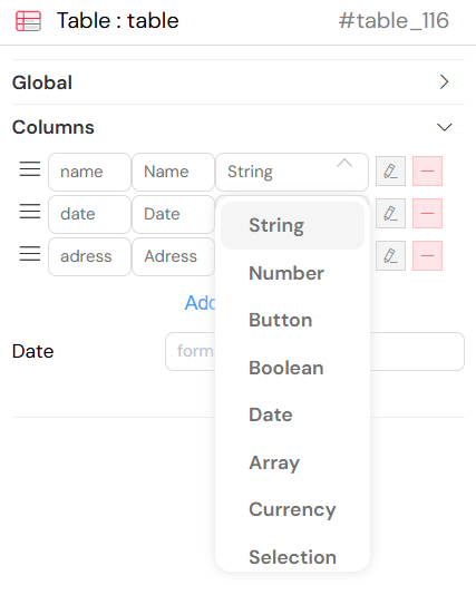
Column Configuration
Column Types
String
- Description: Text data display
- Features:
- Filterable with text search
- Sortable alphabetically
- Custom HTML formatting
Number
- Description: Numeric data display
- Features:
- Numeric filtering (equals, greater than, less than)
- Numeric sorting
- Decimal precision control
Date
- Description: Date and time display
- Features:
- Date range filtering
- Chronological sorting
- Custom date formatting
- Format: Configure using
dateFormatoption - Example:
YYYY-MM-DD HH:mm:ss
Currency
- Description: Monetary value display
- Features:
- Automatic currency formatting
- Locale-specific display
- Numeric filtering
- Configuration:
currency_local: Locale (e.g., 'en-US', 'fr-FR')currency: Currency code (e.g., 'USD', 'EUR')
Boolean
- Description: True/false value display
- Features:
- Checkbox representation
- True/False filtering
Array
- Description: Array data display
- Features:
- List formatting
- Array-specific filtering
Button
- Description: Action buttons within table cells
- Features:
- Multiple buttons per column
- Custom actions and styling
- Conditional visibility
Selection
- Description: Row selection checkboxes
- Features:
- Multi-row selection
- Select all functionality
- Selection event handling
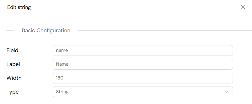
Column Properties
Field
- Purpose: Database field name or data property
- Format: Use dot notation for nested properties
- Example:
user.name,product.price
Label
- Purpose: Display header for the column
- Localization: Supports translation keys
- Example:
User Name,Product Price
Width
- Purpose: Set column width
- Format: Pixels or percentage
- Example:
150px,20%
Column Behavior
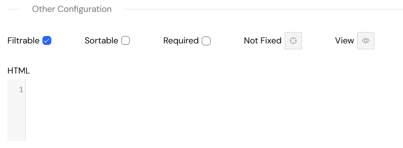
Filterable
- Purpose: Enable filtering for the column
- Features:
- Type-specific filter controls
- Real-time filtering
- Multiple filter operators
Sortable
- Purpose: Enable sorting for the column
- Features:
- Click-to-sort headers
- Visual sort indicators
- Multi-column sorting
Fixed Position
- Purpose: Fix column position during horizontal scroll
- Options:
left: Fix to left sideright: Fix to right sidenone: Not fixed
Required (for editable tables)
- Purpose: Mark field as required for data entry
- Validation: Prevents empty submissions
Visibility
- Purpose: Control column display conditionally
- Format: JavaScript expression
- Example:
{{userRole}} === 'admin'
Interactive Features
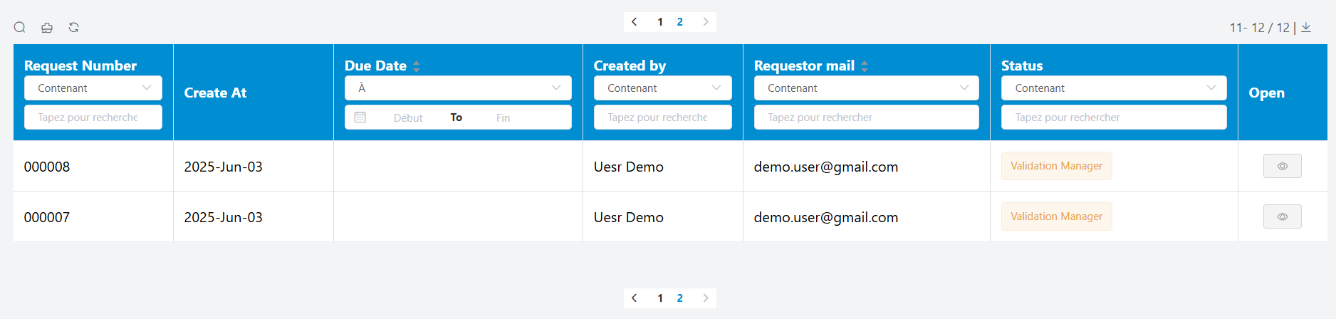
Filtering
- Toggle: Show/hide filter controls
- Per-Column: Individual filter controls
- Filter Types:
- Text search (contains, starts with, ends with)
- Numeric comparison (equals, greater than, less than)
- Date ranges
- Boolean selection
Pagination
- Controls: Previous/Next navigation
- Page Size: Configurable items per page
- Display: Current page and total records
- Position: Top and bottom navigation
Sorting
- Click Headers: Sort by clicking column headers
- Visual Indicators: Sort direction arrows
- Multi-Column: Advanced sorting capabilities
Export Options
CSV Export
- Value Separator: Comma, semicolon, or tab
- Decimal Separator: Point or comma
- Date Format: Customizable date formatting
- File Name: Custom export filename
Excel Export
- Sheet Name: Custom worksheet name
- File Name: Custom export filename
- Formatting: Preserves data types
Selection Handling
- Row Selection: Checkbox-based selection
- Selection Events: Handle selection changes
- Bulk Actions: Operate on selected rows
Advanced Features
Aggregation Support
- Group By: Data grouping operations
- Calculations: Sum, count, average functions
- Nested Data: Hierarchical data display
Real-time Updates
- Data Binding: Automatic updates when source data changes
- Refresh Controls: Manual refresh capabilities
- Loading States: Visual feedback during data operations
Mobile Optimization
- Responsive Layout: Automatic mobile adaptation
- Touch Controls: Touch-friendly interactions
- Collapsible Details: Expandable row details on mobile
Usage Example
Best Practices
Performance
- Use appropriate limits for large datasets
- Implement server-side filtering for big data
- Consider pagination for user experience
User Experience
- Provide clear column headers
- Use consistent data formatting
- Include loading states for better feedback
Accessibility
- Ensure proper keyboard navigation
- Use semantic HTML structure
- Provide alternative text for visual elements
Data Management
- Validate data before display
- Handle error states gracefully
- Implement proper data refresh strategies
Troubleshooting
Common Issues
Data Not Loading
- Check data source configuration
- Verify query syntax
- Ensure proper permissions
Formatting Problems
- Validate column type settings
- Check date/currency format configurations
- Verify CSS class applications
Performance Issues
- Reduce page size for large datasets
- Optimize query complexity
- Consider server-side processing
Debug Tips
- Use browser developer tools
- Check console for error messages
- Test queries independently
- Verify data source connectivity