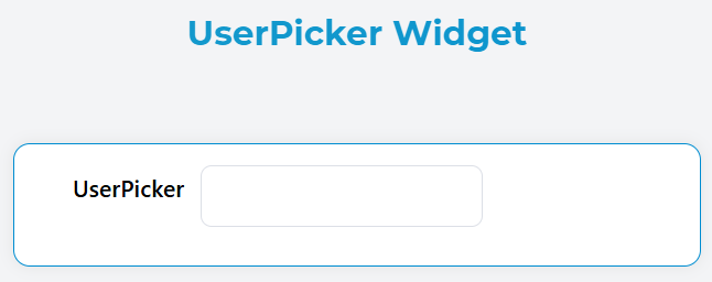
Widget UserPicker
The UserPicker widget provides a searchable dropdown interface for selecting one or multiple users from your application's user base. It supports remote search, group filtering, and flexible display options.
Overview
The UserPicker widget renders as an Element UI select component with remote search capabilities. Users can search and select from the application's user directory with real-time filtering and group-based restrictions.
Configuration Properties
Basic Properties
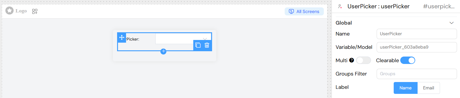
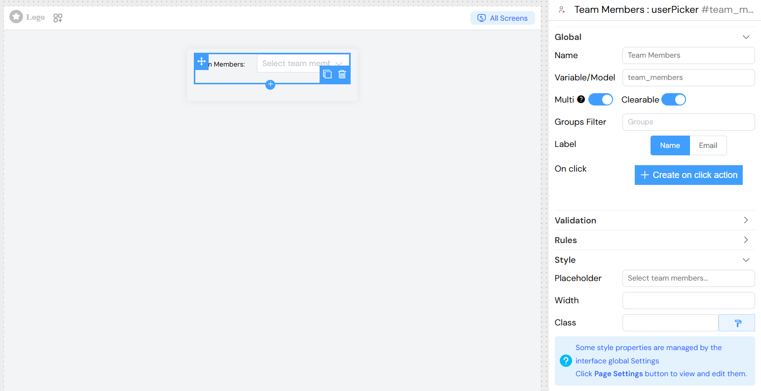
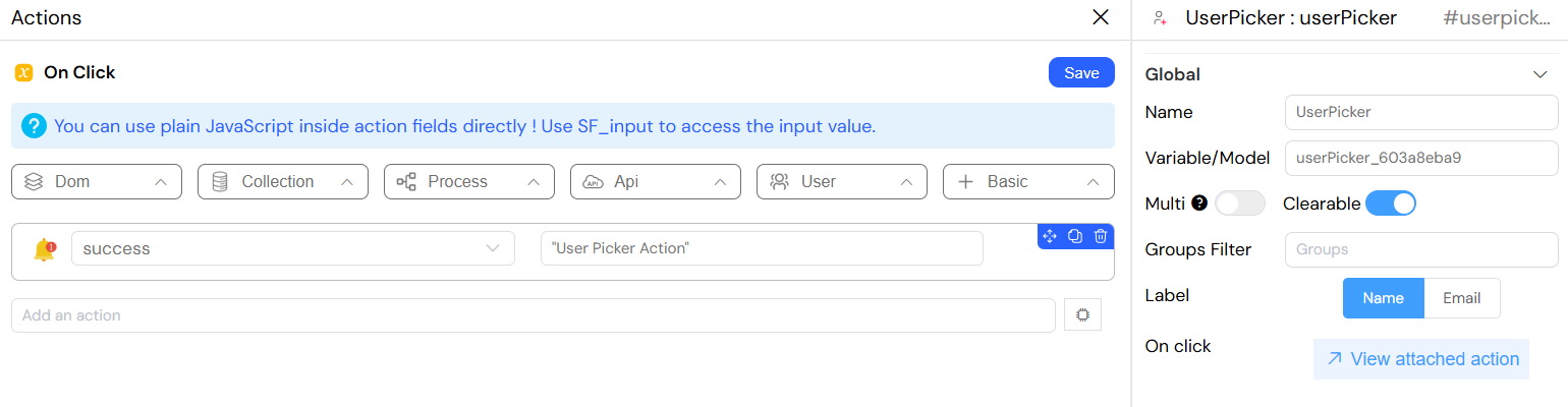
Name
- Description: Display label for the widget
- Type: String
- Default: "Select a user"
- Usage: Appears as the form label above the selection field
Variable/Model
- Description: The data model variable name that will store the selected user(s)
- Type: String
- Required: Yes
- Format: Must be a valid variable name (e.g.,
selectedUser,assignedUsers)
Selection Options
Multiple Selection
- Property:
multiple - Type: Boolean
- Default:
false - Description: Enable selection of multiple users
- When enabled: Returns an array of selected user emails
- When disabled: Returns a single user email string
Clearable
- Property:
clearable - Type: Boolean
- Default:
false - Description: Adds a clear button to remove all selections
User Filtering
Groups Filter
- Property:
groupes - Type: Array of Group Objects
- Description: Restrict user selection to specific groups
- Configuration: Select one or more groups from the dropdown
- API Behavior: Only users belonging to the selected groups will appear in search results
Label Display
- Property:
label - Type: String
- Options:
"name": Display user's first name + last name"Email": Display user's email address
- Default:
"Email" - Description: Determines how users are displayed in the dropdown options
Validation and Visibility
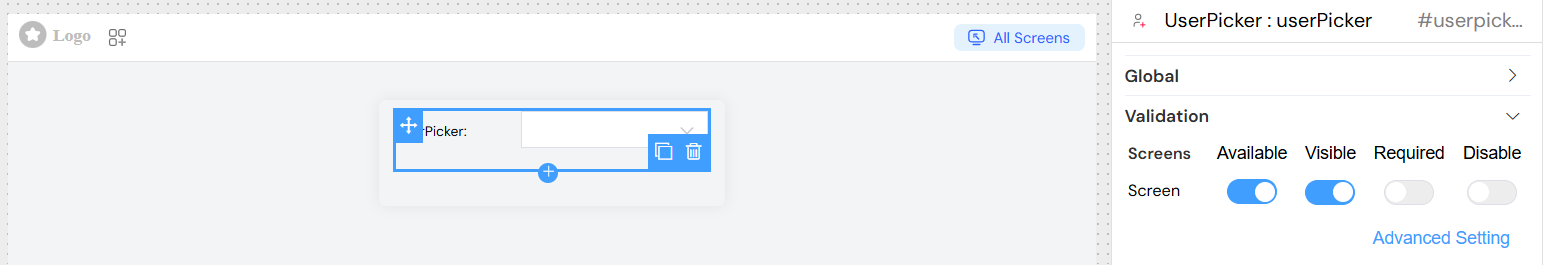
Screen-Based Configuration
The title widget supports different configurations for different screens/contexts:
- Available: Controls widget visibility on the interface
- Visible: Controls widget visibility on the interface
- Required: Makes user selection mandatory for form submission
- Disable: Disables the widget preventing user interaction
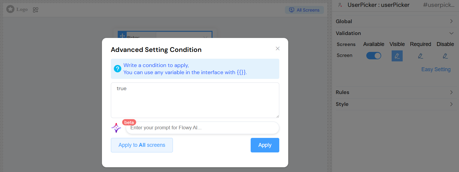
Advanced Visibility Conditions
Use JavaScript expressions for complex visibility logic:
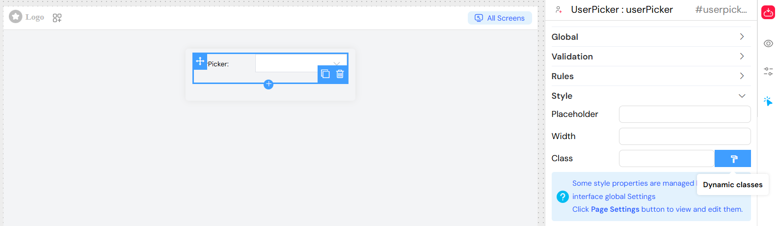
Style and Appearance
Placeholder Text
- Property:
placeholder - Type: String
- Default: "Search for a user..."
- Description: Placeholder text displayed when no selection is made
Width
- Property:
width - Type: String
- Default: "100%"
- Examples:
"300px","50%","auto" - Description: Controls the width of the selection field
CSS Classes
- Property:
classNames - Type: String
- Description: Custom CSS classes for styling
- Format: Space-separated class names
Dynamic Classes
- Property:
classes - Type: JavaScript Object
- Description: Conditional CSS classes based on form state
- Usage: Advanced styling based on data conditions
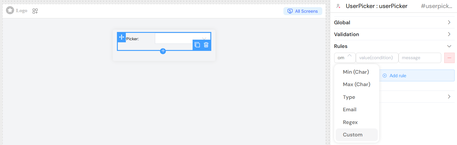
Validation Rules
Add custom validation rules beyond basic required validation:
Rule Types
- Pattern: Regular expression validation
- Custom: JavaScript function validation
- Length: Minimum/maximum selection count (for multiple selection)
Usage Examples
Basic Single User Selection
Multiple User Selection with Group Filter
Events and Interactions
onChange Event
- Trigger: When user selection changes
- Data Available:
SF_input.value: Selected user email(s)SF_input.SF_data: Complete user object(s)SF_input.SF_currentIndex: Current loop index (if in a loop)
Data Structure
Input Data (Selected Values)
// Single selection
"user@example.com"[
  // Multiple selection
  ("user1@example.com", "user2@example.com", "user3@example.com")
];
Complete User Objects (Available in SF_data)
{
  "email": "john.doe@example.com",
  "firstName": "John",
  "lastName": "Doe",
  "_id": "user_id_123",
  // Additional user properties
}
API Integration
User Search Endpoint
- URL:
/api/v1/user - Method: GET
- Parameters:
limit: Maximum results (default: 10)groups: Comma-separated group IDs for filteringkey: Search query stringSF_mode: Application mode parameter
Group Filtering
When groups are configured, the API request automatically includes group filters to restrict results to users belonging to the specified groups.
Best Practices
Performance Optimization
- Use group filtering to reduce search result size
- Set appropriate search limits for large user bases
- Consider caching frequently accessed user data
User Experience
- Provide clear placeholder text indicating the selection purpose
- Use descriptive labels that match your use case
- Enable clearable option for better user control
- Choose appropriate label format (name vs email) based on context
Validation Strategy
- Use required validation for critical selections
- Implement conditional validation based on form context
- Provide meaningful error messages for validation failures
Accessibility
- Ensure proper labeling for screen readers
- Maintain keyboard navigation support
- Use semantic HTML through Element UI components
Troubleshooting
Common Issues
No Users Appearing
- Check group filter configuration
- Verify user API endpoint availability
- Ensure users exist in the specified groups
Selection Not Saving
- Verify model/variable name is correctly configured
- Check for form validation errors
- Ensure proper data binding in parent form
Performance Issues
- Reduce group scope if too many users
- Implement pagination for large datasets
- Optimize search query parameters