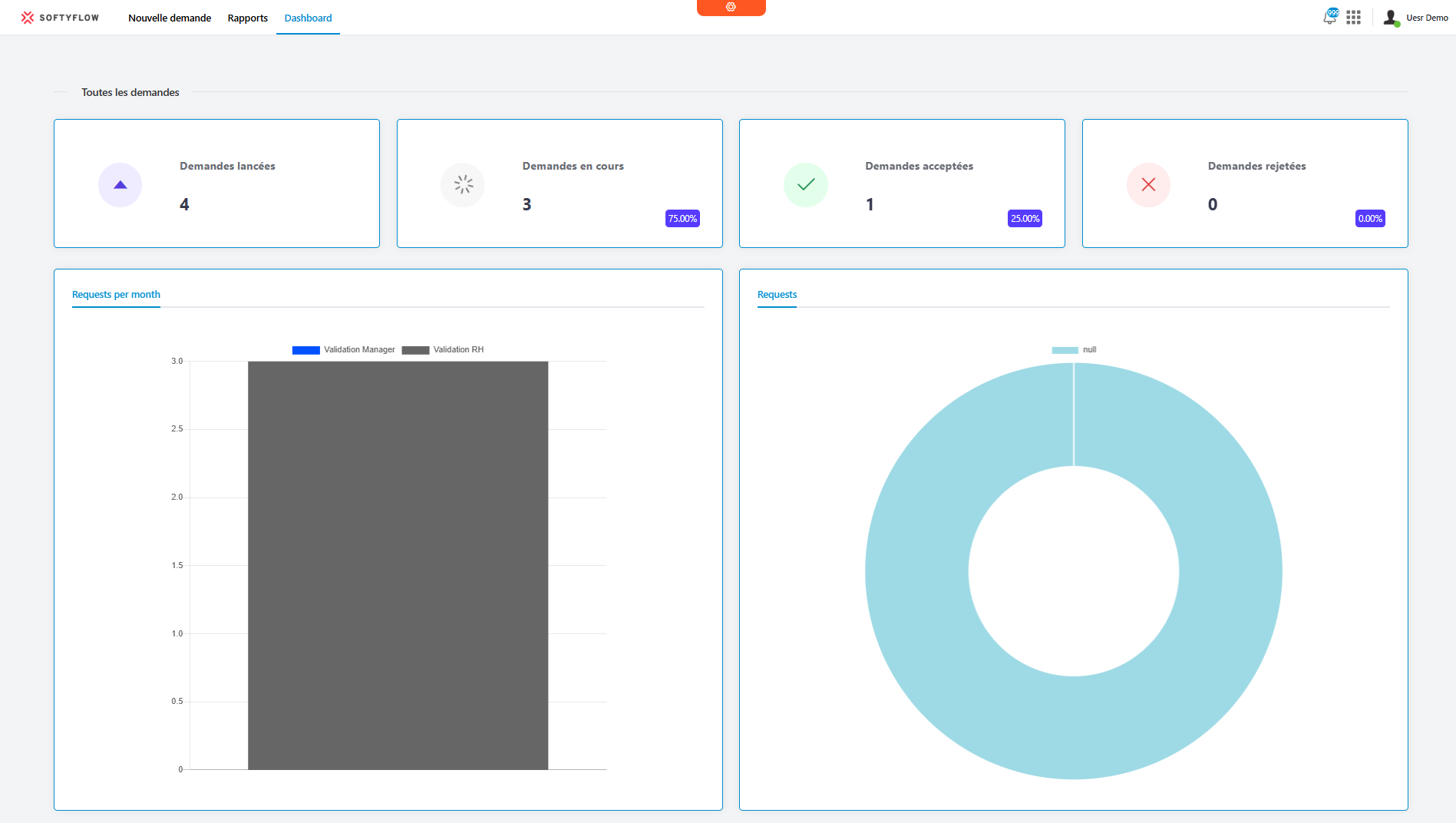
BasicChart Widget
Overview
The BasicChart widget enables creating and displaying interactive charts based on the Chart.js library. It offers great flexibility in configuring data, styles, and chart types to visualize your data clearly and attractively.
Supported Chart Types
The widget supports several chart types:
- Line: Line chart
- Bar: Bar chart
- Doughnut: Doughnut chart
- Pie: Pie chart
- PolarArea: Polar area chart
- Radar: Radar chart
Basic Configuration
Global Settings
Widget Name
- Field: Name
- Description: Display name of the widget
- Type: Text
Variable/Model
- Field: Variable/Model
- Description: Name of the variable that will store the chart data
- Type: Text
- Required: Yes
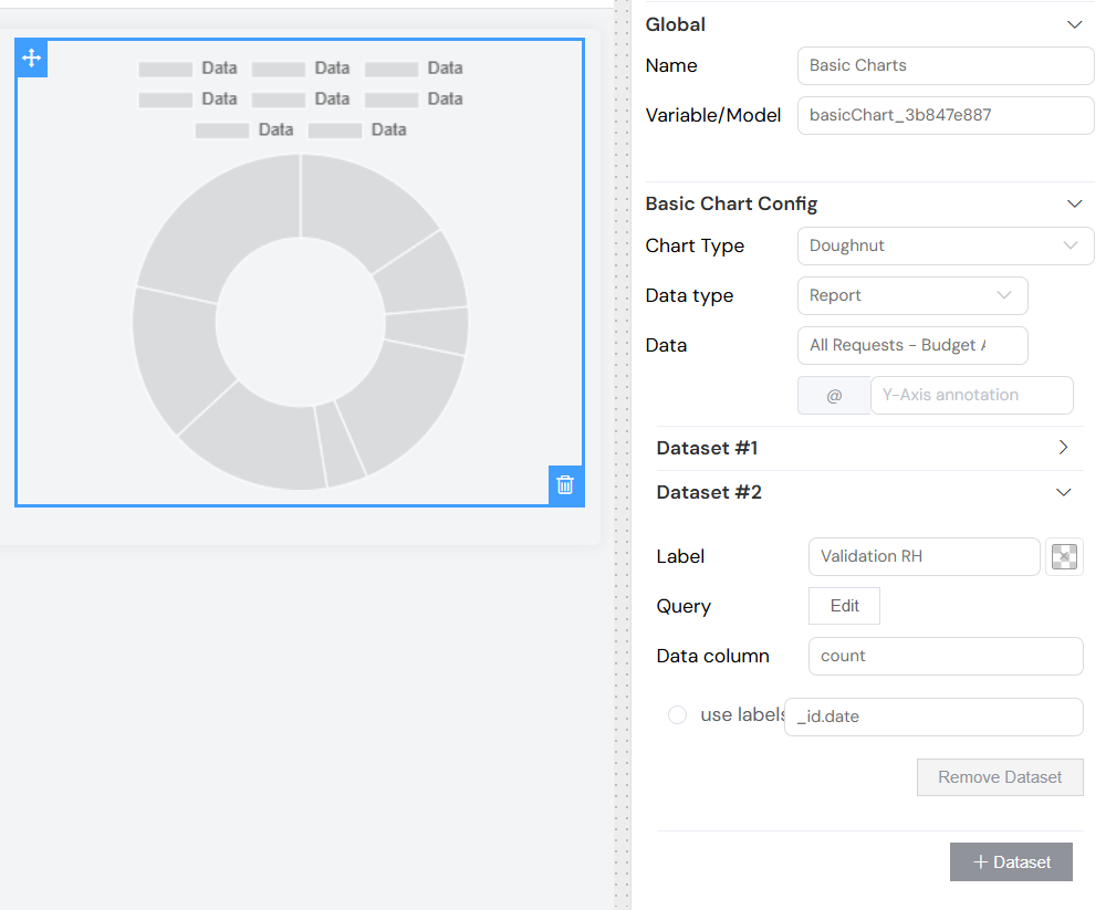
Chart Configuration
Chart Type
- Field: Chart Type
- Description: Selects the type of chart to display
- Options: Line, Bar, Doughnut, Pie, PolarArea, Radar
- Default: Line
Data Type
- Field: Data type
- Description: Source of data for the chart
- Options:
- Collection: Data from a database collection
- Report: Data from a generated report
- External databases: Data from an external database
Data Source
- Field: Data
- Description: Selection of the specific source based on the chosen type
- Depends on: Data type
- Configuration:
- If "Collection": List of available collections
- If "Report": List of available reports
- If "External databases": List of database connections
Y-Axis Annotation
- Field: Y-Axis annotation (@ prefix)
- Description: Text to display next to Y-axis values (e.g., €, $, %)
- Type: Optional text
- Example: "@€" will display "€100" instead of "100"
Dataset Configuration
Each chart can contain multiple datasets to compare different data series.
Adding a Dataset
- Click the "+ Dataset" button
- Configure each dataset individually
Dataset Configuration
Dataset Label
- Field: Label
- Description: Name displayed in the legend for this dataset
- Type: Text
Fill Color
- Field: Color (color picker)
- Description: Color used to represent this dataset
- Type: Color with alpha transparency support
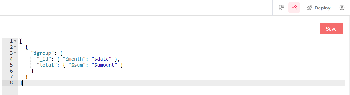
Data Query
- Field: Query (Edit button)
- Description: Query to retrieve data from the source
- Format: JSON
- Example for Collection:
[
  {
    "$match": {
      "status": "active"
    }
  },
  {
    "$group": {
      "_id": "$category",
      "total": { "$sum": "$amount" }
    }
  }
]
Data Column
- Field: Data column
- Description: Name of the field containing numeric values to display
- Type: Text
- Example: "total", "count", "value"
Labels Configuration
- Option: Use labels (radio button per dataset)
- Description: Designates which dataset will provide labels for the X-axis
- Associated Field: Labels column name
- Example: "category", "date", "name"
Advanced Configuration
Validation
The widget inherits standard validation options:
- Available: Controls if the widget is available according to the screen
- Visible: Controls visibility based on conditions
- Required: Not applicable for this widget type
- Disable: Controls the disabled state of the widget
Style
CSS Classes
- Field: Class
- Description: Custom CSS classes to apply to the widget
- Type: Text (class names separated by spaces)
Dynamic Classes
- Button: Brush icon
- Description: Allows defining conditional CSS classes
- Format: JSON object with conditions
Usage Examples
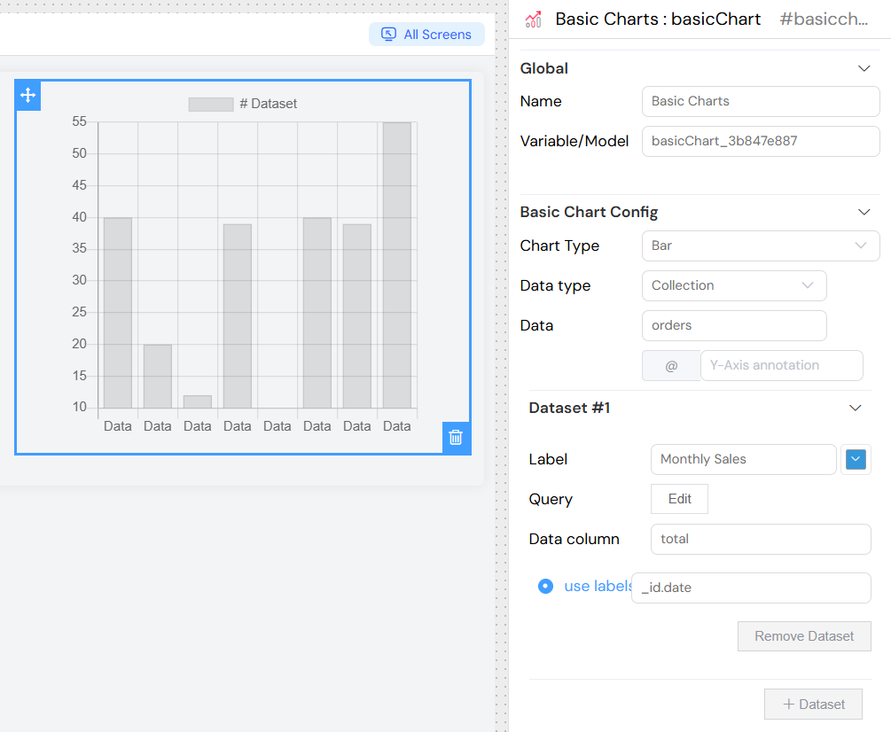
Simple Bar Chart
- Chart Type: Bar
- Data Type: Collection
- Source: Select an orders collection
- Dataset 1:
- Label: "Monthly Sales"
- Color: Blue (#3498db)
- Query:
- Data column: "total"
- Use labels: Checked
- Labels column: "_id"
Pie Chart with Multiple Sources
- Chart Type: Pie
- Data Type: Collection
- Dataset 1:
- Label: "Distribution by Category"
- Query to group by category
- Data column: "count"
Temporal Line Chart
- Chart Type: Line
- Y-Axis Annotation: "@€"
- Multiple Datasets to compare different periods or metrics
Technical Properties
Generated Variables
The widget automatically generates the following variables:
{model}: Contains chart data{model}_chart: Chart.js instance for advanced manipulations
Available Methods
renderChart()
Rebuilds the chart with new data
getChart()
Returns the current Chart.js instance
setChart(chart)
Sets a new Chart.js instance
Events
Query Updates
The chart automatically updates when query variables change.
Best Practices
Performance
- Limit the number of data points for optimal performance
- Use optimized queries with database-side aggregations
- Avoid recreating the chart too frequently
Design
- Choose contrasting colors for readability
- Use explicit labels for datasets
- Add unit annotations when necessary
Data
- Ensure data columns contain numeric values
- Handle missing data cases in your queries
- Use appropriate groupings to avoid information overload
Troubleshooting
Common Issues
Chart doesn't display
- Check that the data source is correctly configured
- Ensure the query returns data
- Verify data and label column names
Incorrect data
- Validate JSON query syntax
- Check data source access permissions
- Test the query independently of the widget
Style issues
- Check custom CSS classes
- Ensure colors are in valid hexadecimal format
- Control parent container dimensions
Error Messages
Configuration errors are displayed directly in the interface with resolution hints.
Advanced Features
Multiple Datasets
You can add multiple datasets to compare different data series on the same chart. Each dataset can have:
- Different queries
- Different colors
- Different data sources
- Shared or individual labels
Chart Responsiveness
The chart automatically adapts to its container size and provides responsive behavior across different screen sizes.
Interactive Features
Charts include built-in interactivity such as:
- Hover tooltips showing exact values
- Legend clicking to show/hide datasets
- Animation effects on data updates
Custom Styling
Beyond basic configuration, you can:
- Apply custom CSS classes for advanced styling
- Use dynamic classes based on data conditions
- Control chart dimensions and layout
Integration with Other Components
The BasicChart widget can be integrated with other form components to create dynamic dashboards where:
- Filter components update chart queries
- Data selection affects chart display
- Chart interactions trigger other component updates