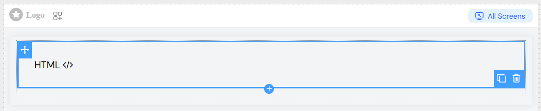
HTML Widget
Overview
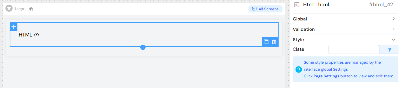
The HTML widget allows you to embed custom HTML content directly into your interface. This widget provides complete flexibility for displaying rich content, custom layouts, or integrating third-party HTML components while maintaining full control over styling and behavior.
Basic Configuration
Global Settings
Name
- Field: Widget name identifier
- Usage: Set a descriptive name for easy identification in the widget tree
- Example: "Custom Header", "Product Description"
Variable/Model
- Field: Model binding for the widget
- Usage: Bind the widget to a data model or variable for dynamic content
- Validation: The system validates model names and shows warnings for potential issues
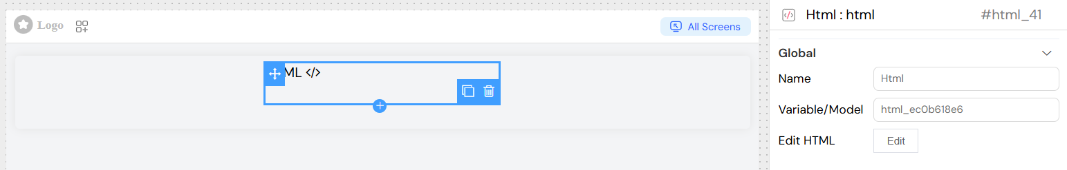
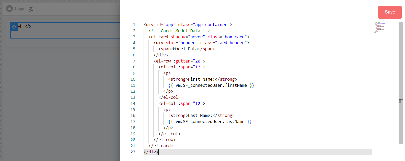
HTML Content Editor
Edit HTML Button
- Location: Global section → Edit HTML
- Function: Opens a code editor for writing custom HTML content
- Features:
- Syntax highlighting
- Code completion
- Error detection
- Preview capabilities
Supported HTML
- Standard HTML5 elements and attributes
- Inline CSS styling
- JavaScript integration (with platform security considerations)
- Dynamic content using template variables
Template Variables
Access dynamic data within your HTML content:
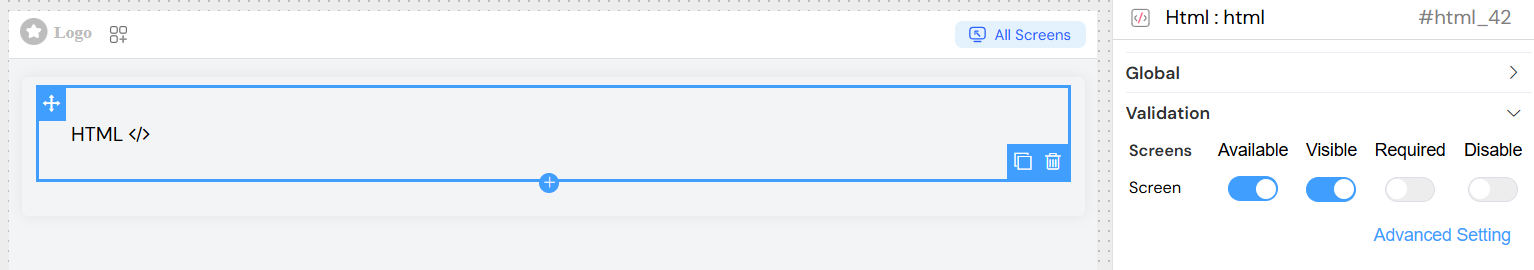
Validation Configuration
Screen-Based Validation
Configure widget behavior across different screens/contexts:
Available
- Purpose: Controls whether the widget exists in the DOM
- Options:
- Boolean toggle (true/false)
- Advanced condition using JavaScript expressions
Visible
- Purpose: Controls widget visibility (display/hide)
- Options:
- Boolean toggle
- Advanced condition with template variables
- Advanced Example:
userRole == 'admin'
Required
- Purpose: Makes the widget mandatory for form validation
- Note: Primarily used when HTML widget contains form elements
- Options: Boolean or conditional expression
Disable
- Purpose: Disables interactive elements within the widget
- Options: Boolean or conditional expression
Style Configuration
- Field: Class names
- Usage: Apply predefined CSS classes
- Format: Space-separated class names
Widget Template Structure
Generated Component
The widget generates a Vue.js component with:
- Unique component ID
- Reactive data binding
- Conditional rendering
- Event handling capabilities
DOM Structure
<div
  id="[widgetId]"
  v-if="[visibilityCondition]"
  class="[staticClasses]"
  :class="[dynamicClasses]"
>
  <!-- Your custom HTML content -->
</div>
Integration Examples
Basic HTML Content
<div class="custom-section">
  <h2>Welcome {{SF_connectedUser.firstName}}</h2>
  <p>Last login: {{models.lastLogin }}</p>
</div>
Interactive Elements
<div class="interactive-widget" style="display: flex; align-items: center; gap: 12px;">
  <el-button type="primary" size="large" @click="customFunction">
    Click
  </el-button>

  <el-input v-model="models.inputValue" placeholder="Enter text" clearable style="max-width: 220px;" />
</div>
Conditional Content
<div v-if="models.isAdmin">
  <h3>Admin Panel</h3>
  <div class="admin-controls">
    <!-- Admin-specific content -->
  </div>
</div>
Best Practices
Security Considerations
- Sanitize user-generated content
- Avoid inline JavaScript in production
- Use platform-provided security features
- Validate all dynamic data
Performance Optimization
- Minimize DOM complexity
- Use efficient CSS selectors
- Implement lazy loading for heavy content
- Optimize images and media
Accessibility
- Include proper ARIA attributes
- Ensure keyboard navigation support
- Provide alternative text for images
- Maintain proper heading hierarchy
Maintainability
- Use semantic HTML structure
- Comment complex functionality
- Follow consistent naming conventions
- Separate concerns (structure, style, behavior)
Troubleshooting
Common Issues
Widget Not Displaying
- Check visibility conditions
- Verify model bindings
- Ensure proper HTML syntax
- Review browser console for errors
Styling Problems
- Verify CSS class names
- Check for conflicting styles
- Ensure responsive design compatibility
- Test across different screen sizes
Dynamic Content Not Updating
- Confirm model binding syntax
- Check for reactivity issues
- Verify data source connections
- Review JavaScript console errors
Debug Mode
Enable debug mode to:
- View generated component structure
- Monitor data binding updates
- Track validation rule execution
- Inspect DOM changes
Advanced Features
Form Integration
Include form elements that integrate with the platform's form system:
<div class="form-section">
  <label for="customField">Custom Input:</label>
  <el-input
    id="customField"
    v-model="model.customField"
    placeholder="Enter value"
    clearable
  ></el-input>
</div>
This HTML widget provides maximum flexibility while maintaining integration with the platform's validation, styling, and data binding systems. Use it when standard widgets don't meet your specific requirements or when you need complete control over the presentation layer.