Steps Widget
Overview
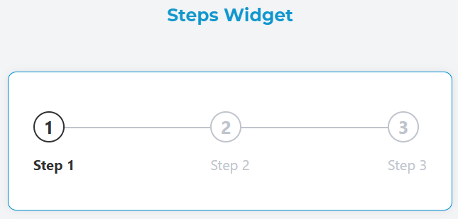
The Steps widget is a visual progress indicator that displays a sequence of steps in a process. It shows the current progress and allows users to understand where they are in a multi-step workflow. The widget is fully responsive and adapts to different screen sizes.
Configuration
Widget Properties
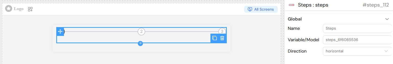
Name
- Field: Name
- Description: A unique identifier for the widget instance
- Type: Text input
- Required: Yes
Variable/Model
- Field: Variable/Model
- Description: The data model that stores the current step index
- Type: Text input
- Required: Yes
- Default: Automatically generated based on widget name
Direction
- Field: Direction
- Description: Controls the orientation of the steps display
- Type: Dropdown
- Options:
horizontal: Steps are displayed horizontally (default)vertical: Steps are displayed vertically
- Usage: Choose based on available space and design requirements
Data Source Configuration
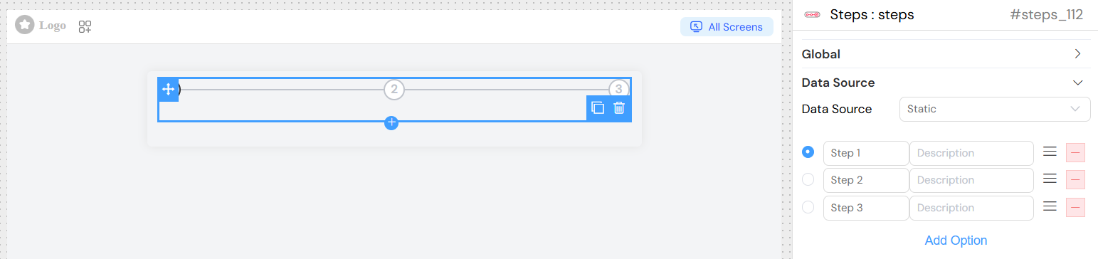
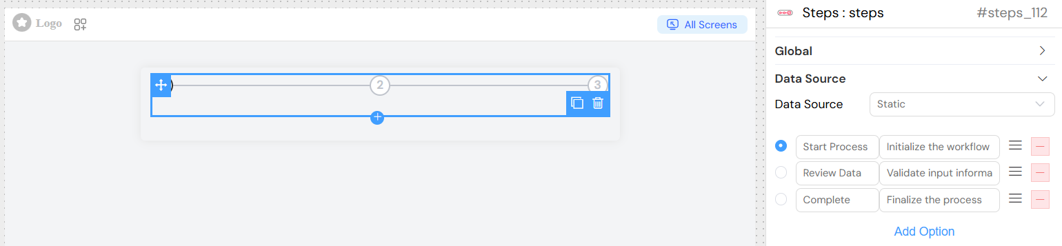
Static Data Source
When using static data, configure individual steps directly in the widget settings:
Step Configuration
Each step requires:
- Title: Display name for the step
- Description: Additional information about the step
Adding Steps
- Select "Static" as the data source
- Configure each step with title and description
- Steps are automatically numbered starting from 0
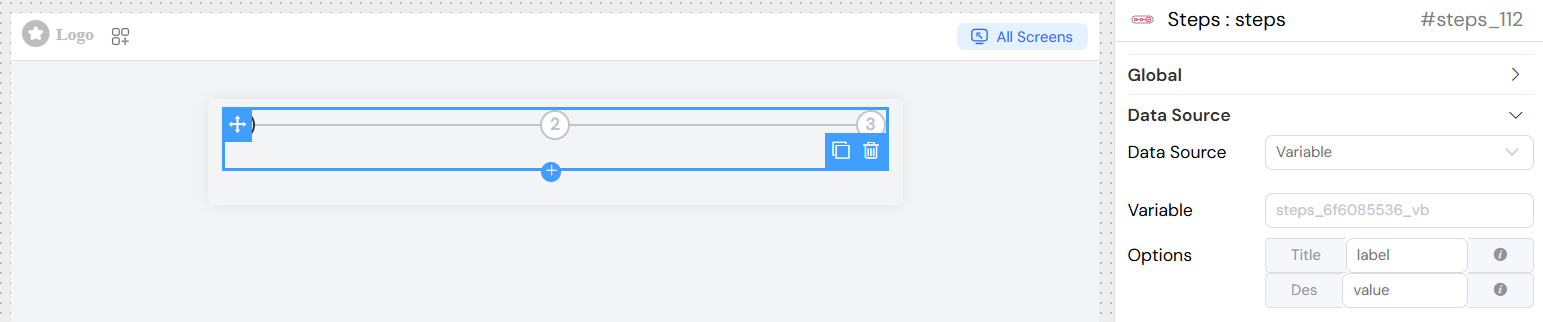
Variable Data Source
For dynamic content, use variable data source:
Variable Binding
- Model Variable:
{model_name}_vb - Label Property: Configure which field contains the step title
- Value Property: Configure which field contains the step description
Label Configuration
- Field: Label
- Description: Specifies the property name for step titles
- Syntax Options:
- Simple property:
title - Dynamic expression:
$.title + ' - ' + $.subtitle
- Simple property:
Value Configuration
- Field: Value/Description
- Description: Specifies the property name for step descriptions
- Syntax Options:
- Simple property:
description - Dynamic expression:
$.description + ' (' + $.status + ')'
- Simple property:
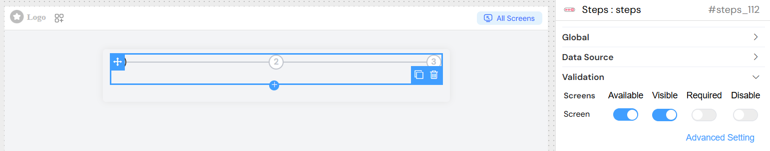
Validation and Visibility
Screen-based Validation
Configure different behaviors for each screen:
Available
- Type: Boolean
- Description: Controls if the widget is available on the screen
- Default: True
Visible
- Type: Boolean or Expression
- Description: Controls widget visibility
- Options:
- Simple boolean toggle
- Advanced expression using variables
Required
- Type: Boolean or Expression
- Description: Makes the widget required for form submission
- Default: False
Disable
- Type: Boolean or Expression
- Description: Disables widget interaction
- Default: False
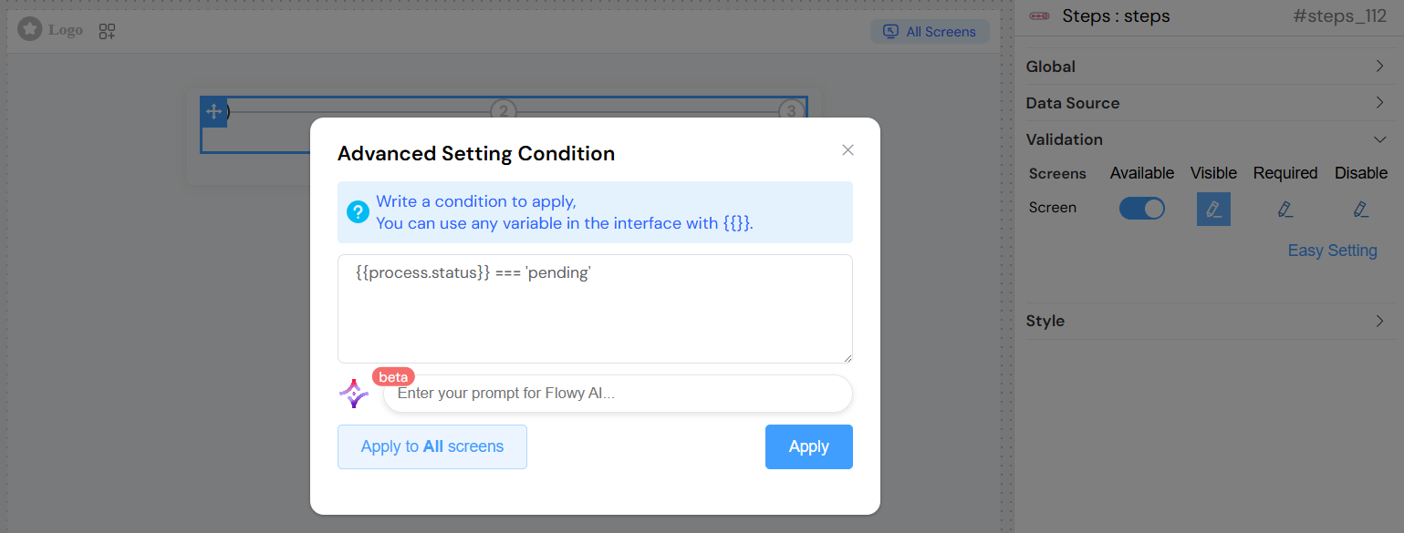
Advanced Conditions
Use JavaScript expressions with model variables:
Styling and Appearance
CSS Classes
- Field: Class
- Description: Add custom CSS classes for styling
- Type: Text input
- Usage: Space-separated class names
Simple Design
- Field: Simple Design
- Description: Enables a simplified visual appearance
- Type: Toggle switch
- Default: False
- Effect: When enabled, reduces visual complexity for cleaner presentation
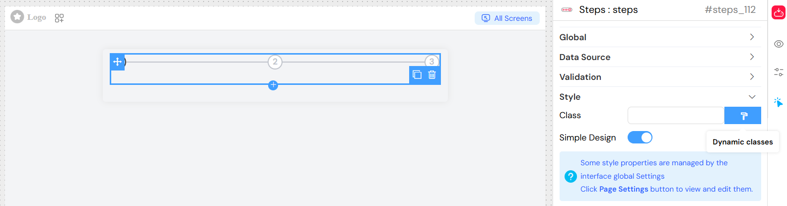
Dynamic Classes
Configure conditional CSS classes based on data:
{
  "completed": "{{currentStep}} > 3",
  "error": "{{hasError}}",
  "highlight": "{{isImportant}}"
}
Static Configuration Examples
Best Practices
Design Guidelines
- Keep titles concise: Use short, descriptive titles
- Provide helpful descriptions: Add context without overwhelming
- Choose appropriate direction: Horizontal for wide layouts, vertical for narrow
- Consider mobile experience: Test accordion behavior on small screens
Performance
- Limit step count: Avoid too many steps (recommended max: 7-10)
- Optimize dynamic data: Use efficient data structures for variable sources
- Cache static data: Pre-configure static steps when possible
Accessibility
- Use semantic titles: Ensure screen readers can interpret steps
- Provide clear descriptions: Help users understand each step's purpose
- Test keyboard navigation: Ensure accessibility compliance
Troubleshooting
Common Issues
Steps not displaying
- Check data source configuration
- Verify model variable binding
- Ensure data structure matches expected format
Responsive layout problems
- Test on different screen sizes
- Verify CSS classes don't conflict
- Check container width constraints
Data not updating
- Verify model binding syntax
- Check for JavaScript errors in expressions
- Ensure data source is properly connected
Debug Tips
- Use browser developer tools to inspect widget state
- Check console for JavaScript errors
- Verify data structure in network tab
- Test with simplified configuration first
API Reference
Component Properties
prop: Widget propertiescomp_model: Data modelcomp_management: Management statemodels: Available modelsmanagement: Management configurationvisible: Visibility staterequired: Required statedisable: Disabled stateclass_config: CSS class configuration
Widget Options
direction: Layout directionclassNames: CSS classesdefaultValue: Initial stepremote: Data source typeoptions: Static step dataprops.label: Label property pathprops.value: Value property pathisSimple: Simple design mode