Loop Widget
Overview
The Loop widget enables you to create dynamic, repeatable sections in your interface where users can add, remove, and manage multiple instances of the same content structure. This widget is particularly useful for forms that require variable numbers of entries, such as contact lists, item inventories, or dynamic questionnaires.
Features
- Dynamic Row Management: Add and remove rows dynamically
- Customizable Content: Each row contains a configurable grid layout
- User Controls: Built-in add/remove buttons with customizable text
- Validation Support: Comprehensive validation rules for visibility, requirements, and disable states
- Responsive Design: Automatic layout adjustment based on screen size
Configuration Options
Global Settings
Basic Configuration
Name
- Field: Name
- Description: Display name for the widget
- Type: Text input
- Usage: Used for identification and labeling
Variable/Model
- Field: Variable/Model
- Description: The data model that stores the loop's array data
- Type: Text input
- Required: Yes
- Usage: Defines the variable name that will contain the array of row data
Gutter
- Field: Gutter
- Description: Spacing between columns in pixels
- Type: Number input
- Usage: Controls the horizontal spacing between grid columns
Loop-Specific Settings
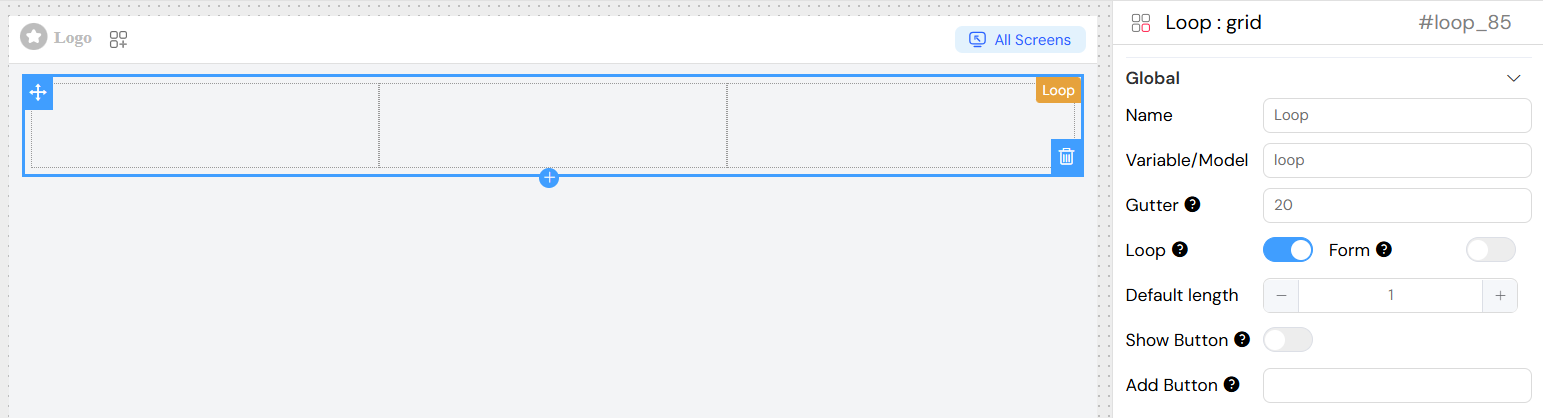
Default Length
- Field: Default length
- Description: Initial number of rows to display when the widget loads
- Type: Number input
- Default: 0
- Minimum: 0
- Usage: Set how many rows appear initially
Show Button
- Field: Show Button (Always Show)
- Description: Controls whether the add button is always visible
- Type: Toggle switch
- Default: False
- Usage: When enabled, the add button remains visible even when rows exist
Add Button Text
- Field: Add Text
- Description: Custom text for the add button
- Type: Text input
- Default: "Add"
- Usage: Customize the label displayed on the add button
Content Structure
The loop widget contains a grid layout where you can add various form elements and components. Each row in the loop will contain the same structure of elements.
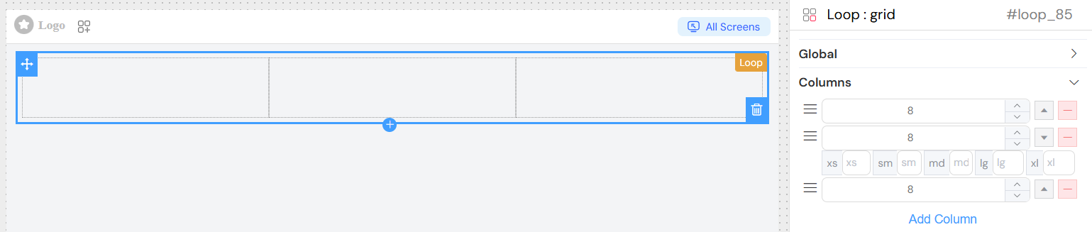
Columns
- Description: Define the column structure for each row
- Configuration: Each column can have:
- Span: Width of the column (1-24)
- Responsive Settings: xs, sm, md, lg, xl breakpoints
- Content: Nested widgets and components
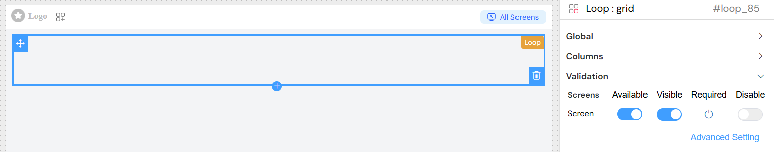
Validation Rules
Screen-Based Validation
The loop widget supports validation across different screens/contexts:
Available
- Description: Controls whether the widget is available in specific screens
- Type: Boolean per screen
- Usage: Hide/show the entire loop widget based on context
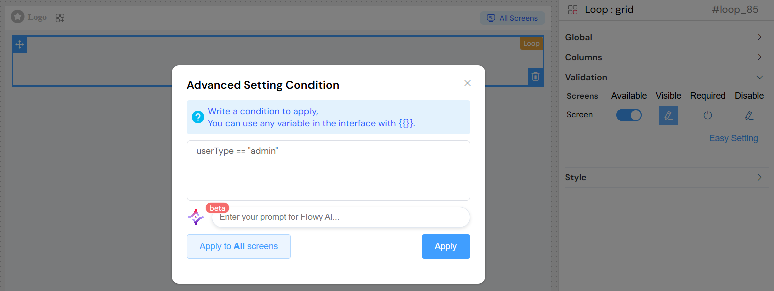
Visible
- Description: Controls widget visibility with advanced conditions
- Type: Boolean or JavaScript expression
- Usage: Dynamic visibility based on form data or user interaction
Required
- Description: Makes the loop widget mandatory
- Type: Boolean or JavaScript expression
- Usage: Enforce that users must add at least one row
Disable
- Description: Disables the widget functionality
- Type: Boolean or JavaScript expression
- Usage: Prevent users from adding/removing rows
Advanced Validation
You can use JavaScript expressions for dynamic validation:
Layout and Styling
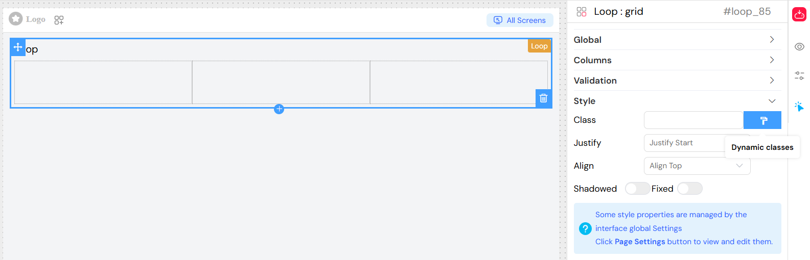
Custom Classes
- Static Classes
- Field: Class
- Type: Text input
- Usage: Add CSS class names separated by commas
- Example:
custom-grid, highlighted
- Dynamic Classes
- Access: Click the paint brush icon next to the Class field
- Usage: Write JavaScript expressions that return class names
- Context: Access model data using
models.prefix - Example:
models.status === 'active' ? 'active-grid' : 'inactive-grid'
Class Names
- Field: Class
- Description: Custom CSS classes for styling
- Type: Text input
- Usage: Apply custom styles or framework classes
Justify
- Options: Start, End, Center, Space Around, Space Between
- Description: Horizontal alignment of content within each row
- Usage: Controls how content is distributed horizontally
Align
- Options: Top, Middle, Bottom
- Usage: Controls vertical alignment of content within columns
- Default: Top
Shadowed
- Description: Adds shadow effect to the grid container
- Type: Toggle switch
- Usage: Enhance visual separation
Fixed
- Description: Makes the grid position fixed
- Type: Toggle switch
- Usage: Keep the grid in a fixed position during scroll
User Interaction
Adding Rows
Users can add new rows in two ways:
- Plus Button: Each existing row has a plus (+) button that adds a new row after the current one
- Empty State Button: When no rows exist or "Always Show" is enabled, a primary button appears to add the first/additional row
Removing Rows
Each row contains a minus (-) button that allows users to remove that specific row. The removal affects:
- The data array (removes the corresponding item)
- The UI (removes the row immediately)
- Validation (re-validates the remaining rows)
Row Management
- Unique Keys: Each row is assigned a unique key for proper tracking
- Index Management: Row indices are automatically managed
- Data Binding: Each row's data is bound to the corresponding array index
Data Structure
Model Binding
The loop widget stores data as an array in the specified model variable:
// Example data structure
loopData: [
  {
    // Row 1 data
    field1: "value1",
    field2: "value2",
    SF_row_key: "generated_unique_key",
  },
  {
    // Row 2 data
    field1: "value3",
    field2: "value4",
    SF_row_key: "generated_unique_key",
  },
];
Special Properties
- SF_row_key: Automatically generated unique identifier for each row
- Array Index: Accessible via
SF_currentIndexin templates - Row Data: Accessible via
SF_currentRowin templates
Implementation Examples
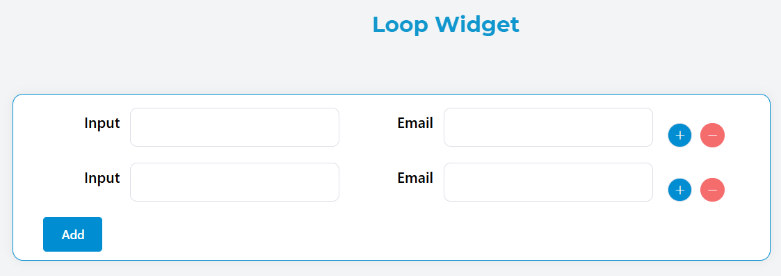
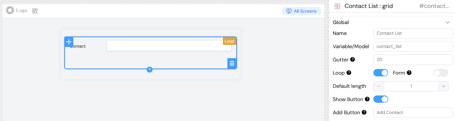
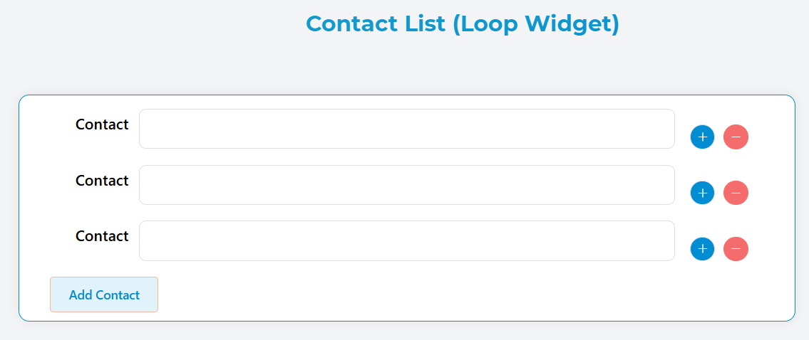
Basic Contact List
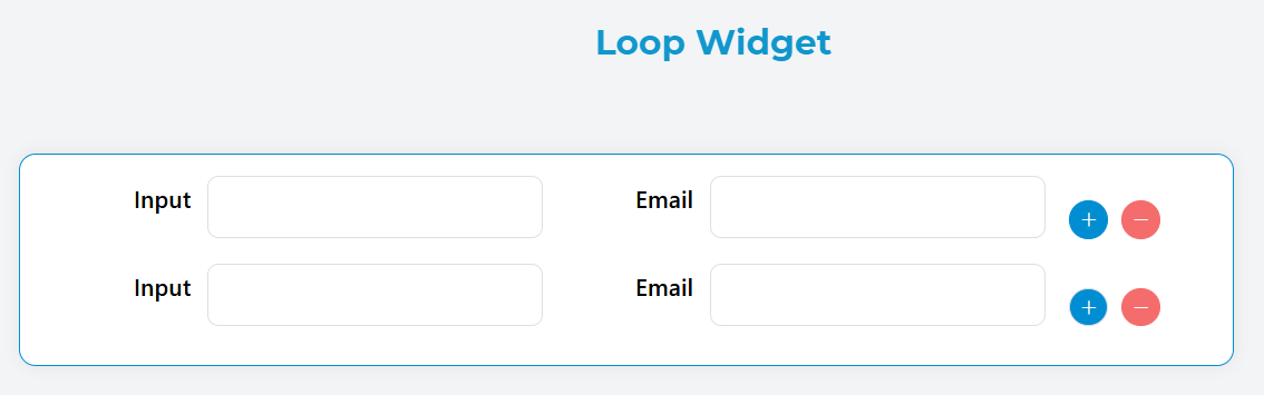
This example demonstrates how to use the Loop widget to display a simple and clean contact list.
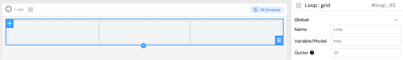
The first image below shows the configuration stage, where you define the structure of a single contact entry and set up the looping behavior.
The second image shows the final result — how the loop renders the list dynamically using actual data from the model.
Best Practices
Performance
- Limit Default Rows: Start with 0-1 default rows to improve initial load time
- Optimize Nested Components: Use lightweight components within loop rows
- Implement Validation Efficiently: Use simple boolean checks when possible
User Experience
- Clear Labels: Use descriptive text for add buttons
- Confirmation: Consider confirmation dialogs for row deletion
- Visual Feedback: Provide clear indication of row boundaries
- Responsive Design: Test on various screen sizes
Data Management
- Validation: Implement both client and server-side validation
- Data Cleanup: Remove empty or invalid rows before submission
- State Management: Properly handle form state changes
- Error Handling: Display meaningful error messages
Troubleshooting
Common Issues
Rows Not Adding
- Check model binding is correctly configured
- Verify add button is not disabled by validation rules
- Ensure JavaScript validation expressions are syntactically correct
Data Not Saving
- Confirm model variable matches form submission structure
- Check for validation errors preventing form submission
- Verify nested component configurations
Layout Problems
- Review column span values (should sum to 24 or less)
- Check responsive breakpoint settings
- Verify CSS class conflicts
Validation Not Working
- Test validation expressions in browser console
- Check variable names match form data structure
- Ensure validation rules are applied to correct screens
Debug Tips
- Console Logging: Use browser console to inspect loop data
- Validation Testing: Test expressions with sample data
- Component Inspection: Use Vue DevTools to examine component state
- Data Flow: Trace data from model to display to submission
Integration with Other Widgets
The loop widget works seamlessly with:
- Form widgets (inputs, selects, etc.)
- Display widgets (text, images, etc.)
- Layout widgets (grids, tabs, etc.)
- Action widgets (buttons, links, etc.)
This comprehensive configuration allows for flexible, powerful dynamic forms that adapt to user needs while maintaining data integrity and user experience standards.