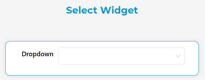
Select Widget
Overview
The Select widget is a dropdown component that allows users to choose one or multiple options from a predefined list. It supports various data sources and provides extensive customization options for different use cases.
Basic Configuration
Global Settings
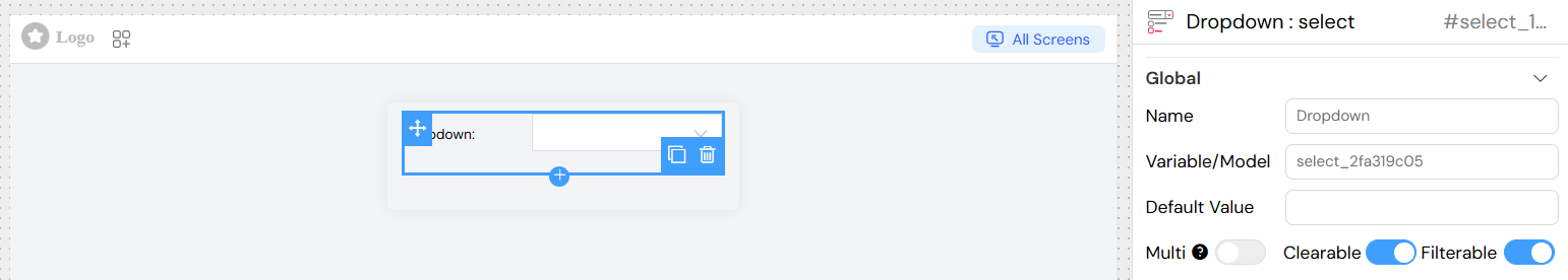
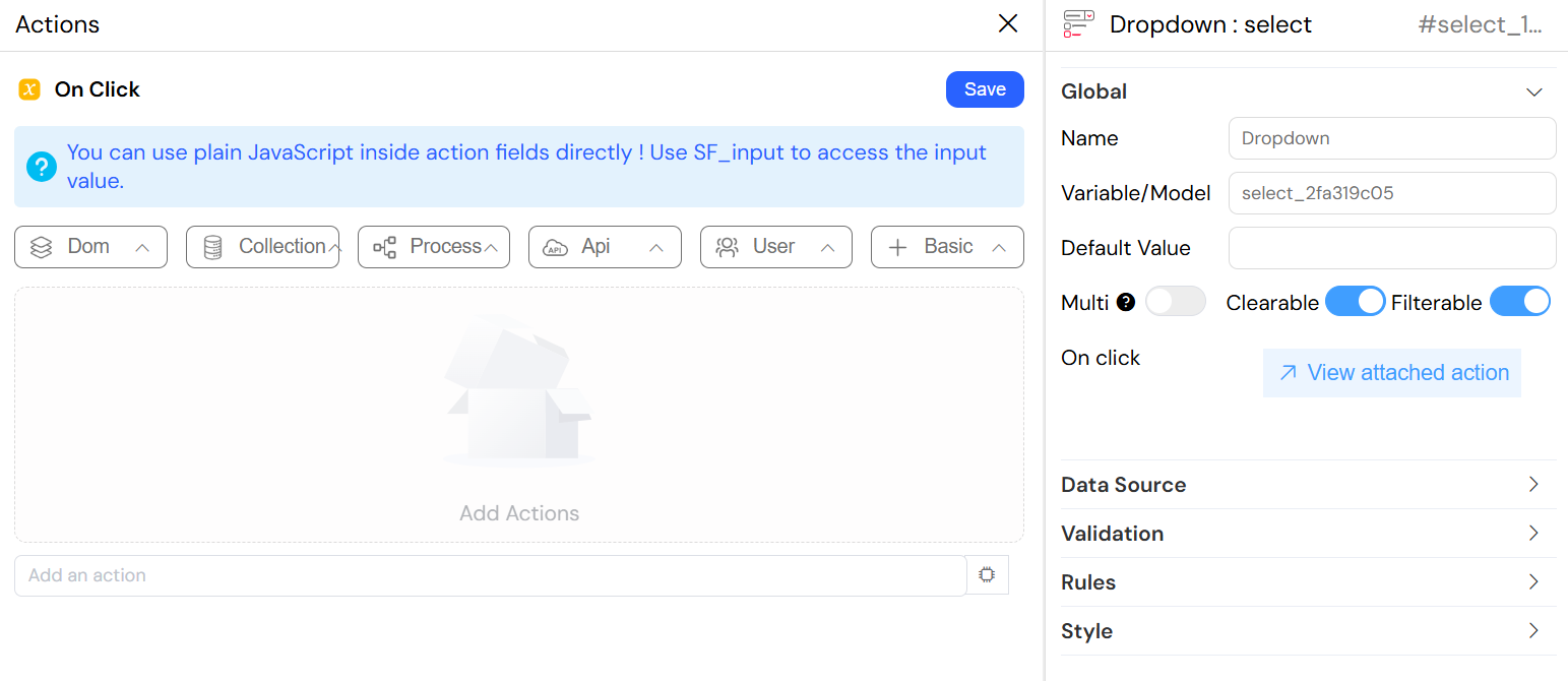
Name
- Field: Name
- Description: Display name for the widget
- Type: Text input
- Required: Yes
Variable/Model
- Field: Variable/Model
- Description: The variable name that will store the selected value(s)
- Type: Text input
- Required: Yes
- Note: This is the data binding variable for the widget
Default Value
- Field: Default Value
- Description: Pre-selected value when the widget loads
- Type: Text input
- Supports: Dynamic expressions using variables
Selection Options
Multiple Selection
- Field: Multi
- Description: Enable selection of multiple options
- Type: Toggle switch
- Default: false
- Effect: When enabled, users can select multiple items and the result will be stored as an array
Clearable
- Field: Clearable
- Description: Allow users to clear the selected value(s)
- Type: Toggle switch
- Default: false
- Effect: Adds a clear button to remove selections
Filterable
- Field: Filterable
- Description: Enable search/filter functionality within the dropdown
- Type: Toggle switch
- Default: false
- Effect: Adds a search input to filter available options
Data Source Configuration
The Select widget supports multiple data source types:
Static Data
- Source Type: Static
- Configuration: Custom List
- Description: Use predefined static data from custom lists
- Setup:
- Select "Static" as remote option
- Choose or create a custom list
- Options will be loaded from the selected list

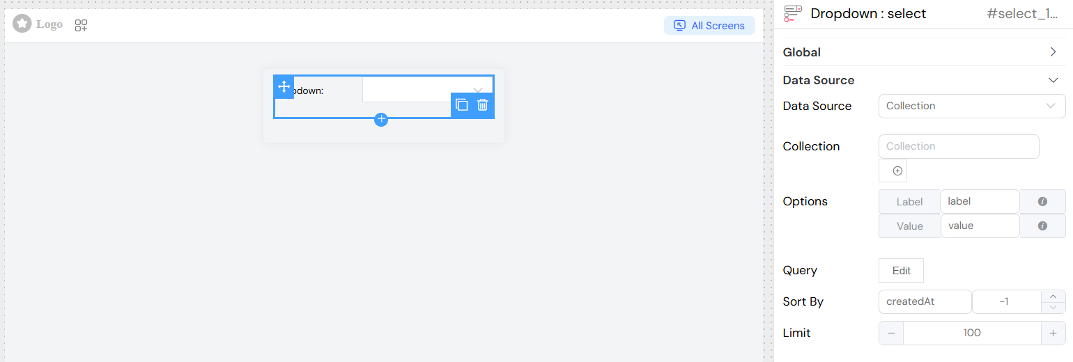
Collection Data
- Source Type: Collection
- Configuration: Database Collection
- Description: Load options from a database collection
- Setup:
- Select "Collection" as remote option
- Choose the target collection
- Configure label and value field mappings
- Set optional query filters, sorting, and limits
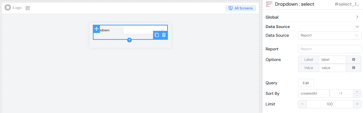
Report Data
Source Type: Report
Configuration: Report Query
Description: Load options from report results
Setup:
- Select "Report" as remote option
- Choose the target report
- Configure label and value field mappings
- Set optional query filters, sorting, and limits
External Database (SQL)
Source Type: SQL
Configuration: External Database Connection
Description: Load options from external database queries
Setup:
- Select "SQL" as remote option
- Choose the database connection
- Configure the SQL query
- Set label and value field mappings
](/img/04_ressources/project/web-interface/widgets/selectEDS.png)
Field Mapping
For dynamic data sources (Collection, Report, SQL), configure field mappings:
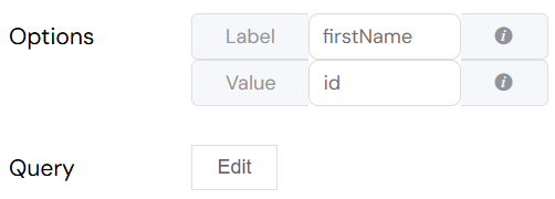
Label Field
- Purpose: Defines what text is displayed to users
- Static Use:
firstName - Dynamic Use:
$.firstName + ' - ' + $.lastName - Support: Expressions using
$prefix for field references
Value Field
- Purpose: Defines what value is stored when an option is selected
- Static Use:
id - Dynamic Use:
$.id + '-' + $.type - Support: Expressions using
$prefix for field references
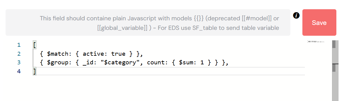
Query Configuration
Basic Query
- Purpose: Filter and customize data retrieval
- Language: JavaScript with variable support
- Variables: Use
{{variableName}}for interface variables - Example:
{status: "active", category: "{{selectedCategory}}"}
Aggregation
- Purpose: Use aggregation pipelines for complex data processing
- Availability: Collection and Report sources
- Toggle: "Is Aggregation" switch
- Example:
Sorting
- Sort By: Field name to sort by
- Direction:
1for ascending-1for descending
- Object Sort: Advanced sorting using sort objects
Limit
- Purpose: Restrict number of options loaded
- Type: Number input
- Default: No limit
- Use Case: Performance optimization for large datasets
Validation Rules
Required Validation
- Configuration: Per screen basis
- Options:
- Boolean toggle for simple required/not required
- Advanced conditions using JavaScript expressions
- Message: Custom validation message
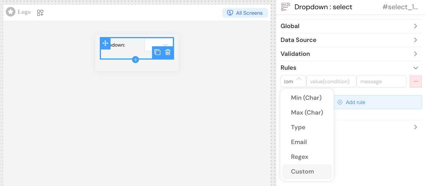
Custom Rules
Add additional validation rules:
- Min Length: Minimum selection requirement
- Max Length: Maximum selection limit
- Pattern: Regular expression validation
- Custom: JavaScript validation functions
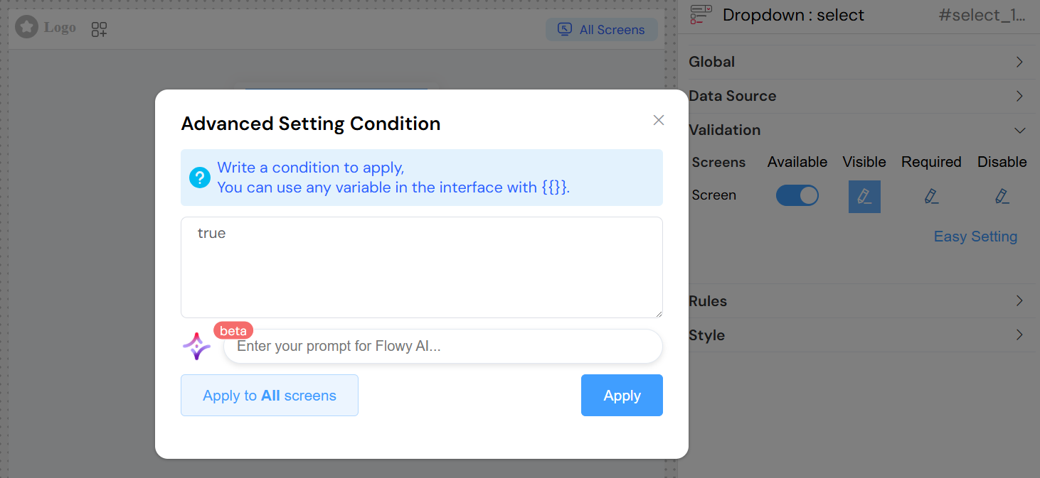
Screen-Based Configuration
Configure widget behavior per screen:
Availability
- Purpose: Control if widget exists on specific screens
- Options: Boolean or conditional expression
Visibility
- Purpose: Control if widget is visible on specific screens
- Options: Boolean or conditional expression
- Advanced: JavaScript conditions using
{{variables}}
Required Status
- Purpose: Control if widget is required on specific screens
- Options: Boolean or conditional expression
Disabled State
- Purpose: Control if widget is disabled on specific screens
- Options: Boolean or conditional expression
Styling and Layout
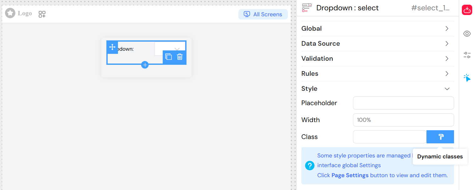
Placeholder Text
- Field: Placeholder
- Purpose: Help text displayed when no option is selected
- Example: "Please select an option"
Width
- Field: Width
- Purpose: Control widget width
- Format: CSS width values (px, %, em, etc.)
- Example: "300px", "100%"
CSS Classes
- Field: Class
- Purpose: Add custom CSS styling
- Types:
- Static Classes: Space-separated class names
- Dynamic Classes: Conditional classes based on data state
Event Handling
On Click Event
- Purpose: Execute custom actions when selection changes
- Language: JavaScript
- Available Variables:
SF_input.value: Selected valueSF_input.SF_data: Complete selected objectSF_input.SF_currentIndex: Loop index (if in a loop)
Action Integration
- V2 Interface: Use visual action builder
- Legacy: Direct JavaScript function calls
- Parameters: Access to selection data and context
Best Practices
- Performance: Use limits for large datasets
- User Experience: Enable filtering for lists with 10+ items
- Validation: Provide clear error messages
- Accessibility: Use descriptive labels and placeholders
- Data Integrity: Validate selected values against available options
- Responsive Design: Set appropriate widths for different screen sizes
Troubleshooting
Common Issues
No Options Displayed
- Check data source configuration
- Verify query syntax and variables
- Ensure proper field mappings
Performance Issues
- Add appropriate limits
- Use filtering instead of loading all data
- Consider pagination for very large datasets
Validation Errors
- Check required field configuration
- Verify custom validation rules
- Ensure proper screen-based settings
Selection Not Saving
- Verify variable/model configuration
- Check data type compatibility
- Ensure proper form submission handling