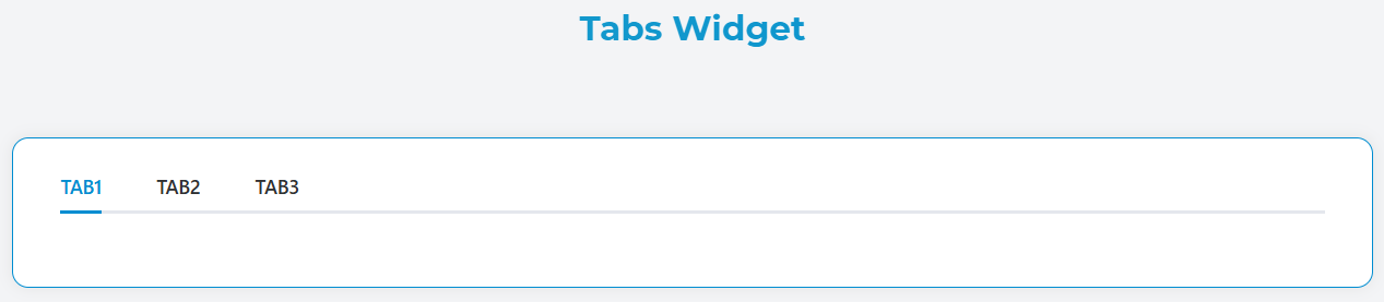
Tabs Widget
The Tabs widget allows you to organize content into multiple tabbed sections, providing an intuitive way to display related information in a compact interface.
Overview
The Tabs widget creates an interactive tabbed interface where users can switch between different content sections. Each tab can contain any combination of other widgets and supports dynamic visibility, validation rules, and custom styling.
Basic Configuration
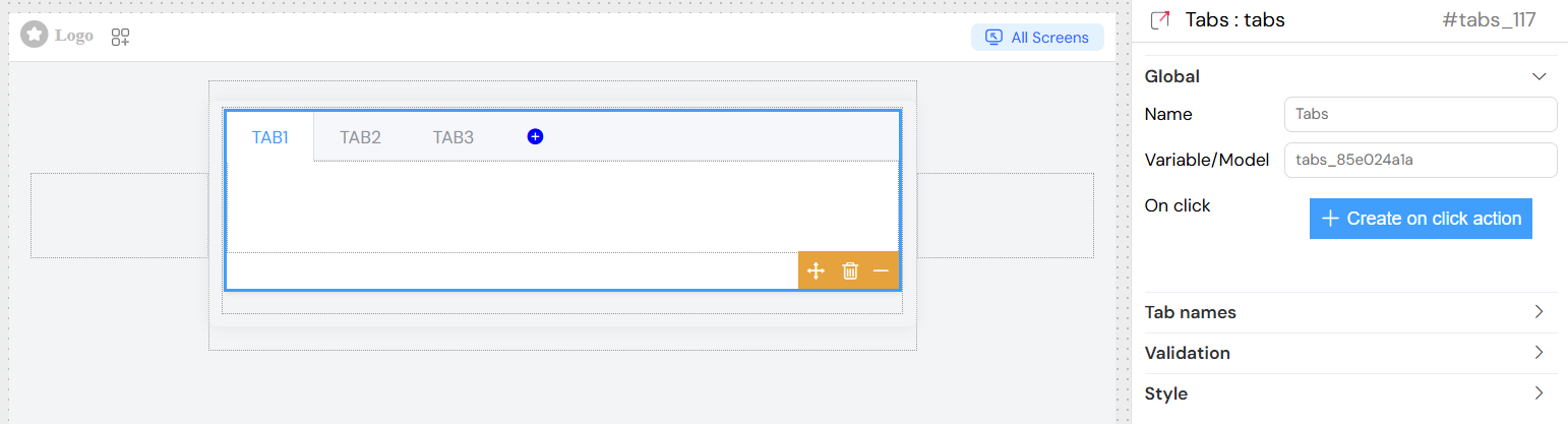
Global Settings
Name
- Description: Display name for the widget
- Usage: Used for identification in the interface builder
Variable/Model
- Description: The data model path that stores the active tab ID
- Format: String value representing the currently selected tab
- Example:
selectedTab
Tab Management
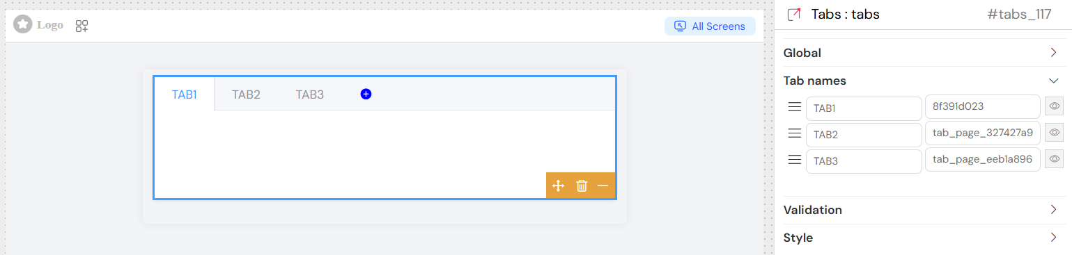
Tab Names Configuration
Each tab in the widget can be configured with the following properties:
Title
- Description: The display text shown on the tab header
- Type: String
- Supports: Static text and dynamic variables
- Example: "User Information", "Settings"
ID
- Description: Unique identifier for the tab
- Type: String
- Usage: Used internally to track the active tab and for programmatic access
- Example: "user_info", "settings"
Visibility Rules
- Description: JavaScript conditions to control when each tab is visible
- Format: Boolean expression or JavaScript code
- Access: Available through the edit button (eye icon) next to each tab
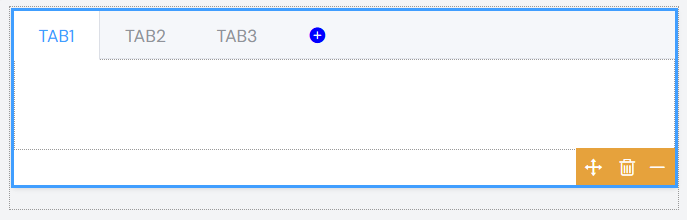
Adding and Managing Tabs
- Tabs are displayed in a draggable list in the configuration panel
- Use the drag handle (bars icon) to reorder tabs
- Each tab row shows:
- Drag handle for reordering
- Title input field
- ID input field
- Edit button for advanced visibility rules
Content Configuration
Each tab can contain any widgets available in the platform. The content is managed through the main widget tree structure where each tab acts as a container for its child widgets.
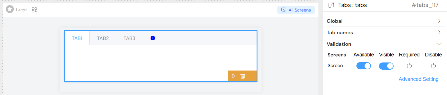
Validation Screen
The tabs widget supports comprehensive validation across different screen:
Validation Options
Available
- Description: Controls whether the widget exists on specific screens
- Type: Boolean switch
- Default: true
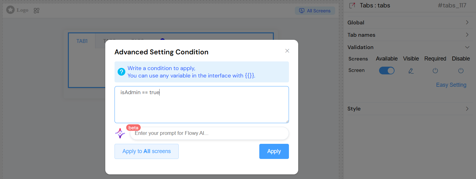
Visible
- Description: Controls widget visibility with support for advanced conditions
- Options:
- Simple: Boolean switch
- Advanced: JavaScript expressions using interface variables
- Syntax: Use
{{variableName}}to reference other interface variables - Example:
{{userRole}} === 'admin'
Required
- Description: Makes the widget mandatory (applies to child form elements)
- Type: Boolean or conditional expression
- Note: Inherits to all form elements within tabs
Disable/Collapse
- Description: Controls whether the widget is disabled or collapsed
- Type: Boolean switch or conditional expression
Advanced Conditions
Click "Advanced Setting" to use JavaScript expressions for dynamic behavior:
- Reference any interface variable using
{{variableName}}syntax - Support for complex logical operations
- Can be applied to individual screens or all screens at once
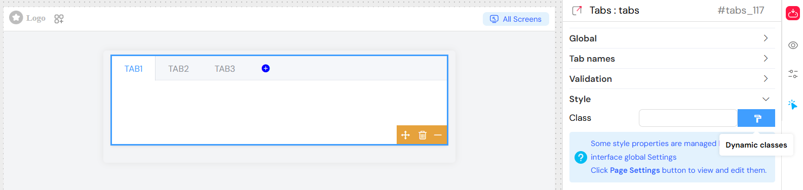
Styling and Appearance
Layout Options
Class Names
- Description: Apply custom CSS classes to the tabs container
- Format: Space-separated class names
- Example:
custom-tabs highlighted
Dynamic Classes
- Description: Apply classes based on interface state
- Access: Click the paint brush icon next to the Class field
- Format: JavaScript expressions returning class names
- Syntax: Reference variables with
{{variableName}}
Built-in Styling
The widget automatically applies:
- Element UI tabs styling (
el-tabs) - Responsive behavior for different screen sizes
- Custom visibility classes (
sf_tabs_visibility)
Integration Features
Form Integration
When tabs contain form elements:
- Validation rules cascade to child elements
- Form submission includes data from all tabs
- Required validation applies across tab boundaries
Variable Binding
- The widget's model variable stores the currently active tab ID
- Changes trigger reactive updates throughout the interface
- Can be used in conditions for other widgets
Best Practices
Tab Organization
- Logical Grouping: Group related content together
- Clear Naming: Use descriptive tab titles
- Consistent IDs: Follow a naming convention for tab IDs
Performance Considerations
- Content Loading: Consider lazy loading for tabs with heavy content
- Validation: Use tab-specific validation when possible
- Responsive Design: Test tab behavior across different screen sizes
User Experience
- Tab Count: Limit to 5-7 tabs for optimal usability
- Default Selection: Set appropriate default active tab
- Progress Indication: Use validation states to show completion
Troubleshooting
Common Issues
Tab Not Switching
- Check that the model variable is properly bound
- Verify onClick event configuration
- Ensure no JavaScript errors in custom handlers
Content Not Displaying
- Verify child widgets are properly configured
- Check validation rules on tab content
- Confirm screen-specific availability settings
Styling Issues
- Check CSS class conflicts
- Verify responsive behavior settings
- Test across different screen sizes
Debugging Tips
- Console Logging: Add console.log statements in onClick handlers
- Variable Inspection: Monitor the model variable in browser dev tools
- Validation Testing: Test all validation scenarios across screens
- Responsive Testing: Use browser dev tools to simulate different devices
Advanced Configuration
Dynamic Tab Creation
For advanced use cases, tabs can be generated dynamically based on data arrays using the interface's loop functionality.
Integration with Other Widgets
Tabs can contain any other widgets including:
- Grids and forms
- Data tables
- Charts and media
- Other container widgets
Custom Event Handling
Advanced users can implement custom tab switching logic through the action system and custom JavaScript functions.