Grid Widget
Overview
The Grid Widget is a flexible layout component that allows you to create responsive column-based layouts for organizing other widgets. It supports responsive design, form functionality, loops, and various styling options.
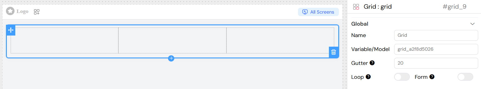
Global Settings
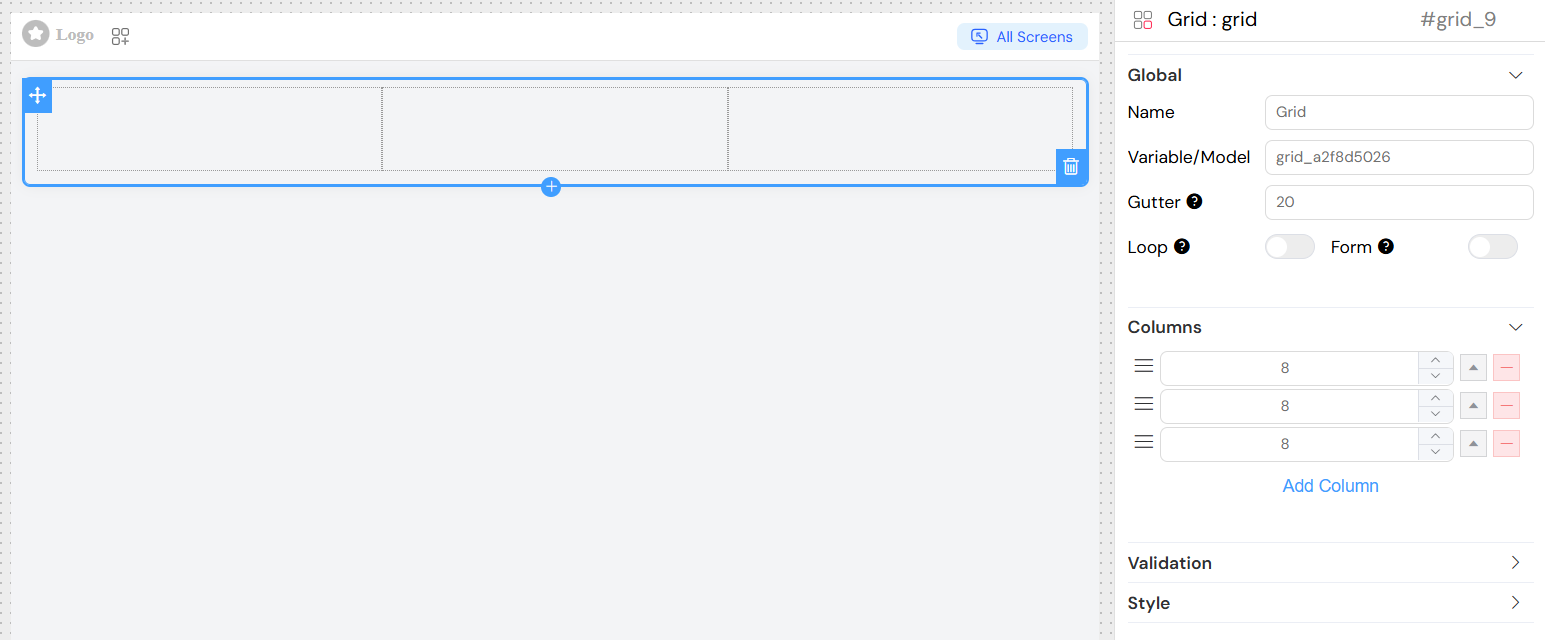
Name
- Description: Display name for the grid widget
- Type: Text input
- Usage: Used for identification and can be displayed in collapse mode
Variable/Model
- Description: The data model that the grid widget binds to
- Type: Text input
- Required: Yes (except for certain widget types)
- Validation: Must be a valid variable name
- Usage: Defines the data binding for the grid component
Gutter
- Description: Spacing between columns in pixels
- Type: Number input
- Default: 0
- Usage: Controls the horizontal spacing between grid columns
If you want to loop the widget, you can use the Loop option.
This option is used to create a seperate form from the main page Form.
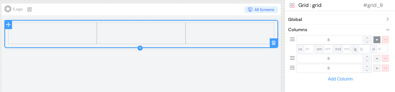
Column Configuration
Adding Columns
- Navigate to the "Columns" section in the widget configuration
- Click "Add Column" to create a new column
- Configure the column span and responsive breakpoints
Column Properties
Span
- Description: Default column width (out of 24 total grid units)
- Type: Number input
- Range: 1-24
- Usage: Defines the column width on medium and larger screens
Responsive Breakpoints
Each column supports responsive design with the following breakpoints:
- xs (Extra Small): Mobile phones (< 768px)
- sm (Small): Tablets (≥ 768px)
- md (Medium): Small laptops (≥ 992px)
- lg (Large): Laptops (≥ 1200px)
- xl (Extra Large): Large screens (≥ 1920px)
Configuration:
- Click the expand button (arrow) next to a column
- Enter values for each breakpoint
- If left empty, the system will use the default span value
Column Management
- Reorder: Drag columns using the grip handle (≡ icon)
- Remove: Click the minus (-) button to delete a column
- Expand: Click the arrow button to show responsive breakpoint inputs
Validation
The grid widget supports validation across different screen contexts:
Screen-Based Validation
For each screen/context, you can configure:
- Available: Whether the widget exists in this context
- Visible: Whether the widget is visible (supports conditions)
- Required: Whether the widget is required (for applicable contexts)
- Disable: Whether the widget is disabled
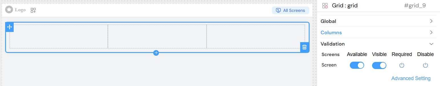
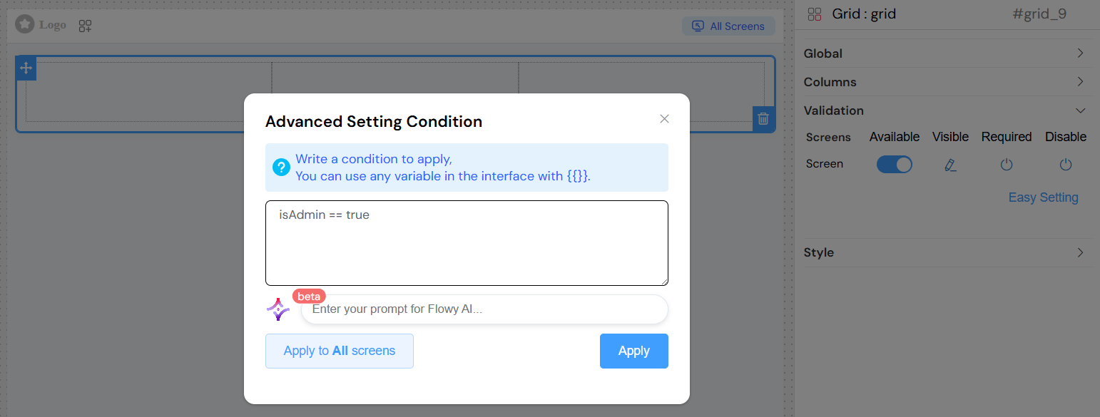
Advanced Conditions
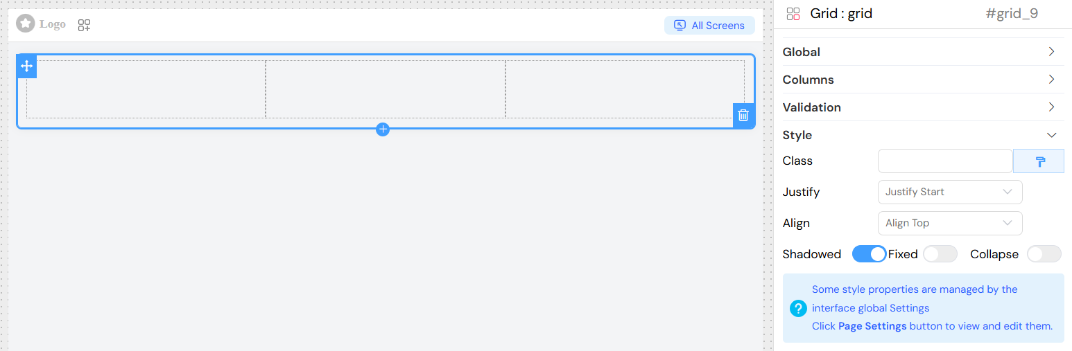
Layout and Styling
Justify Content
- Options: Start, End, Center, Space Around, Space Between
- Usage: Controls horizontal alignment of columns within the grid
- Default: Start
Align Items
- Options: Top, Middle, Bottom
- Usage: Controls vertical alignment of content within columns
- Default: Top
Visual Effects
Shadowed
- Type: Toggle switch
- Usage: Adds a shadow effect to the grid container
- Note: Not applied when Collapse is enabled
Fixed
- Type: Toggle switch
- Usage: Makes the grid position fixed on the page
Collapse
- Type: Toggle switch
- Usage: Makes the grid collapsible with the widget name as header
Custom Classes
Static Classes
- Field: Class
- Type: Text input
- Usage: Add CSS class names separated by commas
- Example:
custom-grid, highlighted
Dynamic Classes
- Access: Click the paint brush icon next to the Class field
- Usage: Write JavaScript expressions that return class names
- Context: Access model data using
models.prefix - Example:
models.status === 'active' ? 'active-grid' : 'inactive-grid'
Best Practices
Column Design
- Plan for Mobile: Always configure xs breakpoints for mobile compatibility
- Use 24-Unit System: Total column spans should add up to 24 for full width
- Progressive Enhancement: Start with mobile (xs) and enhance for larger screens
Performance Considerations
- Optimize Nested Widgets: Avoid deeply nested grid structures
- Efficient Validation: Use simple boolean conditions when possible
Accessibility
- Meaningful Names: Use descriptive names for screen readers
- Logical Tab Order: Ensure proper keyboard navigation
- Color Contrast: Ensure sufficient contrast for shadowed elements
Troubleshooting
Common Issues
- Columns Not Responsive: Check that responsive breakpoints are configured
- Content Overflow: Ensure column spans don't exceed 24 total
Debug Tips
- Use browser developer tools to inspect column classes
- Check console for JavaScript errors in custom conditions
- Verify model data structure matches expected format
- Test responsive behavior at different screen sizes
Integration Notes
- The grid widget automatically integrates with the parent interface validation system
- Validation rules cascade to child widgets appropriately