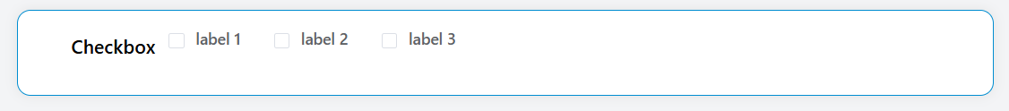
Checkbox Widget
The Checkbox widget allows users to select one or multiple options from a predefined list. It provides flexible data sourcing options and comprehensive validation capabilities.
Overview
The checkbox widget renders as a group of checkboxes that users can interact with to make selections. It supports various data sources including static lists, database collections, reports, and external databases.
Basic Configuration
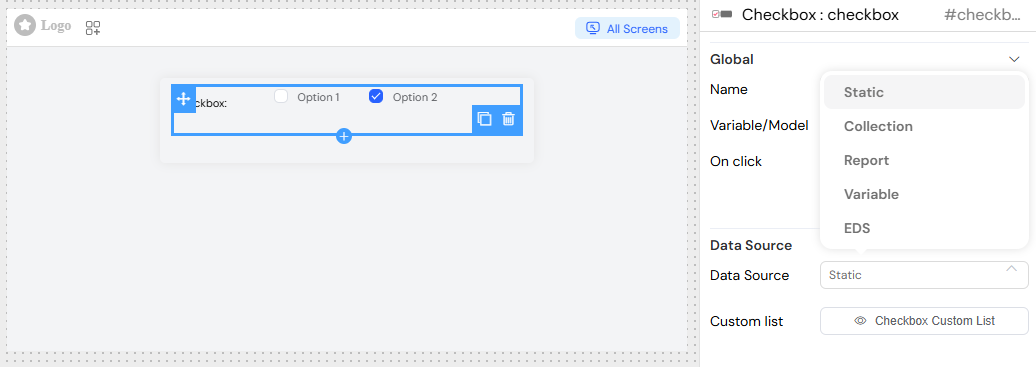
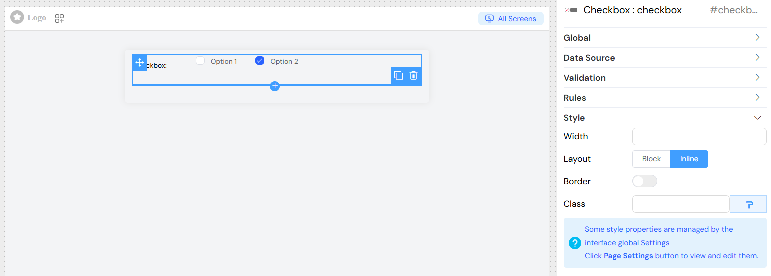
Global Settings
Name: The display label for the checkbox group Variable/Model: The data model variable that will store the selected values Default Value: Pre-selected options when the widget loads
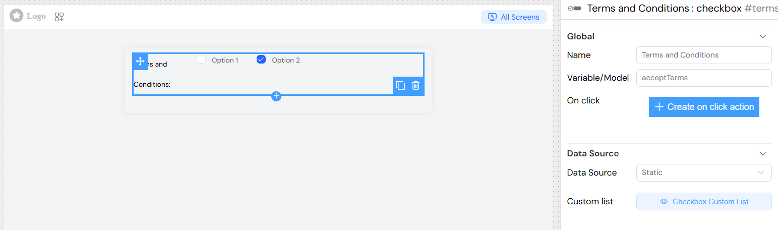
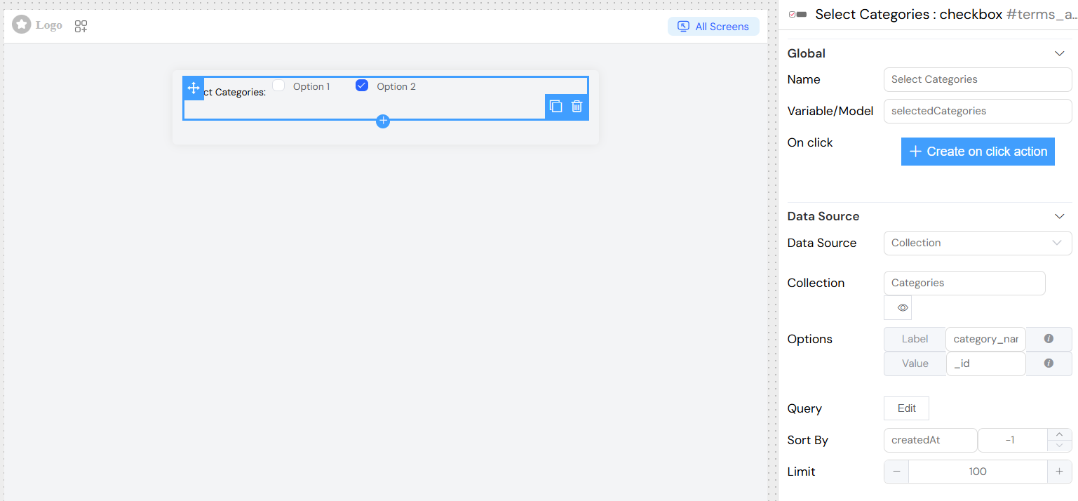
Data Source Configuration
The checkbox widget supports multiple data source types:
Static Data
- Custom List: Select from predefined static lists
- Configure label and value properties for each option
Collection Data
- Collection: Connect to database collections
- Query: Filter and customize data retrieval
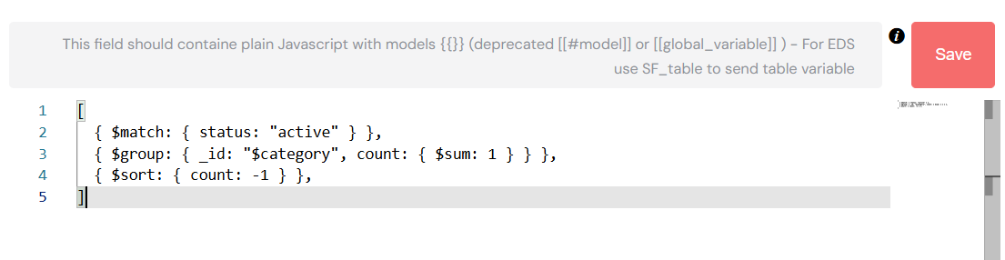
- Aggregation: Use advanced aggregation queries for complex data processing
- Sort By: Define sorting field and direction (1 for ascending, -1 for descending)
- Limit: Restrict the number of options displayed
Report Data
- Report: Connect to existing reports
- Query: Apply filters to report data
- Aggregation: Use aggregation pipelines on report data
External Database (EDS)
- Database: Connect to external database connections
- EDS Source: Define SQL queries or database-specific operations
Variable Data
- Use existing interface variables as data source
- Automatically binds to
{model}_vbvariable
Properties Configuration
Label Property: Define which field contains the display text
- Static use:
firstName - Dynamic use:
$.firstName + ' - ' + $.lastName
Value Property: Define which field contains the stored value
- Static use:
ref - Dynamic use:
$.ref + ' - ' + $.name
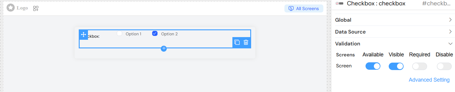
Validation & Rules
Screen-Based Validation
Configure widget behavior across different screens:
Available: Control widget availability per screen
Visible: Show/hide widget conditionally
Required: Make selections mandatory
Disabled: Prevent user interaction
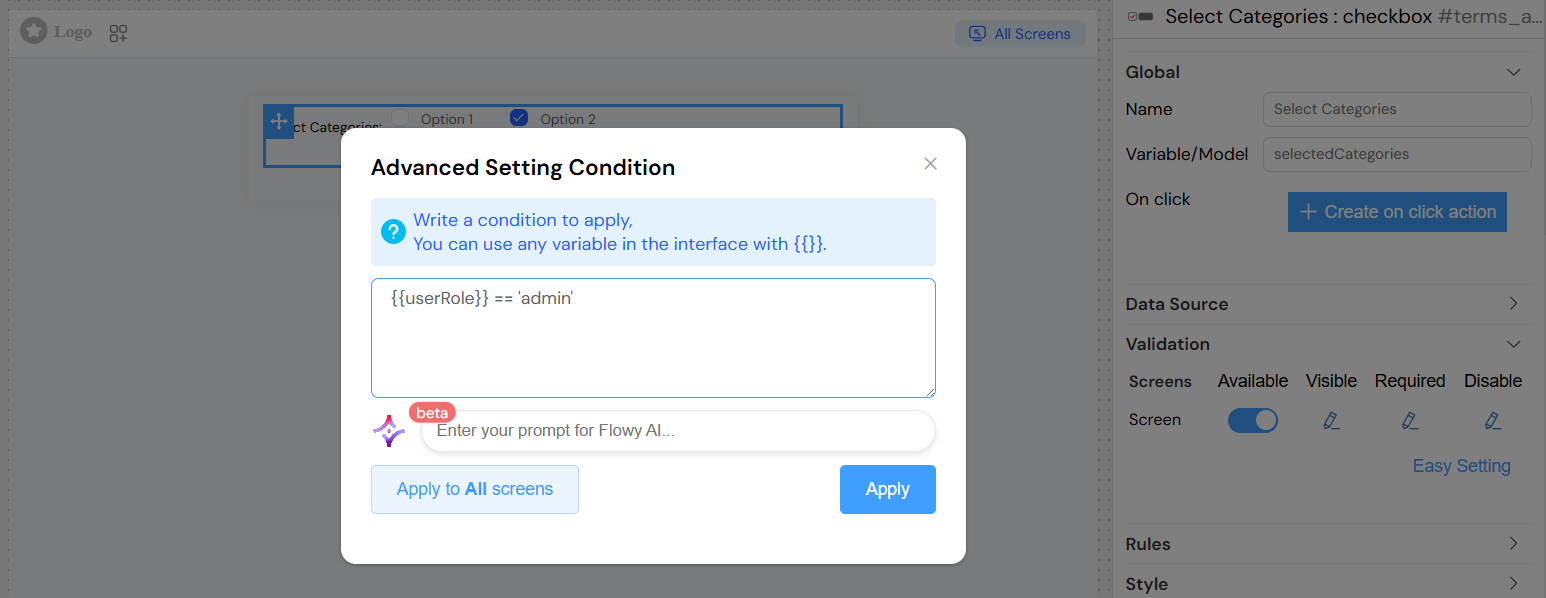
Advanced conditions can be set using variables with {{variable_name}} syntax.
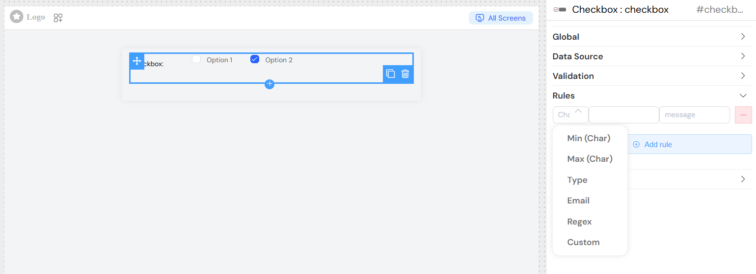
Validation Rules
Add custom validation rules:
- Required: Ensure at least one option is selected
- Min/Max Selection: Control selection count (for multiple selection)
- Custom Rules: Define specific validation logic
- Error Messages: Customize validation feedback
Style Configuration
Layout Options
- Layout: Choose between Block or Inline display
- Border: Add borders around checkbox options
- Width: Set widget width (e.g., "100%", "300px")
CSS Customization
- Class Names: Add custom CSS classes
- Dynamic Classes: Use conditional styling based on data
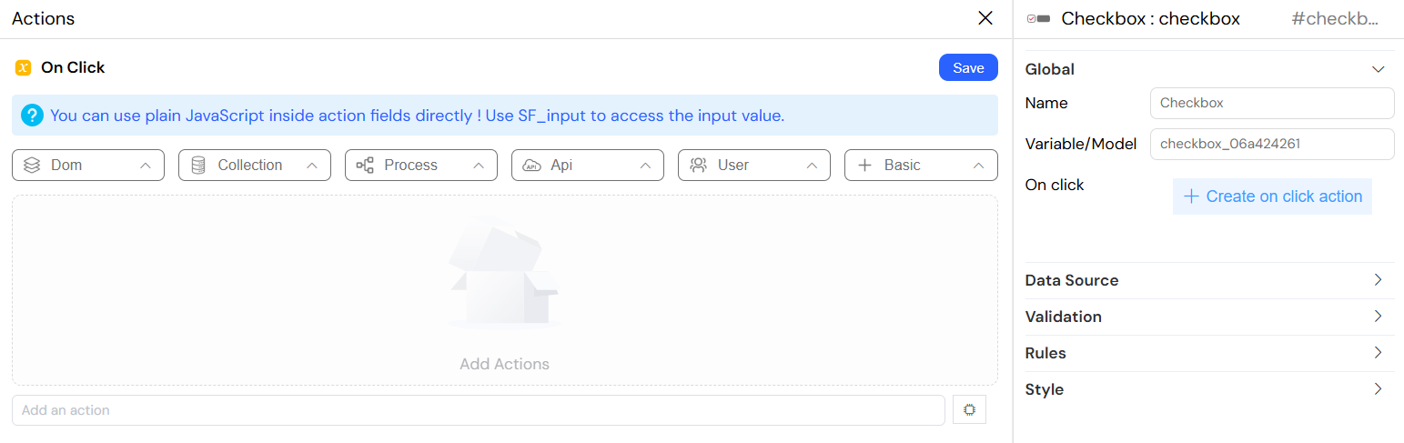
Events
The checkbox widget supports several events:
onChange
Triggered when checkbox selection changes
// Access selected values and data
SF_input.value; // Selected values array
SF_input.SF_data; // Selected objects array
SF_input.SF_currentIndex; // Current loop index
onClick
Custom click handler with access to:
- Selected values
- Complete data objects
- Current context information
Configuration Examples
Basic Static Checkbox
Collection-Based Checkbox
Advanced Features
Query Customization
For collection and report data sources, you can define custom queries:
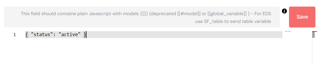
Aggregation Queries
Enable aggregation for complex data operations:
Conditional Visibility
Set advanced visibility conditions:
Best Practices
- Data Source Selection: Choose the appropriate data source type based on your needs
- Performance: Use limits and efficient queries for large datasets
- User Experience: Provide clear labels and meaningful validation messages
- Responsive Design: Consider mobile layouts when choosing inline vs block display
- Accessibility: Ensure proper labeling for screen readers
Troubleshooting
Empty Options: Verify data source configuration and query syntax
Selection Not Saving: Check model variable name and validation rules
Performance Issues: Implement pagination or filtering for large datasets
Styling Issues: Verify CSS class names and responsive design settings