Radio Widget Documentation
Overview
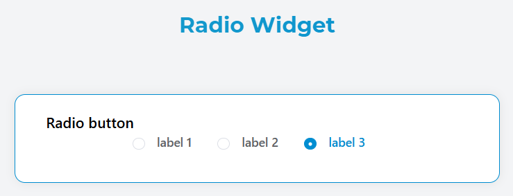
The Radio widget allows users to select a single option from a predefined list of choices. It renders as a group of radio buttons where only one option can be selected at a time.
Basic Configuration
Global Settings
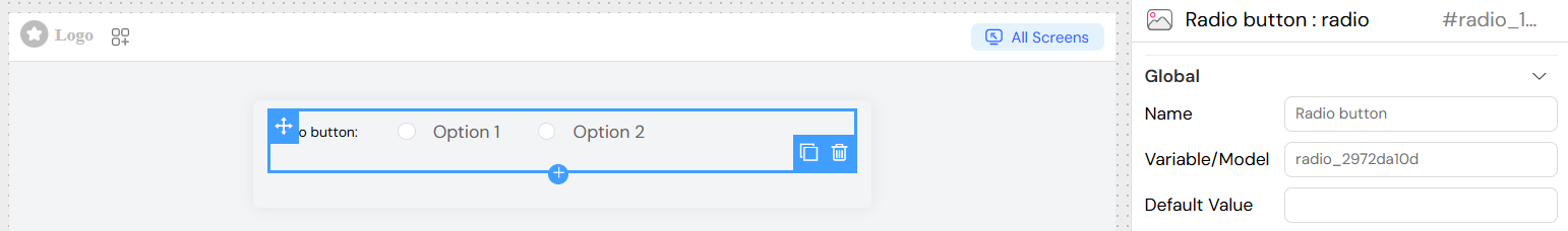
Name
- Field: Name
- Description: The display label for the radio group
- Required: Yes
- Example: "Select Priority Level"
Variable/Model
- Field: Variable/Model
- Description: The data model property that stores the selected value
- Required: Yes
- Format: Must be a valid variable name
- Example:
priority_level
Default Value
- Field: Default Value
- Description: The initial selected value when the form loads
- Required: No
- Type: String
- Example: "medium"
Data Source Configuration
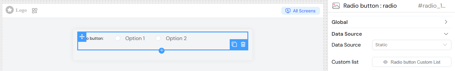
The radio widget supports multiple data sources for populating the available options:
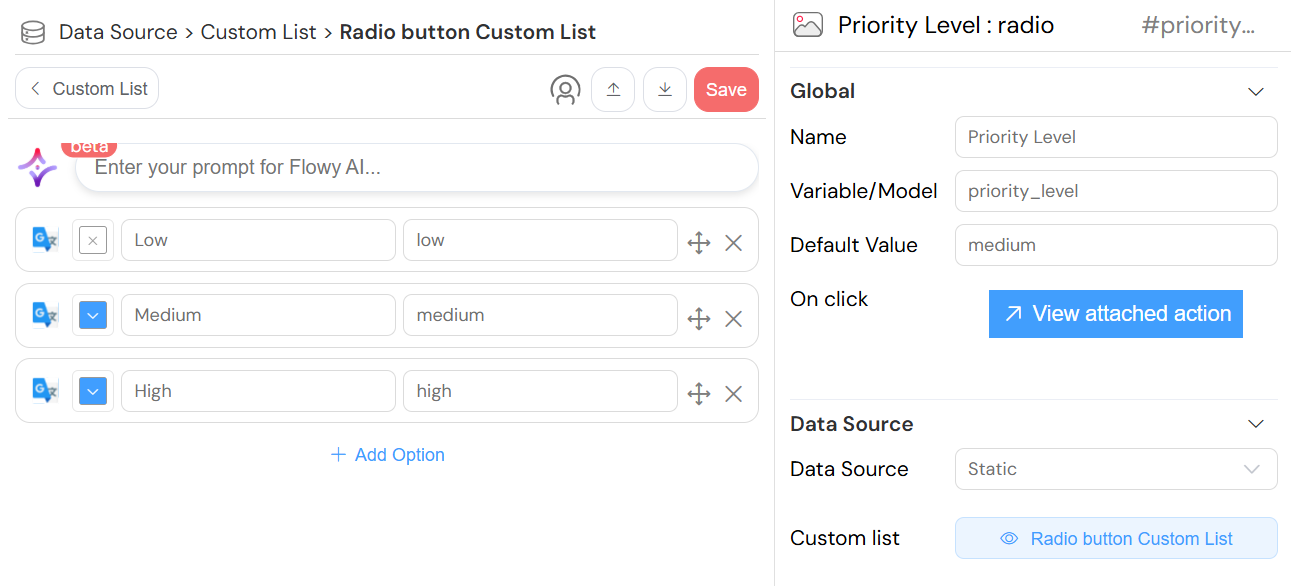
Static Data
- Source: Custom Lists
- Description: Use predefined static lists
- Configuration:
- Select an existing custom list
- Create a new custom list if none exists
- Data Format: Each item requires
labelandvalueproperties
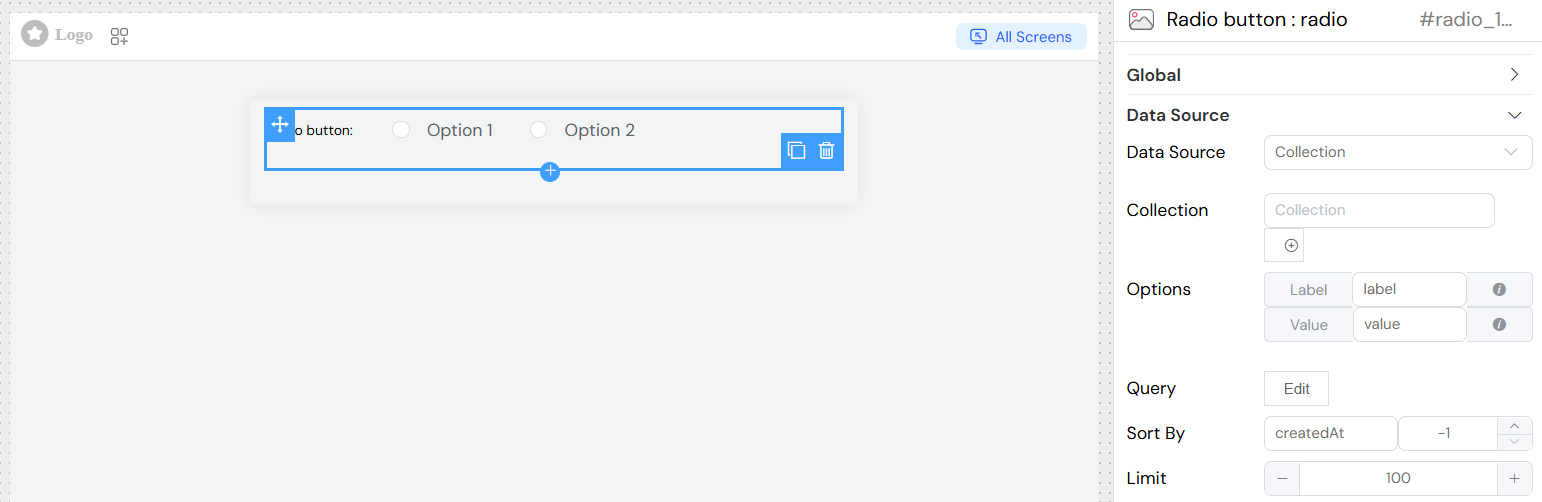
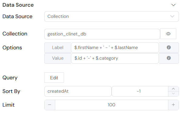
Collection Data
- Source: Database Collections
- Description: Dynamically load options from a collection
- Configuration:
- Select target collection
- Configure label and value mappings
- Set up optional query filters
- Define sort order and limits
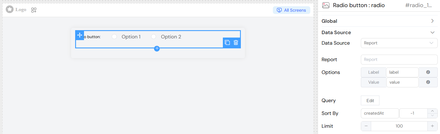
Report Data
- Source: Reports
- Description: Use report results as data source
- Configuration:
- Select target report
- Map result columns to label/value
- Configure aggregation if needed
SQL/External Database
- Source: External Database Connection
- Description: Query external databases for options
- Configuration:
- Select database connection
- Write SQL query
- Map result columns
](/img/04_ressources/project/web-interface/widgets/radioDataSourceEDS.png)
Props Configuration
For dynamic data sources (Collection, Report, SQL):
Label Property
- Field: Label
- Description: Field name or expression for display text
- Static Usage:
firstName - Dynamic Usage:
$.firstName + ' - ' + $.lastName
Value Property
- Field: Value
- Description: Field name or expression for stored value
- Static Usage:
id - Dynamic Usage:
$.id + '-' + $.category
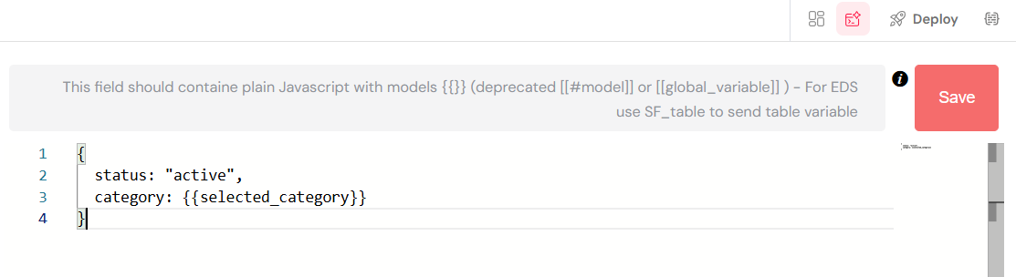
Query Configuration
For collection and report data sources:
Basic Query
- Purpose: Filter and customize data retrieval
- Language: JavaScript with model references
- Variables: Use
{{variable_name}}for dynamic values - Example:
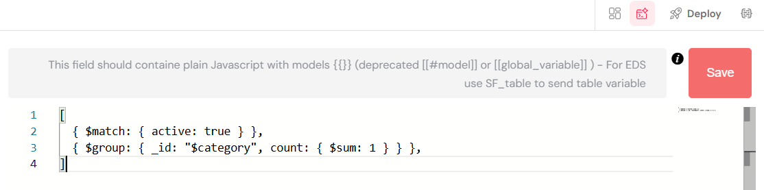
Aggregation
- Purpose: Perform complex data aggregation
- Toggle: Enable "Is Aggregation" switch
- Example:
Sort Configuration
- Sort By: Field name for sorting
- Direction:
1for ascending-1for descending
Limit
- Purpose: Restrict number of options
- Type: Number
- Default: No limit
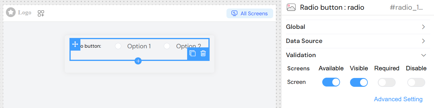
Validation
Screen-based Validation
Configure different behaviors across multiple screens:
Available
- Purpose: Control if widget appears on specific screens
- Type: Boolean per screen
- Default: true
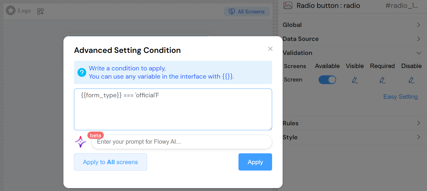
Visible
- Purpose: Control widget visibility
- Options:
- Simple: Boolean toggle
- Advanced: JavaScript condition
Required
- Purpose: Make selection mandatory
- Options:
- Simple: Boolean toggle
- Advanced: JavaScript condition
Disabled
- Purpose: Prevent user interaction
- Options:
- Simple: Boolean toggle
- Advanced: JavaScript condition
Simple Example
Advanced Example
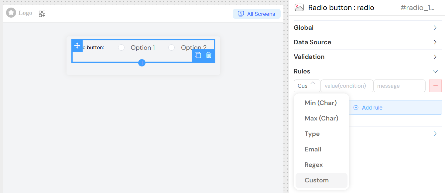
Validation Rules
Add custom validation rules:
Rule Types
- Pattern: Regular expression validation
- Custom: JavaScript validation function
- Range: Value range validation
- Required: Built-in required validation
Rule Configuration
- Rule: Select validation type
- Value: Rule parameter or pattern
- Message: Error message to display
Styling and Layout
Layout Options
Display Mode
- Block: Vertical stack (default)
- Inline: Horizontal arrangement
Border
- Purpose: Add borders around radio buttons
- Type: Boolean
- Default: false
Width Configuration
- Field: Width
- Description: CSS width value
- Examples:
100%(full width)300px(fixed width)50vw(viewport-based)
CSS Classes
Static Classes
- Field: Class
- Description: Space-separated CSS class names
- Example: "custom-radio highlight-group"
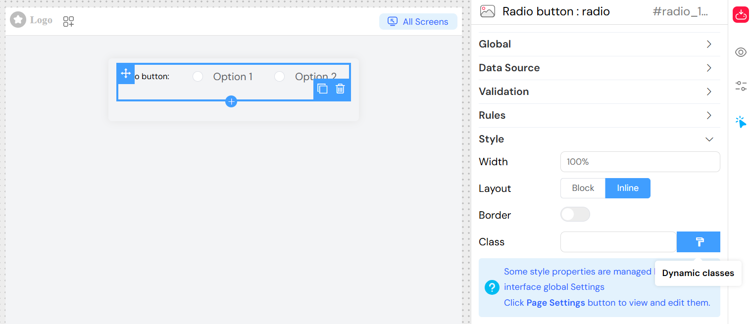
Dynamic Classes
- Purpose: Conditional styling based on data
- Language: JavaScript expressions
- Access: Click "Dynamic classes" button
- Example:
{
  'error-state': {{has_errors}},
  'required-field': {{is_required}}
}
Events and Interactions
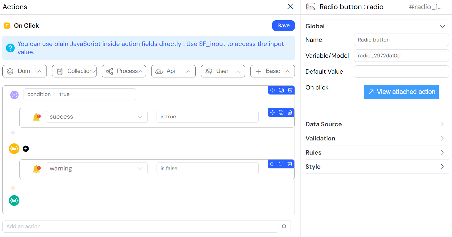
On Click Event
- Trigger: When radio option is selected
- Access Variables:
SF_input.value: Selected valueSF_input.SF_data: Full selected objectSF_input.SF_currentIndex: Loop index (if in repeating context)
Simple Event
- Field: On click
- Type: Function name
- Example:
Best Practices
Data Source Selection
- Static Lists: For fixed, rarely changing options
- Collections: For user-managed data
- Reports: For computed/aggregated options
- SQL: For complex external data
Performance Optimization
- Use limits for large datasets
- Implement proper indexing for sort fields
- Cache static data when possible
- Use aggregation for summary options
User Experience
- Provide clear, descriptive labels
- Use logical ordering (alphabetical, priority-based)
- Set appropriate default values
- Include validation with helpful error messages
Validation Strategy
- Use required validation for critical fields
- Implement conditional validation when needed
- Provide immediate feedback on selection
- Consider cross-field validation rules
Examples
Basic Static Radio Group
Troubleshooting
Common Issues
Options Not Loading
- Check data source configuration
- Verify query syntax
- Ensure proper field mappings
- Check network connectivity for external sources
Selection Not Saving
- Verify model variable name
- Check validation rules
- Ensure proper form submission
- Validate data types
Styling Issues
- Check CSS class names
- Verify width/height values
- Review responsive design settings
- Test dynamic class conditions
Event Not Triggering
- Verify function names
- Check JavaScript syntax
- Ensure proper variable access
- Review browser console for errors