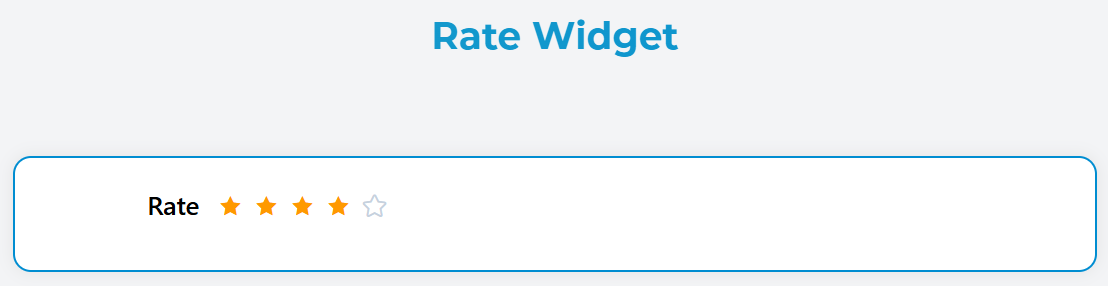
Rate Widget
The Rate widget allows users to provide a rating using stars or other symbols. It's perfect for collecting feedback, reviews, or any kind of scoring input from users.
Overview
The Rate widget renders an interactive rating component where users can select a score by clicking on stars. It supports various customization options including color schemes, half-star selection, and score display.
Configuration
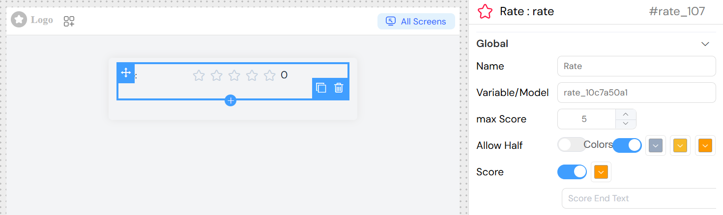
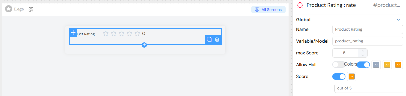
Name
- Field: Name
- Description: Display label for the rating field
- Type: Text input
- Example: "Product Rating", "Service Quality"
Variable/Model
- Field: Variable/Model
- Description: The data model field that will store the rating value
- Type: Text input
- Example:
productRating,serviceScore
Maximum Score
- Field: max Score
- Description: Sets the maximum number of stars/points available
- Type: Number input
- Range: 1 to 50
- Default: 5
- Example: 5 (for 5-star rating), 10 (for 10-point scale)
Allow Half Stars
- Field: Allow Half
- Description: Enables selection of half-star increments (e.g., 3.5 stars)
- Type: Toggle switch
- Default: false
- Use Case: More precise rating when needed
Enable Colors
- Field: Colors toggle
- Description: Activate custom color scheme for different rating ranges
- Type: Toggle switch
When colors are enabled, you can configure three color zones:
- Low Range Color: Color for the first third of the rating scale
- Medium Range Color: Color for the middle third of the rating scale
- High Range Color: Color for the highest third of the rating scale
Each color can be selected using the color picker interface.
Show Score
- Field: Score toggle
- Description: Display the numeric score next to the stars
- Type: Toggle switch
When score display is enabled:
Text Color
- Field: Text color picker
- Description: Color for the displayed score text
- Type: Color picker
Score Text
- Field: Score End Text
- Description: Custom text to display alongside the score
- Type: Text input
- Example: "points", "stars", "out of 5"
Interaction Configuration
On Click Action
- Field: On Click
- Description: Define actions to execute when rating changes
- Type: JavaScript code or action builder
- Access Variables:
SF_input.value: The selected rating valueSF_input.SF_currentIndex: Current loop index (if in loop)
Example Actions:
](/img/04_ressources/project/web-interface/widgets/rateActions.png)
Validation and Rules
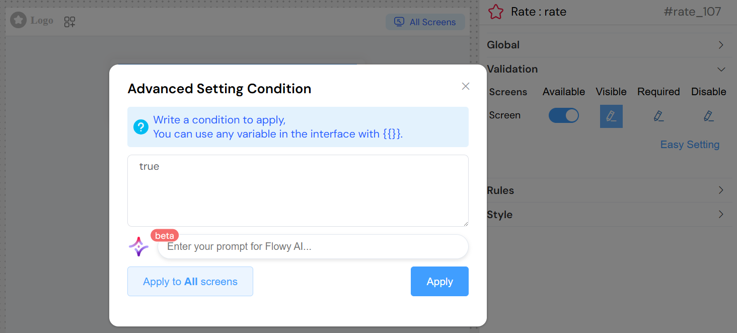
Screen-Based Validation
Configure different behaviors across multiple screens:
Available
- Control if the widget appears on specific screens
- Type: Toggle per screen
Visible
- Control widget visibility with conditions
- Type: Toggle or JavaScript condition
- Example:
{{userType}} === 'customer'
Required
- Make rating mandatory on specific screens
- Type: Toggle or JavaScript condition
Disabled
- Disable interaction on specific screens
- Type: Toggle or JavaScript condition
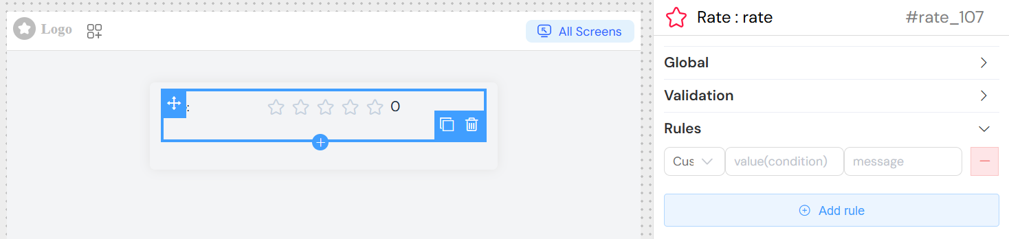
Validation Rules
Add custom validation rules:
Rule Types Available:
- Required: Make rating mandatory
- Min Value: Minimum acceptable rating
- Max Value: Maximum acceptable rating
- Custom: JavaScript-based validation
Example Rules:
Styling Options
CSS Classes
- Field: Class
- Description: Apply custom CSS classes
- Type: Text input
- Examples:
custom-rating,highlight-rating
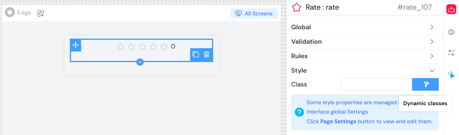
Dynamic Classes
- Use the format painter button to set conditional CSS classes
- Example: Apply different classes based on rating value
Advanced Features
Loop Integration
When used within a loop (grid with loop enabled):
- Access loop index via
SF_input.SF_currentIndex - Each iteration maintains independent rating state
- Useful for rating multiple items in a list
Form Integration
When used within a form:
- Rating value automatically included in form submission
- Validation rules applied during form validation
- Required settings enforced on form submit
Implementation Examples
Basic Rating
Events and Data Handling
Event
Triggered whenever the rating value changes:
- Event Data: New rating value
- Use Case: Real-time updates, conditional logic
- Access: Via onClick action configuration
Data Storage
- Rating values are stored as numbers (integers or decimals if half-stars enabled)
- Automatically bound to the specified model/variable
- Integrated with form data collection
Best Practices
- Choose Appropriate Scale: Use 5 stars for general ratings, 10 points for detailed feedback
- Enable Half-Stars: For more precise feedback collection
- Use Colors Wisely: Help users understand rating significance
- Provide Context: Use clear labels and helper text
- Set Sensible Defaults: Consider if a default rating is appropriate
- Validation: Make ratings required for critical feedback
- Responsive Design: Ensure ratings work well on mobile devices
Troubleshooting
Common Issues:
- Rating not saving: Check model/variable name configuration
- Colors not showing: Ensure "Colors" toggle is enabled
- Half-stars not working: Verify "Allow Half" is enabled
- Validation not working: Check validation rules and required settings
- On click action not firing: Verify JavaScript syntax in onClick field
Debug Tips:
- Use browser console to check rating values
- Verify model binding with form data
- Test validation rules with different input values
- Check CSS classes for styling issues