Spacer Widget
Overview
The Spacer widget is a non-interactive layout utility used to add vertical space between interface components. It provides consistent spacing control while supporting dynamic visibility and styling.
Basic Configuration
Global Settings
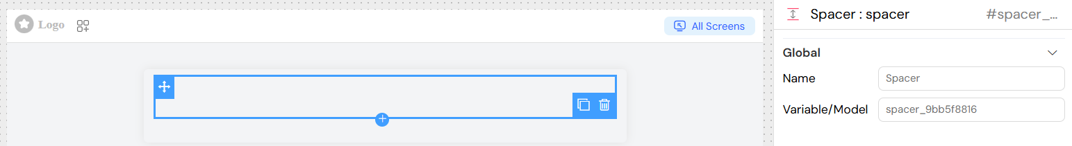
Name
- Field: Name
- Description: Display name for the widget in the interface builder
- Type: Text input
- Required: Yes
Variable/Model
- Field: Variable/Model
- Description: Not applicable – Spacer does not bind to a model
- Type: N/A
- Required: No
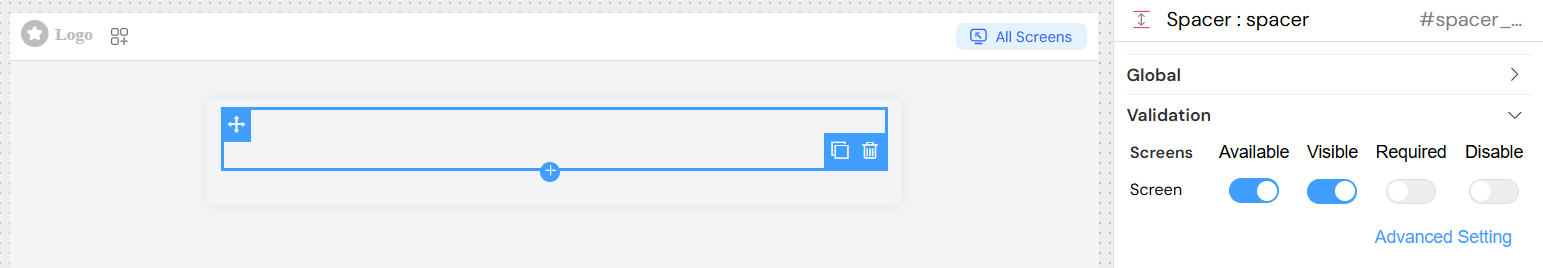
Validation
- Available: Controls if the widget is available on the screen
- Visibility: Controls whether the spacer is displayed
- Required: Not applicable
- Disable: Not applicable
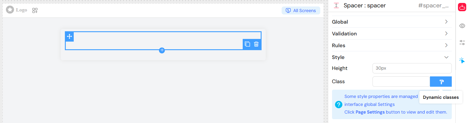
Styling
Layout Options
- Width: Inherits from parent container
- Height: Configurable via widget settings
- Class: Add custom CSS classes for additional styling
Dynamic Classes
Dynamic classes can be applied using configuration:
{
  "hidden": "{{isMobile}}",
  "highlight": "{{isImportant}}"
}
Best Practices
- Use only when necessary – Prefer margin/padding for simple spacing
- Keep consistent sizes – Apply standard spacing values across the interface
- Responsive design – Use relative units (
vh,%,em) when targeting multiple screen sizes - Combine with layouts – Works best when used in grid or row containers
Accessibility Considerations
- Spacer has no impact on accessibility tools
- Ignored by screen readers
- Does not affect keyboard navigation
Performance Tips
- Very lightweight, minimal rendering cost
- Use static sizes where possible for predictable layouts
Troubleshooting
Spacer not visible
- Check
visibleproperty is set to true - Ensure height is configured with valid CSS units
Unexpected size
- Verify container styling does not override spacer height
- Inspect computed CSS with developer tools
Class not applied
- Remove commas in class names
- Ensure CSS class definitions exist