Textarea Widget
The Textarea widget allows users to input multi-line text in forms and interfaces. It provides extensive configuration options for validation, styling, and behavior customization.

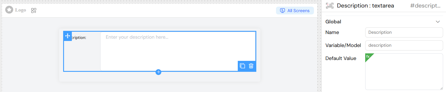
Basic Configuration
- Name: Display label for the textarea field
- Variable/Model: The variable name used to store and retrieve the textarea value
- Default Value: Pre-filled text content (supports dynamic values). Initial text content
- Static text:
"Default description" - Dynamic value:
{{user.name}}'s description - Formula:
="Prefix: " + {{variable}}
- Static text:
- Rows: Number of visible text lines (default: 5)
Events and Actions
Event Context
Actions receive SF_input object containing:
value: Current textarea contentSF_currentIndex: Loop index (if in repeated context)
](/img/04_ressources/project/web-interface/widgets/textareaActions.png)
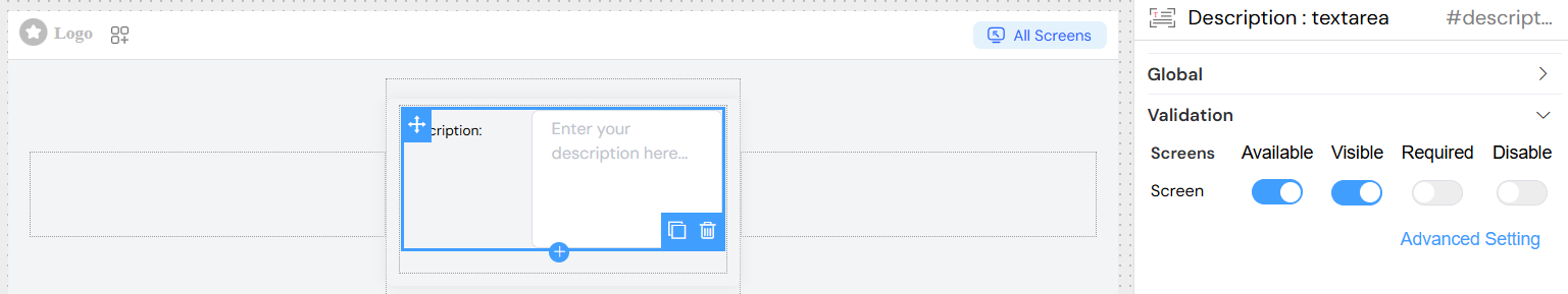
Validation Screen
Screen-Based Validation
Configure different behaviors across multiple screens/views:
- Available: Controls if the widget exists on the screen
- Visible: Controls visibility (supports conditions)
- Required: Makes field mandatory on specific screens
- Disabled: Prevents user interaction
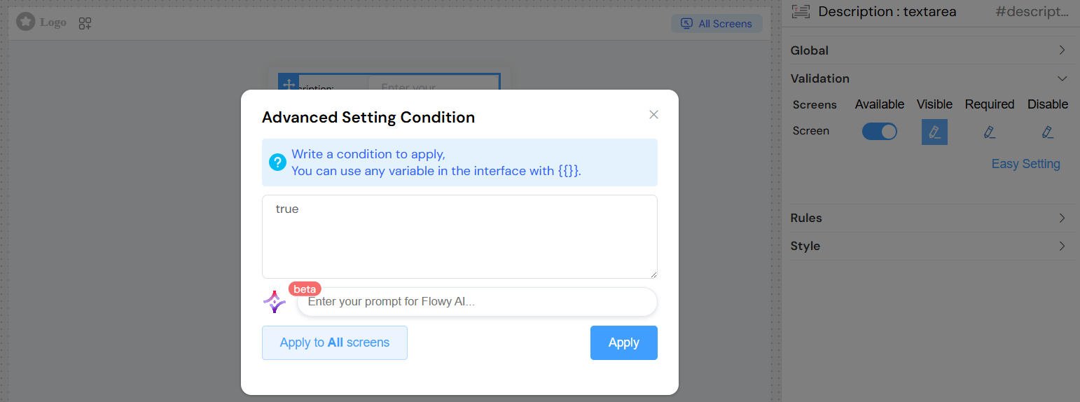
Screen Configuration Examples
Advanced Conditions
Use dynamic conditions for screen validation:
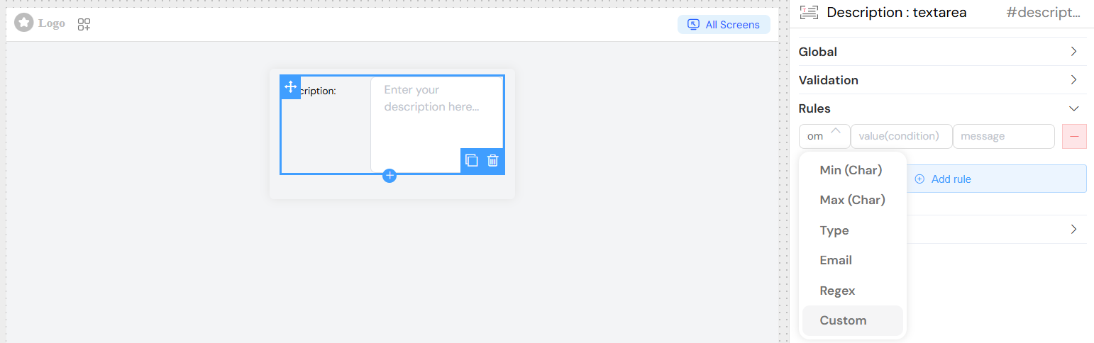
Validation Rules
Built-in Rules
- Required: Makes the field mandatory
- Maximum Length: Limits character count
- Minimum Length: Requires minimum character count
- Pattern: Regular expression validation
- Custom Rules: JavaScript-based validation functions
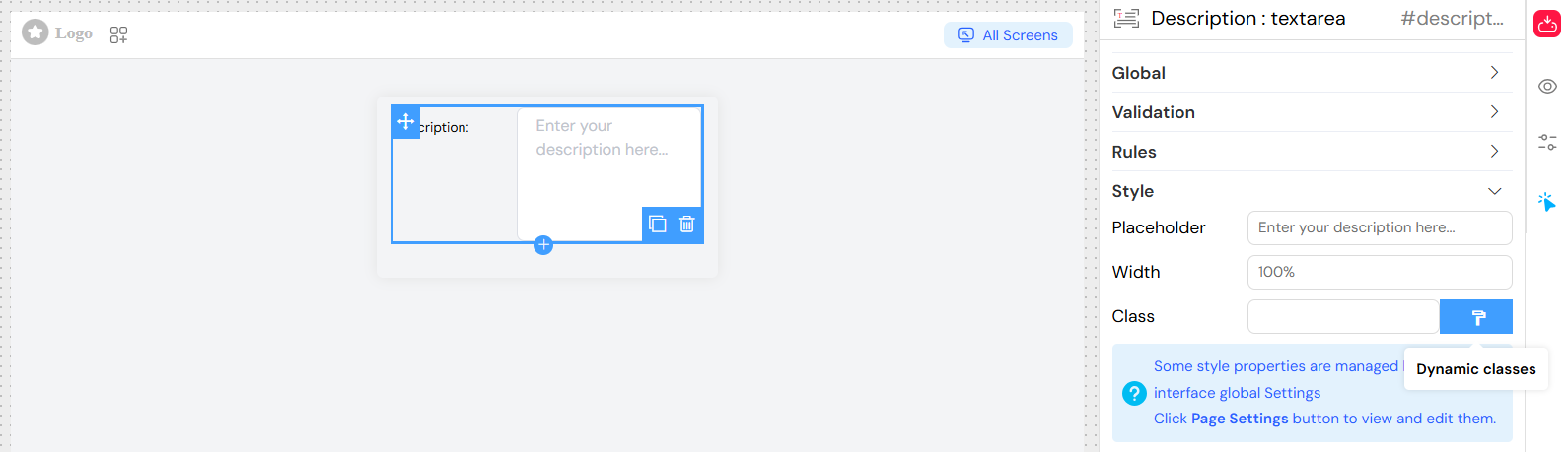
Styling
- Width: Field width (
100%,300px,auto) - Placeholder: Hint text displayed when field is empty
- Class Names: Custom CSS classes
- Dynamic Classes: Apply conditional CSS classes based on data
Best Practices
Performance
- Use appropriate
rowsvalue for expected content - Implement debounced onChange for heavy operations
- Consider lazy loading for large forms
User Experience
- Provide clear placeholder text
- Use appropriate validation messages
- Consider character counters for length limits
- Implement auto-save for long content
Accessibility
- Ensure proper labeling
- Maintain logical tab order
- Provide clear error messages
- Support keyboard navigation
Data Handling
- Validate on both client and server
- Handle special characters properly
- Consider text encoding for different languages
- Implement proper sanitization for security
This comprehensive configuration system allows for flexible and powerful textarea implementations suitable for various application requirements.