Text Widget
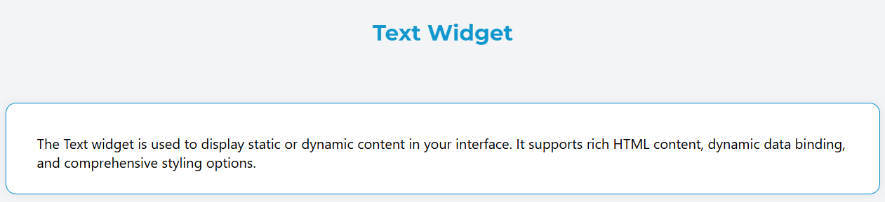
The Text widget is used to display static or dynamic content in your interface. It supports rich HTML content, dynamic data binding, and comprehensive styling options.
Overview
The Text widget renders as a paragraph element that can display formatted text, HTML content, and dynamic values from your data models. It's highly configurable and supports responsive design patterns.
Configuration Options
Global Settings
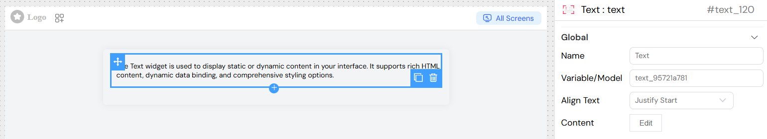
Basic Properties
- Name: A descriptive name for your text widget
- Variable/Model: The data model variable to bind this widget to (optional for static content)
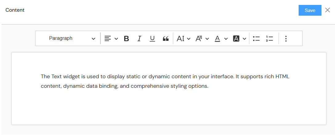
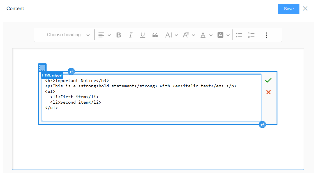
Content Configuration
- Content: Rich HTML content editor for defining the text content
- Supports HTML formatting (bold, italic, lists, links, etc.)
- Allows dynamic variable interpolation using
{{variable_name}}syntax - Full WYSIWYG editor with formatting toolbar
Text Alignment
Configure how the text content is aligned within the widget:
- Left: Align text to the left (default)
- Center: Center the text horizontally
- Right: Align text to the right
- Start: Align text to the start (language-dependent)
- End: Align text to the end (language-dependent)
- Justify: Justify text with even spacing
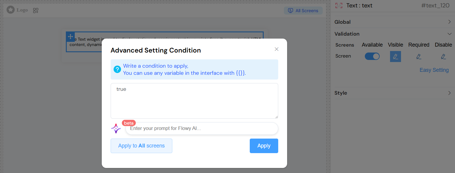
Validation and Visibility
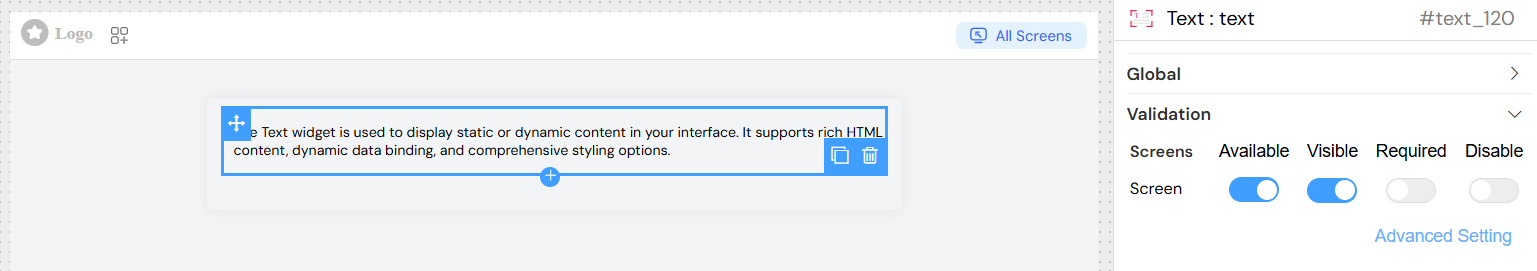
Screen-based Configuration
Configure widget behavior across different interface screens:
- Available: Whether the widget is available on each screen
- Visible: Control visibility with boolean values or dynamic conditions
- Required: Set requirement status (typically not applicable for text widgets)
- Disable: Control if the widget is disabled or collapsed
Advanced Visibility Conditions
- Use JavaScript expressions for dynamic visibility
- Reference other form variables using
{{variable_name}}syntax - Support for complex conditional logic
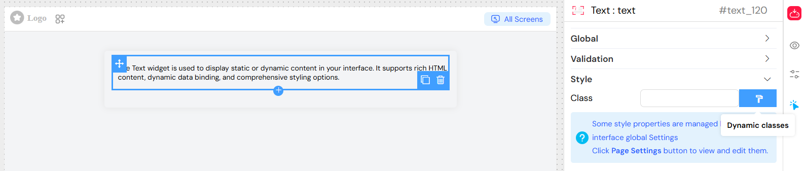
Styling and Layout
CSS Classes
- Static Classes: Add custom CSS classes for styling
- Dynamic Classes: Use JavaScript expressions to apply conditional classes
- Reference data models using
models.variable_name - Support for conditional class application
- Reference data models using
Dimensions
- Width: Set custom width (supports CSS units: px, %, rem, etc.)
- Height: Set custom height (supports CSS units: px, %, rem, etc.)
Layout Options
- Inline/Block: Choose between inline and block display modes
- Border: Enable/disable border display
Dynamic Content
HTML Content Support
The content editor supports full HTML formatting:
Best Practices
Content Organization
- Keep content concise: Text widgets work best with focused, clear messaging
- Use semantic HTML: Structure content with proper heading tags and paragraphs
- Plan for responsiveness: Consider how text will display on different screen sizes
Performance Considerations
- Optimize HTML: Avoid excessive nesting and complex markup
- Efficient variable binding: Only bind necessary variables to reduce processing overhead
- Conditional rendering: Use visibility conditions to improve performance
Accessibility
- Semantic markup: Use proper HTML elements for screen readers
- Color contrast: Ensure sufficient contrast for readability
- Font sizing: Use relative units for better accessibility
Technical Implementation
Rendered Output
The text widget generates a <p> element with:
- Unique ID and Vue.js reference
- Conditional visibility binding
- CSS classes (both static and dynamic)
- Inline styles for alignment and spacing
- Processed content with variable interpolation
Variable Processing
- Variables are automatically prefixed with
models.in the rendering process - Supports nested object properties:
{{user.profile.avatar}} - Safe variable access with optional chaining
Troubleshooting
Common Issues
- Variables not displaying: Ensure variable names match exactly with your data model
- HTML not rendering: Check that HTML content is properly formatted
- Styling not applied: Verify CSS class names and dynamic class conditions
- Visibility issues: Review visibility conditions and variable references
Debugging Tips
- Test variable binding: Use simple variable references first, then add complexity
- Validate HTML: Ensure HTML content is well-formed
- Check console: Look for JavaScript errors in dynamic class expressions
- Preview different screens: Test visibility conditions across all configured screens
Example Configurations
Simple Static Text
- Content: "Welcome to our application!"
- Alignment: Center
- Class: "welcome-message"
Dynamic User Information
- Content:
<h3>Hello, {{user.name}}</h3><p>Last login: {{user.lastLogin}}</p> - Alignment: Left
- Visibility:
{{user.isLoggedIn}} === true
Conditional Styling
- Content: "{{notification.message}}"
- Dynamic Classes:
{{notification.type}} === 'error' ? 'text-danger' : 'text-info' - Alignment: Left
This comprehensive configuration system allows the Text widget to serve a wide range of content display needs while maintaining flexibility and performance.