Autocomplete Widget Documentation
Overview
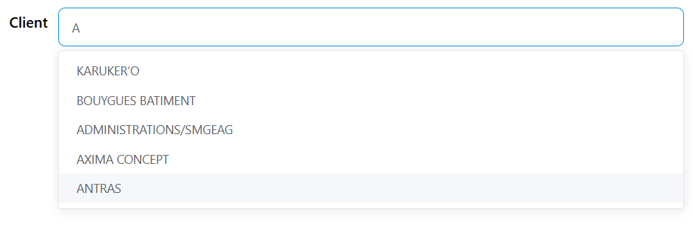
The Autocomplete widget provides a dynamic dropdown input with real-time search functionality. It allows users to search and select values from a remote data source such as collections, reports, or external databases. The widget supports both single and multiple selection modes with customizable filtering and validation.
Basic Configuration
Widget Properties
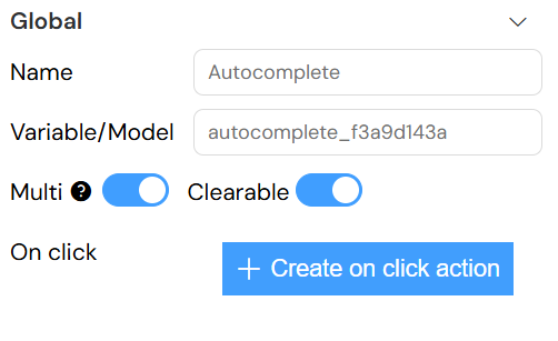
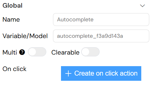
Name and Model
- Name: Display label for the widget
- Variable/Model: The variable name that will store the selected value(s)
Data Type Support
The autocomplete widget can handle various data types and automatically formats the selected values based on the configured label and value properties.
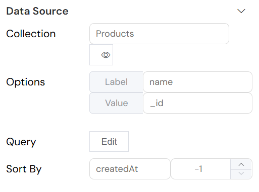
Data Source Configuration
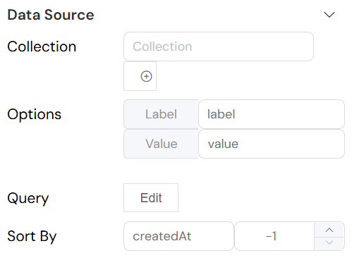
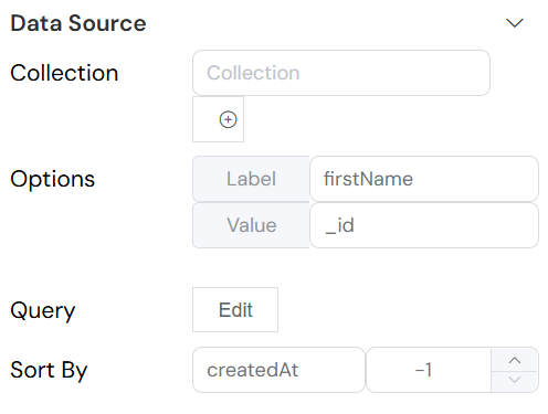
Data Sources
Connect to a database collection:
- Collection: Select from available collections
- Query: Define filtering criteria using MongoDB-style queries
- Sort By: Configure sorting by field name and direction (-1 for descending, 1 for ascending)
- Limit: Set maximum number of results to display
Data Mapping
Label and Value Properties
Configure how data is displayed and stored:
- Label Property: Field used for display text (e.g.,
name,title) - Value Property: Field used for the stored value (e.g.,
_id,code)
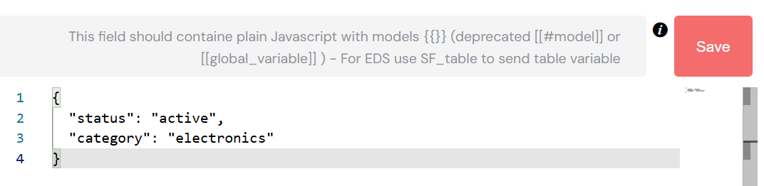
Query Configuration
Basic Queries
Use the query editor to define filtering criteria:
For Collections (MongoDB-style):
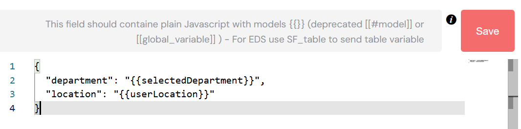
Advanced Queries with Variables
Reference form variables in queries:
Selection Options
Single vs Multiple Selection
- Multiple: Enable to allow selection of multiple values
- Clearable: Allow users to clear the selection
- Filterable: Enable real-time search filtering (enabled by default for autocomplete)
Default Values
Set initial values for the widget:
- Single Selection: Provide a single default value
- Multiple Selection: Provide an array of default values
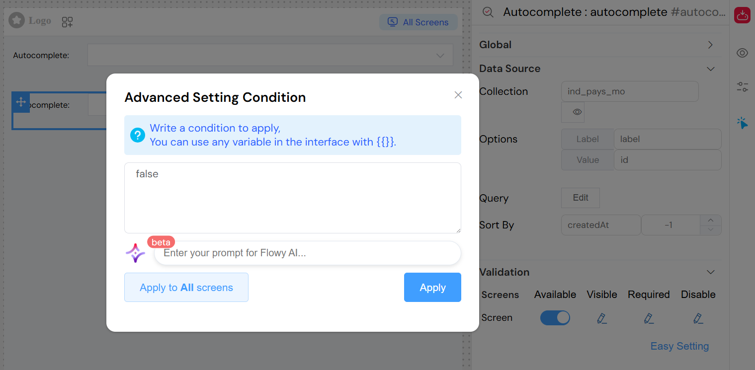
Validation Configuration
Screen-based Validation
Configure widget behavior across different screens:
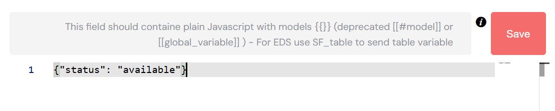
Available States
- Available: Widget is rendered on the screen
- Visible: Widget is visible to users
- Required: Field must be filled before form submission
- Disabled: Widget is read-only
Validation Modes
- Simple Mode: Use boolean values for each state
- Advanced Mode: Use JavaScript expressions for dynamic validation
Example advanced validation:
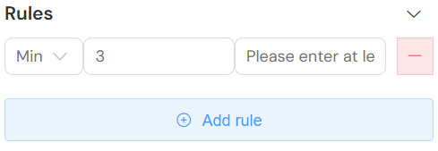
Validation Rules
Add custom validation rules with the Rules configuration:
Available Rule Types
- Required: Field must have a value
- Min Length: Minimum number of characters
- Max Length: Maximum number of characters
- Pattern: Regular expression validation
- Custom: JavaScript validation function
Rule Configuration
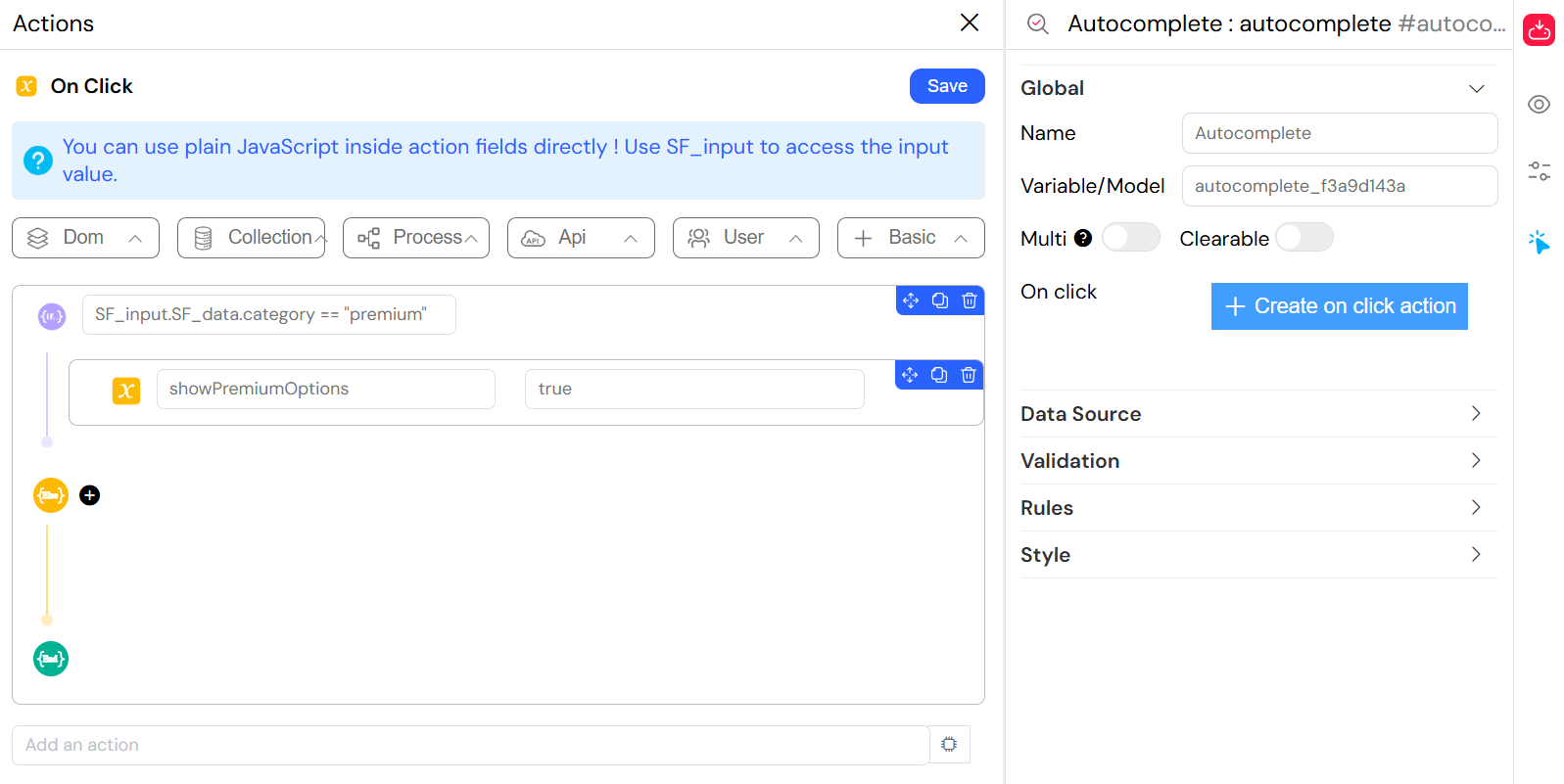
Event Handling
On Click Events
Configure actions when users interact with the widget:
Event Data
The onClick event provides access to:
- SF_input: Object containing:
value: Selected value(s)SF_data: Complete selected object(s)SF_currentIndex: Loop index (if within a loop)
Action Configuration
Use the action editor to define JavaScript functions:
Styling and Layout
Basic Styling
- Placeholder: Text displayed when no selection is made
- Width: Widget width (CSS units: px, %, em, etc.)
- Class Names: CSS classes for custom styling
Dynamic Classes
Use the dynamic classes feature for conditional styling:
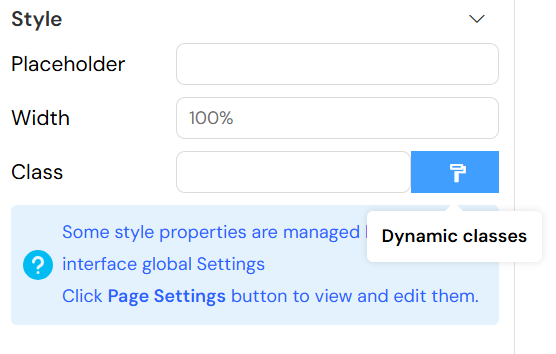
{
  "error": "{{hasValidationError}}",
  "highlighted": "{{isImportant}}",
  "disabled": "{{!isEditable}}"
}
Advanced Features
Remote Search Configuration
The autocomplete widget automatically configures remote search with:
- Debounced Search: Optimized search performance
- Minimum Query Length: Prevents excessive API calls
- Result Caching: Improves user experience
Data Refresh
The widget automatically refreshes data when:
- Search query changes
- Parent form variables change
- Widget gains focus
Performance Optimization
- Lazy Loading: Data is loaded only when needed
- Result Limiting: Default limit of 10 results for optimal performance
- Query Optimization: Efficient database queries with indexing support
Integration Examples
Basic Product Selection
Troubleshooting
Common Issues
No Results Displayed
- Verify collection/database connection
- Check query syntax
- Ensure proper field mapping
- Verify user permissions
Slow Performance
- Add database indexes for searched fields
- Reduce result limit
- Optimize query filters
- Check network connectivity
Validation Errors
- Verify required field configuration
- Check validation rule syntax
- Ensure proper event handling
- Test with different data types
Best Practices
- Query Optimization: Use specific filters to reduce result sets
- Field Mapping: Choose descriptive labels and unique values
- Error Handling: Provide clear validation messages
- User Experience: Set appropriate placeholders and defaults
- Performance: Use pagination for large datasets
API Reference
Widget Properties
id: Unique widget identifiermodel: Data model bindingoptions: Configuration object containing all widget settingsvalidation: Screen-based validation rulesevents: Event handler configurations
Methods
refresh(keyword): Manually refresh data with optional search termsetLabels(value): Update display labels based on selected valuesclearValue(): Clear current selectionsetValue(value): Programmatically set widget value
Events
@change: Triggered when selection changes@focus: Triggered when widget gains focus@blur: Triggered when widget loses focus