Group Picker Widget
Overview
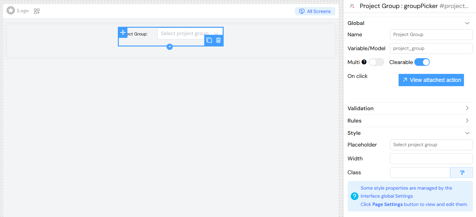
The Group Picker widget is a searchable dropdown component that allows users to select one or multiple groups from your system. It provides real-time search functionality with remote data loading and supports various configuration options for validation, styling, and user interaction.

Basic Configuration
Global Settings
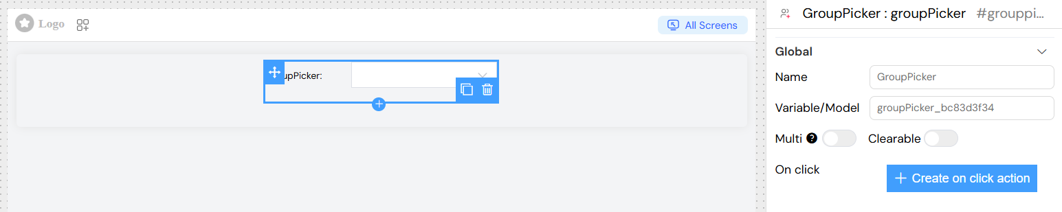
Name
- Label: Name
- Description: The display label for the group picker field
- Type: Text input
- Usage: This text appears as the field label in forms
Variable/Model
- Label: Variable/Model
- Description: The data model property name where selected values will be stored
- Type: Text input
- Required: Yes
- Usage: Defines the variable name for accessing selected group data
- Example:
selectedGroups,userGroups
Selection Options
Multiple Selection
- Label: Multi
- Description: Enable selection of multiple groups
- Type: Toggle switch
- Default: false
- Usage: When enabled, users can select multiple groups from the dropdown
Clearable
- Label: Clearable
- Description: Allow users to clear their selection
- Type: Toggle switch
- Default: false
- Usage: Adds a clear button to remove all selected values
Filterable
- Label: Filterable
- Description: Enable search/filter functionality
- Type: Toggle switch
- Default: true (always enabled for Group Picker)
- Usage: Allows users to type and search for groups by name
Default Value
- Label: Default Value
- Description: Set a default selected group or groups
- Type: Text input
- Usage: Specify default group name(s). For multiple selection, separate with commas
Data Source Configuration
The Group Picker automatically connects to your system's group API endpoint (/api/v1/group) and provides:
- Real-time search: Groups are loaded dynamically as users type
- Pagination support: Loads 10 groups per request for optimal performance
- Automatic label mapping: Uses group
nameproperty for display - Value mapping: Uses group
nameproperty as the stored value
Value Storage
The Group Picker stores data in multiple formats for flexibility:
- Primary Value (
model): Group name(s) as string or array - Display Label (
model_label): Human-readable group name(s) - Full Object (
model_vb): Complete group object(s) with all properties
Events and Actions
On Click Action
- Label: On click
- Description: Define custom JavaScript code to execute when a group is selected
- Type: Code input or Action builder
- Available Variables:
SF_input.value: Selected group name(s)SF_input.SF_data: Complete group object(s)SF_input.SF_currentIndex: Current loop index (if within a loop)
Example Actions
](/img/04_ressources/project/web-interface/widgets/groupPickerExampleActions.png)
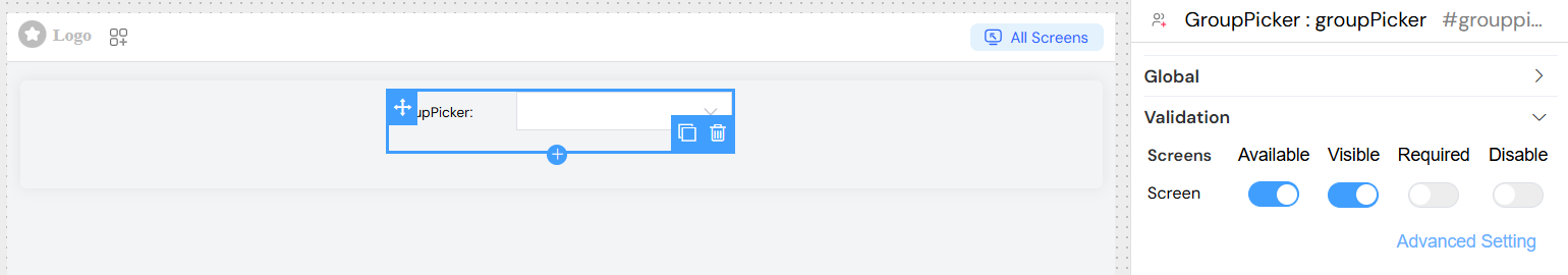
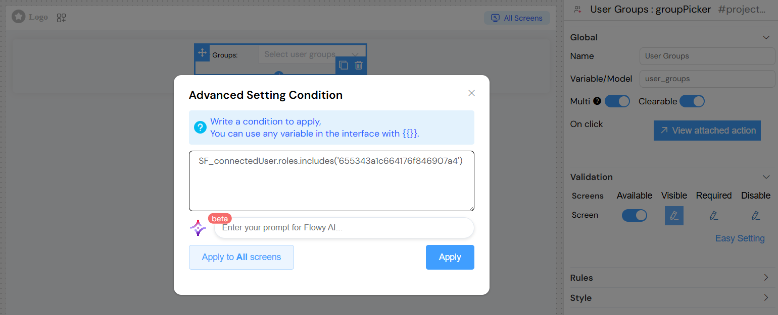
Validation Configuration
Screen-based Validation
Configure validation rules for different screens (Create, Edit, View, etc.):
Available
- Description: Control whether the widget appears on specific screens
- Type: Toggle switch per screen
Visible
- Description: Control widget visibility with dynamic conditions
- Type: Toggle switch or JavaScript expression
- Advanced: Use JavaScript expressions for dynamic visibility
- Example:
{{user.role === 'admin'}}
Required
- Description: Make group selection mandatory
- Type: Toggle switch or JavaScript expression
- Validation: Displays error message if no group is selected
Disabled
- Description: Disable the widget to prevent user interaction
- Type: Toggle switch or JavaScript expression
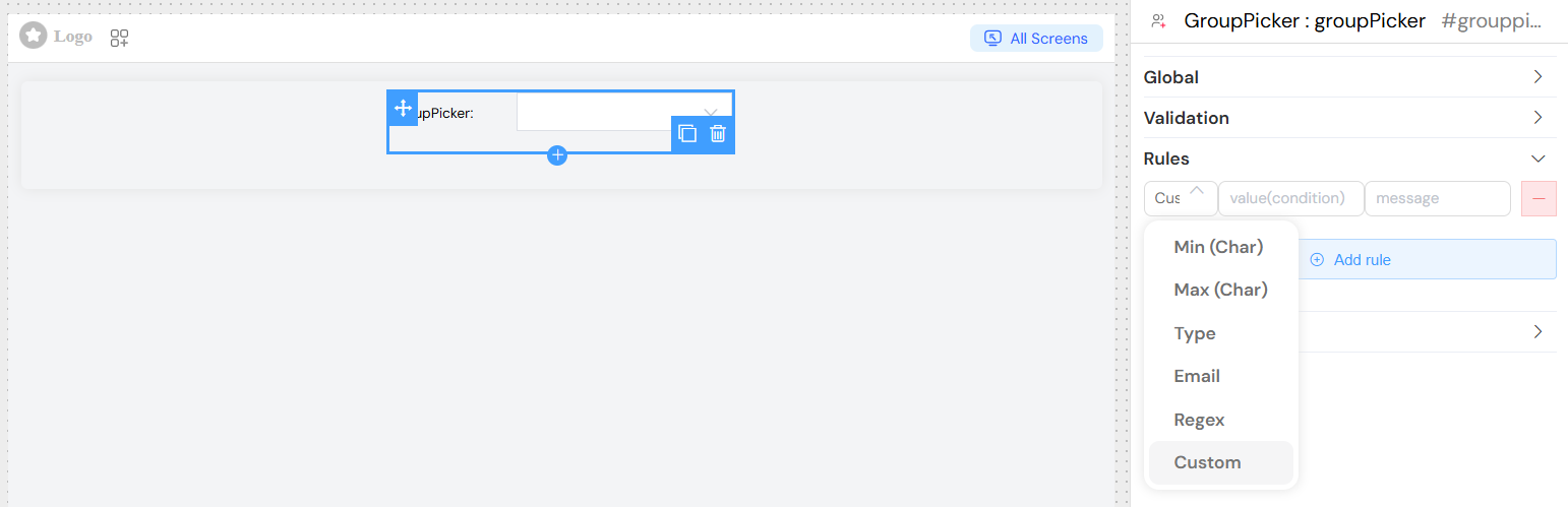
Custom Validation Rules
Add custom validation rules beyond basic required validation:
Rule Types Available
- Minimum selection: Require minimum number of groups (for multiple selection)
- Maximum selection: Limit maximum number of groups
- Pattern matching: Validate group names against specific patterns
- Custom validation: Write custom JavaScript validation logic
Adding Rules
- Navigate to the "Rules" section
- Click "Add rule"
- Select rule type from dropdown
- Enter validation value
- Provide custom error message
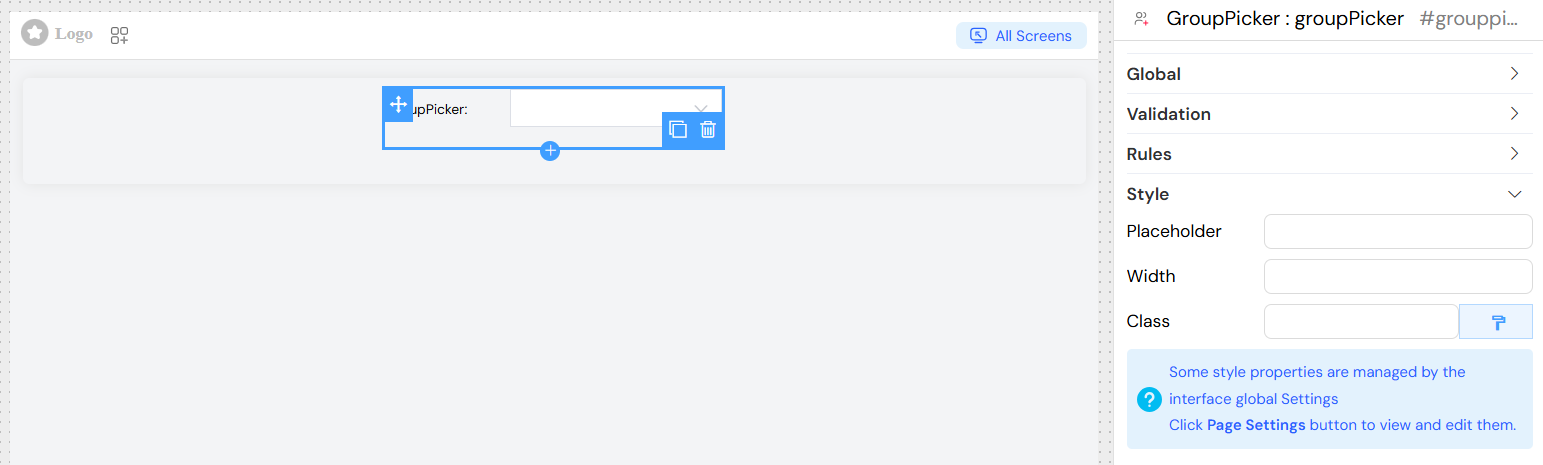
Styling and Layout
Appearance Options
Placeholder
- Label: Placeholder
- Description: Hint text displayed when no group is selected
- Type: Text input
- Example: "Select a group...", "Choose groups..."
Width
- Label: Width
- Description: Control the width of the dropdown
- Type: Text input
- Values: CSS width values
- Examples:
100%,300px,50rem
CSS Classes
- Label: Class
- Description: Add custom CSS classes for styling
- Type: Text input
- Usage: Space-separated class names
- Dynamic Classes: Use the dynamic classes button for conditional styling
Usage Examples
Basic Single Group Selection
Dynamic Visibility Based on User Role
Best Practices
- Performance: Use appropriate limits for large group lists
- User Experience: Provide clear placeholder text and labels
- Validation: Implement proper validation for required fields
- Accessibility: Ensure proper labeling for screen readers
- Error Handling: Provide meaningful error messages for validation failures
Troubleshooting
Common Issues
- Groups not loading: Check API endpoint accessibility and authentication
- Search not working: Verify network connectivity and API response format
- Selection not saving: Ensure proper model binding and form configuration
- Validation errors: Check required field settings and custom validation rules
Debugging
Access the browser's developer console to:
- Monitor API calls to
/api/v1/group - Check stored values in
comp_model - Verify event triggers and validation states