Widget History
Overview
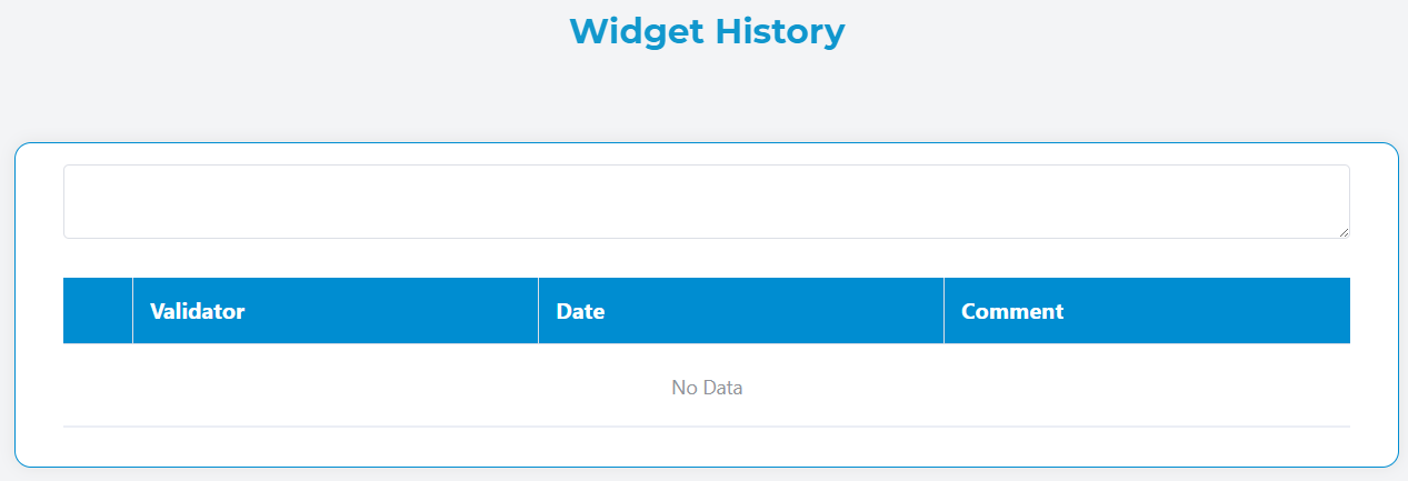
The Widget History component displays a chronological record of activities and changes for instances and tasks. This component automatically loads and presents historical data in a structured table format, providing users with a comprehensive view of all actions, validations, and modifications that have occurred.
Key Features
- Automatic History Loading: Automatically fetches history data when an instance ID or task ID is present
- Hierarchical History: Option to include parent and child instance histories
- Responsive Design: Optimized for both desktop and mobile viewing
- Customizable Measures: Add custom columns to display additional data fields
- Interactive Comments: Integrated comment area for adding new entries
- Mobile-Friendly: Collapsible rows on mobile devices for better user experience
Configuration Options
Basic Configuration
Include Father History
- Description: When enabled, includes the history of the parent instance in addition to the current instance history
- Use Case: Useful for tracking the complete lineage of related processes
Include Children History
- Description: When enabled, includes the history of all child instances related to the current instance
- Use Case: Provides a comprehensive view of all sub-processes and their activities
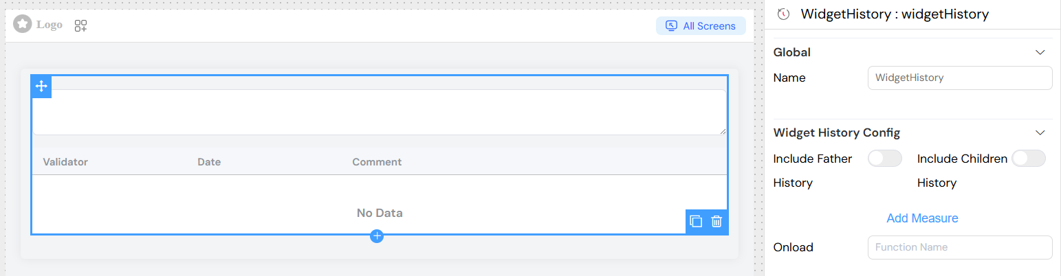
Measures Configuration
Measures allow you to add custom columns to display additional data from the history records.
Adding a New Measure
- Click "Add Measure" button
- Configure the following properties:
Field: The field name from the history data object
- Example:
status,priority,assignedUser
Label: The display label for the column header
- Example: "Status", "Priority Level", "Assigned To"
Width: Column width (optional)
- Format: CSS width values
- Examples:
120px,15%,auto
Visibility Rule: JavaScript condition to show/hide the column
- Context: Access to
modelsobject - Example:
models.userRole === 'admin'
HTML Template: Custom HTML template for rendering cell content
- Context: Access to
scope.rowfor current row data - Example:
<span class="status-badge" :class="scope.row.status">
  {{ scope.row.measures.status || 'N/A' }}
</span>
 Configuration](/img/04_ressources/project/web-interface/widgets/widgetHistoryMeasuresConfiguration.png)
Default Columns
Validator
- Content: User avatar and email
- Mobile: Shows email with expand/collapse functionality
- Special: Displays "pour [representative]" if user is acting on behalf of someone else
Date
- Format: "DD MMM YYYY h:mm a" (e.g., "15 Jan 2024 10:30 AM")
- Mobile: Hidden by default, shown when row is expanded
Commentary
- Content: Text description of the action or change
- Mobile: Hidden by default, shown when row is expanded
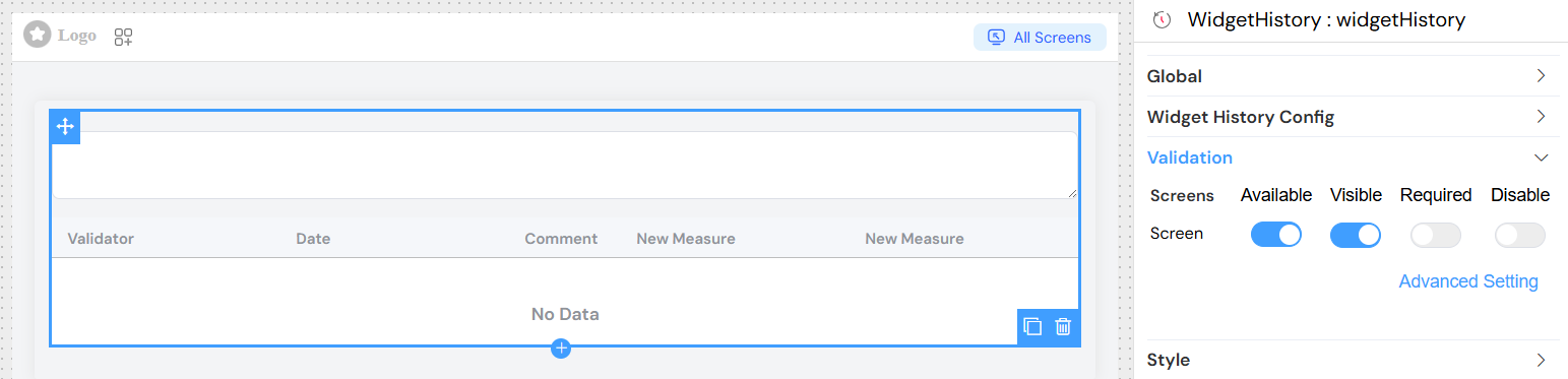
Validation and Visibility
Screen-Based Configuration
The widget History supports different configurations for different screens/contexts:
- Available: Controls whether the widget exists in the interface
- Visible: Controls whether the widget is visible to users
- Required: Not applicable for widgets History (display-only component)
- Disable: Not applicable for widgets History (non-interactive component)
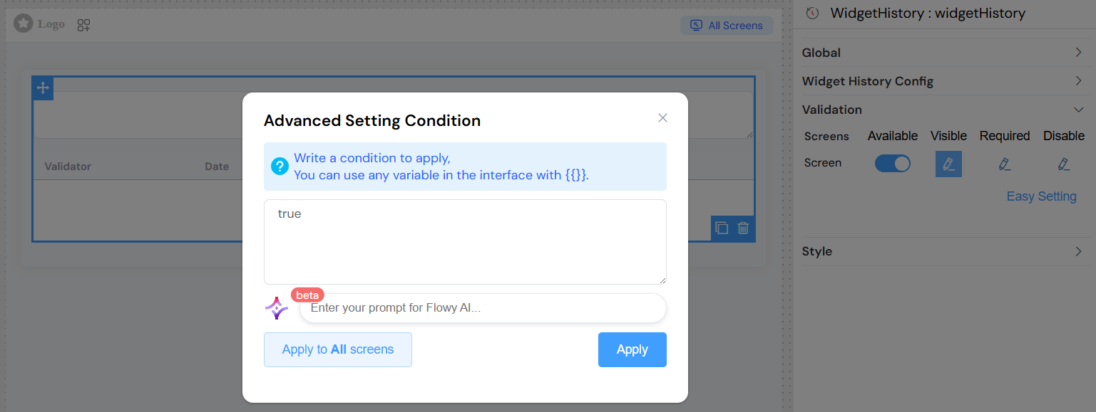
Advanced Visibility Conditions
Use JavaScript expressions for complex visibility logic:
Styling and Responsive Behavior
Desktop View
- Full table layout with all columns visible
- Sortable columns (where applicable)
- Fixed table height with scrolling (max-height: 250px)
Mobile View
- Compact row display showing only avatar and email
- Expandable rows revealed by tapping the arrow icon
- All additional information appears when row is expanded
- Touch-friendly interface with larger touch targets
Comment Integration
The widget includes an integrated comment textarea that allows users to add new comments to the history. This feature:
- Automatically binds to
SF_comment_widget_historymodel - Supports validation rules
- Can be hidden/shown based on visibility settings
- Integrates with the overall form validation system
Loading States
The component provides visual feedback during data loading:
- Loading spinner overlay on the table
- Disabled state for comment input during loading
- Error handling with console logging
Browser Compatibility
- Modern browsers with ES6 support
- Vue.js 2.x compatible
- Element UI components
- Responsive CSS Grid and Flexbox support
Troubleshooting
Common Issues
No data displayed
- Verify
uiQuery.SF_instanceIdoruiQuery.SF_taskIdis properly set - Check network connectivity and API endpoints
- Verify user permissions for accessing history data
Custom measures not showing
- Ensure field names match exactly with data structure
- Check visibility conditions syntax
- Verify HTML templates are valid
Mobile view not working
- Check viewport meta tag configuration
- Ensure CSS classes are properly loaded
- Verify touch event handlers are enabled
Performance Considerations
- Large histories may impact loading times
- Consider pagination for instances with extensive history
- Custom HTML templates should be optimized for performance
- Limit the number of custom measures for optimal display
Security Notes
- History data access is controlled by backend permissions
- User representation is validated server-side
- Custom HTML templates are rendered client-side (sanitize input)
- Comment submission follows standard form validation rules