Icon Widget
Overview
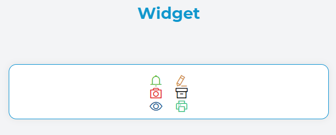
The Icon widget is a visual component that displays scalable vector icons on your interface. It supports a wide variety of icon libraries and provides flexible styling options including color customization, size adjustment, and alignment controls.
Widget Properties
Basic Configuration
| Property | Type | Description | Default |
|---|---|---|---|
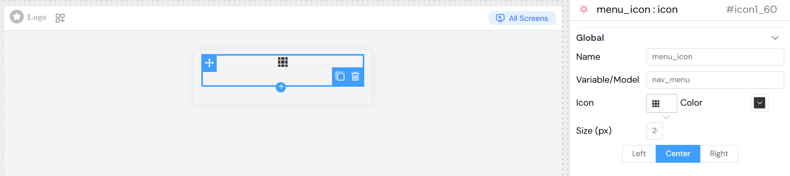
| Name | String | Display name for the widget | - |
| Variable/Model | String | Variable name to bind the widget to your data model | - |
Icon Configuration
| Property | Type | Description | Options |
|---|---|---|---|
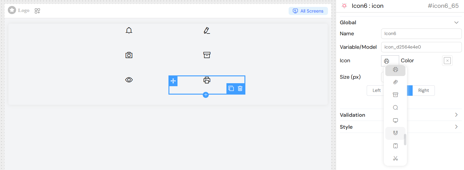
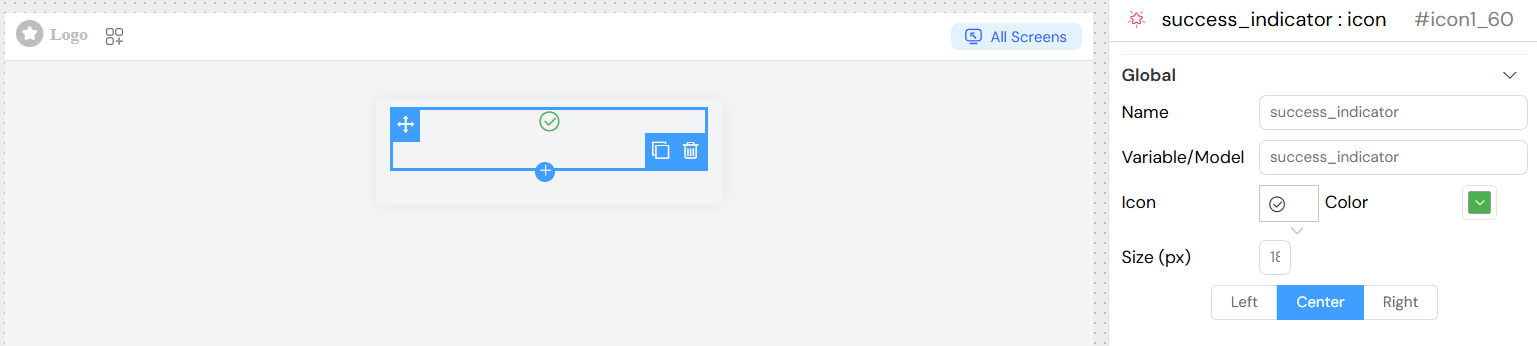
| Icon | String | Icon class name from supported icon libraries | Font Awesome, Material Icons, etc. |
| Color | Color | Icon color using color picker | Any valid CSS color |
| Size (px) | Number | Icon size in pixels | Any positive number |
| Alignment | String | Horizontal alignment of the icon | left, center, right |
Usage Examples
Basic Icon Display
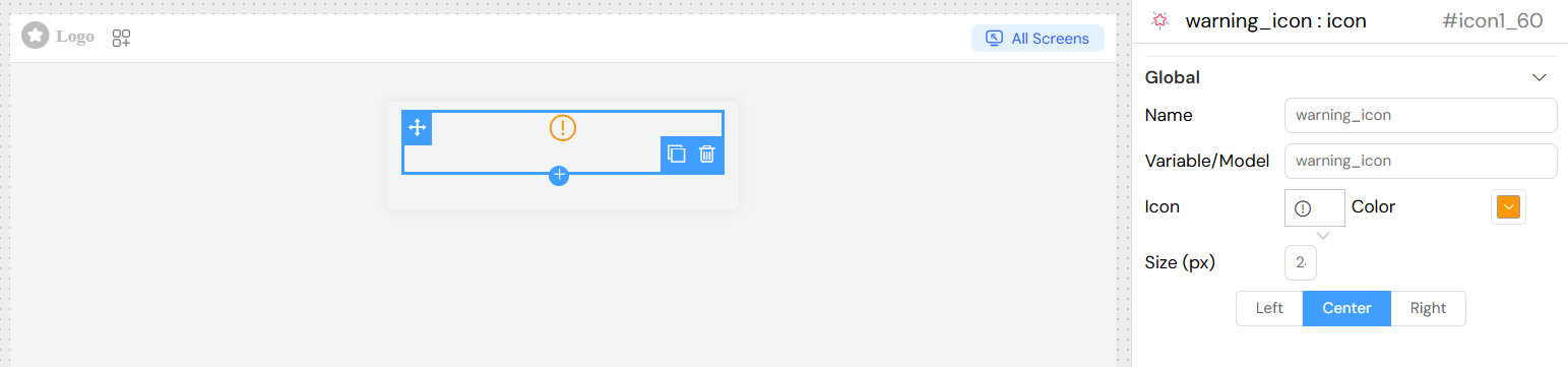
Status Indicator
Navigation Icon
Validation and Visibility
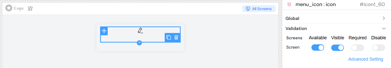
Screen-Based Validation
Configure visibility and availability across different screens:
| Validation Rule | Description |
|---|---|
| Available | Whether the widget is available on the screen |
| Visible | Controls widget visibility (can use conditions) |
| Required | Not applicable for icon widgets |
| Disable | Not applicable for icon widgets |
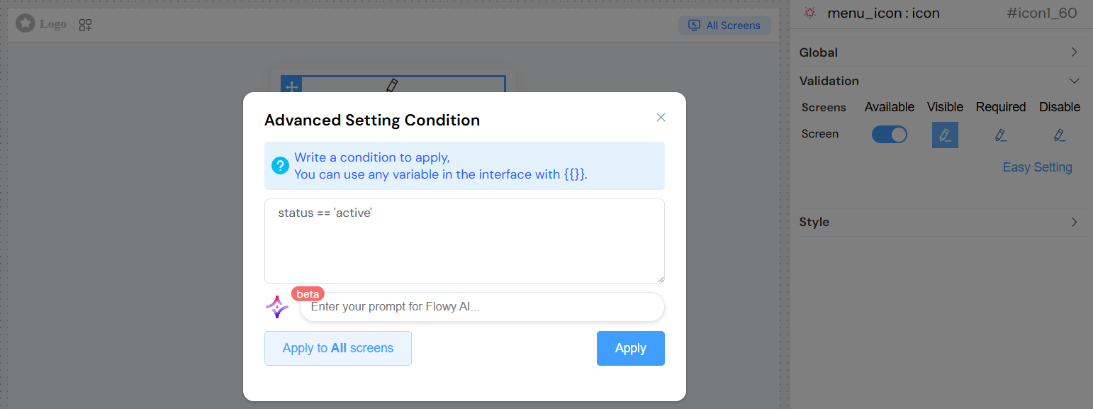
Advanced Conditions
Use JavaScript expressions for dynamic visibility:
Styling Options
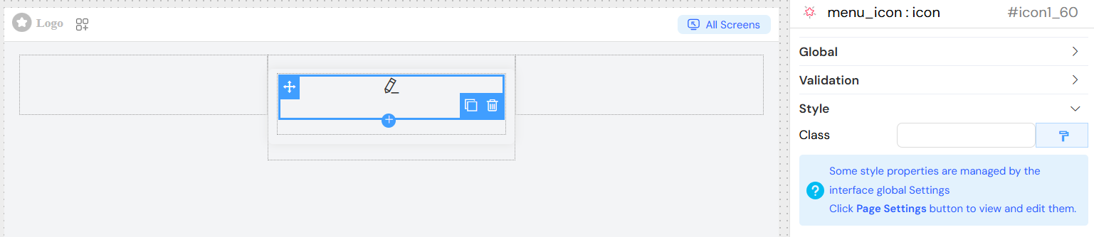
Custom Classes
- Add custom CSS classes through the Class field
- Use dynamic classes for conditional styling based on data
Responsive Design
- Icons scale appropriately across different screen sizes
- Use relative units in custom CSS for better responsiveness
Color Schemes
- Support for theme-based color schemes
- Can be integrated with global color variables
Best Practices
Performance
- Icon Selection: Choose appropriate icon sizes to maintain performance
- Color Usage: Use CSS variables for consistent theming
- Caching: Icon fonts are cached by browsers for better performance
Accessibility
- Alt Text: While icons don't have alt text, ensure surrounding context is clear
- Color Contrast: Maintain sufficient contrast ratios for visibility
- Size Guidelines: Use minimum 16px for important interactive icons
Design Consistency
- Icon Family: Use icons from the same library for consistency
- Size Standards: Establish size guidelines (e.g., 16px, 20px, 24px)
- Color Palette: Limit color variations to maintain visual hierarchy
Responsive Considerations
- Scalability: Test icons at different sizes and resolutions
- Touch Targets: Ensure adequate spacing for mobile interfaces
- Loading States: Consider placeholder or loading states for dynamic icons
Troubleshooting
Common Issues
Icon Not Displaying:
- Verify icon class name is correct
- Check if icon library is loaded
- Ensure icon font files are accessible
Size Not Applying:
- Check for CSS conflicts
- Verify font-size property inheritance
- Use browser developer tools to inspect styles
Color Not Changing:
- Ensure color property is properly formatted
- Check for CSS specificity issues
- Verify color value is valid
Alignment Issues:
- Review container styles
- Check for conflicting CSS rules
- Ensure proper text-align inheritance
Debug Tips
- Use browser developer tools to inspect icon elements
- Verify CSS class application
- Check console for any font loading errors
- Test with simple, known-working icon classes first