Switch Widget
Overview
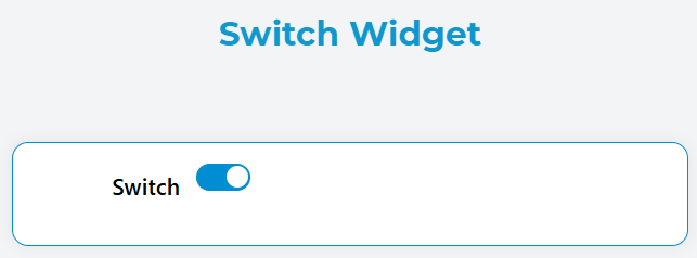
The Switch widget provides a toggle control that allows users to switch between two states (on/off, true/false). It's ideal for boolean settings, feature toggles, and binary choices in forms and interfaces.
Configuration
Widget Properties
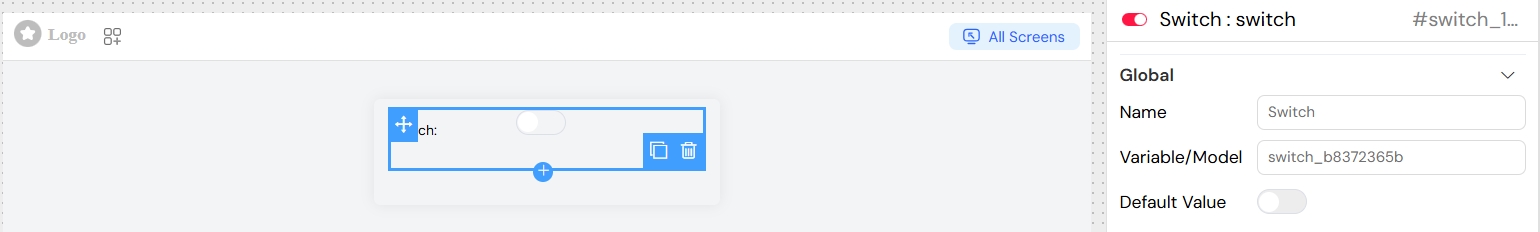
Name
- Description: Display label for the switch widget
- Type: Text
- Required: Yes
- Usage: This text appears as the label next to the switch control
Variable/Model
- Description: The data binding variable that stores the switch state
- Type: String
- Required: Yes
- Format: Use camelCase naming convention (e.g.,
isEnabled,showDetails) - Note: This variable will contain
truewhen switch is on,falsewhen off
Default Value
- Description: Initial state of the switch when the interface loads
- Type: Boolean
- Options:
true- Switch starts in the "on" positionfalse- Switch starts in the "off" position
- Default:
false
Interaction & Events
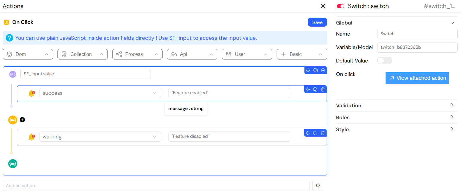
On Click Action
- Description: JavaScript code executed when switch state changes
- Type: JavaScript Code
- Available Variables:
SF_input.value- The new switch value (true/false)SF_input.SF_currentIndex- Current loop index (if inside a loop)
- Example:
Validation & Rules
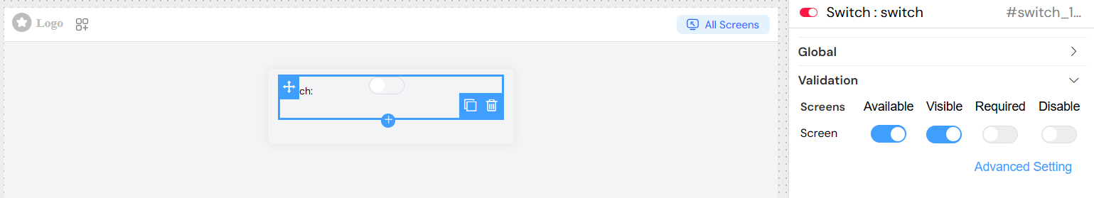
Screen-Based Validation
The switch widget supports different validation states across multiple screens/contexts:
Visible
- Description: Controls when the switch is displayed
- Options:
- Boolean:
true(always visible) /false(always hidden) - Expression: Dynamic visibility using variables
- Boolean:
- Example Expression:
{{userRole}} === 'admin'
Required
- Description: Makes the switch mandatory for form submission
- Options:
- Boolean:
true(required) /false(optional) - Expression: Dynamic requirement based on conditions
- Boolean:
- Example Expression:
{{agreementType}} === 'commercial'
Disabled
- Description: Controls whether users can interact with the switch
- Options:
- Boolean:
true(disabled) /false(enabled) - Expression: Dynamic disable state
- Boolean:
- Example Expression:
{{isProcessing}} === true
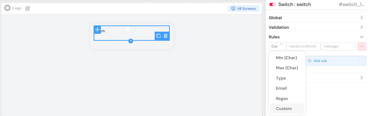
Validation Rules
Custom Validation
- Required Rule: Automatically applied when marked as required
- Custom Message: Personalized error message for validation failures
- Format:
{field_name} is required(default)
Advanced Features
Form Integration
- The switch automatically integrates with parent form validation
- Participates in form submission and validation cycles
- Supports form reset and clear operations
Loop Support
- Can be used within repeating sections
- Access loop index via
SF_currentIndex - Each instance maintains independent state
Screen Management
- Supports multiple screen configurations
- Different validation rules per screen
- Responsive behavior across device types
Best Practices
Naming Conventions
- Use descriptive, action-oriented labels
- Keep labels concise but clear
- Use positive phrasing ("Enable X" rather than "Disable X")
Default Values
- Set sensible defaults based on most common use case
- Consider user experience and safety
- Document the impact of each state
Validation
- Use required validation sparingly for switches
- Provide clear feedback for validation errors
- Consider user flow when setting visibility conditions
Accessibility
- Ensure labels are descriptive and clear
- Test with screen readers
- Maintain adequate contrast for switch states
Common Use Cases
- Feature Toggles: Enable/disable application features
- User Preferences: Theme selection, notification settings
- Form Options: Agreement checkboxes, optional sections
- Status Controls: Active/inactive states, publish/draft modes
- Conditional Display: Show/hide related form sections
Troubleshooting
Switch Not Changing
- Verify the model variable is properly bound
- Check for disabled state conditions
- Ensure no conflicting validation rules
Validation Not Working
- Confirm required rules are properly set
- Check screen-specific validation settings
- Verify form integration is active
Actions Not Executing
- Validate JavaScript syntax in onClick handler
- Check browser console for errors
- Ensure proper variable references
Integration Notes
- Compatible with all form validation systems
- Supports real-time value binding
- Integrates with conditional display logic
- Works within complex form structures and loops