Web Interface
A Web Interface is the visual layer of your application — the environment in which users interact with your forms, dashboards, and manual task screens. Designed with responsive behavior in mind, the interface automatically adapts to desktop, tablet, or mobile devices.
In Softyflow, every interface is built around screens, which are essentially application pages. These screens are composed of widgets — modular design elements such as tables, forms, charts, or buttons that define what the user sees and how they interact with your app.
To get started, make sure you've completed your project setup and understand the core concepts behind Softyflow interfaces.
The web modeler provides a drag-and-drop canvas for designing your application's user interface.
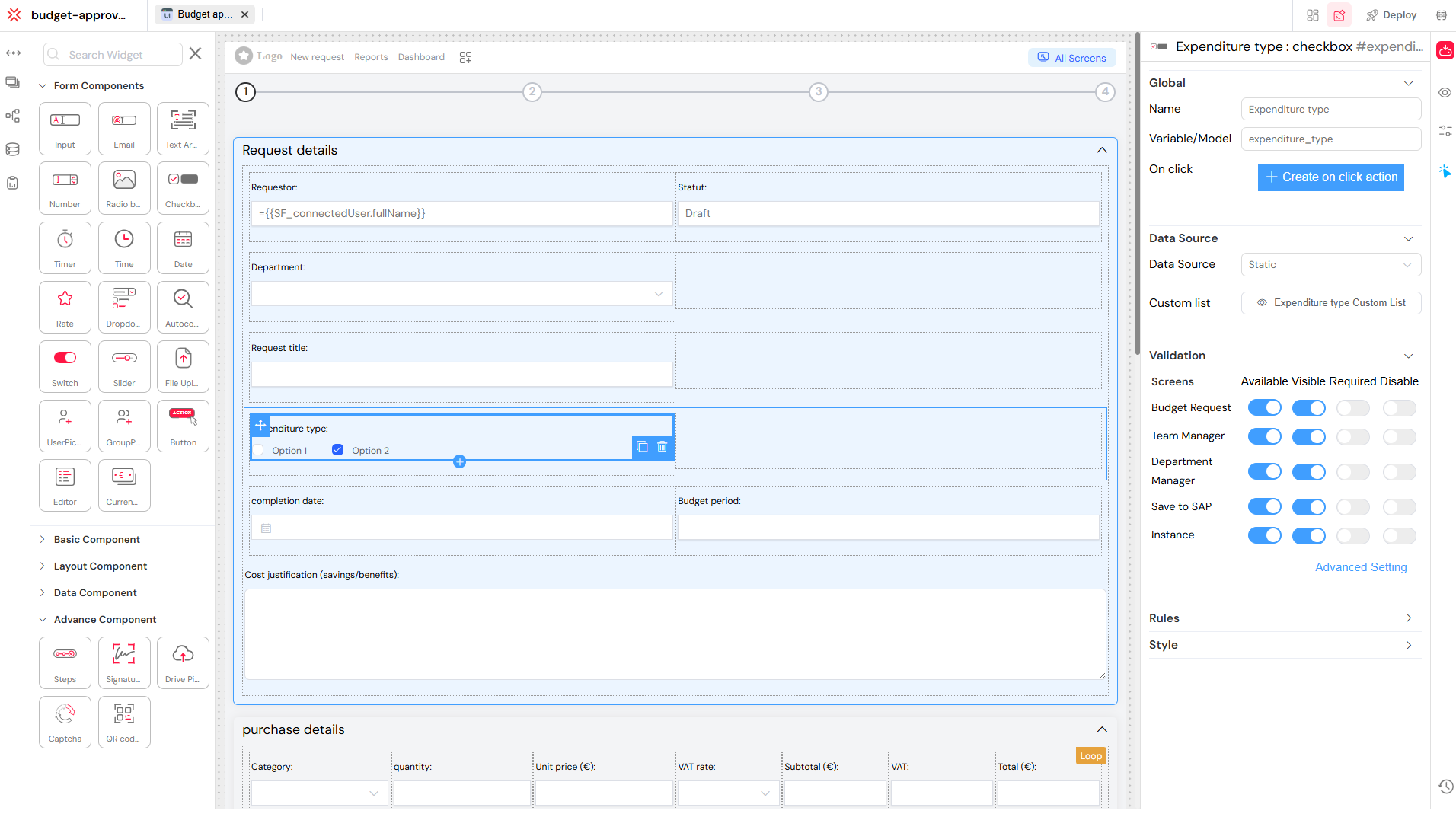
1. Widgets
Widgets are the fundamental building blocks of your screen. You can drag and drop them into your canvas to create interactive and data-driven user interfaces. Each widget can be configured individually and linked to variables, MongoDB collections, processes, or external sources through our integration features.
1.1. Widget Categories
Widgets are organized into five categories, each serving a specific purpose in building a complete user experience:
1.1.1. Form Components
These widgets are essential for gathering user input within forms or workflows. They range from simple text inputs to more complex user and group pickers.
- Input Types: Input, Email, Text Area, Number
- Date & Time: Timer, Time, Date
- Selectors: Radio Button, Checkbox, Select, Switch, Slider
- Rating & Feedback: Rate
- Advanced Input: Autocomplete, File Upload
- User Management: User Picker, Group Picker
- Actions: Button
- Content Tools: Editor, Currency
A variety of form components are available to capture user input.
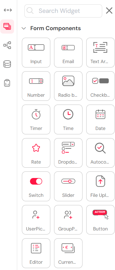
1.1.2. Basic Components
These widgets are used for fundamental UI elements and content display. They help in structuring the content and providing visual cues to the user.
- Layout Elements: Spacer, Divider
- Text Components: Title, Text
- Media Elements: Image, Thumbnail
- Content Display: Card, Alert
- Development Tools: Html
- Visual Elements: Icon
- Document Tools: PDF Reader
Basic components for adding text, images, and other essential UI elements.
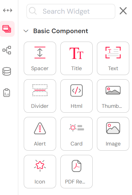
1.1.3. Layout Components
Used for structuring and organizing content on the page, these widgets help in creating a clean and responsive layout.
Layout components to structure your page with grids, tabs, and popups.
1.1.4. Data Components
These widgets are used for displaying and managing data from various sources like databases and reports.
- Data Display: Table
- Data Visualization: Basic Chart
- Performance Metrics: Widget History
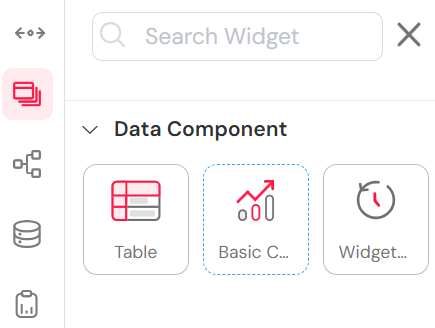
Data components for displaying tables, charts, and historical data.
1.1.5. Advanced Components
These widgets support extended process control and interactivity, adding a layer of security and integration to your application.
- Process Flow: Steps (multi-step workflows), Drive Picker (cloud file selection)
- Security: Captcha (bot protection), Signature (digital signatures)
- Integration: QR Code (quick scanning functionality)
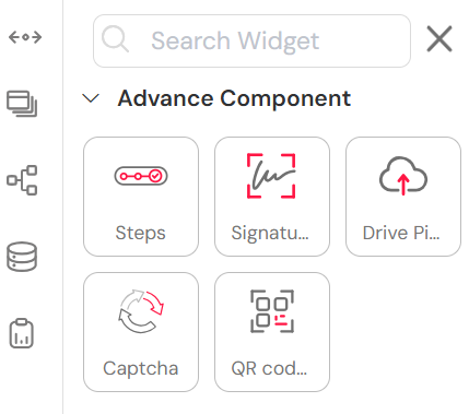
Advanced components for multi-step processes, security, and integrations.
Widgets are designed via drag-and-drop inside the web modeler and are aligned using the grid layout system for a responsive structure.
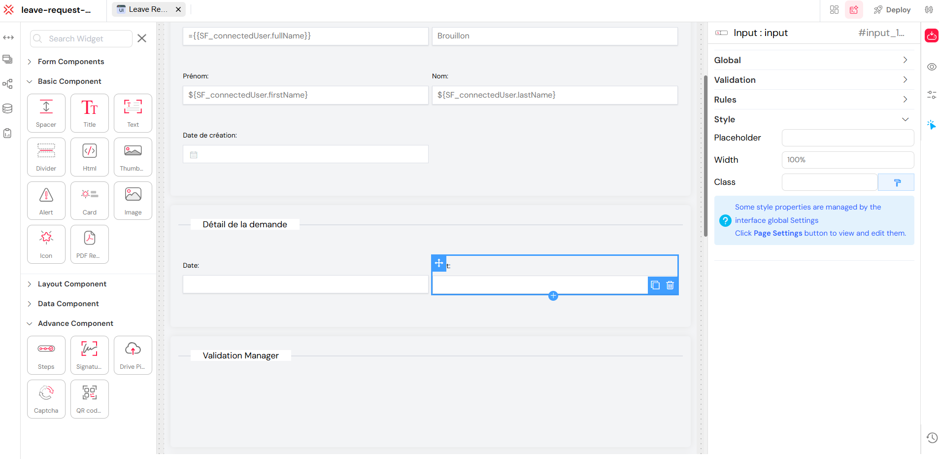
1.2. Widget Configuration
Each widget comes with a rich set of configuration options that let you adapt its behavior per screen and context. This allows for a high degree of customization and dynamic behavior.
- Name: The name you give to your components. In some cases, like PopUp, Divider, or Input, it will be shown in the rendered output.
- Variable / Model: A distinctive name that holds or represents the component's data model.
- ID: A unique identifier you assign to the component to distinguish it within the interface or logic.
- Default Value: The initial value assigned to the component. It can be a static value or dynamically bound to a variable.
- Visibility Rules: Define whether a widget is visible or hidden based on role, screen, or form data.
- Editability: Specifies whether the component is editable or read-only.
- Requirement: Marks the component as required, based on defined conditions.
- Binding: Links the content of the component to variables, data collections, or API responses from our integration system.
You can define different rules per screen, ensuring one widget behaves differently across steps without duplicating it.
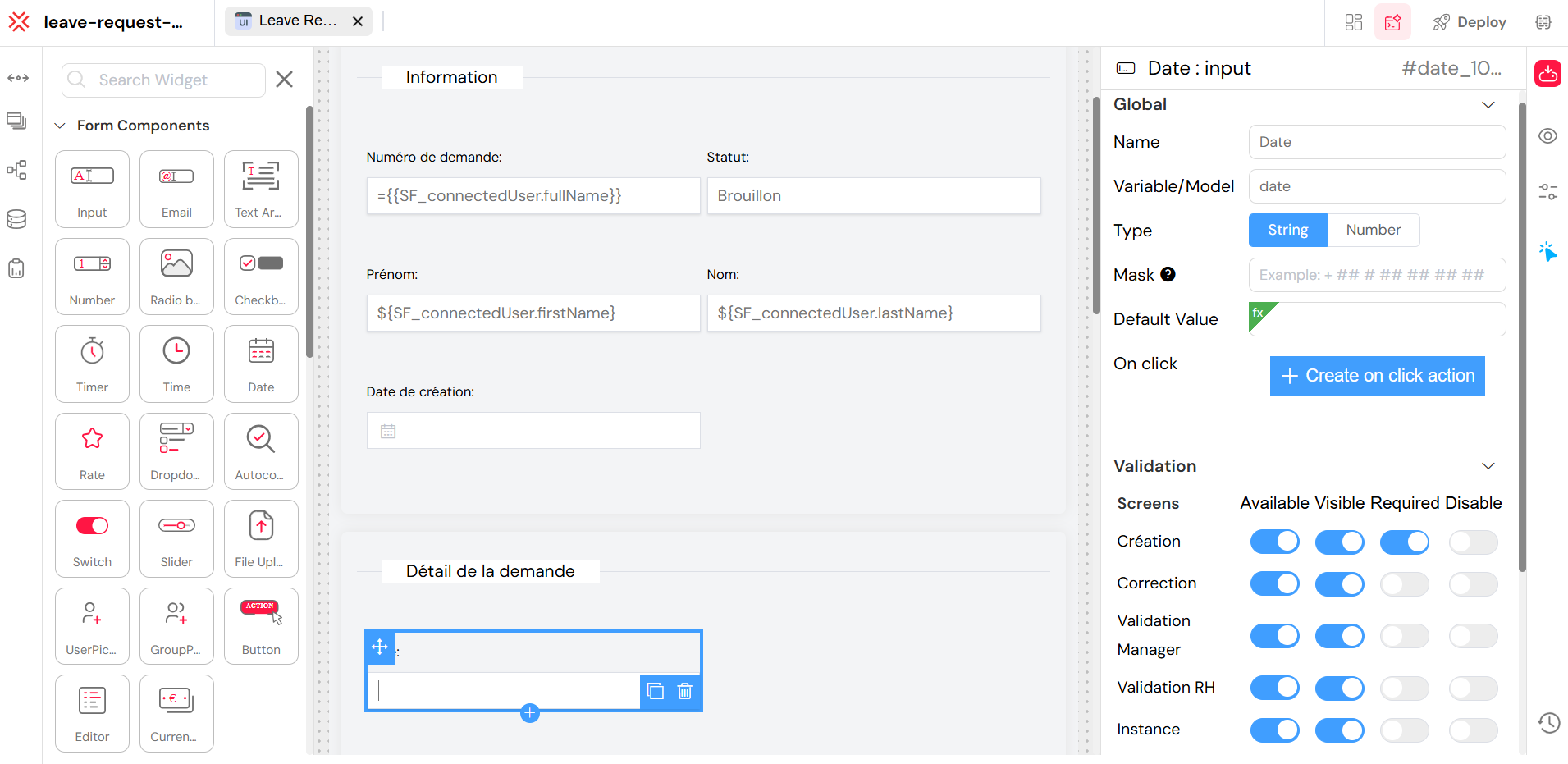
The widget configuration panel allows for detailed customization of each widget's properties.
2. Actions
Actions bring interactivity and logic to your interface using our comprehensive actions system. They define what happens when users perform events — like clicking a button, submitting a form.
2.1. Creating a New Action
Follow these steps to create a new action from the interface:
- Click on any widget.
- Click Create On Click Action.
- Add your desired Actions from the available list.
- Click Save to store the actions on the interface.
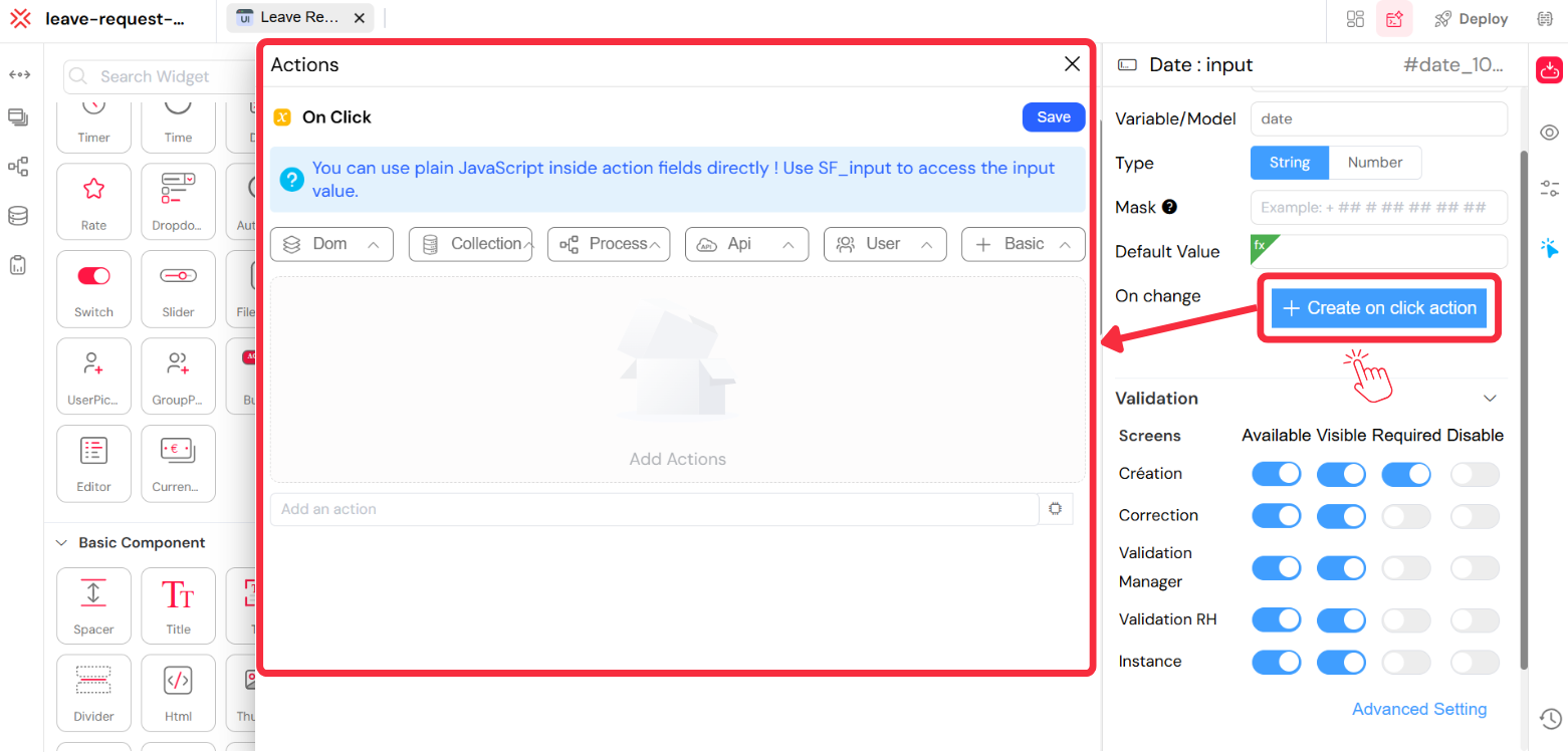
Creating an "On Click" action for a button in the web modeler.
An action is a predefined triggerable behavior that can be linked to widgets, variables, or logic conditions. Common uses include:
- Calling APIs (e.g., fetch or post data)
- Starting workflows or processes
- Updating variables or models
- Toggling widget visibility
- Running custom functions or scripts
- Displaying alerts, confirmations, or messages
2.1.1. Example Use Cases
- A button that submits a form and sends data to a collection.
- A screen that, on load, fetches filtered reports from an API.
- A toggle that reveals another field and sets a variable.
2.2. Available Actions
Actions are organized by category. Here's an overview of what you can achieve with them:
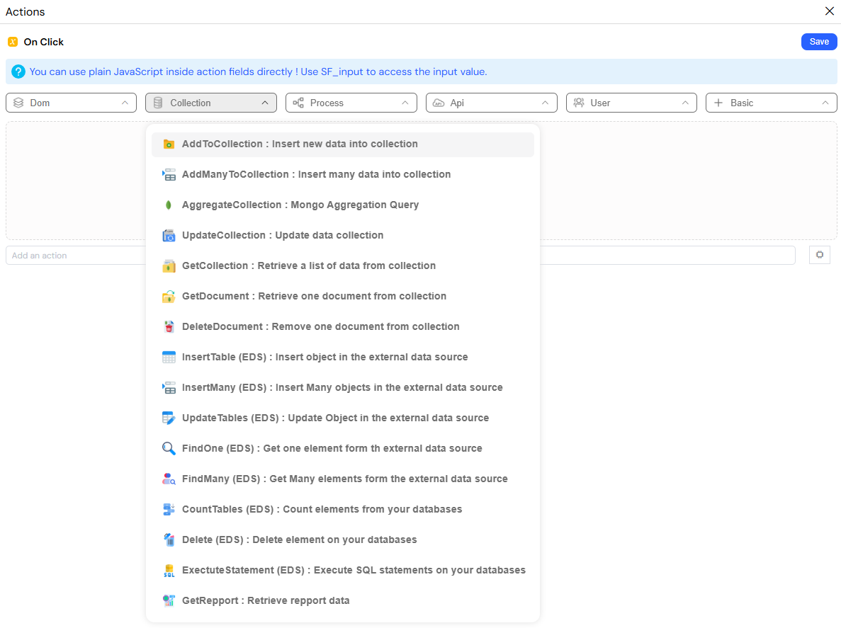
2.2.1. DOM (Interface/UI Manipulation)
These actions allow you to manipulate the user interface dynamically.
show,hide,toggleVisibiltysetRequired,setDisable,disableFormrefreshWidget,fillForm,clearFormconfirm,pushToArray,alertMessagevalidateForm,validateHistoryCommentsetModel,setVariable
](/img/02_developpement_guide/01-web-interface-design/actions_dom.png)
A list of DOM actions available for UI manipulation.
2.2.2. Collection (Data Handling)
Manage data in MongoDB collections and external databases with these actions.
addToCollection,addManyToCollection,updateCollectiongetCollection,AggregateCollectiongetDocument,deleteDocumentinsertTable (EDS),updateTables (EDS)findOne (EDS),findMany (EDS),countTables (EDS)insertMany (EDS),delete (EDS),exectuteStatement (EDS)
A list of collection actions for data manipulation.
2.2.3. Workflow/Process
Integrate your interface with the process design and monitoring features.
startProcess,OpenNextTask,update,saveopenInstance,redirect,execute
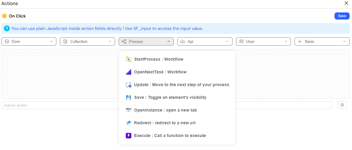
A list of workflow and process actions for process integration.
2.2.4. API Integrations
Connect with external services through our integration system.
invokeApi,sendEmail,nextValueeditPDFTemplate,previewPDF
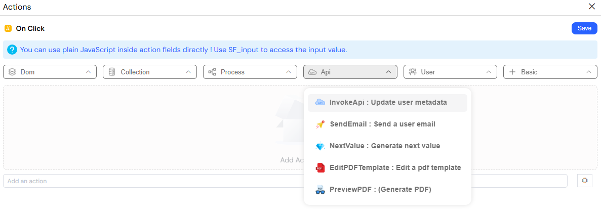
A list of API integration actions for connecting to external services.
2.2.5. User Management
Integrate with user management and authentication systems.
findUserById,findUsersuserMetadata,getUserPendingTasks
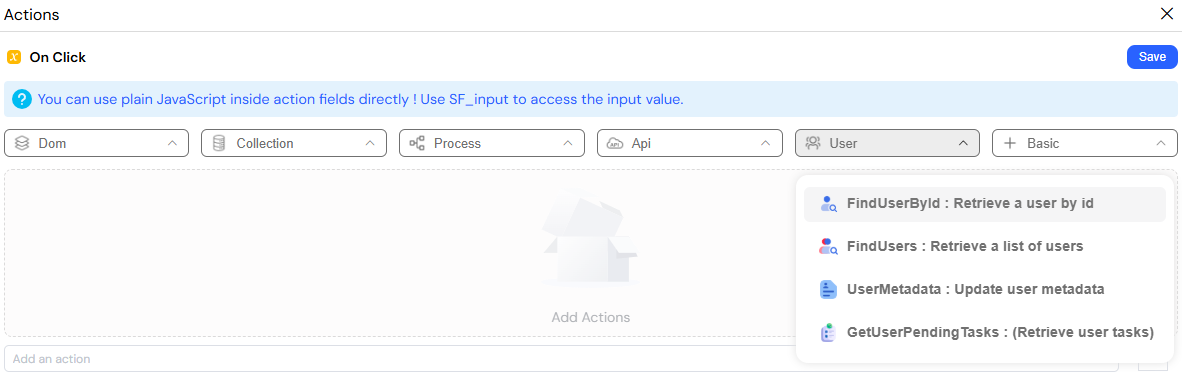
A list of user management actions for user-related operations.
2.2.6. Basic
These actions provide basic logical constructs for your action flows.
if,if(deprecated)repeat (loop),loopArray
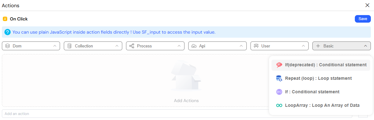
Basic actions for conditional logic and loops.
3. CSS and Styling
Styling controls how your app looks and feels — both at the widget level and across the full page layout. Softyflow gives you several layers of styling capabilities to keep your interface consistent, responsive, and easy to customize.
The CSS and Styling panel allows for custom styling of your application.
Each widget includes a Style panel where you can:
- Set placeholder text
- Control width (e.g. 100%, auto)
- Assign a custom class (e.g.
input-demo)
This allows you to manage spacing, visibility, and alignment directly inside the web modeler — no code required.
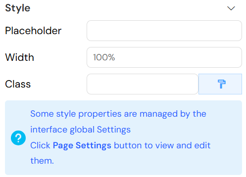
The Style panel for a widget allows for quick and easy styling adjustments.
4. Page Settings
The Page Settings panel defines the identity and display behavior of your interface page. It governs metadata, layout preferences, user visibility based on role management, and navigation.
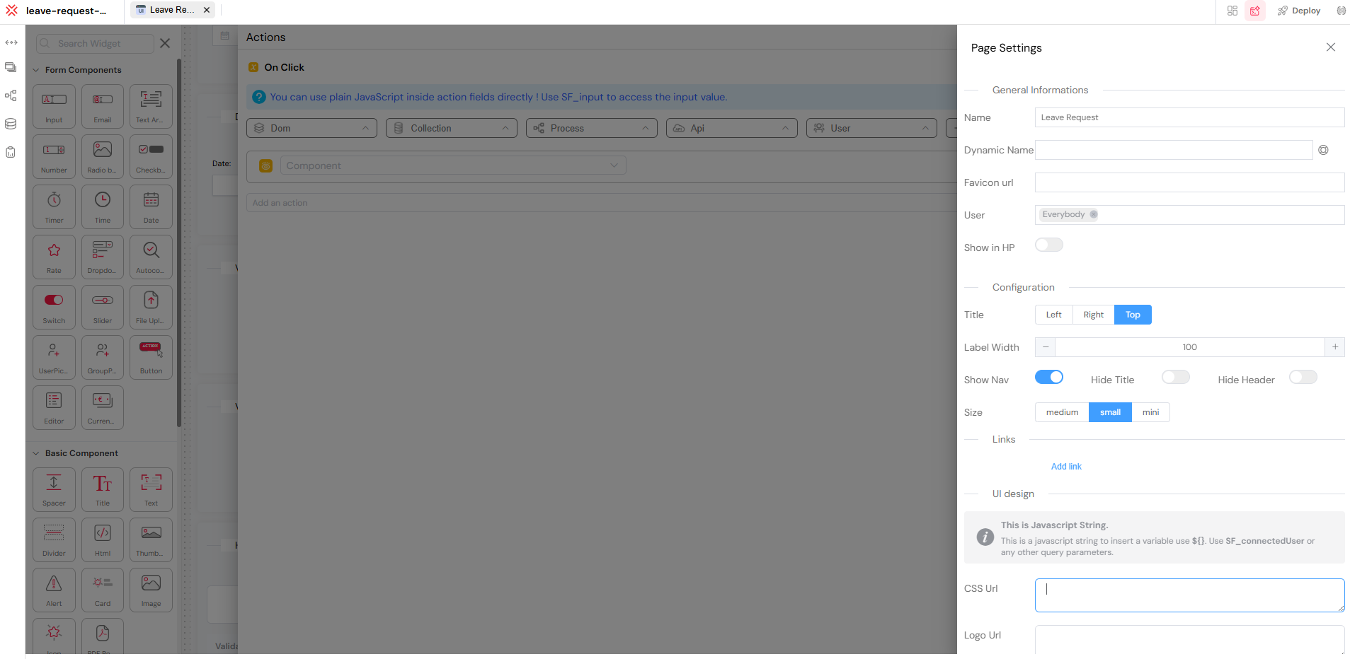
The Page Settings panel provides a centralized location for all page-level configurations.
4.1. General Information
This section allows you to set the general information for your page, such as the title, favicon, and access permissions.
- Name: The title of the page shown in menus and headers.
- Dynamic Name: Optional. Use variables (e.g.,
${request_number}) to dynamically adjust the page title depending on user or form data. - Favicon URL: A URL to a custom favicon displayed in the browser tab.
- User: Controls who can access the page based on our user management system. By default, access is set to
Everybody. - Show in HP: Toggle whether this page appears in the application's home interface (homepage).
- Thumbnail URL: Sets a preview image for the page in the homepage or project gallery.
- Workspace: Optional. Use it to logically group pages in multi-app environments.
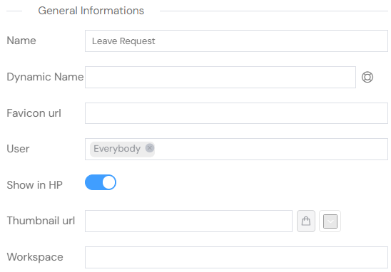
The General Information section in Page Settings.
4.2. Configuration
This section allows you to configure the layout and appearance of your page.
- Title: Align the page title to the
Left,Right, orTop. - Label Width: Define the width (in pixels) of form labels for consistent layout (e.g.,
100). - Show Nav: Toggle whether the navigation panel is displayed.
- Hide Title / Hide Header: Show or hide the page title and global header.
- Size: Define the visual density of your form:
mini: Compact layoutsmall: Standard layoutmedium: Spacious layout
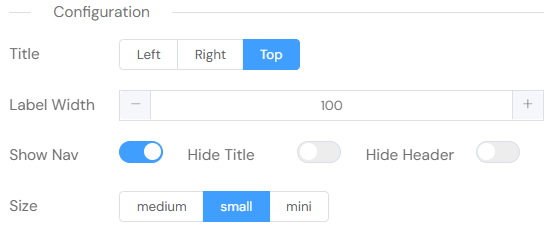
The Configuration section in Page Settings.
These settings help tailor the presentation and accessibility of your page to specific needs — whether you're building for all users or specific roles, internal back-office or public-facing apps.
4.3. Links
You can add external CDN links to load JavaScript or CSS libraries into your application. This is useful for including third-party libraries like Bootstrap, jQuery, or Font Awesome.
- Paste the CDN URL in the input field.
- Select the type: JS (JavaScript) or CSS.
- Use Add link to include multiple CDN resources.
- Click the red minus (–) button to remove a link.
📘 Common use cases include loading libraries like Bootstrap, jQuery, Font Awesome, etc.
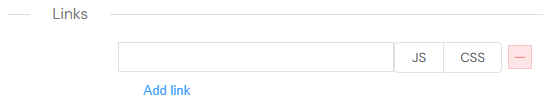
The Links section in Page Settings for adding external CDN links.
4.4. UI Design
Customize the interface using JavaScript-compatible expressions and URLs compatible with our SDK.
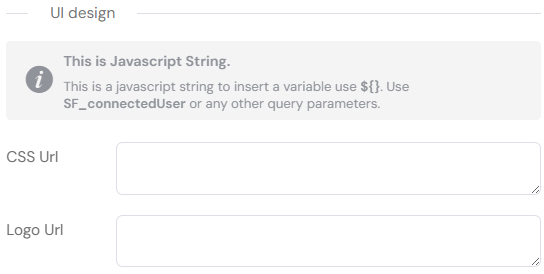
The UI Design section in Page Settings for advanced UI customization.
CSS URL
A custom URL for loading a CSS file that styles the UI.Logo URL
A direct URL to the logo image displayed in the application interface.
5. Screens
Screens are designed to operate only within a workflow.
They are not standalone pages, but dynamic interfaces that adjust automatically based on the user’s role and the current stage of the process.
This ensures that each screen displays only the information and actions relevant to its workflow context.
A screen is like a mask applied to your web interface. It defines what each user sees, when they see it, and how they interact with it throughout the workflow. Instead of duplicating pages or forms, screens allow you to personalize visibility and behavior for different roles or process steps — all within the same interface structure.
5.1. Why Use Screens?
For example, in a leave request application built with our process design tools:
- Launch Screen: The employee fills out the form.
- HR Manager Screen: The HR team validates the request.
- Approve Screen: A final reviewer confirms or rejects it.
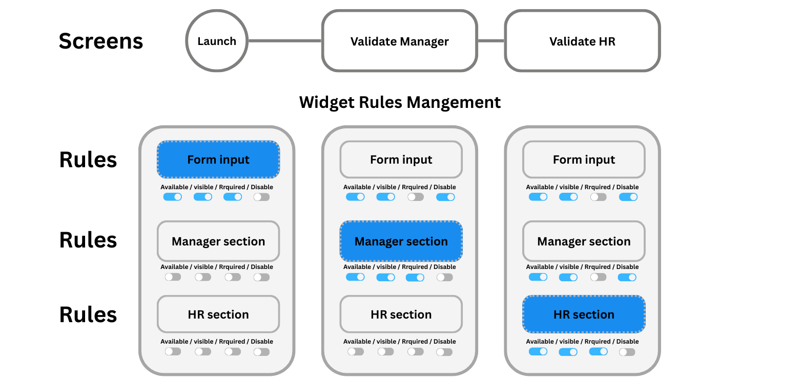
An example of how screens can be used in a leave request workflow.
Even though all users interact with the same interface, screens control what's shown and editable based on context. This is especially powerful when combined with role-based access control.
5.2. How Screens Work
When you add a new screen:
- It inherits all widgets and layout from the original screen.
- You don't need to duplicate or rebuild content.
- Each widget can be configured with rules:
- Available: Is the widget present in the interface?
- Visible: Is it shown to the user?
- Required: Must it be filled?
- Disabled: Is it read-only?
These toggles are screen-specific and define how widgets behave across process steps.
5.3. Connecting Screens to Process Steps
Each screen can be assigned directly to a process step in our process modeler. This linkage ensures the interface automatically adapts when a user reaches a specific step.
This allows behavior to shift depending on:
- The current step in the process
- The user's role (configured through user management)
- Data values present in the form
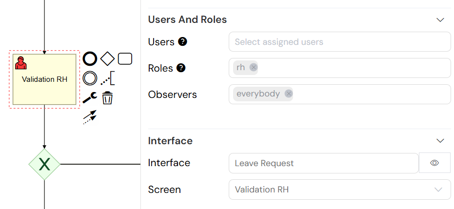
Connecting screens to process steps in the process modeler.
Next Steps
Now that you understand web interface design, continue building your application:
- Process Design - Connect your interfaces to powerful workflows
- Database Integration - Connect your widgets to data sources
- Integration - Connect with external APIs and services
- Reporting - Create data visualization and reports
- Test & Deploy - Test your interfaces across environments
For hands-on experience, try our step-by-step tutorials or watch our web modeler video tutorials.
For advanced customization, explore our Web Modeler SDK and learn about the complete widget library.