Web Modeler
1. Web Modeler Description
SoftyFlow Web Modeler is a user-friendly application that gives users powerful features for designing their own UIs. It uses an easy-to-use drag-and-drop interface designed for all types of developers, from No-code/ Low-Code developers to professional software engineers. It offers a large configuration, many UIs components, and script editor if you want to go further.
2. Setting of Web Interface
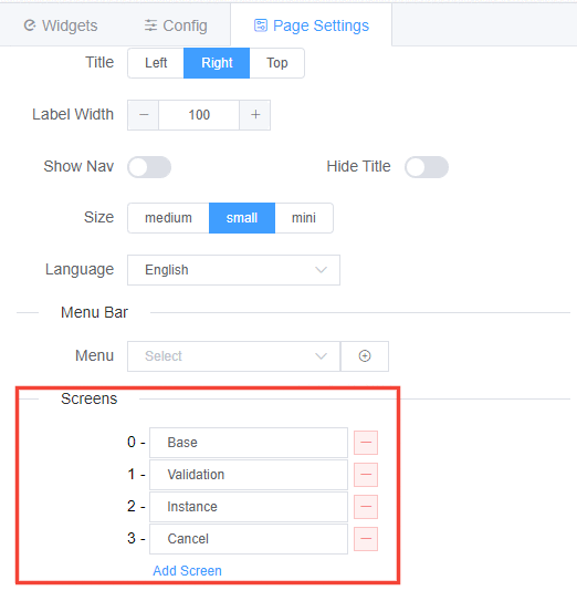
Once you create the web interface, you can configure it via the page settings tab:
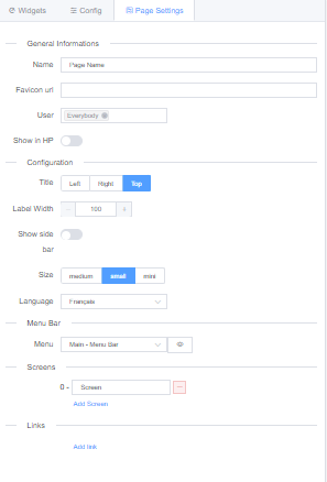
- General Informations
- Name: The name you choose for the page, it will appear in each screen of the web interface.
- Favicon url: You can set your favicon that will be your website icon, tab icon, or bookmark icon. You can choose any image format you want and insert the URL to use the favicon.
- User: The users or Group or users allowed to open and interact with the interface.
- Show in HP: Display or not the interface in the Home Page.
- Configuration:
- Title: Where you want to place the title of each component. You can choose among: Left, Right or Top.
- Label width: Set the width of page elements
- Show side bar: Choose if the side bar will be shown or not. Each element of the sidebar correspond to a section in the page. Only visible sections will appear in the sidebar.
- Size: The size of page's elements. You can choose among: medium small or mini
- Language: Define the language of the page. It is usefull for the predefined texts, to choose among: English, French and Arabic.
- Menu Bar: Choose the navigation bar you want to display in your page.
- Screens: You can attach many screens to the same interface. Gathering interfaces with similar components or behviour into screens, will help you reduce the amount of web interfaces and gain in performance.
- Links:
3. Widgets
The web modeler contains a list of ready to use components with drag and drop functionality to easily create layouts and web pages. Each component is configurable in three levels:
- Global configuration : Configuration shared between all components.
- Custom configuration : Configuration depending proper to each type of component.
- Validation : Component management in each screen.
3.1. Global Configuration
All components have in common a configuration that requires defining a name, a model and an ID.
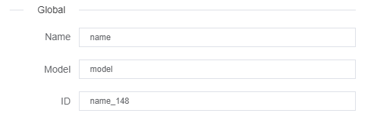
- Name : Name you give to your components. In some cases: PopUp, Divider or Input it will be shown in redering
- Model : Distinctive name that holds the component data model.
- ID : A unique distinctive identifier you give to your componant.
Every component should have a distinct model, unless 2 components are supposed to point on the same data model. ( In most cases it should be unique )
3.2. Components
SoftyFlow offers many pre-built components that can be divided to four categories: Basic components, Advance Components, Layout Components and chart components.
| Components | Type | Components | Type |
|---|---|---|---|
| Timer | Basic components | Title | Basic components |
| Text | Basic components | Thumbnail | Basic components |
| Divider | Basic components | Card | Advance components |
| HTML | Basic components | Jumbotron | Advance components |
| Input | Basic components | File Upload | Advance components |
| Text Area | Basic components | GroupPicker | Advance components |
| Number | Basic components | Table | Advance components |
| Radio Button | Basic components | Steps | Advance components |
| Checkbox | Basic components | UserPicker | Advance components |
| Time | Basic components | Widget History | Advance components |
| Date | Basic components | Grid | Layout |
| Dropdown | Basic components | Section | Layout |
| Autocomplete | Basic components | PopUp | Layout |
| Switch | Basic components | Drawer | Layout |
| Slider | Basic components | Tabs | Layout |
| Button | Basic components | QR code scanner | Layout |
| Rate | Basic components | Basic Charts | Chart Components |
3.2.1. Basic Components
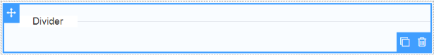
Divider:
Allows you to segment your content vertically, you may also add a title to your divider:
Input:
A simple input field to hold data, data types : String , Number, Currency.
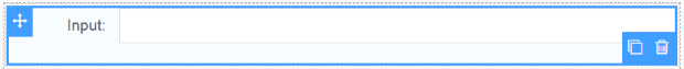
Configuration
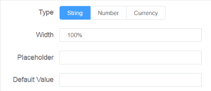
Type : Define a data type of the input choosing among: String, Number and currency.
Width : Component's width.
Placeholder : Hint that describes the expected value of an input field.
Default Value : A value by default assigned to the input field.
Variables
If model is the model name of the variable
this.models.model: The field contentthis.models.model_label: (Only for Currency ) Formatted value
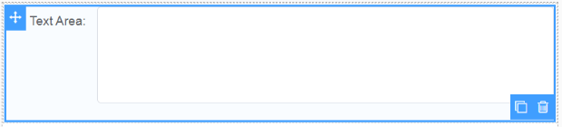
- Text Area:
Write multiple lines of text.
Configurations
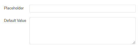
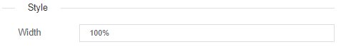
- Width : Component's width
- Placeholder : Helper text to display whenever the input field is empty
- Default Value : A Default value for the input field
Variables
If model is the model name of the variable
this.models.model: The field content
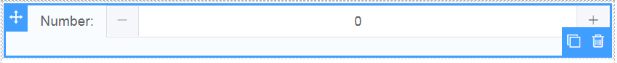
- Number:
Input field for numerical data, with controllers to increase/decrease the value.(the step could be specified in configuration)
Configurations

- Width : Component's width
Variables
If model is the model name of the variable
this.models.model: The field content
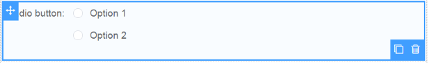
- Radio Button:
Define data source from radio button : Static with predefined values, a database or a variable.
Configurations
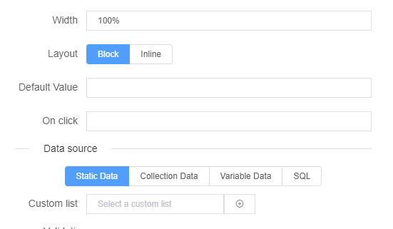
Width : Component's width
Layout : Display options as blocks (each in a row) or inline (each in a column)
Defaul Value : A Default value for the input field
OnClick : Attach a function to the onClick event listener
DataSource : Choose a source for your radio options :
- Static Data : generated from custom lists
- Collection Data : generated from database collections
- Variable Data : generate Value/label pairs as options
- SQL : generated from a SQL request
Variables
If model is the model name of the variable
this.models.model: The field content
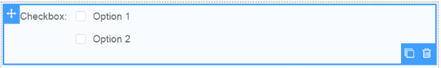
- Checkbox:
Checkbox allows you to select several items. Define the name and data source from the right panel.
Configurations
- Width : Component's width
- Layout : Display options as blocks (each in a row) or inline (each in a column)
- OnClick : Attach a function to the onClick event listener
- DataSource : Choose a source for your radio options :
- Static Data : generated from custom lists
- Collection Data : generated from database collections
- Variable Data : generate Value/label pairs as options
Variables
- If model is the model name of the variable
- this.models.model : The field content
- Time:
Drag and drop the time widget, define the name and the format.The time variable returns a timestamp.

Configurations
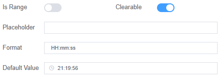
- Width : Component's width
- Placeholder : Helper text to display when the input field is empty
- IsRange : Setup up range limits for the time input
- Format : Time display format (default is HH:mm:ss)
- Default Value : A Default value for the input field
Variables
- If model is the model name of the variable
- this.models.model : The field content
- Timer:
For add a timer, select the timer widget and define the name and the duration.

Configurations

- Width : Component's width
- Duration : The time during which something continues.
Variables
- If model is the model name of the variable
- this.models.model : The field content
- Date:
For date inputs, select the date widget and define the properties from the panel.

Configurations
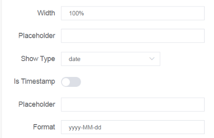
- Width : Component's width
- Placeholder : Helper text to display when the input field is empty
- Show Type : Date data type to show (year, month, date...)
- Is Timestamp : If the date includes or not the time
- Start Placeholder : Minimum date limit allowed
- End Placeholder : Maximum date limit allowed
- Format : Date display format (default is yyyy:MM:dd)
Variables
- If model is the model name of the variable
- this.models.model : The field content
- Dropdown:
Drag & Drop a dropdown field, select the data source and configure the options from the panel : Multiselection, Filterable etc

Configurations
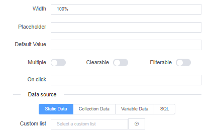
- Width : Component's width
- Placeholder : Helper text to display when the input field is empty
- Multiple : Allow multiple options select
- Filterable : Make options filterable depending on select field input
- Defaul Value : A Default value for the input field
- OnClick : Attach a function to the onClick event listener
- DataSource : Choose a source for your radio options :
- Static Data : generated from custom lists
- Collection Data : generated from database collections
- Variable Data : generate Value/label pairs as options
- SQL : generated from a SQL request
Variables
- If model is the model name of the variable
- this.models.model : The field content
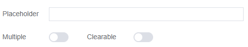
Autocomplete:
This widget will provede the users, while typing the beginning word, a list of suggestion among data you selected.
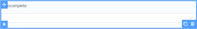
Configurations
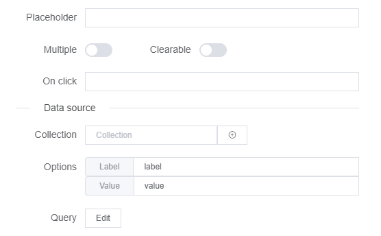
- Placeholder : A hint that describes the expected value.
- Multiple : Enable/ Disable multi selecion option.
- Clearable : Enable/ Disable clearing the field after each selection.
- On click : Define a function to be called when the user make a selection.
- Datasource : Select the source for autocomplete data:
- Collection Data : Getting your autocomplete data from a database collection.
- Switch:
Using the switch is very simple. Drag and drop the widget, put a name and a default value.

Configurations

- Default value : A value by default given to the switch.
Variables
- If model is the model name of the variable
- this.models.model : The field content
- Slider:
Drag and drop the slider widget and define the range, the name and the other properties. Very useful to pick up a value.

Configurations
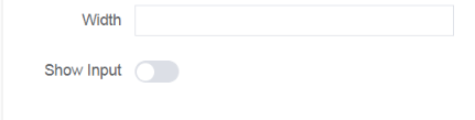
- Width : Component's width.
- Show Input : Add a numbers button controller next to the slider.
Variables
- If model is the model name of the variable
- this.models.model : The field content
Button:
Select the button widget to implement actions : Script (For scripting purposes), Process (Start, Update)

Configurations
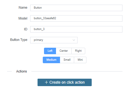
- Button Type : different color layout for the button component: primary, success, info, warning or danger.
- Button place : Where to place the button: Left, center or right.
- Button size : The size of the button : Medium, small or mini
- Actions: to add actions to the button.
Variables
- If model is the model name of the variable
- this.models.model : The field content
- Html:
Drag and drop an HTML widget to edit your HTML code.

Configurations
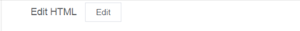
- EditHTML : Opens up a script editor where you can write HTML markup.
Variables
- If model is the model name of the variable
- this.models.model : The field content
- Text:
Drag and drop a text widget to add some fixed text.
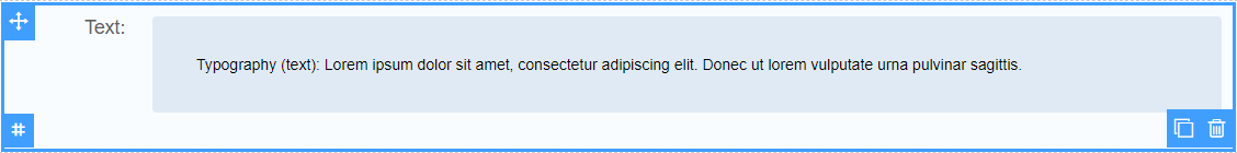
Configurations
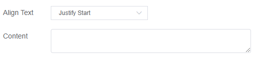
- Content : The fix text that will be add.
- Align Text : How to align your content horizontaly
Variables
- If model is the model name of the variable
- this.models.model : The field content
- Title:
Drag and drop a title widget to add some fixed title.

Configurations
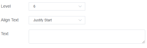
- Level : The size of title that will be add.
- Text : The fix title that will be add.
- Align Text : How to align your content horizontaly
Variables
- If model is the model name of the variable
- this.models.model : The field content
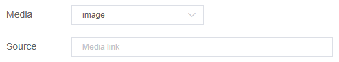
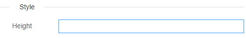
- Thumbnail:
Drag and drop a thumbnail widget and define the with , the height, type of media, the source of the media. Very useful to recognizing and organizing the chosen media.
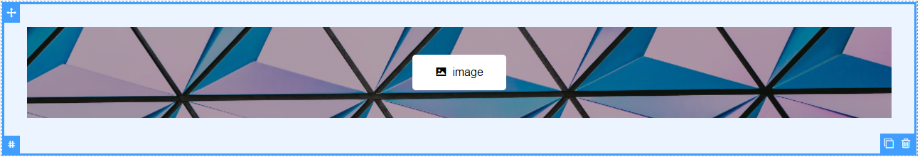
Configurations
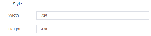
- Width : Component's width
- Height : Component's Height
- Media : Type of Thumbnail (image, video or avatar).
- Source : The source where the media is stored.
Variables
- If model is the model name of the variable
- this.models.model : The field content
- Rate:
Drag and drop a thumbnail widget and define your configuration max score, allow half, colors and show score. Very useful to valuate a work or anything that can be evaluated.

Configurations
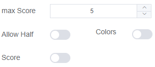
- max Score : The high-score that someone can give.
- Allow Half : If it active that allow you to give half score.
- Colors : If it active your rate will be colored on 3 variant color depends on the score that you gave.
- Score : If it active your score will be showed in number.
Variables
- If model is the model name of the variable
- this.models.model : The field content
3.2.2. Advance Components
File Upload:
Drag and drop upload widget to upload files.
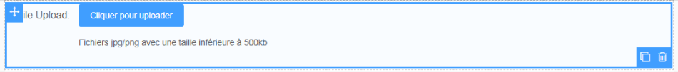
Configurations
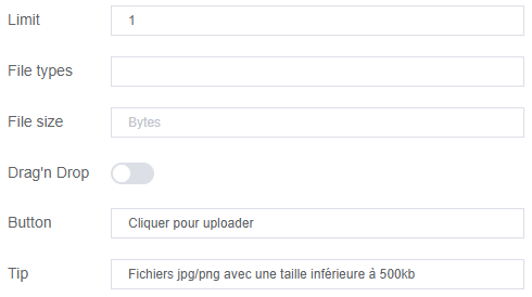
- Width : Component's width
- Limit : Limit of files to upload
- File types : Type of the file to be uploaded ( should start with . )
- File size : The max size of the file
- Drag'n Drop : If it active the files can be dragged and dropped
- Button : Text to display on the upload button
- Tip : Text to display under the upload button
Variables
- If model is the model name of the variable
- this.models.model : The field content
- GroupPicker:
Drag and drop the user picker widget to list groups. Use the panel from the right to configure the widget.

Configurations
- Width : Component's width
- Placeholder : Helper text to display when the input field is empty
- Multiple : Allow multiple options select
Variables
- If model is the model name of the variable
- this.models.model : The field content
- Table:
Organise your tables and data using Table widget, define columns and variables.
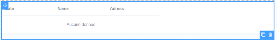
Configurations
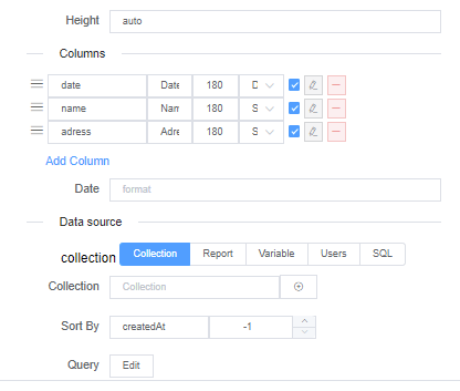
- Columns : Columns Configuration (Add, remove and resize columns)
- DataSource : Choose a source for your radio options :
- Collection Data : generated from database collections
- Variable Data : generate Value/label pairs as options
- Reports : generated from a report
- User : generated from Users Data
- SQL : generated from a SQL request
Variables
- If model is the model name of the variable
- this.models.model : The field content
- Steps:
Drag and drop the steps widget, representing the status/step of your workflow.

Configurations
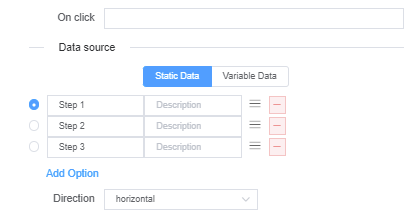
- OnClick : Attach a function to the onClick event listener
- DataSource : Choose a source for your steps options :
- Static Data : Static steps with descriptions for each step
- Variable Data : generate Value/label pairs as options
- Direction : Horizontal/Vertical
Variables
- If model is the model name of the variable
- this.models.model : The field content
- UserPicker:
Drag and drop the user picker widget to list users. Use the panel from the right to configure the widget.

Configurations
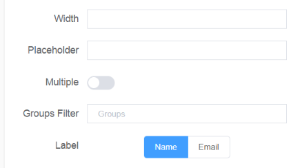
- Width : Component's width
- Placeholder : Helper text to display when the input field is empty
- Multiple : Allow multiple options select
- Groups Filter : Make available only user's from specific groups
- Label : Label user by name or email
Variables
- If model is the model name of the variable
- this.models.model : The field content
- WidgetHistory:
The widget history will help you know metrics about the process, it shows the user/group of user resposable of a task, the date when it is completed and if any comments are left by whosoever did it.
Configurations
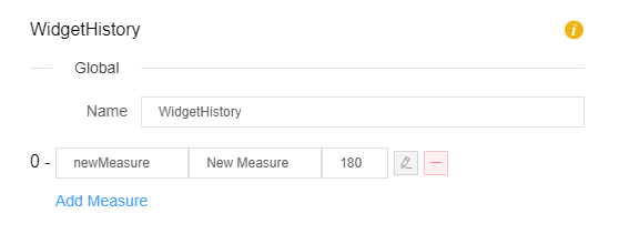
- Name :Name for your Widget History
- Mesures :By default there are: Responsable, Date and comments; but you can add mesurements linked to your process.
Variables
- If model is the model name of the variable
- this.models.model : The field content
- Jumbotron:
The jumbotron widget will let you add a jumbotron to your interface.
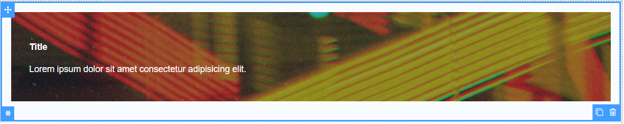
Configurations
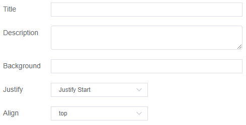
- Title : The title of your subject
- Description : Text that describe your subject content
- Background : The source of the image that will be played on backgroung of jumbotron
- Justify : How to align your content horizontaly
- Align : How to align your column items verticaly
Variables
- If model is the model name of the variable
- this.models.model : The field content
- Card:
The card widget will let you add a a flexible and extensible content container to your interface.
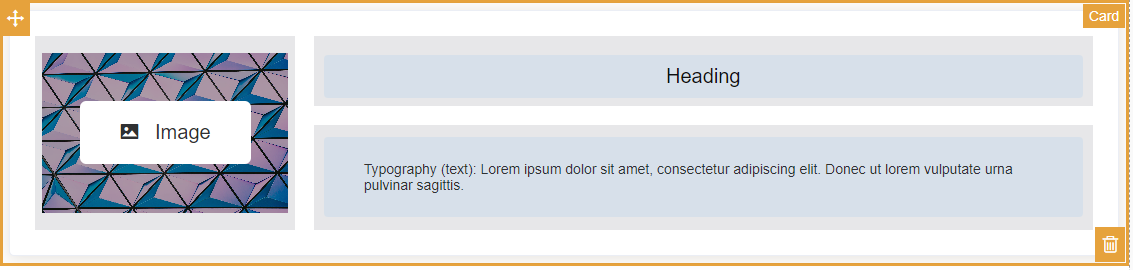
Configurations
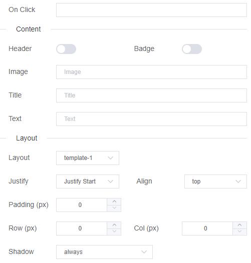
- Height : Component's Height.
- On click : Define a function to be called when the user make a selection.
- Header : If it active the name of the card will be showed
- Image : The source of the image that will be add to your card
- Title : The title of your subject
- Text : Text that describe your subject content
- Layout : The template to display the components of the card ( template-1, template-2, full )
- Justify : How to align your content horizontaly
- Align : How to align your column items verticaly
- Padding : Space around each element of the card components
- Row : Size of rows in pixels
- Col : Size of columns in pixels
- Shadow : Add a box shadow to your card ( always, hover, never )
Variables
- If model is the model name of the variable
- this.models.model : The field content
3.2.3. Layout
- Grid:
Use the grid widget to divide your page. very useful to organise your fields.

Configurations
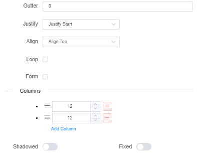
- Gutter : Grid column gap
- Justify : How to align your content horizontaly
- Align : How to align your column items verticaly
- Loop : The grid will be repeated
- Form : Either the gris is a form or not
- Columns : Columns Configuration (Add, remove and resize columns)
- Shadowed : Add a box shadow to the grid
- Fixed : make grid fixed to the screen and detach it from the rest of the layout
Variables
- If model is the model name of the variable
- this.models.model : The field content
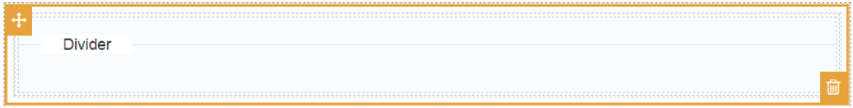
Section:
Page section with a divider to seperate page content.
Configurations
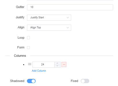
- Gutter : Grid column gap
- Justify : How to align your content horizontaly
- Align : How to align your column items verticaly
- Loop : The grid will be repeated
- Form : Either the gris is a form or not
- Columns : Columns Configuration (Add, remove and resize columns)
- Shadowed : Add a box shadow to the grid
- Fixed : make grid fixed to the screen and detach it from the rest of the layout
Variables
- If model is the model name of the variable
- this.models.model : The field content
- Popup: Drag and drop the popup widget to define differents alerts to the user.

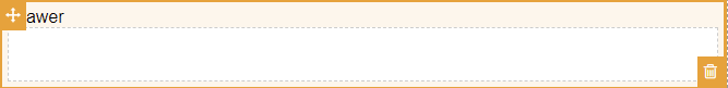
- Drawer:
You might use drawer widget to present information such as notifications or context-sensitive help.
Configurations
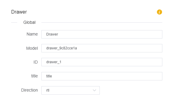
- Direction: The direction in which the drawer apears, you can choose between: rtl (right to left) or ltr (left to right)
Variables
- If model is the model name of the variable
- this.models.model : The field content
- Tabs:
Divide content that is related yet belongs to different types into different tabs.
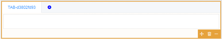
Configurations
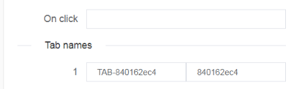
- OnClick : Attach a function to the onClick event listener
- Tab names : Name and model properties for each Tab
Variables
- If model is the model name of the variable
- this.models.model : The field content
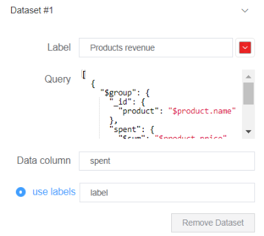
3.2.4. Chart Components
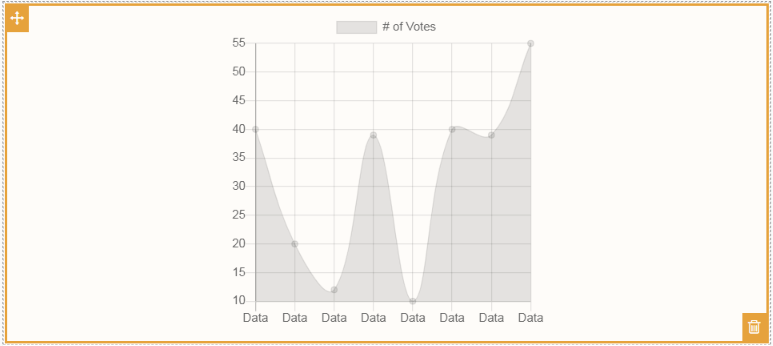
- Basic charts:
Different types of charts to display and compare statistical dynamic data.
Configurations
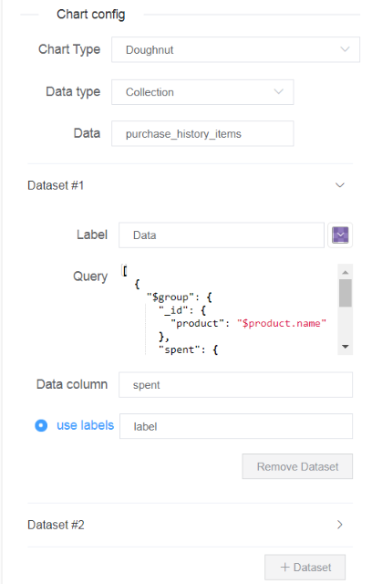
Chart Type : Choose one of 6 different charts to display your data
Data Type : Data source type from which to retrieve data
Data : Data source (Collection/Report)
DataSet : Visualise and compare different datasets.
- Query : An aggregation query (JSON) that will execute on the selected Data (Collection/Report) each time the web interface renders, the query is expected to return at least a Data column
- Data column : Name of the data column to display in chart from the executed aggregation query
- use labels : At least one dataset query should return an extra labels column to use as names for the returned data on the charts
Variables
- If model is the model name of the variable
- this.models.model : The field content
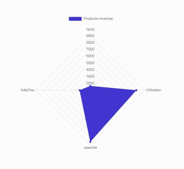
Example
We are provided with the following data collection of customers purshase history, their inventories and the products they bought as well as the price :
[
 {
    "buyer": {
      "name": "someone",
      "age": "22",
      "inventory": 12500
    },
    "product": {
      "name": "cleanSoft",
      "price": 854
    }
  },
   {
    "buyer": {
      "name": "someone",
      "age": "22",
      "inventory": 12500
    },
    "product": {
      "name": "cleanSoft",
      "price": 332
    }
  },
   {
    "buyer": {
      "name": "someone",
      "age": "22",
      "inventory": 12500
    },
    "product": {
      "name": "cleanSoft",
      "price": 6565
    }
  },
  {
    "buyer": {
      "name": "someone",
      "age": "22",
      "inventory": 12500
    },
    "product": {
      "name": "cleanSoft",
      "price": 854
    }
  },
  {
    "buyer": {
      "name": "someone",
      "age": "22",
      "inventory": 12500
    },
    "product": {
      "name": "IOSolution",
      "price": 854
    }
  },
   {
    "buyer": {
      "name": "someone",
      "age": "22",
      "inventory": 12500
    },
    "product": {
      "name": "IOSolution",
      "price": 332
    }
  },
   {
    "buyer": {
      "name": "someone",
      "age": "22",
      "inventory": 12500
    },
    "product": {
      "name": "IOSolution",
      "price": 6565
    }
  },
  {
    "buyer": {
      "name": "someone",
      "age": "22",
      "inventory": 12500
    },
    "product": {
      "name": "SoftyFlow",
      "price": 854
    }
  },
  {
    "buyer": {
      "name": "Person2",
      "age": "22",
      "inventory": 6528
    },
    "product": {
      "name": "TEPD",
      "price": 542
    }
  },
  {
    "buyer": {
      "name": "PPO",
      "age": "22",
      "inventory": 12500
    },
    "product": {
      "name": "SoftyFlow",
      "price": 854
    }
  },
  {
    "buyer": {
      "name": "mongodb",
      "age": "22",
      "inventory": 12500
    },
    "product": {
      "name": "TEPD",
      "price": 542
    }
  },
  {
    "buyer": {
      "name": "keys",
      "age": "22",
      "inventory": 12500
    },
    "product": {
      "name": "SoftyFlow",
      "price": 854
    }
  },
  {
    "buyer": {
      "name": "newObject",
      "age": "22",
      "inventory": 12500
    },
    "product": {
      "name": "TEPD",
      "price": 542
    }
  }
]
We want to calculate the revenue of each individual product through the customer's purchase history. So we write the following aggregation :
[
  {
    "$group": {
      "_id": {
        "product": "$product.name"
      },
      "spent": {
        "$sum": "$product.price"
      },
      "label": {
        "$first": "$product.name"
      }
    }
  }
]
The result of the query is a dataset array with 2 columns of data : 'spent' and 'label'. So we fill our chart config the following way and recieve the following result on the render page:
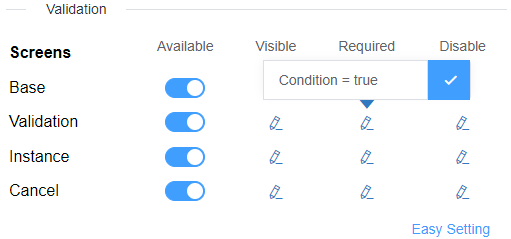
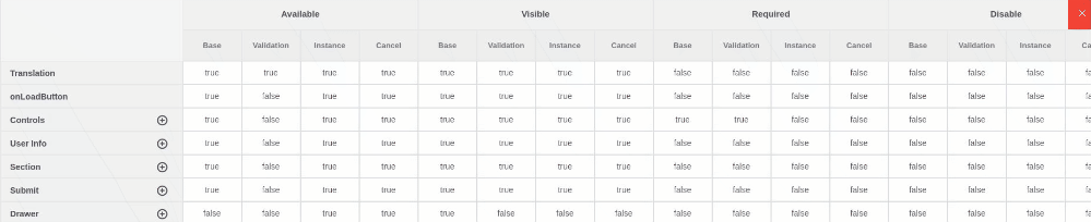
3.3. Rules Manager
For each created screen, define if a field is Visible, Required or editable.
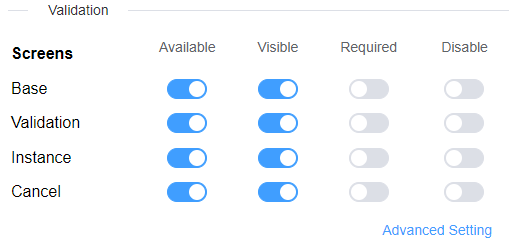
You can personalize a rule for each screen by adding a condition.
Providing a faster way to setup rules for all your components and screens in one page, you can copy/write values to multiple items at the same time for repetitive values. Select a value and drag through field with the mouse pressed and you can paste your field to multiple ones.
4. Screens
4.1. Create Screens
On the Page Settings you can create as many screens as you want and link them to the same page / Web Interface.
4.2. Manage Screens
SoftyFlow offers a rule management for each widget that let you set or personalize the rules of widgets for each screen.
- Available: Weither the widget is available or not in the screen.
- Visible: The widget is available, but you can chose if it is shown or not.
- Required: Useful to choose if an input in a form is required or not.
- Disable: You can disable a widget.The user interactions with it are disabled.
5. Managing the Navigation
Navigation's management is about creating a system that empowers users to interact with your application. SoftyFlow offers a Nav bar tool that will help you direct the navigation to the way it pleases you.
5.1. Nav bar
In UI a NavBar is a section used to aid visitors in accessing pages. In SoftyFlow, you can create easily a NavBar using the web modeler.
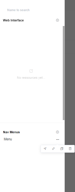
5.2. Arrange navigation
Once the NavBar created You can add elements to it.
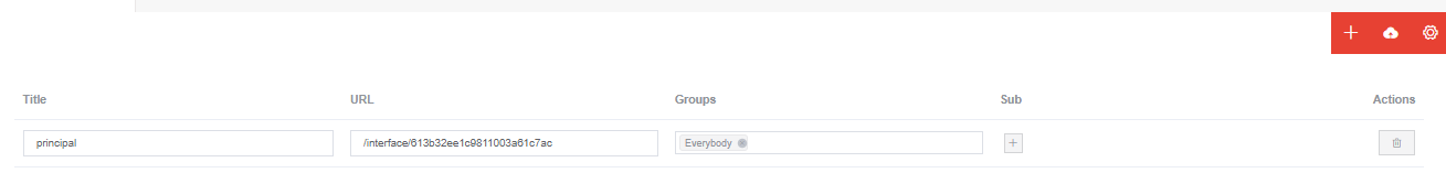
Each element is an interface with a specific ID, for redirection when clicked; or a dropdown that contain a list of interfaces.
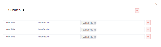
You can choose among users or group of users, the ones to display to each element of the Navbar.
6. Actions
SoftyFlow allows you to attach actions to your UI components. Those actions can be triggered On mounted: when the interface is rendered, in mode Watch: A specific component is watched and if it is touched, clicked or updated the action will be executed, in mode On click: the action is executed when the component (it has to be a button) is clicked or Computed: when the function will 'compute' the return value from existing information.
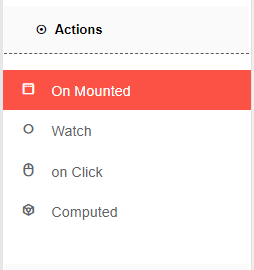
Here follows a list of the available actions
6.1. Model actions
- Show: This action allows you to set visible true to any component. In this case, you have to choose the component that will be shown by selecting its identifier.
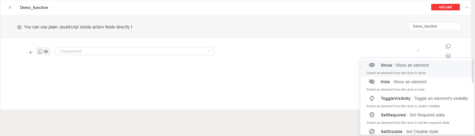
- Hide: This action allows you to set visible false to any component. In this case, you have to choose the component that will be hidden by selecting its identifier.
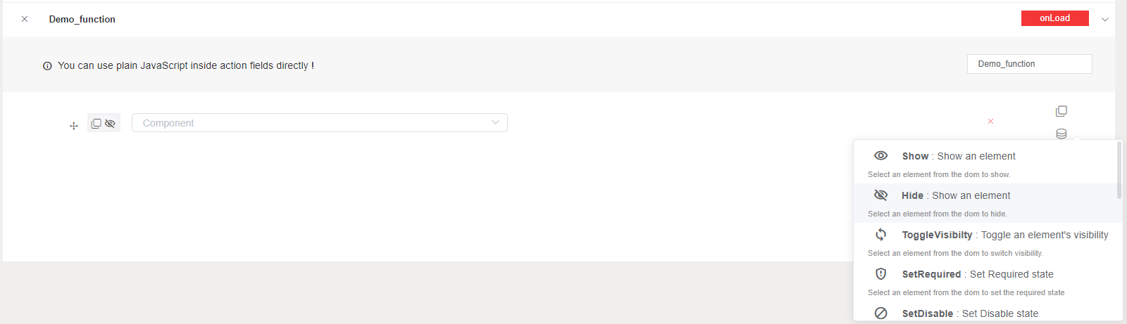
- Toggle visibility: This action allows you to switch the visibility of any component. In this case, you have to choose the component that will be switched, it visibility by selecting its identifier.

- Set Required: This action allows you to set required true to any component. In this case, you have to choose the component that will be required by selecting its identifier and setting the value (true/false).
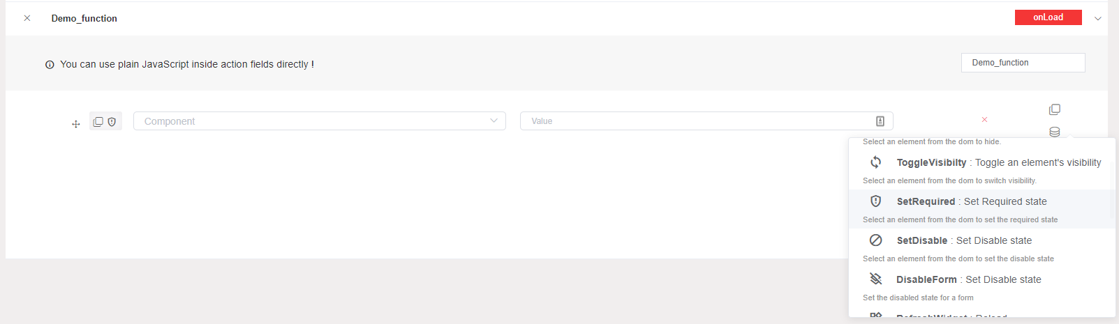
- Set Disable: This action allows you to set disable true to any component. In this case, you have to choose the component that will be disable by selecting its identifier and setting the value (true/false).
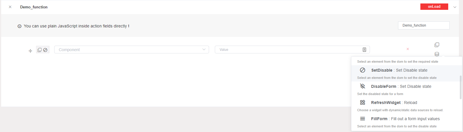
- Disable Form: This action allows you to turn a form disable. In this case, you have to choose the form that will be disable selecting its identifier.
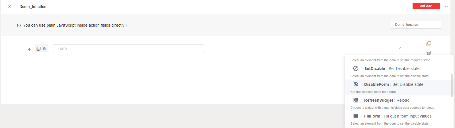
- Refresh Widget: This action allows you to reload a widget with dynamic or static data. In this case, you have to choose the table that will be refreshed by selecting its identifier.
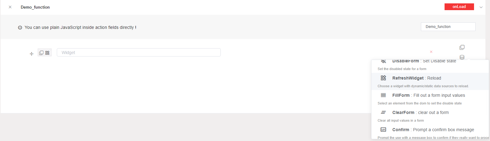
- Fill Form: This action allows you to fill a form input values. In this case, you have to choose the form that will be filled out by selecting its identifier, and also give you the ability to customize your fill by getting just your needs.
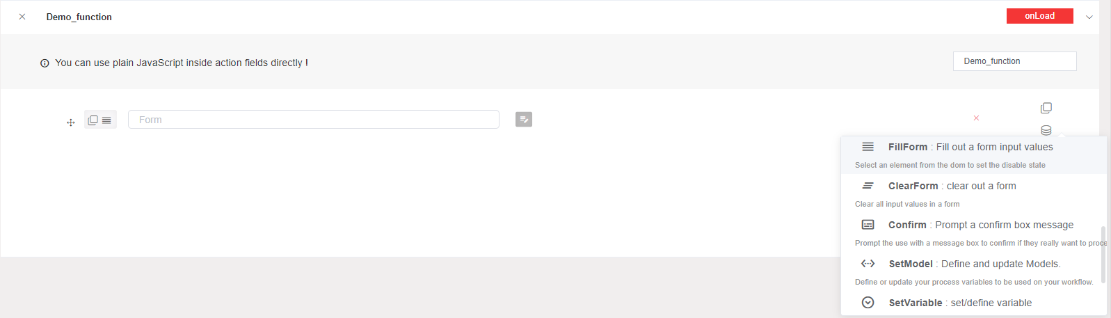
- Clear Form: This action allows you to clear all input values from a form. In this case, you have to choose the form that will be cleared by selecting its identifier.
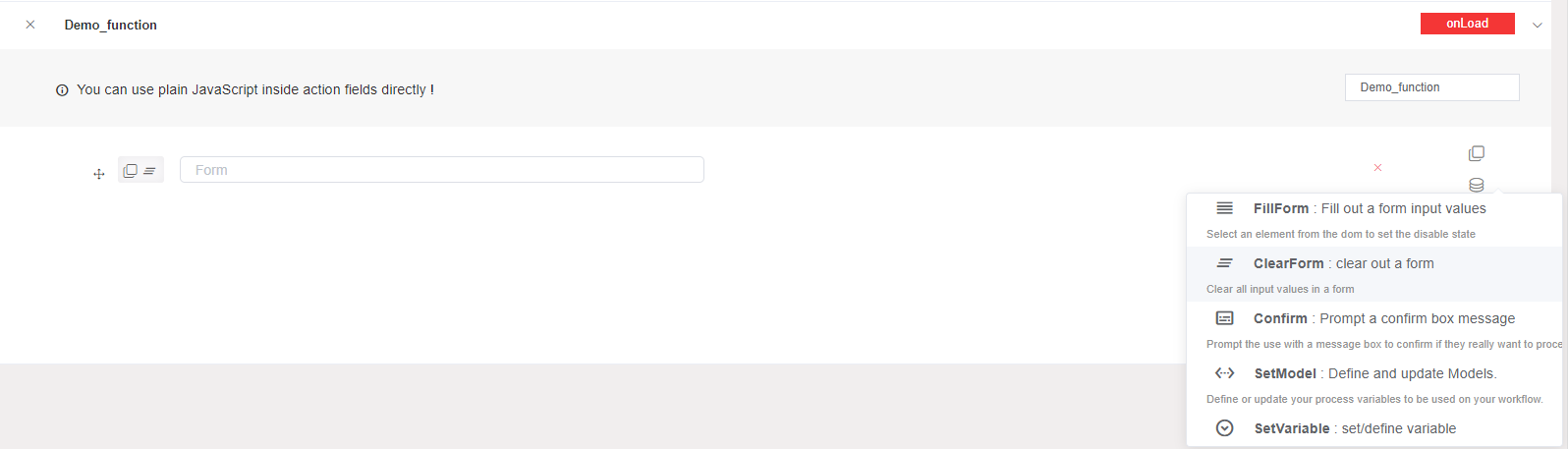
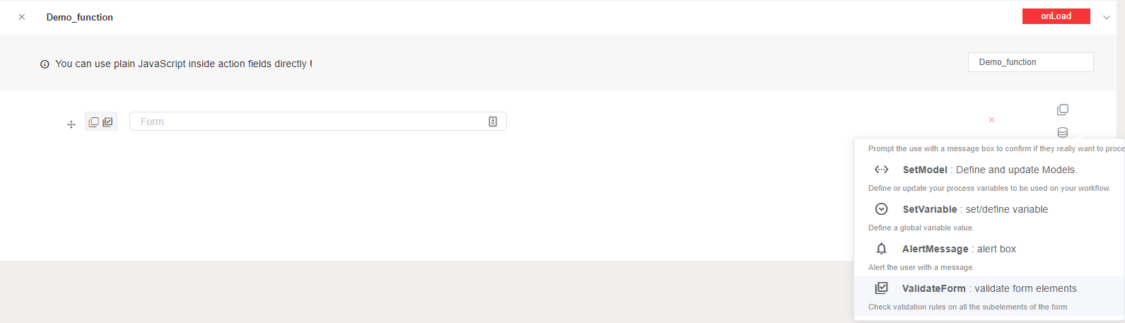
- Confirm: This action allows you to prompt the use with a message box to confirm if they really want to proceed. In this case, you customize the confirm message that will be shown.
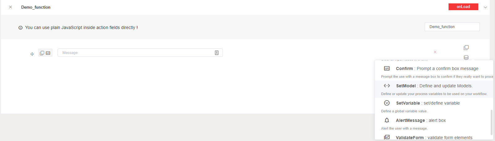
- Set Model: This action allows you to define or update a model variable. In this case, you have to choose the process variable that will be define or update.
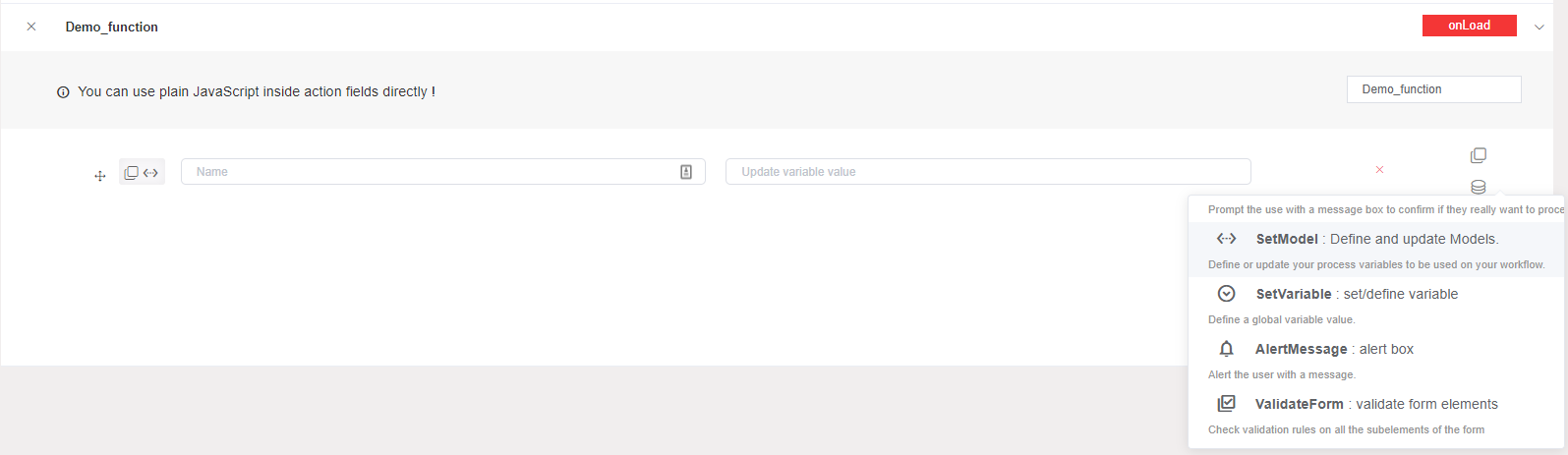
- Set Variable: This action allows you to set or define a global variable value.
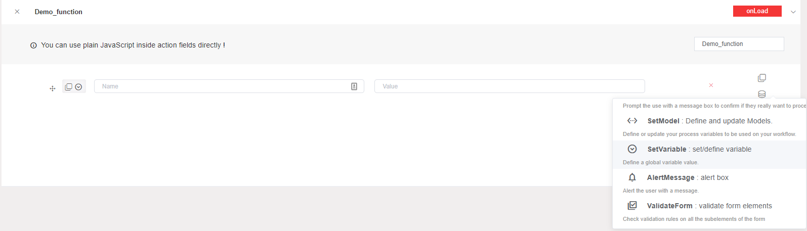
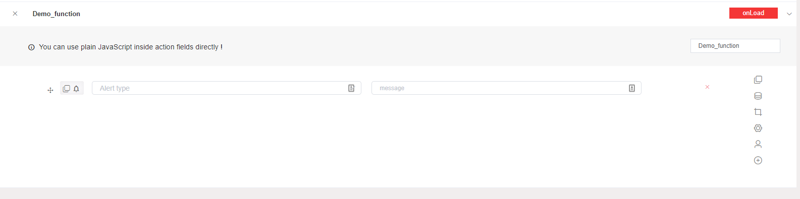
- Alert Message: This action allows you to alert the user with a message. In this case, you have to choose the alter type (success, error, warning, info) and the message that will be shown.
- Validate Form: This action allows you to check validation rules on the all the subelements of the form.
6.2. Collection actions
Add to Collection: This action allows you to insert a new document into a collection. In this case, you have to choose the form that will be added in the selected collection.
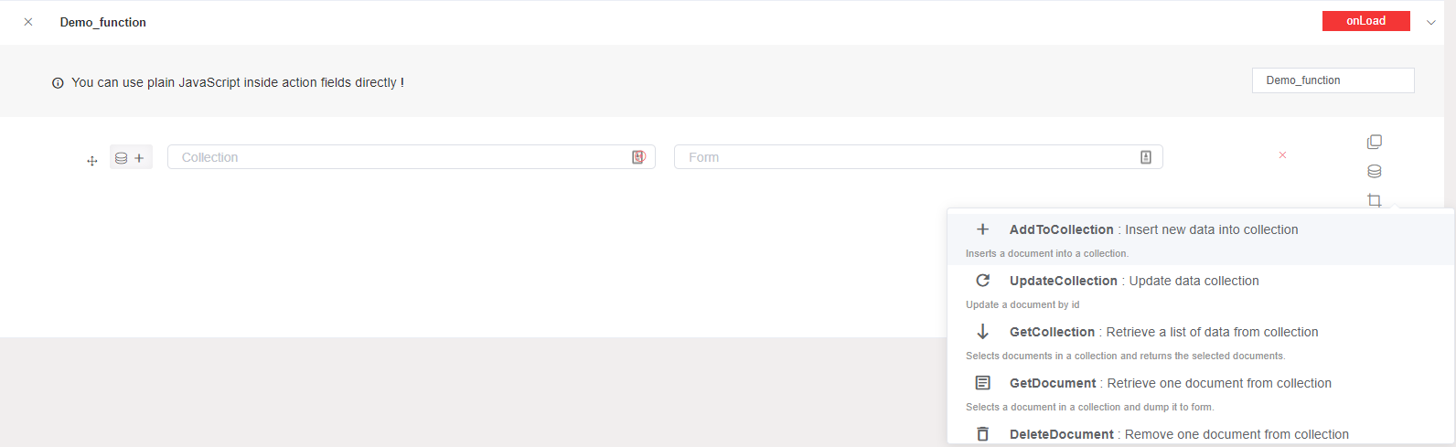
Update Collection: This action allows you to update a document's data in a collection by giving its id.
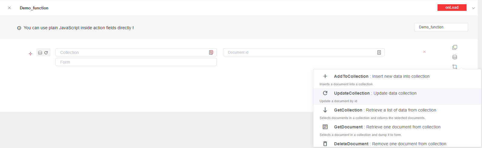
Get Collection: This action allows you to get a list of selected documents from a collection.In this case, you must add a variable which will contain your list, you can also customize your list by getting your requirements only from the selected collection.
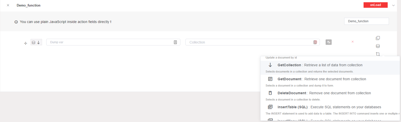
Get Document: This action allows you to get a selected document from a collection. In this case, you must add a variable which will contain your document, you can also customize your document by getting your requirements only from the selected collection.
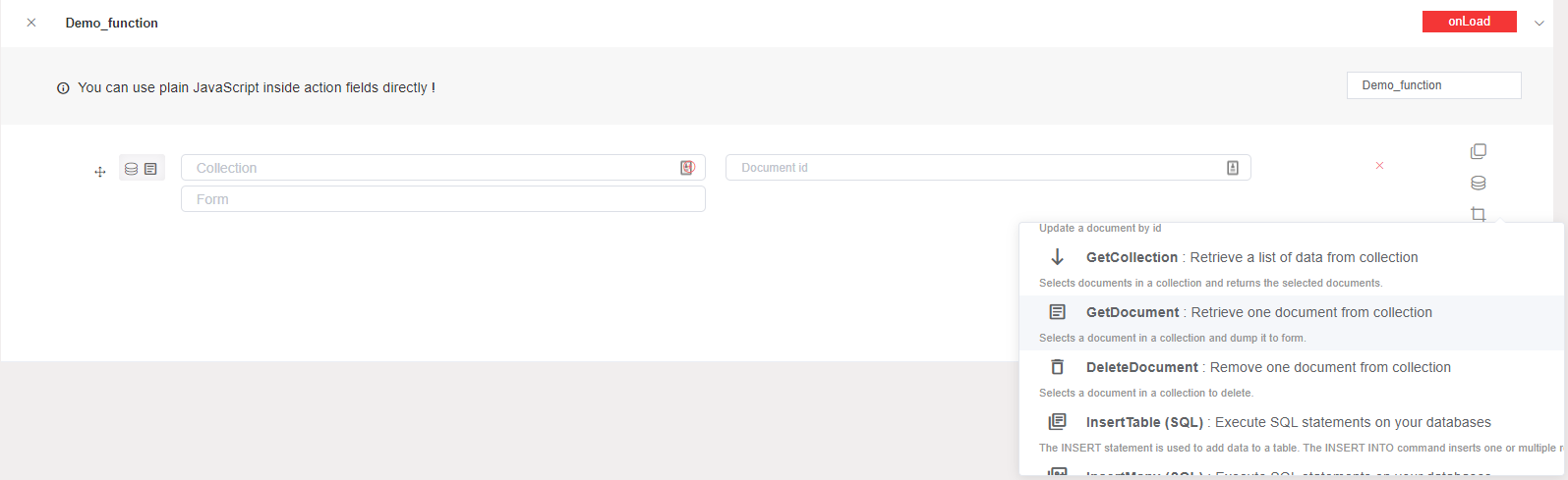
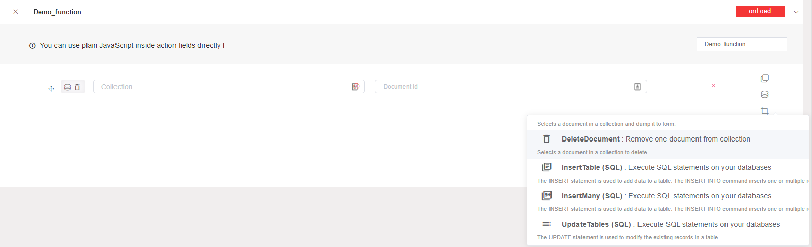
Delete Document: This action allows you to delete a document from a collection by giving its id. In this case, you have to choose the document identifier of the document that will be deleted from the selected collection.
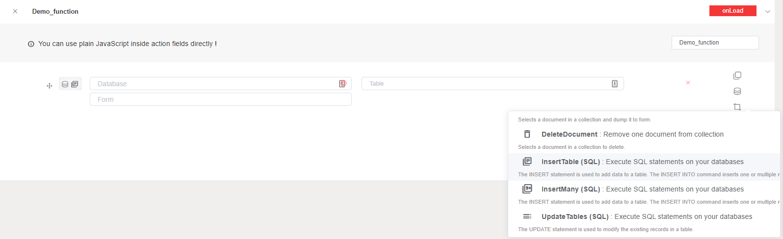
Insert Table (SQL): This action allows you to insert one or multiple data rows into a table (Equivalent to INSERT INTO statement). In this case, you have to choose your form or customize your data that will be inserted in the table of your external database selected.
Insert Many (SQL): This action allows you to insert multiple data rows into a table (Equivalent to INSERT INTO statement). In this case, you have to add manually multiple data that will be inserted in the table of your external database selected.
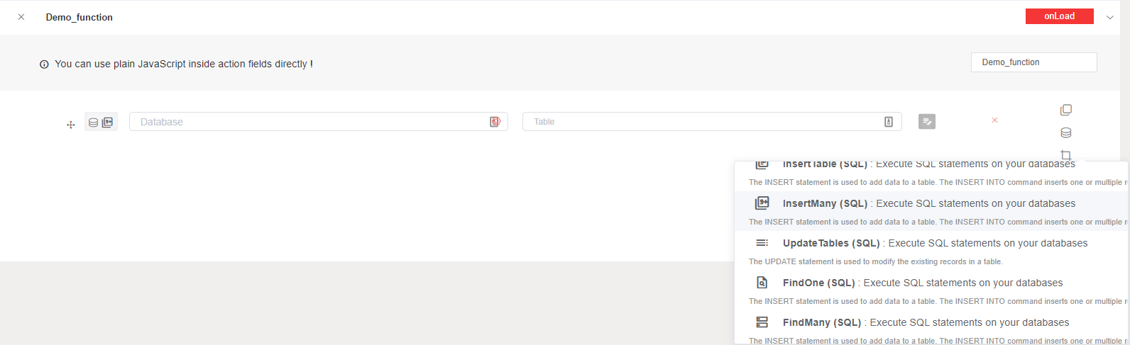
Update Tables (SQL): This action allows you to update one data rows into a table (Equivalent to UPDATE statement). In this case, you have to choose your form or customize your data that will be updated in the table of your external database selected.
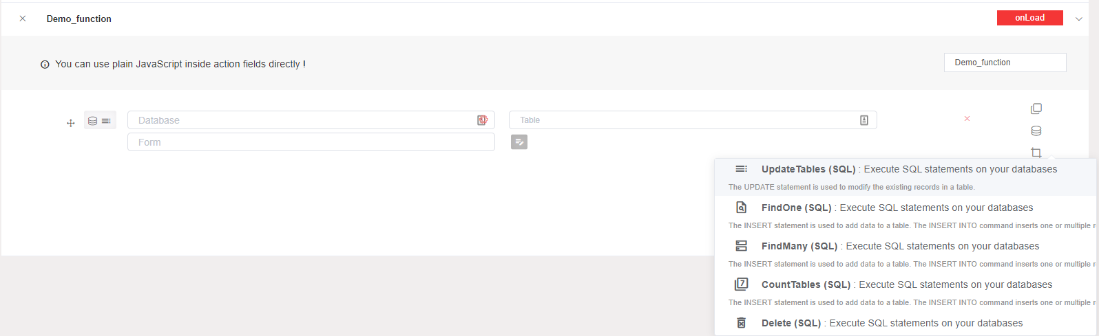
Find One (SQL): This action allows you to select one data rows from a table (Equivalent to SELECT statement). In this case, you must add a variable which will contain your data, you can also customize your data by getting your requirements only from the selected table in external DB.
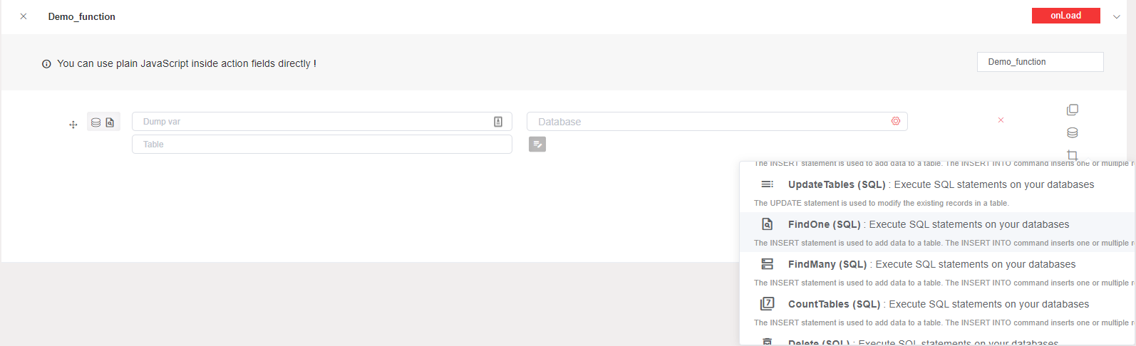
Find Many (SQL): This action allows you to select multiple data rows from a table (Equivalent to SELECT statement). In this case, you must add a variable which will contain your multiple data, you can also customize your data by getting your requirements only from the selected table in external DB.
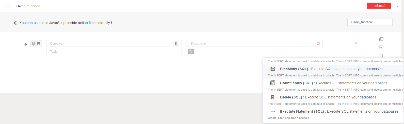
Count Tables (SQL): This action allows you to count the number of rows and return that count as a column in the result set (Equivalent to SELECT count(*) statement). In this case, you need to add a variable that will contain the number of the line that has satisfied your condition in a table in your selected external database.
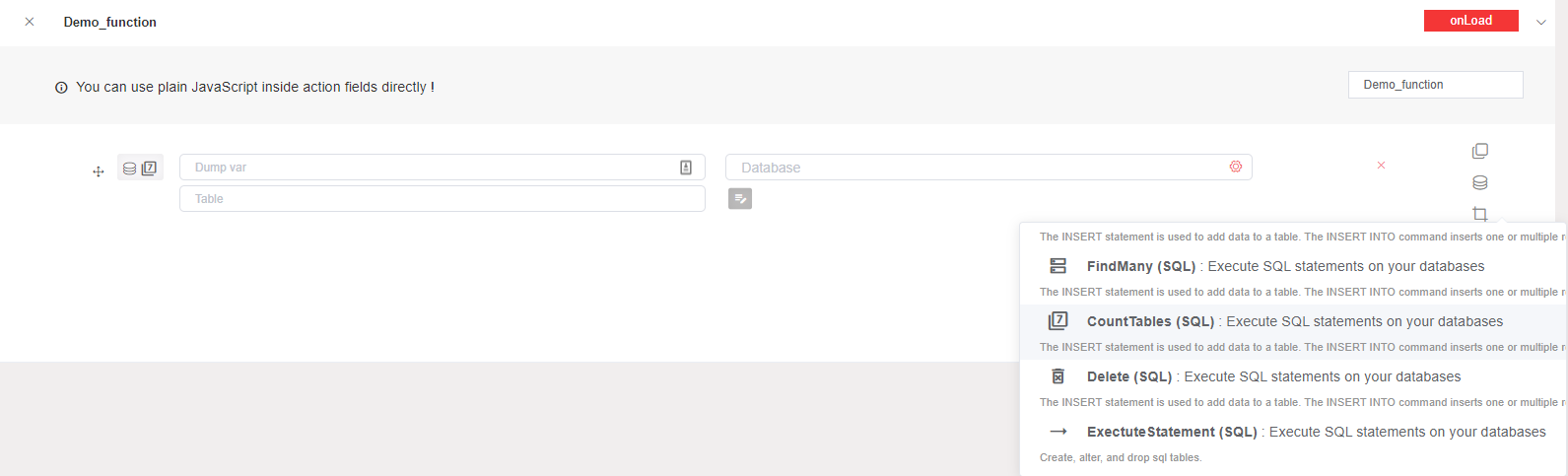
Delete (SQL): This action allows you to delete a record in a table (Equivalent to DELETE FROM statement).
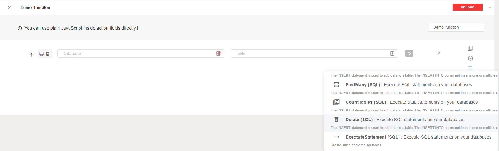
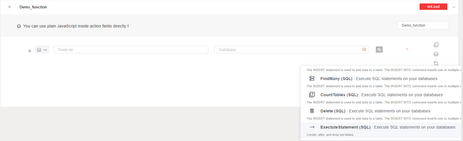
Execute Statement (SQL): This action allows you to execute an SQL statements such as create, alter or drop...
6.3. Process actions
Start Process: This action allows you to start a new instance of a workflow. In this case, you should choose the process that u like to start it.
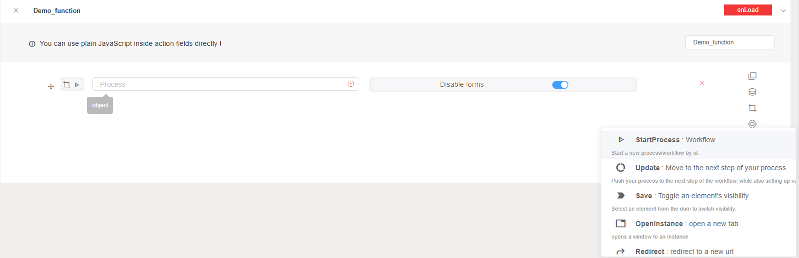
Update: This action allows you to move to the next step of a process. In this case, you choose the module variable that will be updated if it needs.
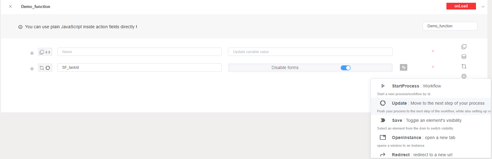
Save: This action allows you to save a snapshot of the process's progress.

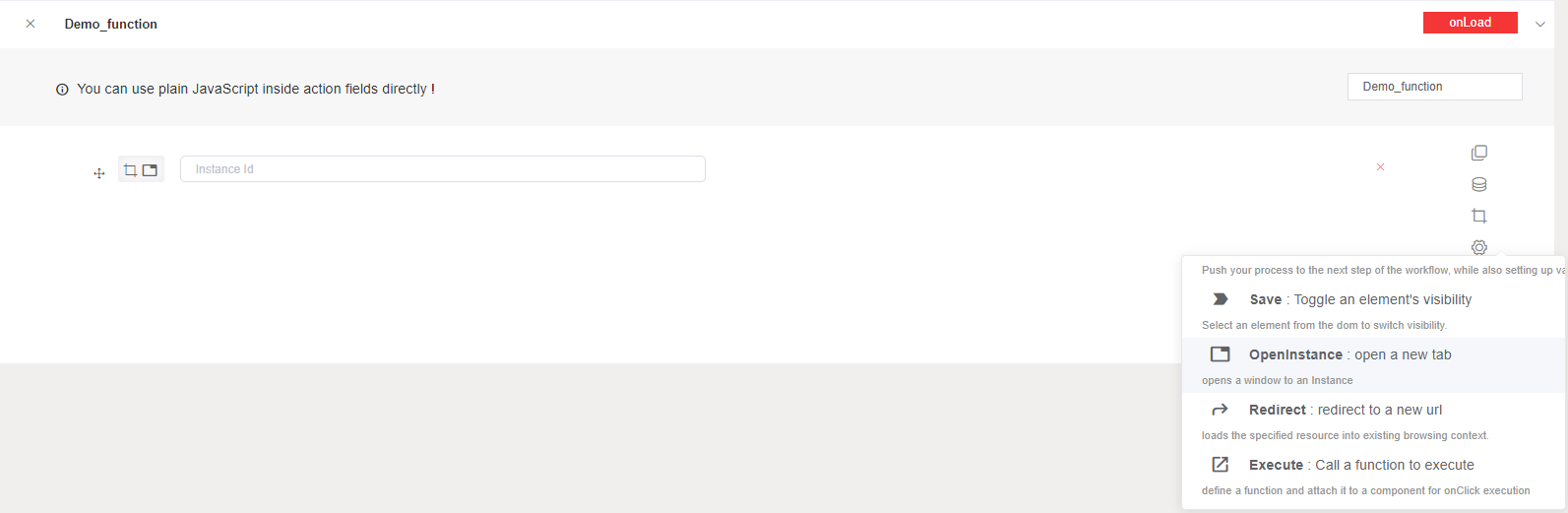
Open Instance: This action allows you to open a window to an instance. In this case, you should add the instance identifier that will be open.
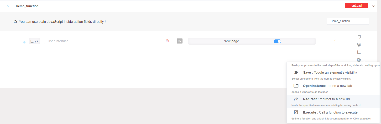
Redirect: This action allows you to redirect to an URL. In this case, you choose the interface that you wish to redirect to it, if it is an external URL you should put it in double quotes. If the New page option its active your URL will be open in a new page not in your current page.
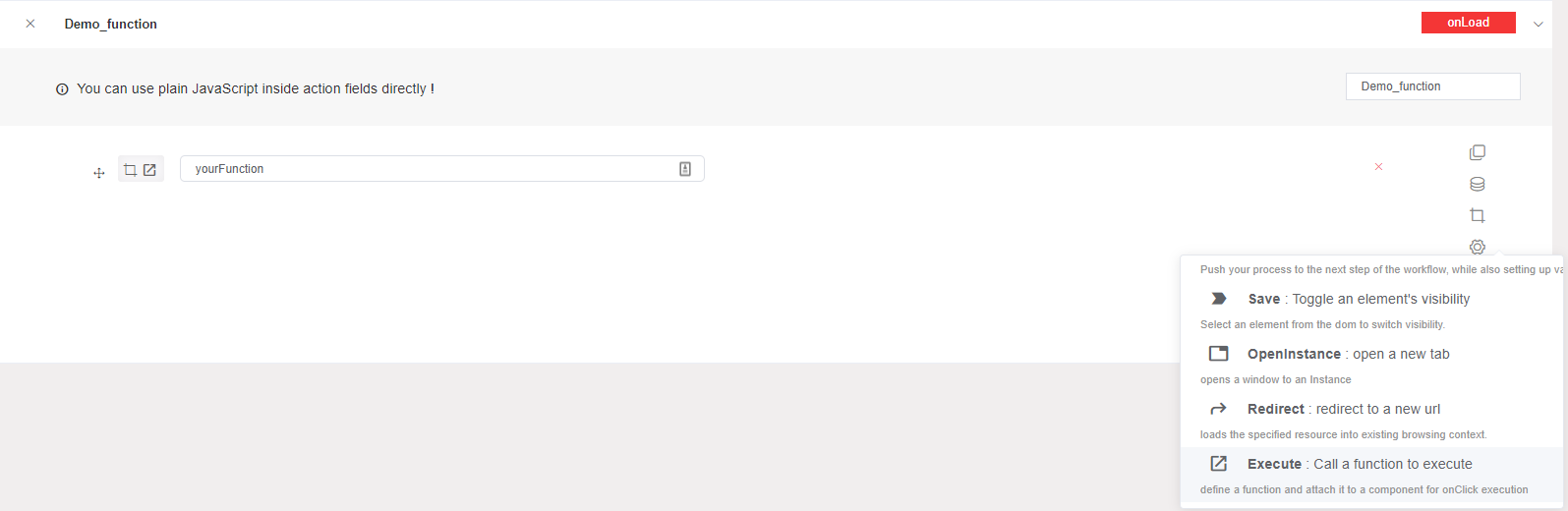
Execute: This action allows you to define a function and call it. In this case, you choose the function that will be executed.
6.4. Users actions
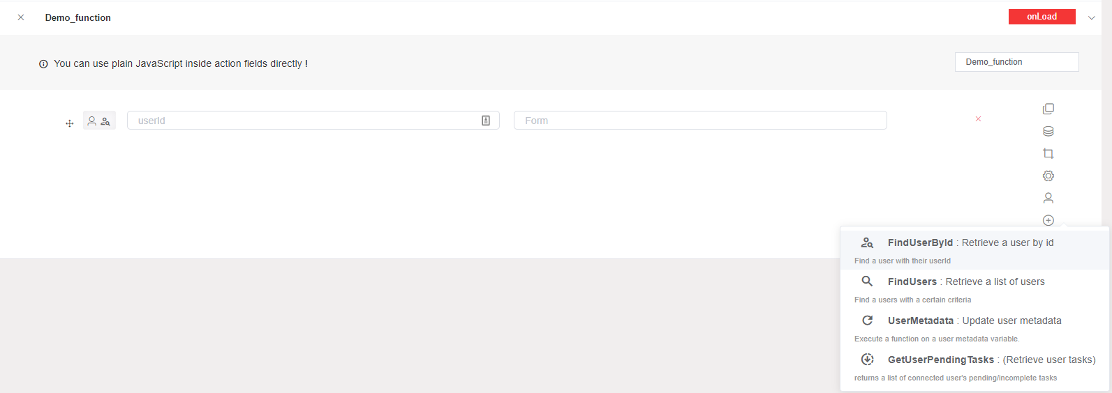
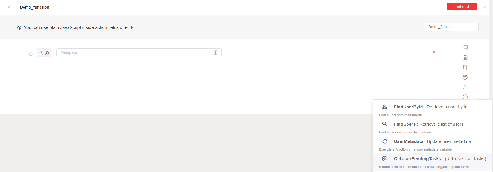
Find User By Id: This action allows you to get a user by giving an id. In this case, you should put the user identifier to get his information too this action gives you the possibility to customize your selected data.
Find Users: This action allows you to find users filling a certain criteria. In this case, you should put the variable that will contain the user data depends on your criteria.
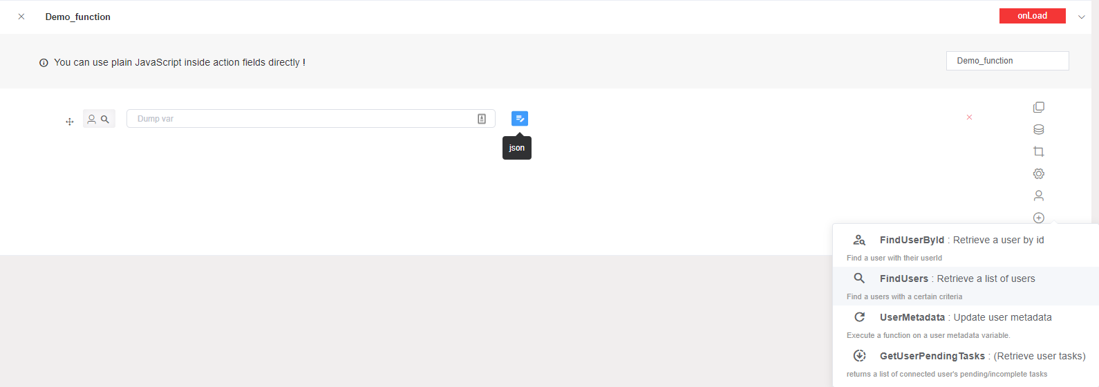
User Metadata: This action allows you to update a user's metadata. In this case, you must choose the user whose metadata will be updated by inserting their identifier.
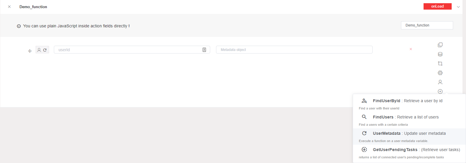
Get User Pending Tasks: This action allows you to returns a list of connected user's pending/incomplete tasks.
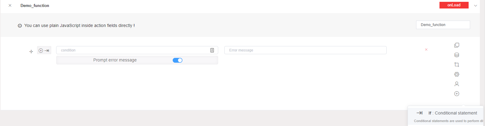
6.5. If action
Conditional statements are used to perform different actions based on different conditions. If conditions aren't verified an error message will be thrown.
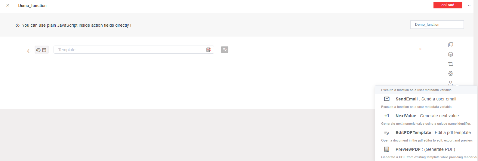
6.6. Other actions
Invoke API: This action allows you to call an API.
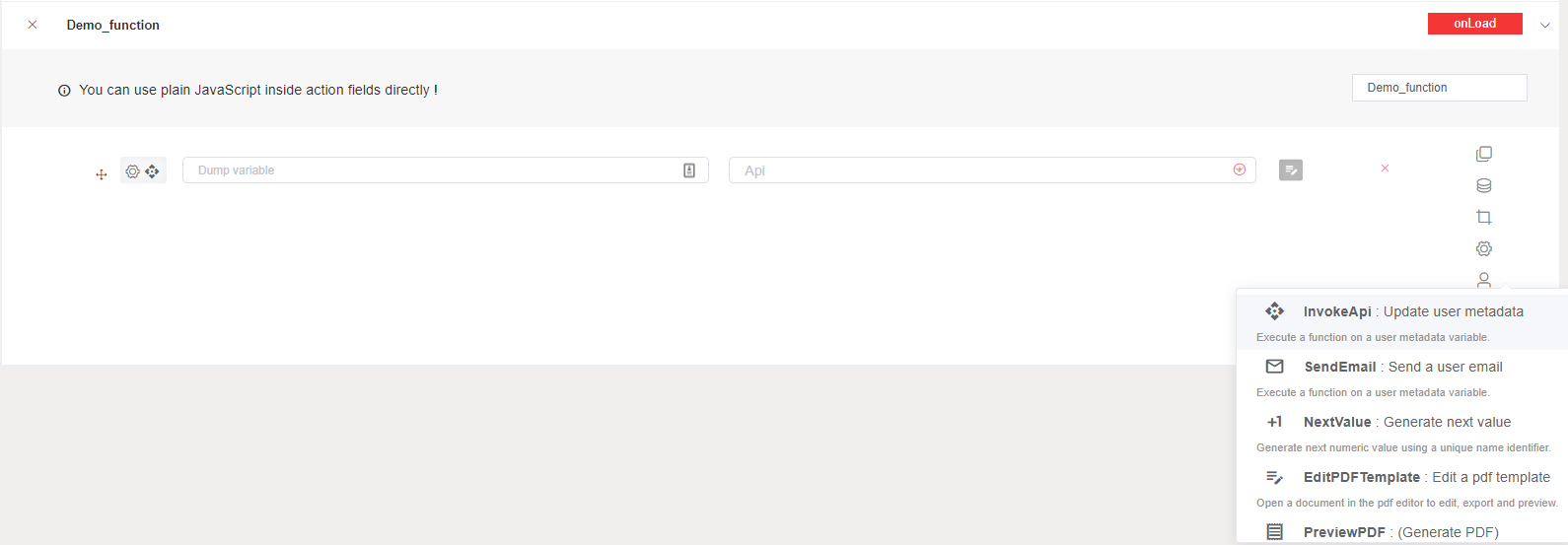
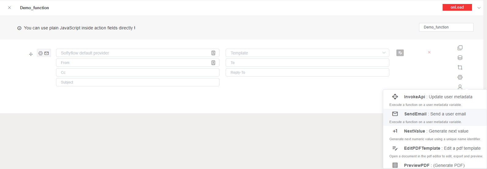
Send Email: This action allows you to send an email by giving the receiver email, the subject and the body.
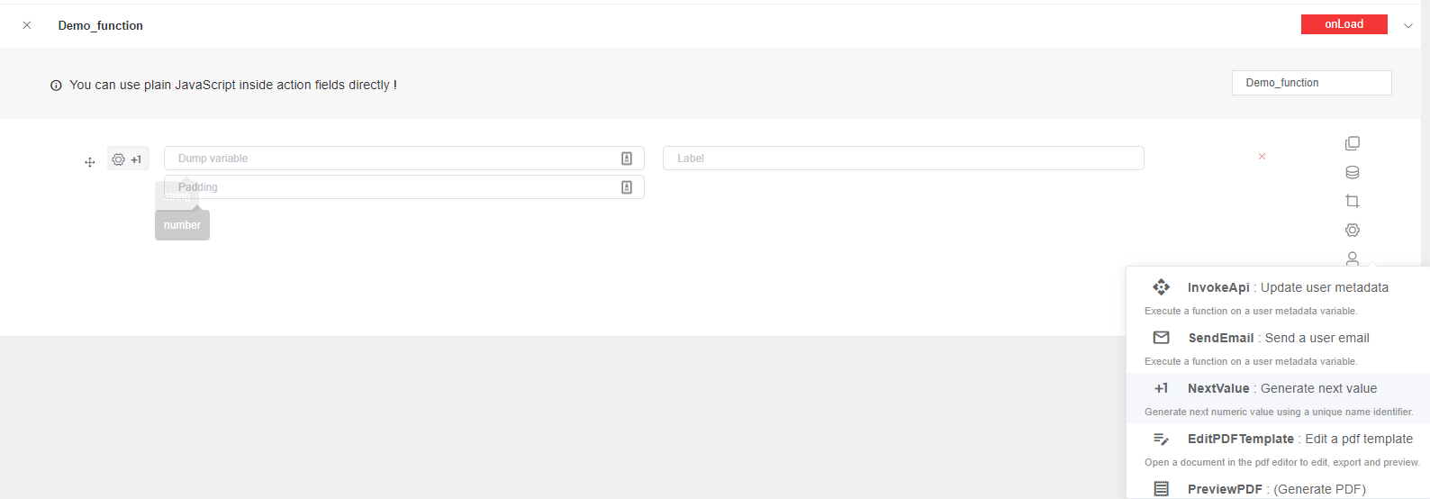
Next Value: This action allows you to generate the next numeric value using a unique name identifier.
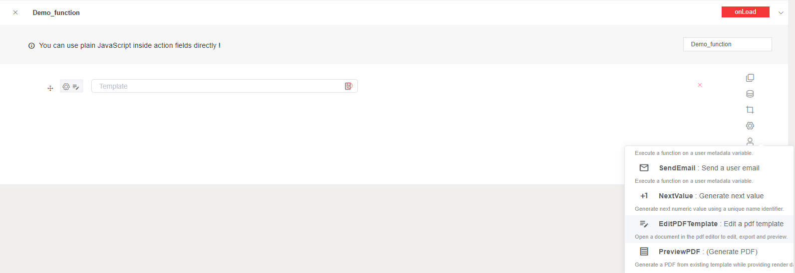
Edit PDF Template: This action allows you to open a document in the pdf editor to edit, export and preview.
Preview PDF: This action allows you to generate a PDF from existing template while providing render data/context.
You can use many actions for a given component.
7. Script
SoftyFlow is built and based on VueJS 2 - it uses the same lifecycle hooks and it offers you scriptable functions to control that functionality.
Mounted() (DOM Insertion)
Mounted hook is the most used lifecycle hook, called after the DOM has been rendered : allows you access to the component immediately after first render.Most frequently used to run page initializing DOM manipulation.
important: do not use mounted to fetch data, the propre hook is Created().
Mounted () : it will execut after rendering the component.
Read More